


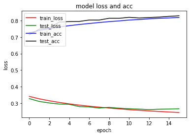
 本文介绍了一种使用Python和matplotlib库来绘制深度学习模型训练过程中的损失(loss)和准确率(acc)变化曲线的方法。通过调用model.summary()查看模型结构,并利用训练历史数据hist.history,分别绘制了训练集和验证集上的损失与准确率曲线,帮助理解和优化模型性能。

model.summary()
#绘制acc-loss曲线
import matplotlib.pyplot as plt
plt.plot(hist.history['loss'],color='r')
plt.plot(hist.history['val_loss'],color='g')
plt.plot(hist.history['acc'],color='b')
plt.plot(hist.history['val_acc'],color='k')
plt.title('model loss and acc')
plt.ylabel('loss')
plt.xlabel('epoch')
plt.legend(['train_loss', 'test_loss','train_acc', 'test_acc'], loc='upper left')
plt.show()


 6万+
6万+


 到【灌水乐园】发言


