


 本文介绍matplotlib 3.4.1中新增的bar_label()函数,用于为柱状图添加数据标签,演示了'center'和'edge'两种标签类型,并展示了堆积柱状图的使用技巧。通过实例展示如何增强数据可视化表达。
当前有效matplotlib版本为:3.4.1。
bar_label()概述
与其他可视化工具相比,为数据系列添加数据标签一直是matplotlib的薄弱项。bar_label()函数是matplotlib3.4.0新增API,功能是为柱状图添加数据标签。
函数的签名为matplotlib.pyplot.bar_label(container, labels=None, *, fmt='%g', label_type='edge', padding=0, **kwargs)。
函数的参数为:
container:柱子的容器对象,通常为bar或barh函数返回值。.BarContainer对象。必备参数。labels: 标签文本列表。类数组对象。可选参数。如果为None,则值为使用fmt参数格式化的柱子的数据(柱子的高度)。fmt:标签的格式字符串。 字符串。默认值为'%g',即将标签值格式化为浮点数。label_type:标签类型。取值范围为{'edge', 'center'},默认值为'edge'。对于普通柱状图,该参数仅用于控制标签的位置,对于堆积柱状图,不同标签类型对应不同的标签值。'edge': 标签位于柱子的端点。显示的值为柱子的端点位置。注意!对于堆积柱状图即堆积的多个柱子的总长度。'center':标签位于柱子的中部。显示的值为柱子的长度。
padding: 标签与柱子之间的距离,单位为像素。浮点数。默认值为0。**kwargs:传递给annotate()的其他参数。
返回值为标签的Text对象列表。
案例1:柱状图标签类型演示
import matplotlib.pyplot as plt
import numpy as np


# 构造数据
menMeans = (20, 35, 30, 35, 27)
womenMeans = (25, 32, 34, 20, 25)
xlabels = ['G1', 'G2', 'G3', 'G4', 'G5']
width = 0.35

plt.subplot(211)
p1 = plt.bar(xlabels, menMeans, width, label='Men')
plt.bar_label(p1, label_type='center')
plt.title('center')
plt.subplot(212)
p2 = plt.bar(xlabels, womenMeans, width, label='Women')
plt.bar_label(p2, label_type='edge')
plt.title('edge')
plt.show()
案例2:堆积柱状图标签演示
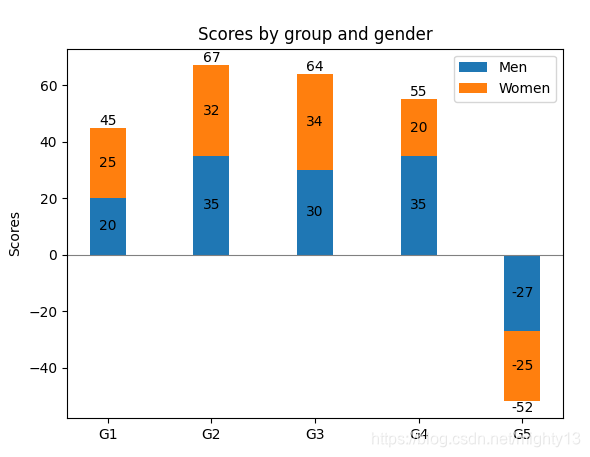
import matplotlib.pyplot as plt
import numpy as np


# 构造数据
menMeans = (20, 35, 30, 35, -27)
womenMeans = (25, 32, 34, 20, -25)
xlabels = ['G1', 'G2', 'G3', 'G4', 'G5']
width = 0.35

# 绘制堆积柱状图
p1 = plt.bar(xlabels, menMeans, width, label='Men')
p2 = plt.bar(xlabels, womenMeans, width,
            bottom=menMeans,label='Women')

plt.axhline(0, color='grey', linewidth=0.8)
plt.ylabel('Scores')
plt.title('Scores by group and gender')


plt.legend()

# 为第一段柱子添加标签
plt.bar_label(p1, label_type='center')
# 为第二段柱子添加标签
plt.bar_label(p2, label_type='center')
# 为柱子整体添加标签
plt.bar_label(p2)

plt.show()


 1740
1740


 到【灌水乐园】发言


