 鸿蒙Button组件详解


Button是按钮组件,通常用于响应用户的点击操作,其类型包括胶囊按钮、圆形按钮、普通按钮。Button做为容器使用时可以通过添加子组件实现包含文字、图片等元素的按钮。具体用法请参考 Button 。
创建按钮
Button通过调用接口来创建,接口调用有以下两种形式:
- 创建不包含子组件的按钮。
Button(label?: ResourceStr, options?: { type?: ButtonType, stateEffect?: boolean })
其中,label用来设置按钮文字,type用于设置Button类型,stateEffect属性设置Button是否开启点击效果。
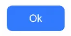
Button('Ok', { type: ButtonType.Normal, stateEffect: true })
  .borderRadius(8)
  .backgroundColor(0x317aff)
  .width(90)
  .height(40)
- 创建包含子组件的按钮。
Button(options?: {type?: ButtonType, stateEffect?: boolean})
只支持包含一个子组件,子组件可以是 基础组件 或者 容器组件。
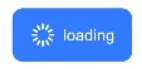
Button({ type: ButtonType.Normal, stateEffect: true }) {
  Row() {
    Image($r('app.media.loading')).width(20).height(40).margin({ left: 12 })
    Text('loading').fontSize(12).fontColor(0xffffff).margin({ left: 5, right: 12 })
  }.alignItems(VerticalAlign.Center)
}.borderRadius(8).backgroundColor(0x317aff).width(90).height(40)
设置按钮类型
Button有三种可选类型,分别为胶囊类型(Capsule)、圆形按钮(Circle)和普通按钮(Normal),通过type进行设置。
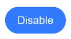
- 胶囊按钮(默认类型)
此类型按钮的圆角自动设置为高度的一半,不支持通过borderRadius属性重新设置圆角。
Button('Disable', { type: ButtonType.Capsule, stateEffect: false })
  .backgroundColor(0x317aff)
  .width(90)
  .height(40)
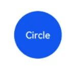
- 圆形按钮
此类型按钮为圆形,不支持通过borderRadius属性重新设置圆角。
Button('Circle', { type: ButtonType.Circle, stateEffect: false })
  .backgroundColor(0x317aff)
  .width(90)
  .height(90)
- 普通按钮
此类型的按钮默认圆角为0,支持通过borderRadi
 最低0.47元/天 解锁文章


 扫一扫
扫一扫


 1557
1557

 被折叠的 条评论
为什么被折叠?
被折叠的 条评论
为什么被折叠?
 到【灌水乐园】发言


