


1、概 述
属性字符串StyledString/MutableStyledString(MutableStyledString继承于StyledString,以下统一简称StyledString)是功能强大的标记对象,可用于字符或段落级别设置文本样式。通过将StyledString附加到文本组件, 可以通过多种方式更改文本,包括修改字号、添加字体颜色、使文本可点击以及自定义方式绘制文本等。
属性字符串提供多种类型样式对象,涵盖各种常见的文本样式格式。也可以自行创建CustomSpan, 以应用自定义样式。
2、富文本属性字符串的使用
👉🏻 基本的创建与使用
可以通过TextController提供的setStyledString(StyledString)方法将属性字符串附加到文本组件【推荐在onPageShow中触发绑定,在aboutToAppear中调用setStyledString无法实现页面初始即可见属性字符串文本内容,因为aboutToAppear运行时组件还没有完成创建并成功挂载节点树】
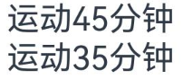
基本的使用示例如下:
@Entry@Componentstruct styled_string_demo1 {styledString1: StyledString = new StyledString("运动45分钟");mutableStyledString1: MutableStyledString = new MutableStyledString("运动35分钟");controller1: TextController = new TextController();controller2: TextController = new TextController();async onPageShow() {this.controller1.setStyledString(this.styledString1)this.controller2.setStyledString(this.mutableStyledString1)}build() {Column() {// 显示属性字符串Text(undefined, { controller: this.controller1 })Text(undefined, { controller: this.controller2 })}.width('100%')}}
示例效果如下(没有设置自定义样式):
👉🏻 设置行内文本样式
属性字符串目前提供了TextStyle、TextShadowStyle、DecorationStyle、BaselineOffsetStyle、LineHeightStyle、LetterSpacingStyle各种Style对象来实现设置文本的各类样式。分别介绍如下:
-
使用TextStyle设置样式
示例代码如下:
import { LengthMetrics } from '@kit.ArkUI'@Entry@Componentstruct styled_string_demo2 {textStyleAttrs: TextStyle = new TextStyle({ fontWeight: FontWeight.Bolder, fontSize: LengthMetrics.vp(24), fontStyle: FontStyle.Italic })mutableStyledString: MutableStyledString = new MutableStyledString("运动35分钟 目标达成", [{start: 2,length: 2,styledKey: StyledStringKey.FONT,styledValue: this.textStyleAttrs},{start: 7,length: 4,styledKey: StyledStringKey.FONT,styledValue: new TextStyle({ fontColor: Color.Orange, fontSize: LengthMetrics.vp(12)})}]);controller: TextController = new TextController();async onPageShow() {this.controller.setStyledString(this.mutableStyledString)}build() {Column() {// 显示属性字符串Text(undefined, { controller: this.controller }).margin({ top: 10 })}.width('100%')}}
效果如下:
-
使用TextShadowStyle设置样式
示例代码如下:
// xxx.ets@Entry@Componentstruct styled_string_demo3 {mutableStyledString: MutableStyledString = new MutableStyledString("运动35分钟", [{start: 0,length: 3,styledKey: StyledStringKey.TEXT_SHADOW,styledValue: new TextShadowStyle({radius: 5,type: ShadowType.COLOR,color: Color.Red,offsetX: 10,offsetY: 10})}]);controller: TextController = new TextController();async onPageShow() {this.controller.setStyledString(this.mutableStyledString)}build() {Column() {// 显示属性字符串Text(undefined, { controller: this.controller })}.width('100%')}}
示例效果如下:
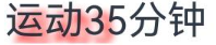
-
使用DecorationStyle设置样式
示例代码如下:
// xxx.ets@Entry@Componentstruct styled_string_demo4 {mutableStyledString: MutableStyledString = new MutableStyledString("运动35分钟", [{start: 0,length: 3,styledKey: StyledStringKey.DECORATION,styledValue: new DecorationStyle({type: TextDecorationType.LineThrough, color: Color.Red})}]);controller: TextController = new TextController();async onPageShow() {this.controller.setStyledString(this.mutableStyledString)}build() {Column() {// 显示属性字符串Text(undefined, { controller: this.controller })}.width('100%')}}
示例效果如下:
 最低0.47元/天 解锁文章


 扫一扫
扫一扫


 720
720

 被折叠的 条评论
为什么被折叠?
被折叠的 条评论
为什么被折叠?
 到【灌水乐园】发言


