


01
鸿蒙中的文本展示-Text组件
Text 组件的普通用法和其他语言一样,可以直接使用字符串Text('我是一段文本')
通过点语法设置文本样式:
Text('我是超长文本,超出的部分显示省略号。I am an extra long text, with ellipses displayed for any excess。')
  .width(250)
  .textOverflow({ overflow: TextOverflow.Ellipsis })
  .maxLines(1)
  .fontSize(12)
  .border({ width: 1 })
  .padding(10)
也可以将 Text 组件作为容器,添加 Span 、ImageSpan,针对每段文本设置不同的样式并且统一换行,ImageSpan 可以展示本地图片与网络图片:
Text() {
  Span('我是Span1,').fontSize(16).fontColor(Color.Grey)
    .decoration({ type: TextDecorationType.LineThrough, color: Color.Red })
  Span('我是Span2').fontColor(Color.Blue).fontSize(16)
    .fontStyle(FontStyle.Italic)
    .decoration({ type: TextDecorationType.Underline, color: Color.Black })
  Span(',我是Span3').fontSize(16).fontColor(Color.Grey)
    .decoration({ type: TextDecorationType.Overline, color: Color.Green })
}
.borderWidth(1)
.padding(10)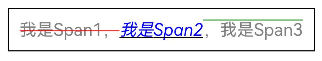
// xxx.ets
@Entry
@Component
struct SpanExample {
  build() {
    Flex({ direction: FlexDirection.Column, alignItems: ItemAlign.Center, justifyContent: FlexAlign.Center }) {
      Text() {
        Span('This is the Span and ImageSpan component').fontSize(25).textCase(TextCase.Normal)
          .decoration({ type: TextDecorationType.None, color: Color.Pink })
      }.width('100%').textAlign(TextAlign.Center)

      Text() {
        ImageSpan($r('app.media.icon'))
          .width('200px')
          .height('200px')
          .objectFit(ImageFit.Fill)
          .verticalAlign(ImageSpanAlignment.CENTER)
        Span('I am LineThrough-span')
          .decoration({ type: TextDecorationType.LineThrough, color: Color.Red }).fontSize(25)
        ImageSpan($r('app.media.icon'))
          .width('50px')
          .height('50px')
          .verticalAlign(ImageSpanAlignment.TOP)
        Span('I am Underline-span')
          .decoration({ type: TextDecorationType.Underline, color: Color.Red }).fontSize(25)
        ImageSpan($r('app.media.icon'))
          .size({ width: '100px', height: '100px' })
 最低0.47元/天 解锁文章


 扫一扫
扫一扫


 326
326

 被折叠的 条评论
为什么被折叠?
被折叠的 条评论
为什么被折叠?
 到【灌水乐园】发言


