


一、入门必备:用Matplotlib绘制基础折线图
1. 环境准备:安装绘图库
# 安装Matplotlib(基础绘图库)
pip install matplotlib

# 安装Seaborn(提升美观度,可选)
pip install seaborn
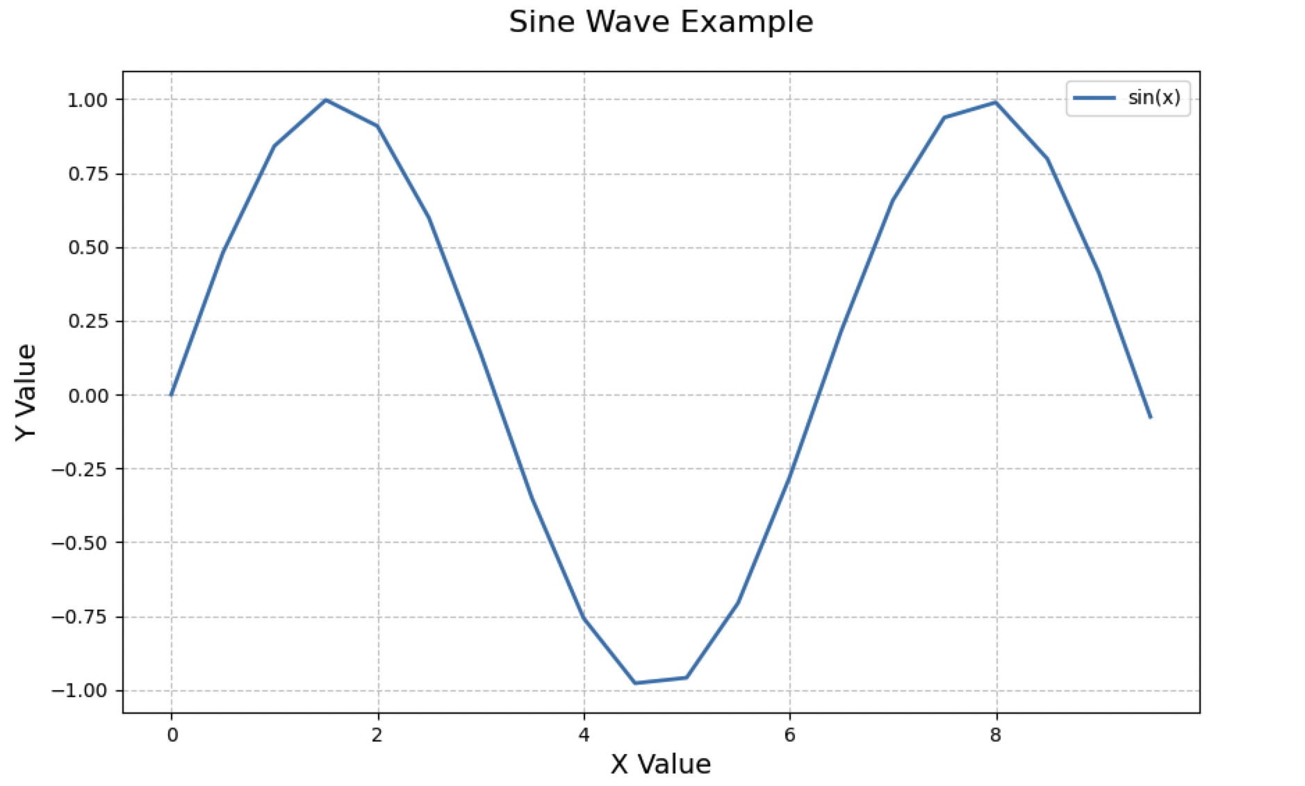
2. 基础代码框架:绘制单条折线
import matplotlib.pyplot as plt
import numpy as np

# 生成示例数据
x = np.arange(0, 10, 0.5)  # X轴数据(0-10,步长0.5)
y = np.sin(x)  # Y轴数据(正弦曲线)

# 创建画布
plt.figure(figsize=(10, 6))  # 设置画布大小(宽10英寸,高6英寸)

# 绘制折线图
plt.plot(x, y,
         color='#1f77b4',  # 线条颜色(RGB十六进制值)
         linestyle='-',    # 线条样式(实线)
         linewidth=2,      # 线条宽度
         label='sin(x)')   # 图例标签

# 添加图表元素
plt.title("Sine Wave Example", fontsize=16, pad=20)  # 主标题
plt.xlabel("X Value", fontsize=14)  # X轴标签
plt.ylabel("Y Value", fontsize=14)  # Y轴标签
plt.legend()  # 显示图例
plt.grid(True, linestyle='--', alpha=0.7)  # 添加网格线

# 显示图表
plt.show()
效果展示:
3. 关键参数解析:让图表更“听话”
| 参数 | 作用 | 常用值示例 |
|---|---|---|
color | 线条颜色 | 'red', '#FF5733', 'tab:blue' |
linestyle | 线条样式 | '-'(实线), '--'(虚线), ':'(点线) |
linewidth | 线条宽度 | 1, 2.5, 3 |
marker | 数据点标记样式 | 'o'(圆点), 's'(方块), '^'(三角) |
markersize | 标记大小 | 6, 8 |
二、进阶技巧:让折线图更专业、更美观
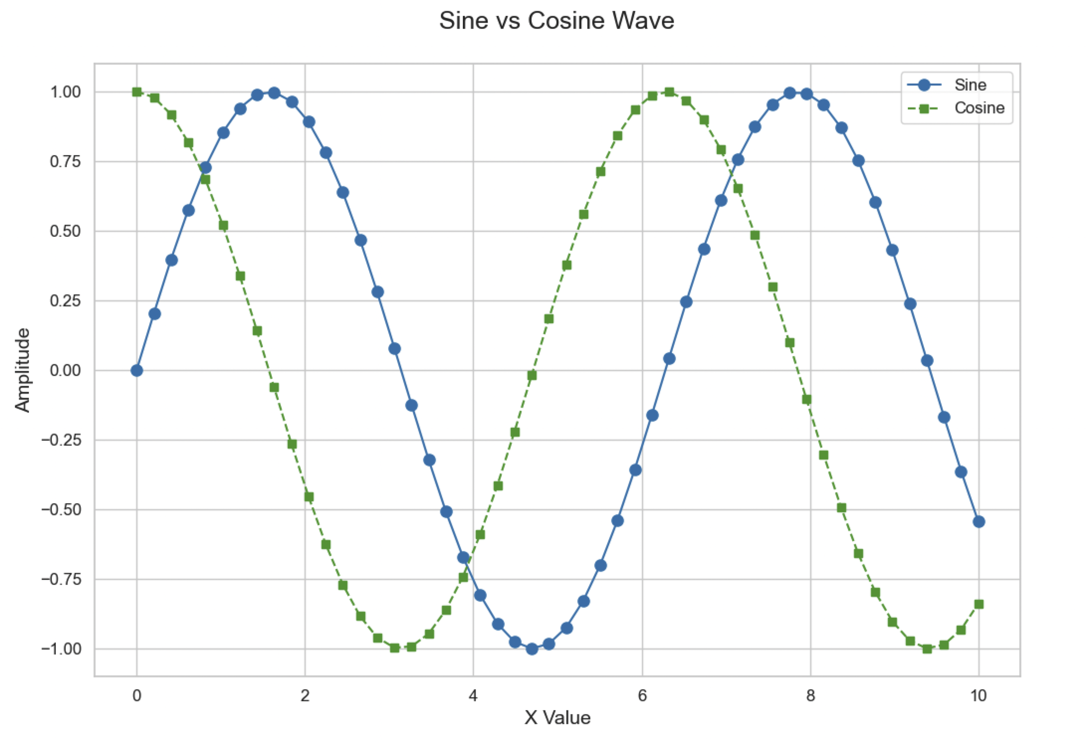
1. 样式升级:使用Seaborn提升颜值
import seaborn as sns

# 设置Seaborn主题(可选:'darkgrid', 'whitegrid', 'dark', 'white', 'ticks')
sns.set_theme(style="whitegrid")

# 绘制带标记的多线折线图
x = np.linspace(0, 10, 50)
y1 = np.sin(x)
y2 = np.cos(x)

plt.figure(figsize=(12, 8))
plt.plot(x, y1, 'o-', label='Sine', color='#1f77b4', markersize=8)
plt.plot(x, y2, 's--', label='Cosine', color='#2ca02c', markersize=6)

plt.title("Sine vs Cosine Wave", fontsize=18, pad=25)
plt.xlabel("X Value", fontsize=14)
plt.ylabel("Amplitude", fontsize=14)
plt.legend(fontsize=12, loc='upper right')  # 图例位置
plt.xticks(fontsize=12)  # X轴刻度字体大小
plt.yticks(fontsize=12)  # Y轴刻度字体大小

plt.show()
效果展示:
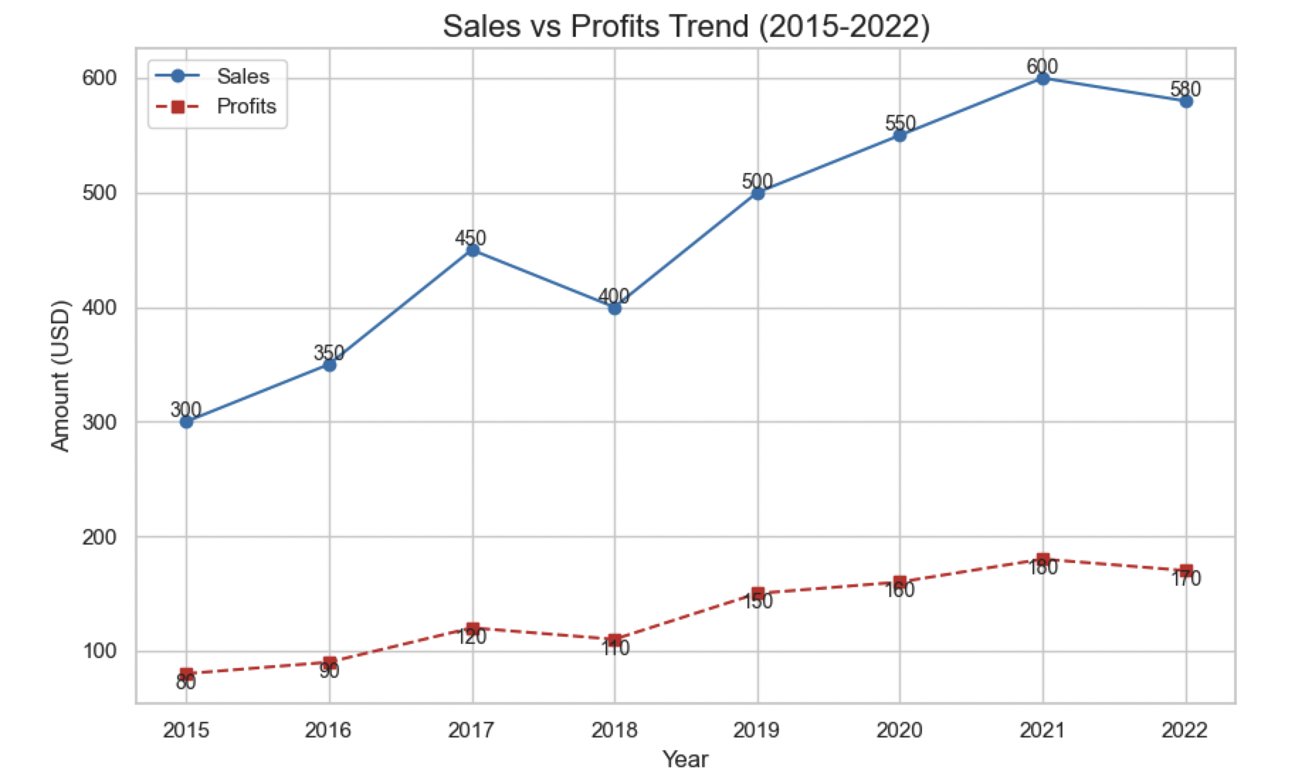
2. 多线绘制:对比多个数据系列
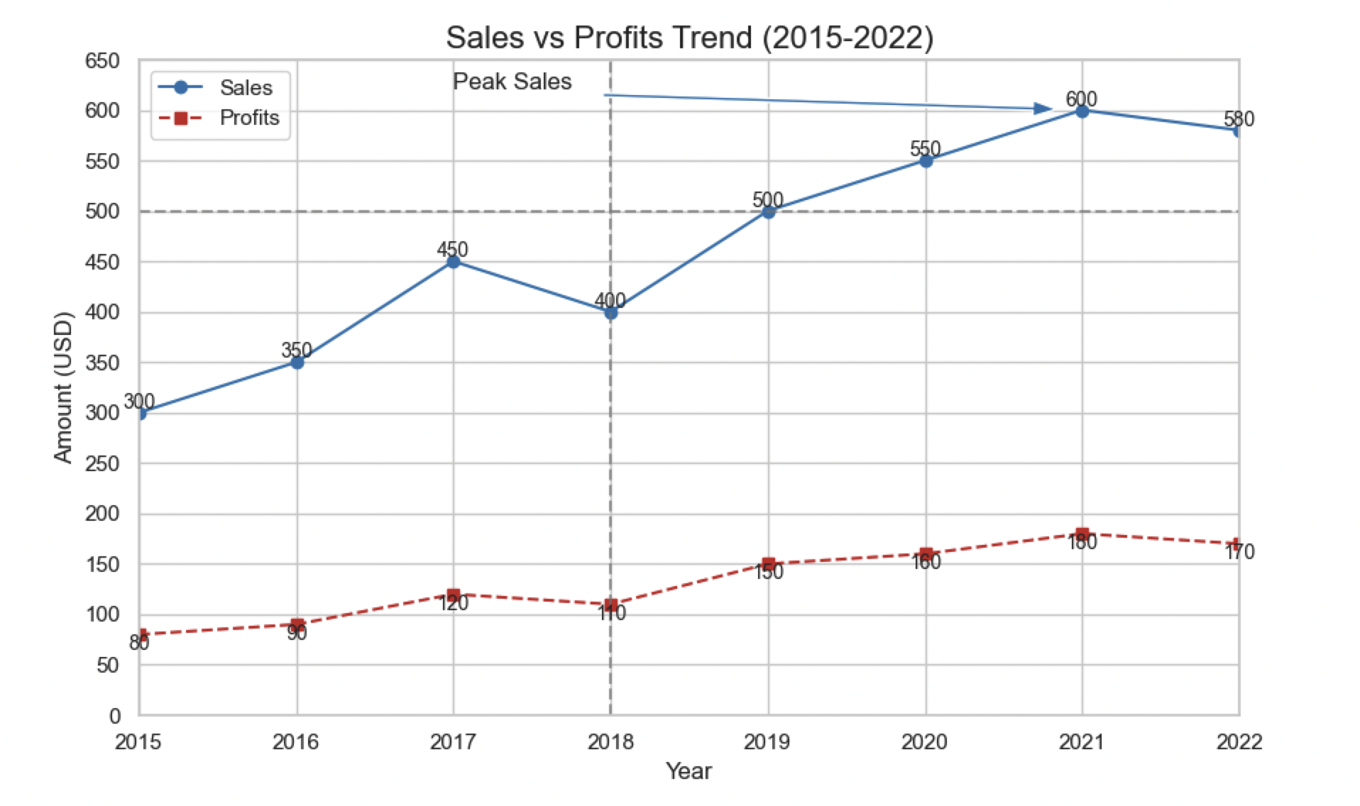
# 生成多组数据
years = [2015, 2016, 2017, 2018, 2019, 2020, 2021, 2022]
sales = [300, 350, 450, 400, 500, 550, 600, 580]
profits = [80, 90, 120, 110, 150, 160, 180, 170]

plt.figure(figsize=(10, 6))
plt.plot(years, sales, 'o-', color='#1f77b4', label='Sales')
plt.plot(years, profits, 's--', color='#d62728', label='Profits')

# 添加数据标签(关键点位标注)
for x, y in zip(years, sales):
    plt.text(x, y, f'{y}', ha='center', va='bottom', fontsize=10)
for x, y in zip(years, profits):
    plt.text(x, y, f'{y}', ha='center', va='top', fontsize=10)

plt.title("Sales vs Profits Trend (2015-2022)", fontsize=16)
plt.xlabel("Year")
plt.ylabel("Amount (USD)")
plt.legend()

plt.show()
效果展示:
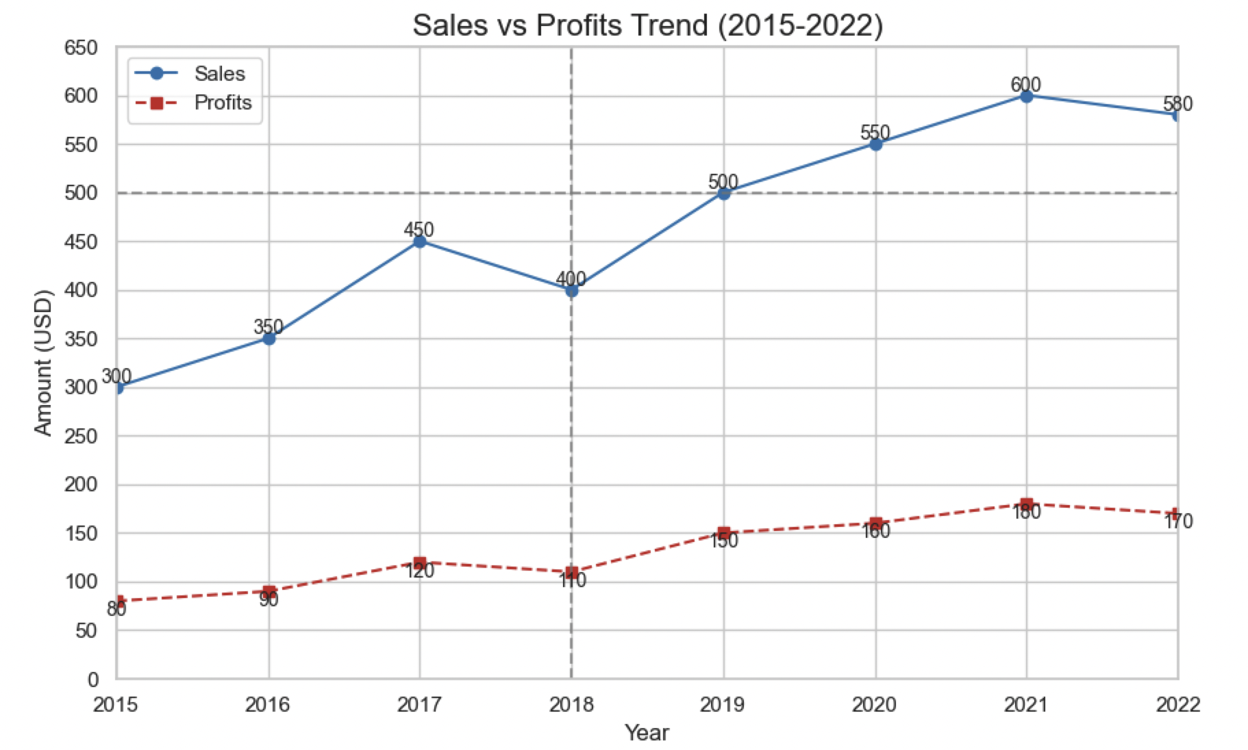
3. 坐标轴精细化调整
# 设置坐标轴范围
plt.xlim(2015, 2022)  # X轴范围
plt.ylim(0, 650)       # Y轴范围

# 自定义刻度间隔
plt.xticks(np.arange(2015, 2023, 1))  # X轴刻度步长为1年
plt.yticks(np.arange(0, 700, 50))     # Y轴刻度步长为100

# 添加参考线
plt.axhline(y=500, color='gray', linestyle='--', alpha=0.7)  # 水平参考线
plt.axvline(x=2018, color='gray', linestyle='--', alpha=0.7)  # 垂直参考线
效果展示:
4. 添加注释与标注
# 关键事件标注
plt.annotate(
    "Peak Sales",             # 注释文本
    xy=(2021, 600),          # 注释位置(数据点坐标)
    xytext=(2017, 620),      # 文本位置
    arrowprops=dict(         # 箭头属性
        facecolor='#1f77b4',
        shrink=0.05,
        width=2,
        headwidth=8
    ),
    fontsize=12
)
效果展示:
三、高级应用:处理复杂数据与场景
1. 时间序列可视化(处理日期数据)
import pandas as pd

# 生成时间序列数据
dates = pd.date_range(start='2023-01-01', periods=30, freq='D')
values = np.cumsum(np.random.randn(30))  # 累加随机数模拟趋势

plt.figure(figsize=(12, 6))
plt.plot(dates, values, color='#2c7bb6', linewidth=1.5)

# 旋转X轴日期标签避免重叠
plt.xticks(rotation=45, ha='right', fontsize=10)

plt.title("Time Series Analysis (2023-01)", fontsize=16)
plt.xlabel("Date")
plt.ylabel("Value")

plt.show()
2. 子图布局:同时展示多个折线图
# 创建2x2子图
fig, axes = plt.subplots(nrows=2, ncols=2, figsize=(15, 12))

# 子图1:简单折线
axes[0, 0].plot(x, y1, color='blue')
axes[0, 0].set_title("Subplot 1")

# 子图2:带标记折线
axes[0, 1].plot(x, y2, 'o-', color='green')
axes[0, 1].set_title("Subplot 2")

# 子图3:多线对比
axes[1, 0].plot(x, y1, 'r-', x, y2, 'b--')
axes[1, 0].set_title("Subplot 3")

# 子图4:带网格线
axes[1, 1].plot(x, y1, color='purple')
axes[1, 1].grid(True, linestyle='--', alpha=0.5)
axes[1, 1].set_title("Subplot 4")

plt.tight_layout()  # 自动调整子图间距
plt.show()
四、常见问题与解决方案
1. 数据点重叠怎么办?
- 解决方案:
- 增大标记透明度(
alpha=0.6) - 使用空心标记(如
marker='o', facecolor='white') - 错开相邻线条的标记位置
- 增大标记透明度(
2. 折线图抖动严重?
- 可能原因:数据噪声过大或采样间隔不均匀
- 解决方案:
- 对数据进行平滑处理(如移动平均)
- 添加趋势线(使用
numpy.polyfit()拟合曲线)
3. 中文字体显示为方块?
- 解决方案:
from matplotlib.font_manager import FontProperties
font = FontProperties(fname='/System/Library/Fonts/Hiragino Sans GB.ttc', size=14)  # 苹果系统中文字体
plt.title("中文标题", fontproperties=font)
五、总结:
以下是对Python绘制折线图可配置参数的全面总结表格,分为 核心参数、样式参数、坐标轴设置、高级方法 四大类:
📊 基础参数配置表
| 参数/方法 | 类型 | 作用 | 示例值 |
|---|---|---|---|
x | array | X轴数据 | x=[1,2,3] |
y | array | Y轴数据 | y=np.random.rand(5) |
label | str | 图例标签 | label="销售额" |
color | str | 线条颜色 | 'red'、'#2c7bb6' |
linestyle | str | 线型样式 | '-'(实线)、'--'(虚线) |
linewidth | float | 线条宽度 | 2.5 |
marker | str | 数据点标记 | 'o'(圆形)、'^'(三角形) |
markersize | int | 标记大小 | 8 |
alpha | float | 透明度 | 0.7(半透明) |
🎨 样式增强参数
| 参数 | 作用域 | 说明 | 示例 |
|---|---|---|---|
plt.style.use() | 全局 | 预设样式主题 | plt.style.use('seaborn') |
plt.rcParams | 全局 | 自定义全局样式 | plt.rcParams['font.size'] = 12 |
grid() | 坐标轴 | 网格线 | plt.grid(True, linestyle=':') |
spines | 坐标轴 | 边框控制 | ax.spines['top'].set_visible(False) |
text() | 图表 | 添加任意文本 | plt.text(5, 0.5, '注释') |
annotate() | 图表 | 带箭头的注释 | plt.annotate('峰值', xy=(x,y)) |
📐 坐标轴精细化设置
| 方法/参数 | 功能 | 示例代码 |
|---|---|---|
xlim()/ylim() | 坐标范围 | plt.xlim(0, 10) |
xticks()/yticks() | 刻度位置 | plt.xticks([1,2,3], ['A','B','C']) |
xlabel()/ylabel() | 轴标签 | plt.xlabel("时间", fontsize=14) |
tick_params() | 刻度样式 | plt.tick_params(axis='y', direction='in') |
DateFormatter | 时间格式化 | ax.xaxis.set_major_formatter(DateFormatter("%Y-%m")) |
LogFormatter | 对数坐标 | ax.yaxis.set_major_formatter(LogFormatter()) |
🚀 高级方法与技巧
| 方法 | 库 | 功能 | 应用场景 |
|---|---|---|---|
plt.fill_between() | matplotlib | 填充区域 | 置信区间可视化 |
sns.lineplot() | seaborn | 智能统计绘图 | 带误差带的折线图 |
fig.autofmt_xdate() | matplotlib | 自动旋转日期标签 | 时间序列数据 |
ax.secondary_yaxis() | matplotlib | 双Y轴 | 不同量纲数据对比 |
plt.legend() | matplotlib | 图例控制 | loc='upper left', ncol=2 |
axhline()/axvline() | matplotlib | 参考线 | 标记阈值 plt.axhline(y=0) |
🌟 常用组合示例
# 专业级折线图模板
plt.figure(figsize=(12, 7))
plt.plot(x, y,
         color='steelblue',
         linestyle='--',
         marker='o',
         markersize=8,
         linewidth=2,
         alpha=0.8,
         label='主数据线')

plt.title("专业级折线图", fontsize=16, pad=20)
plt.xlabel("X轴", fontsize=12)
plt.ylabel("Y轴", fontsize=12)
plt.xticks(rotation=45)
plt.grid(True, linestyle=':', alpha=0.5)
plt.legend(frameon=True, shadow=True)
plt.tight_layout()
⚠️ 注意事项
- 中文字体支持:需额外设置字体
plt.rcParams['font.family'] = 'SimHei' - 输出质量:保存时设置高DPI
plt.savefig('chart.png', dpi=300, bbox_inches='tight') - 大数据优化:超过10万数据点时使用
ax.plot(x, y, '-', rasterized=True)


 1140
1140


 到【灌水乐园】发言


