 情侣网页HTML源码分享


「情侣网页」
链接:https://pan.quark.cn/s/6b35b2b5a1d7链接:https://pan.quark.cn/s/6b35b2b5a1d7
链接:https://pan.quark.cn/s/6b35b2b5a1d7
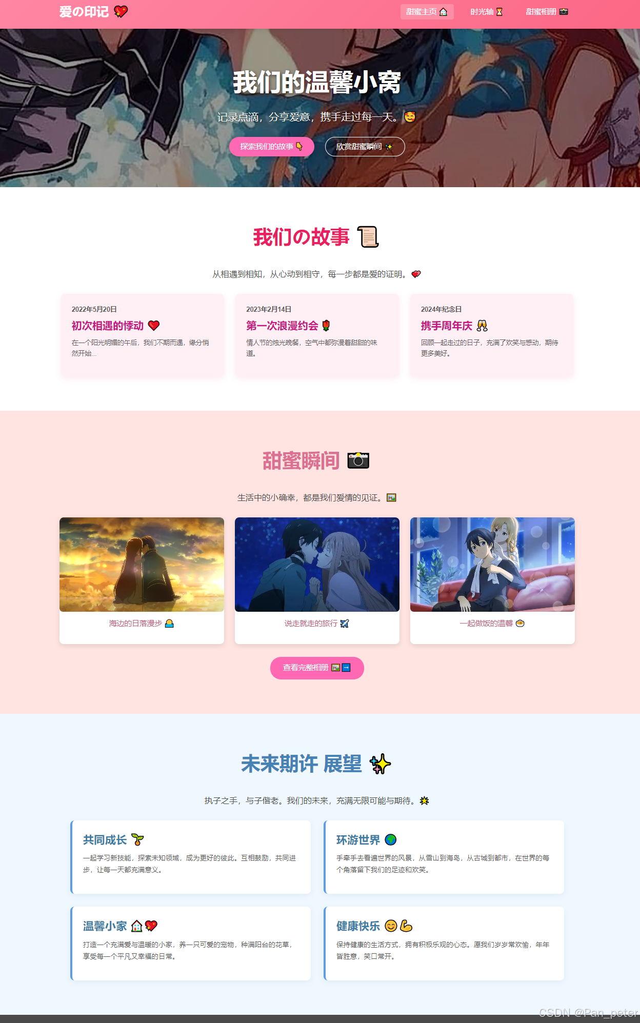
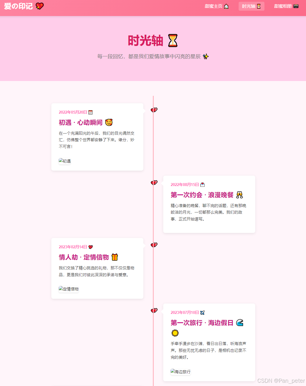
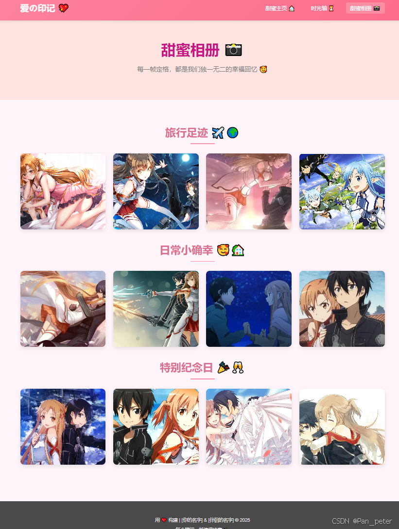
<!DOCTYPE html> <html lang="zh-CN"> <head> <meta charset="UTF-8"> <meta name="viewport" content="width=device-width, initial-scale=1.0"> <title>甜蜜主页 💕 - 我们的二人世界</title> <script src="https://cdnjs.cloudflare.com/ajax/libs/gsap/3.12.5/gsap.min.js"></script> <style> /* 0. CSS 重置与基础设定 */ *, *::before, *::after { box-sizing: border-box; margin: 0; padding: 0; } body { font-family: 'Helvetica Neue', Arial, 'PingFang SC', 'Hiragino Sans GB', 'Microsoft YaHei', sans-serif; line-height: 1.6; color: #333; background-color: #FFF5FA; /* 淡雅的背景色 */ overflow-x: hidden; /* 防止水平滚动 */ } /* 1. 响应式排版与容器 */ .container { width: 90%; max-width: 1200px; margin: 0 auto; padding: 20px 0; } h1, h2, h3 { color: #E91E63; /* 主题粉色 */ margin-bottom: 0.8em; font-weight: 600; } p { margin-bottom: 1em; color: #555; } img { max-width: 100%; height: auto; border-radius: 8px; } /* 2. 导航栏 Navbar 🎨 */ .navbar { background: linear-gradient(135deg, #FF8FAB 0%, #FB607F 100%); /* 渐变粉色 */ padding: 1em 0; box-shadow: 0 2px 10px rgba(0,0,0,0.1); position: sticky; top: 0; z-index: 1000; transition: background-color 0.3s ease; } .navbar .container { display: flex; justify-content: space-between; align-items: center; padding-top: 0; padding-bottom: 0; } .logo { font-size: 1.8em; font-weight: bold; color: #fff; text-decoration: none; animation: fadeInDown 1s ease-out; } .nav-links { list-style: none; display: flex; } .nav-links li { margin-left: 25px; animation: fadeInDown 1s ease-out 0.2s; animation-fill-mode: backwards; /* Ensure it starts from invisible if animation is delayed */ } .nav-links li:first-child { animation-delay: 0.2s; } .nav-links li:nth-child(2) { animation-delay: 0.4s; } .nav-links li:nth-child(3) { animation-delay: 0.6s; } .nav-links a { color: #fff; text-decoration: none; font-size: 1.1em; padding: 0.5em 0.8em; border-radius: 5px; transition: background-color 0.3s ease, transform 0.2s ease; } .nav-links a:hover, .nav-links a.active { background-color: rgba(255,255,255,0.2); transform: translateY(-2px); } /* 移动端导航栏 */ .menu-toggle { display: none; /* 默认隐藏 */ font-size: 1.5em; color: #fff; background: none; border: none; cursor: pointer; } /* 3. 英雄区域 Hero Section 🌟 */ .hero { background: url('img/bg\ -\ 副本.jpg') no-repeat center center/cover; /* 备用背景色,如果图片加载失败 */ background-color: #FFCDEA; /* 柔和粉色 */ color: #fff; text-align: center; padding: 80px 20px; position: relative; overflow: hidden; /* For pseudo-element overlay */ } .hero::before { /* 添加一层蒙版让文字更清晰 */ content: ''; position: absolute; top: 0; left: 0; width: 100%; height: 100%; background: rgba(0, 0, 0, 0.4); z-index: 1; } .hero-content { position: relative; /* 高于蒙版 */ z-index: 2; } .hero h1 { font-size: 3.5em; margin-bottom: 0.3em; color: #fff; font-weight: 700; text-shadow: 2px 2px 8px rgba(0,0,0,0.6); } .hero .subtitle { font-size: 1.5em; margin-bottom: 1.5em; color: #f0f0f0; text-shadow: 1px 1px 4px rgba(0,0,0,0.5); } .hero-buttons .btn { background-color: #FF69B4; /* 亮粉色 */ color: white; padding: 12px 25px; text-decoration: none; border-radius: 25px; font-size: 1.1em; margin: 0 10px; transition: background-color 0.3s ease, transform 0.3s ease; border: 2px solid transparent; box-shadow: 0 4px 15px rgba(0,0,0,0.2); } .hero-buttons .btn:hover { background-color: #FF1493; /* 深一点的粉色 */ transform: translateY(-3px) scale(1.05); box-shadow: 0 6px 20px rgba(0,0,0,0.3); } .hero-buttons .btn-secondary { background-color: transparent; border: 2px solid #fff; } .hero-buttons .btn-secondary:hover { background-color: rgba(255,255,255,0.2); } /* 4. "我们の故事" Our Story Section 📜 */ .our-story { padding: 60px 0; background-color: #FFFFFF; /* 白色背景,突出内容 */ } .our-story .container { text-align: center; } .our-story h2 { font-size: 2.8em; } .story-intro { font-size: 1.2em; max-width: 700px; margin: 0 auto 30px auto; color: #4A4A4A; } .story-timeline { display: flex; justify-content: space-around; flex-wrap: wrap; gap: 20px; /* 间隙 */ } .timeline-item { background: #FFF0F5; /* 淡紫色背景 */ padding: 25px; border-radius: 10px; box-shadow: 0 5px 15px rgba(233, 30, 99, 0.1); /* 粉色阴影 */ width: calc(33.333% - 20px); /* 减去部分间隙 */ text-align: left; transition: transform 0.3s ease, box-shadow 0.3s ease; } .timeline-item:hover { transform: translateY(-8px); box-shadow: 0 8px 25px rgba(233, 30, 99, 0.2); } .timeline-item h3 { font-size: 1.5em; color: #C71585; /* 中紫罗兰红 */ margin-bottom: 10px; } .timeline-item p { font-size: 0.95em; color: #585858; } .timeline-date { font-size: 0.9em; color: #E91E63; font-weight: bold; margin-bottom: 5px; } /* 5. "甜蜜瞬间" Sweet Moments Section (Gallery Teaser) 📸 */ .sweet-moments { padding: 60px 0; background-color: #FFE4E1; /* Misty Rose */ } .sweet-moments .container { text-align: center; } .sweet-moments h2 { font-size: 2.8em; color: #DB7093; /* PaleVioletRed */ } .gallery-teaser { display: grid; grid-template-columns: repeat(auto-fit, minmax(280px, 1fr)); gap: 25px; margin-top: 30px; } .moment-card { background: #fff; border-radius: 10px; box-shadow: 0 4px 12px rgba(0,0,0,0.1); overflow: hidden; transition: transform 0.3s ease, box-shadow 0.3s ease; } .moment-card:hover { transform: scale(1.05); box-shadow: 0 8px 20px rgba(0,0,0,0.15); } .moment-card img { width: 100%; height: 220px; object-fit: cover; display: block; } .moment-card-caption { padding: 15px; font-size: 1.1em; font-weight: 500; color: #BF5A7F; /* A bit darker pink for text */ } .cta-button { display: inline-block; background-color: #FF69B4; color: white; padding: 12px 30px; text-decoration: none; border-radius: 25px; font-size: 1.1em; margin-top: 30px; transition: background-color 0.3s ease, transform 0.2s ease; } .cta-button:hover { background-color: #FF1493; transform: translateY(-2px); } /* 6. "未来期许" Future Wishes Section 展望 */ .future-wishes { padding: 60px 0; background-color: #F0F8FF; /* AliceBlue */ } .future-wishes .container { text-align: center; } .future-wishes h2 { font-size: 2.8em; color: #4682B4; /* SteelBlue */ } .wishes-list { display: flex; justify-content: center; align-items: flex-start; /* Align items to the top if they have different heights */ flex-wrap: wrap; gap: 30px; margin-top: 30px; text-align: left; } .wish-item { background: white; padding: 25px; border-radius: 10px; box-shadow: 0 5px 15px rgba(70, 130, 180, 0.1); /* SteelBlue shadow */ width: calc(50% - 40px); /* Adjust width for two items per row, considering gap */ min-width: 280px; /* Minimum width before wrapping */ border-left: 5px solid #5D9CEC; /* Nice blue accent */ } .wish-item h3 { font-size: 1.6em; color: #3A7CA5; margin-bottom: 10px; } .wish-item p { font-size: 1em; color: #555; line-height: 1.7; } /* 7. 页脚 Footer 💌 */ .site-footer { background-color: #4A4A4A; /* 深灰色页脚 */ color: #E0E0E0; text-align: center; padding: 30px 0; font-size: 0.95em; } .site-footer p { margin-bottom: 0.5em; color: #E0E0E0; } .site-footer a { color: #FFB6C1; /* LightPink */ text-decoration: none; } .site-footer a:hover { text-decoration: underline; } /* 8. 响应式设计 Media Queries 📱💻 */ @media (max-width: 992px) { .timeline-item { width: calc(50% - 15px); /* 两列布局 */ } .wish-item { width: calc(50% - 25px); } } @media (max-width: 768px) { .hero h1 { font-size: 2.8em; } .hero .subtitle { font-size: 1.2em; } .nav-links { display: none; /* 隐藏链接 */ flex-direction: column; width: 100%; position: absolute; top: 70px; /* 根据navbar高度调整 */ left: 0; background: linear-gradient(135deg, #FB607F 0%, #FF8FAB 100%); padding: 10px 0; } .nav-links.active { display: flex; /* 点击后显示 */ } .nav-links li { margin: 10px 0; text-align: center; animation: none; /* 移除桌面端的动画 */ } .menu-toggle { display: block; /* 显示汉堡菜单按钮 */ } .timeline-item { width: calc(100% - 10px); /* 单列布局 */ } .story-timeline { gap: 15px; } .gallery-teaser { grid-template-columns: repeat(auto-fit, minmax(250px, 1fr)); gap: 15px; } .wish-item { width: 100%; } .wishes-list { gap: 20px; } } @media (max-width: 480px) { .hero h1 { font-size: 2.2em; } .hero .subtitle { font-size: 1em; } .hero-buttons .btn { padding: 10px 20px; font-size: 1em; margin: 5px; } .hero-buttons { display: flex; flex-direction: column; align-items: center; } .our-story h2, .sweet-moments h2, .future-wishes h2 { font-size: 2.2em; } } /* 9. GSAP 动画辅助类 (如果需要,例如隐藏元素以便动画进入) */ .gsap-reveal { opacity: 0; transform: translateY(30px); } .gsap-fade-in { opacity: 0; } .gsap-hero-title-char { /* For letter animation */ display: inline-block; opacity: 0; transform: translateY(-30px) rotateX(90deg) scale(0.5); } </style> </head> <body> <header class="navbar"> <div class="container"> <a href="index.html" class="logo">爱の印记 💖</a> <button class="menu-toggle" id="menuToggle" aria-label="Toggle navigation">☰</button> <ul class="nav-links" id="navLinks"> <li><a href="index.html" class="active">甜蜜主页 🏠</a></li> <li><a href="timeline.html" >时光轴 ⏳</a></li> <li><a href="album.html">甜蜜相册 📸</a></li> </ul> </div> </header> <section class="hero"> <div class="hero-content"> <h1 id="heroTitle">我们的温馨小窝 </h1> <p class="subtitle gsap-fade-in">记录点滴,分享爱意,携手走过每一天。🥰</p> <div class="hero-buttons"> <a href="#our-story" class="btn gsap-fade-in">探索我们的故事 👇</a> <a href="#sweet-moments" class="btn btn-secondary gsap-fade-in">欣赏甜蜜瞬间 ✨</a> </div> </div> </section> <section id="our-story" class="our-story"> <div class="container"> <h2 class="gsap-reveal">我们の故事 📜</h2> <p class="story-intro gsap-reveal">从相遇到相知,从心动到相守,每一步都是爱的证明。💕</p> <div class="story-timeline"> <div class="timeline-item gsap-reveal"> <p class="timeline-date">2022年5月20日</p> <h3>初次相遇的悸动 ❤️</h3> <p>在一个阳光明媚的午后,我们不期而遇,缘分悄然开始...</p> </div> <div class="timeline-item gsap-reveal"> <p class="timeline-date">2023年2月14日</p> <h3>第一次浪漫约会 🌹</h3> <p>情人节的烛光晚餐,空气中都弥漫着甜甜的味道。</p> </div> <div class="timeline-item gsap-reveal"> <p class="timeline-date">2024年纪念日</p> <h3>携手周年庆 🥂</h3> <p>回顾一起走过的日子,充满了欢笑与感动,期待更多美好。</p> </div> </div> </div> </section> <section id="sweet-moments" class="sweet-moments"> <div class="container"> <h2 class="gsap-reveal">甜蜜瞬间 📸</h2> <p class="story-intro gsap-reveal">生活中的小确幸,都是我们爱情的见证。🖼️</p> <div class="gallery-teaser"> <div class="moment-card gsap-reveal"> <img src="img/1111.jpg" alt="幸福瞬间1"> <p class="moment-card-caption">海边的日落漫步 🌅</p> </div> <div class="moment-card gsap-reveal"> <img src="img/222.webp" alt="幸福瞬间2"> <p class="moment-card-caption">说走就走的旅行 ✈️</p> </div> <div class="moment-card gsap-reveal"> <img src="img/333.webp" alt="幸福瞬间3"> <p class="moment-card-caption">一起做饭的温馨 🍲</p> </div> </div> <a href="#" class="cta-button gsap-reveal">查看完整相册 🖼️➡️</a> </div> </section> <section id="future-wishes" class="future-wishes"> <div class="container"> <h2 class="gsap-reveal">未来期许 展望 ✨</h2> <p class="story-intro gsap-reveal">执子之手,与子偕老。我们的未来,充满无限可能与期待。🌟</p> <div class="wishes-list"> <div class="wish-item gsap-reveal"> <h3>共同成长 🌱</h3> <p>一起学习新技能,探索未知领域,成为更好的彼此。互相鼓励,共同进步,让每一天都充满意义。</p> </div> <div class="wish-item gsap-reveal"> <h3>环游世界 🌍</h3> <p>手牵手去看遍世界的风景,从雪山到海岛,从古城到都市,在世界的每个角落留下我们的足迹和欢笑。</p> </div> <div class="wish-item gsap-reveal"> <h3>温馨小家 🏠💖</h3> <p>打造一个充满爱与温暖的小家,养一只可爱的宠物,种满阳台的花草,享受每一个平凡又幸福的日常。</p> </div> <div class="wish-item gsap-reveal"> <h3>健康快乐 😊💪</h3> <p>保持健康的生活方式,拥有积极乐观的心态。愿我们岁岁常欢愉,年年皆胜意,笑口常开。</p> </div> </div> </div> </section> <footer class="site-footer"> <div class="container"> <p>用 ❤️ 构建 | [你的名字] & [伴侣的名字] © 2025</p> <p>所有瞬间,只因有你 ✨</p> <p><a href="#">回到顶部 ↑</a></p> </div> </footer> <script> document.addEventListener('DOMContentLoaded', function() { // GSAP 动画 const tl = gsap.timeline({ defaults: { ease: 'power3.out' } }); // 1. Logo & Nav Links Animation tl.fromTo('.logo', { opacity: 0, y: -30 }, { opacity: 1, y: 0, duration: 0.8 }) .fromTo('.nav-links li', { opacity: 0, y: -20 }, { opacity: 1, y: 0, duration: 0.5, stagger: 0.15 }, "-=0.5" // Overlap with previous animation slightly ); // 2. Hero Section Title - Letter by Letter Animation const heroTitle = document.getElementById('heroTitle'); if (heroTitle) { const chars = heroTitle.innerText.split(''); heroTitle.innerHTML = chars.map(char => `<span class="gsap-hero-title-char">${char === ' ' ? ' ' : char}</span>`).join(''); tl.to('.gsap-hero-title-char', { opacity: 1, y: 0, rotationX: 0, scale: 1, duration: 0.8, stagger: 0.04, // Time between each letter's animation ease: "back.out(1.7)" }, "-=0.2"); // Start this animation slightly before the previous one finishes } // 3. Hero Subtitle and Buttons tl.fromTo('.hero .subtitle', { opacity: 0, y: 20 }, { opacity: 1, y: 0, duration: 0.8 }, "-=0.6" // Adjust timing relative to title ) .fromTo('.hero-buttons .btn', { opacity: 0, y: 20, scale: 0.8 }, { opacity: 1, y: 0, scale: 1, duration: 0.6, stagger: 0.2 }, "-=0.4" ); // 4. Section elements reveal on scroll (or load if not implementing ScrollTrigger yet) // For simplicity, this will animate all at once after hero, can be enhanced with ScrollTrigger gsap.utils.toArray('.gsap-reveal').forEach((elem, i) => { gsap.fromTo(elem, { opacity: 0, y: 50 }, { opacity: 1, y: 0, duration: 0.8, delay: i * 0.1 + tl.duration() - 0.5, // Stagger based on element index and hero animation duration scrollTrigger: { // Basic ScrollTrigger example trigger: elem, start: "top 85%", // When the top of the element is 85% from the top of the viewport toggleActions: "play none none none", // Play animation once when it enters viewport // markers: true, // For debugging } } ); }); // Responsive Navbar Toggle const menuToggle = document.getElementById('menuToggle'); const navLinks = document.getElementById('navLinks'); if (menuToggle && navLinks) { menuToggle.addEventListener('click', () => { navLinks.classList.toggle('active'); // Optional: Change hamburger icon to X if (navLinks.classList.contains('active')) { menuToggle.innerHTML = '✕'; } else { menuToggle.innerHTML = '☰'; } }); } // Smooth scroll for anchor links in navbar document.querySelectorAll('.nav-links a[href^="#"]').forEach(anchor => { anchor.addEventListener('click', function (e) { e.preventDefault(); const targetId = this.getAttribute('href'); const targetElement = document.querySelector(targetId); if (targetElement) { targetElement.scrollIntoView({ behavior: 'smooth' }); // If mobile nav is open, close it after clicking a link if (navLinks.classList.contains('active')) { navLinks.classList.remove('active'); menuToggle.innerHTML = '☰'; } } }); }); // Smooth scroll for hero buttons document.querySelectorAll('.hero-buttons a[href^="#"]').forEach(anchor => { anchor.addEventListener('click', function (e) { e.preventDefault(); const targetId = this.getAttribute('href'); const targetElement = document.querySelector(targetId); if (targetElement) { targetElement.scrollIntoView({ behavior: 'smooth' }); } }); }); }); </script> </body> </html>


 扫一扫
扫一扫


 1646
1646

 被折叠的 条评论
为什么被折叠?
被折叠的 条评论
为什么被折叠?
 到【灌水乐园】发言


