


241017
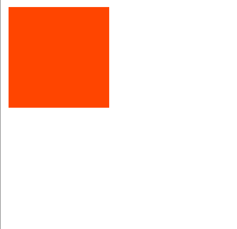
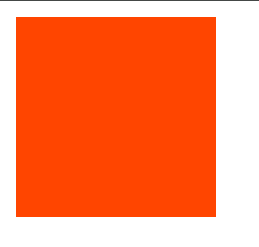
1. 过渡 transition
<!DOCTYPE html>
<html lang="en">
<head>
    <meta charset="UTF-8">
    <meta name="viewport" content="width=device-width, initial-scale=1.0">
    <title>过渡</title>
    <style>
        /*
            transition复合属性,多个属性值用空格隔开
            可以为一个元素在不同状态之间切换的时候添加过渡效果
            transition: all 1s;
        */
        div{
            width: 100px;
            height: 100px;
            background-color: orangered;
            /* transition: width 1s,height 1s; */
            transition: all 1s;
        }
        div:hover{
            width: 200px;
            height: 200px;
            background-color: lightblue;
        }
    </style>
</head>
<body>
    <div></div>
</body>
</html>
2. 平面转换
2.1 平移 translate
<!DOCTYPE html>
<html lang="en">
<head>
    <meta charset="UTF-8">
    <meta name="viewport" content="width=device-width, initial-scale=1.0">
    <title>平移</title>
    <style>
        /*
            平移translate
            属性值百分比,参照自身尺寸计算平移结果
            水平方向平移:translateX
            垂直方向平移:translateY
            translate3D & translateZ 3D效果

            正值表示向右或向下移动,负值表示向左或向上移动。
        */
        div{
            width: 100px;
            height: 100px;
            background-color: orangered;

            /* translate属性值数值之间加逗号!!! */
            transform: translate(200px,30px);
            /* 一个值 水平方向平移 */
            transform: translate(50px);

            /* 单水平方向平移 */
            transform: translateX(30px);
            /* 单垂直方向平移 */
            transform: translateY(20px);
        }
    </style>
</head>
<body>
    <div></div>
</body>
</html>
2.2 旋转 rotate
<!DOCTYPE html>
<html lang="en">
<head>
    <meta charset="UTF-8">
    <meta name="viewport" content="width=device-width, initial-scale=1.0">
    <title>旋转</title>
    <style>
        div{
            width: 100px;
            height: 100px;
            background-color: orangered;
            transition: 1s;
        }
        div:hover{
            /* rotate 正数顺时针旋转,负数逆时针 */
            transform: rotate(60deg);
        }
    </style>
</head>
<body>
    <div></div>
</body>
</html>
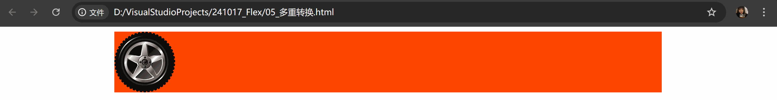
2.3 多重转换
<!DOCTYPE html>
<html lang="en">
<head>
    <meta charset="UTF-8">
    <meta name="viewport" content="width=device-width, initial-scale=1.0">
    <title>多重转换</title>
    <style>
        /* 一个标签具有多重转换效果 */
        div{
            width: 900px;
            height: 100px;
            background-color: orangered;
            margin: 0 auto;
        }
        img{
            width: 100px;
            aspect-ratio: 1;

            /* 过渡 自带变化曲线 先快后慢 */
            transition: all 2s;
        }
        /* 鼠标悬停在div区域内,img动 */
        div:hover img{
            /* 先平移固定了坐标轴方向,再旋转时以平移轴向为准 */
            transform: translate(800px) rotate(360deg);
            /* 旋转会改变坐标轴向 */
            /* transform: rotate(360deg) translate(800px); */
        }
    </style>
</head>
<body>
    <div>
        <img src="./tyre.png" alt="">
    </div>
</body>
</html>
2.4 缩放 scale
<!DOCTYPE html>
<html lang="en">
<head>
    <meta charset="UTF-8">
    <meta name="viewport" content="width=device-width, initial-scale=1.0">
    <title>缩放</title>
    <style>
        /*
            缩放比取值大于1表示放大,取值小于1表示缩小
            通常只为scale()设置一个值,表示X轴和Y轴等比例缩放
        */
        div{
            width: 100px;
            height: 100px;
            background-color: orangered;
            transition: 1s;
        }
        div:hover{
            /* X、Y缩放比例相同 */
            transform: scale(0.8);
            /* X、Y设置不同缩放比例 */
            transform: scale(1,0.8);
        }
    </style>
</head>
<body>
    <div></div>
</body>
</html>
3. 动画 animation
<!DOCTYPE html>
<html lang="en">
<head>
    <meta charset="UTF-8">
    <meta name="viewport" content="width=device-width, initial-scale=1.0">
    <title>动画</title>
    <style>
        /*
            动画:实现多个状态间的变化过程
        */
        div{
            width: 100px;
            height: 100px;
            background-color: orangered;

            /* 调用动画 animation:动画名称 动画时长 */
            /* animation: 动画名称 动画花费时长 速度曲线 延迟时间 重复次数 动画方向 执行完毕时的状态; */
            /* 取值不分先后顺序 */
            /* infinite无限循环 */
            animation: change 2s infinite;
            /* 第二个时间为延迟时间 */
            /* 数字为动画重复次数 */
            /* linear 速度曲线的匀速运动 */
            /* alternate往返运动 */
            /* forwards 动画结束状态为完毕时效果 */
            animation: change 3s 1s 3;
        }

        /* 定义动画方法一 */
        @keyframes change {
            from{
                width: 100px;
            }
            to{
                width: 800px;
            }
        }

        /* 定义动画方法二 */
        /*  */
        /* @keyframes change {
            20%{width: 200px;}
            50%{width: 500px;}
            80%{width: 700px;}
            100%{width: 1000px;}
        } */
    </style>
</head>
<body>
    <div></div>
</body>
</html>
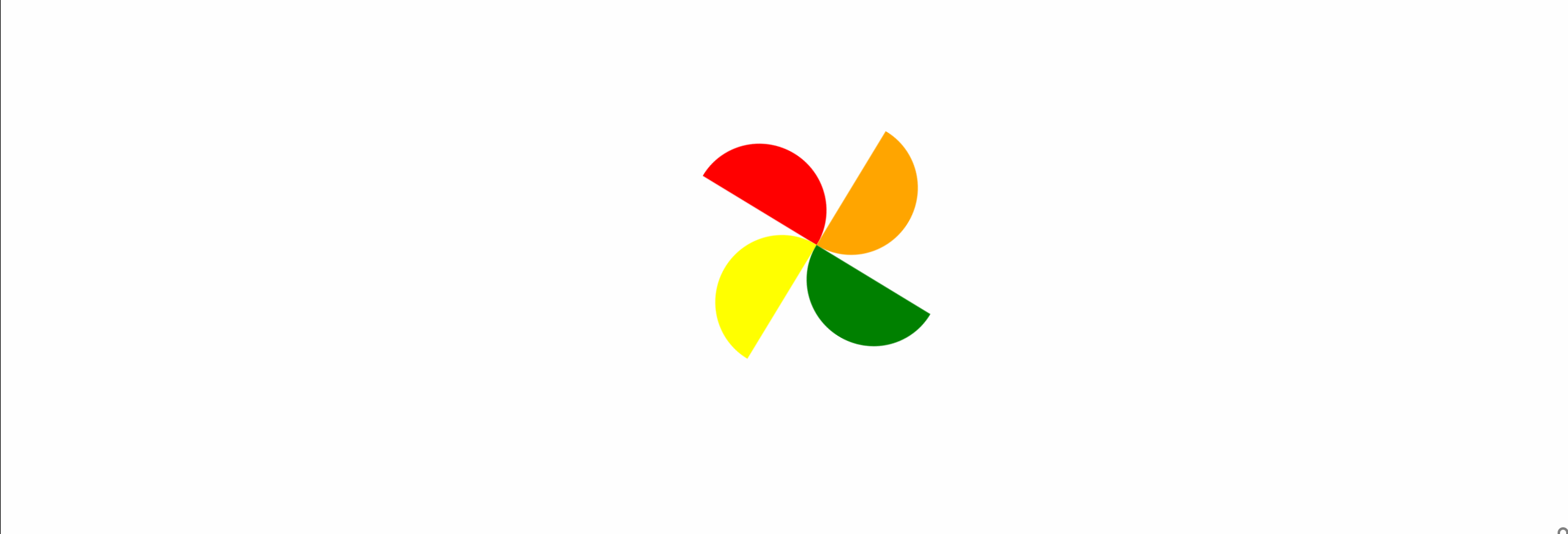
4. 案例-风车
<!DOCTYPE html>
<html lang="en">
<head>
    <meta charset="UTF-8">
    <meta name="viewport" content="width=device-width, initial-scale=1.0">
    <title>风车</title>
    <style>
        @keyframes donghua{
            from{
                width: 200px;
                height: 200px;
            }
            to{
                /* width: 500px;
                height: 500px; */
                transform: translate(300px) scale(2) rotate(360deg);
            }
        }
        .fengche{
            margin: 100px auto;
            width: 200px;
            height: 200px;
            /* background-color: lightgray; */
            display: flex;
            flex-wrap: wrap;
            position: relative;
            animation: donghua 5s infinite;
            /* transition: 5s; */
        }

        /* .fengche:hover{ */
            /* transform: translate(800px) rotate(360deg); */
            /* transform: rotate(360deg) scale(1.5);   */
        /* } */

        .fengche div{
            position: absolute;
        }
        .lt{
            width: 100px;
            height: 50px;
            background-color: red;
            left: 0;
            top: 50px;
            border-radius: 50px 50px 0 0;
        }
        .rt{
            width: 50px;
            height: 100px;
            background-color: orange;
            left: 100px;
            top: 0;
            border-radius: 0 50px 50px 0;
        }
        .lb{
            width: 50px;
            height: 100px;
            background-color: yellow;
            left: 50px;
            top: 100px;
            border-radius: 50px 0 0 50px;
        }
        .rb{
            width: 100px;
            height: 50px;
            background-color: green;
            left: 100px;
            top: 100px;
            border-radius: 0 0 50px 50px;
        }
    </style>
</head>
<body>
    <div class="fengche">
        <div class="lt"></div>
        <div class="rt"></div>
        <div class="lb"></div>
        <div class="rb"></div>
    </div>
</body>
</html>
5. 字体图标
字体图标:展示的是图标本质是字体
作用:在网页中添加简单的、颜色单一的小图标
优点:
- 灵活性:灵活地修改样式,例如:尺寸、颜色等
- 轻量级:体积小、渲染快、降低服务器请求次数
- 兼容性:几乎兼容所有主流浏览器
- 使用方便:先下载再使用
<!DOCTYPE html>
<html lang="en">
<head>
    <meta charset="UTF-8">
    <meta name="viewport" content="width=device-width, initial-scale=1.0">
    <title>字体图标</title>
    <link rel="stylesheet" href="./font_4714743_wegxds146em/iconfont.css">
    <style>
        .iconfont{
            /* iconfont优先级高于span */
            font-size: 50px;
            color: aqua;
        }
    </style>
</head>
<body>
    <!-- 使用字体图标 两个类名 -->
    <!-- iconfont 字体的公共样式,专门用来指定字体文件 -->
    <!-- icon-xxxx 具体图标的名字 -->
    <span class="iconfont icon-shouye-zhihui"></span>
</body>
</html>
@font-face {
  font-family: "iconfont"; /* Project id 4714743 */
  src: url('iconfont.woff2?t=1729151189668') format('woff2'),
       url('iconfont.woff?t=1729151189668') format('woff'),
       url('iconfont.ttf?t=1729151189668') format('truetype');
}

.iconfont {
  /* 字体 */
  font-family: "iconfont" !important;
  font-size: 16px;
  font-style: normal;
  -webkit-font-smoothing: antialiased;
  -moz-osx-font-smoothing: grayscale;
}

.icon-xihuan:before {
  content: "\e61d";
}

.icon-shouye-zhihui:before {
  content: "\e61e";
}

.icon-gerenzhongxin-zhihui:before {
  content: "\e61f";
}
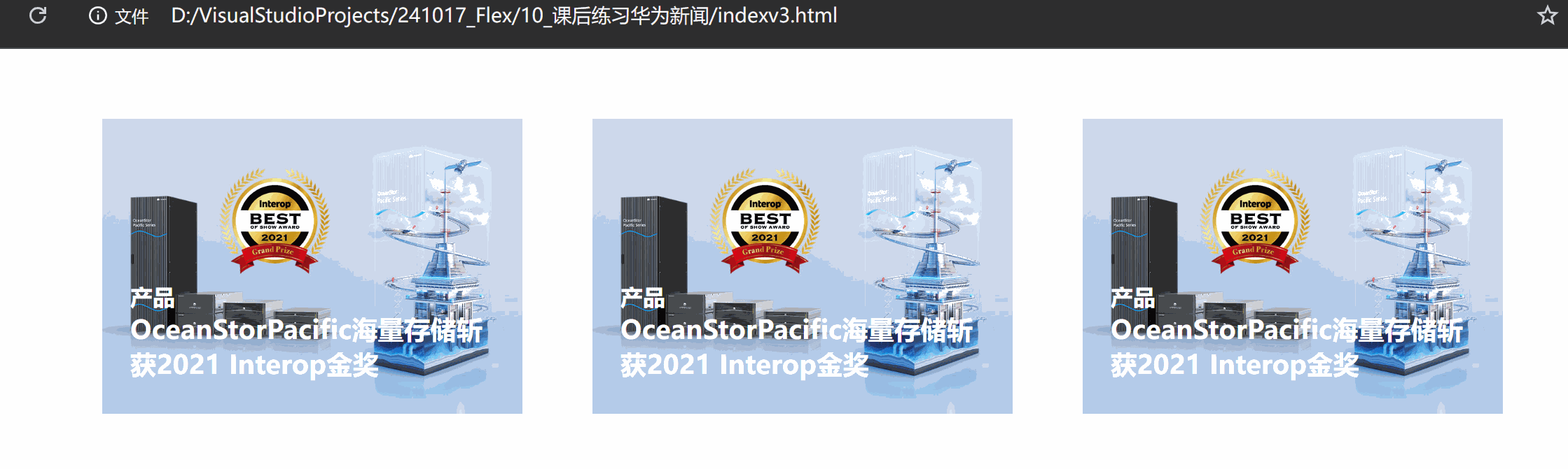
6. 案例-华为新闻
<!DOCTYPE html>
<html lang="en">
<head>
    <meta charset="UTF-8">
    <meta name="viewport" content="width=device-width, initial-scale=1.0">
    <title>241018华为新闻_课上跟练</title>
    <link rel="stylesheet" href="./iconfont/iconfont.css">
    <style>
        /* 布局 从外到内 先大后小 写一个盒子写一个css样式 */
        *{
            margin: 0;
            padding: 0;
            box-sizing: border-box;
        }
        /* 总区域 版心居中 spacebetween布局 */
        .box{
            width: 1000px;
            height: 211px;
            /* background-color: lightcyan; */
            margin: 50px auto;
            display: flex;
            justify-content: space-between;
        }
        /* 单个新闻大块 */
        .news{
            width: 300px;
            height: 100%;
            /* background-color: lightcoral; */
            position: relative;
            /* 给底块加溢出隐藏效果 */
            overflow: hidden;
        }
        /* 新闻图设置 */
        img{
            width: 300px;
            transition: all 0.5s;
        }
        /* 新闻介绍文字 */
        .txt{
            width: 300px;
            position: absolute;
            bottom: -60px;
            padding: 20px;
            color: white;
            /* background-color: lightgreen; */
            transition: all 0.5s;
        }
        h3{
            margin-bottom: 40px;
        }
        .iconfont{
            color: red;
            vertical-align: middle;
            font-size: 20px;
            font-weight: 700;
        }

        /* 悬停时灰色底色块 */
        .touming{
            width: 100%;
            height: 100%;
            background-color: #5f53532f;
            position: absolute;
            top: 0;
            /* 透明度opacity 0完全透明 1不透明*/
            opacity: 0;
            transition: all 0.5s;
        }
        .news:hover img{
            transform: scale(1.2);
        }
        .news:hover .txt{
            bottom: 0;
        }
        .news:hover .touming{
            opacity: 1;
        }

    </style>
</head>
<body>
    <div class="box">
        <div class="news">
            <!-- 新闻图片 -->
            <img src="./images/product.jpeg" alt="">

            <!-- 介绍文字 -->
            <div class="txt">
                <h4>产品</h4>
                <h3>OceanStorPacific海量存储斩获2021 Interop金奖</h3>
                <p>
                    <span>了解更多</span>
                    <i class="iconfont icon-arrow-right"></i>
                </p>
            </div>
            <!-- 遮罩层 透明阴影图片 -->
            <div class="touming"></div>
        </div>


        <div class="news">
            <img src="./images/product.jpeg" alt="">
            <div class="txt">
                <h4>产品</h4>
                <h3>OceanStorPacific海量存储斩获2021 Interop金奖</h3>
                <p>
                    <span>了解更多</span>
                    <i class="iconfont icon-arrow-right"></i>
                </p>
            </div>
            <div class="touming"></div>
        </div>
    </div>
</body>
</html>


 扫一扫
扫一扫


 6万+
6万+

 被折叠的 条评论
为什么被折叠?
被折叠的 条评论
为什么被折叠?
 到【灌水乐园】发言


