


此节核心:
- 弹性布局 Flex
- 定位
- 层叠布局
241004
1. 弹性布局 Flex
弹性布局Flex与线性布局LinearLayout主要区别:弹性布局中子组件灵活性相对较大,可自动换行。当出现子组件大小不等且每行排列数目不一时推荐使用弹性布局Flex,其他情况推荐线性布局LinearLayout。
Flex提供更加有效的方式对容器中的子组件进行排列、对齐和分配剩余空间。常用于页面头部导航栏的均匀分布、页面框架的搭建、多行数据的排列等。
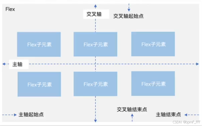
容器默认存在主轴(主轴默认水平方向)与交叉轴,子组件默认沿主轴排列,子组件在主轴方向的尺寸成为主轴尺寸,在交叉轴方向的尺寸成为交叉轴尺寸。
1.1 Flex基本使用
//弹性容器组件Flex的基本使用
Flex(参数对象) {
⼦组件1
 ⼦组件2
 ⼦组件3
 ⼦组件N
}
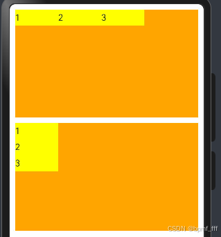
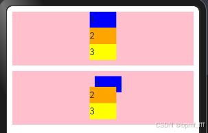
1.2 布局方向 direction
在弹性布局中,容器的子组件可以按照任意方向排列(默认水平排列)。通过设置参数direction,可以决定主轴方向,从而控制子组件的排列方向。
参数direction的值:枚举FlexDirection
| 枚举值 | 描述 |
| Row | 主轴水平,(默认值),从起始端开始排列 |
| RowReverse | 主轴水平,排列顺序与Row相反,从终点端开始排列 |
| Column | 主轴垂直,从起始端开始排列,较常用 |
| ColumnReverse | 主轴垂直,排列顺序与Column相反,从终点端开始排列 |
示例代码:
@Entry
@Component
struct Index {
  build() {
    Column({space:10}){
      //Flex布局,默认主轴在水平方向,子组件水平排列
      Flex(){
        Text('1')
          .width(80)
          .height(30)
          .backgroundColor(Color.Yellow)
        Text('2')
          .width(80)
          .height(30)
          .backgroundColor(Color.Yellow)
        Text('3')
          .width(80)
          .height(30)
          .backgroundColor(Color.Yellow)
      }
        .width('100%')
        .height(200)
        .backgroundColor(Color.Orange)

      //Flex布局,设置主轴在垂直方向,子组件垂直排列
      Flex({direction:FlexDirection.Column}){
        Text('1')
          .width(80)
          .height(30)
          .backgroundColor(Color.Yellow)
        Text('2')
          .width(80)
          .height(30)
          .backgroundColor(Color.Yellow)
        Text('3')
          .width(80)
          .height(30)
          .backgroundColor(Color.Yellow)
      }
      .width('100%')
      .height(200)
      .backgroundColor(Color.Orange)

    }
      .padding(10)
  }
}
预览器效果:
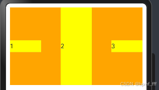
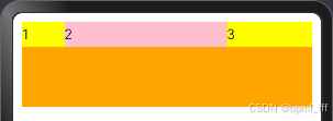
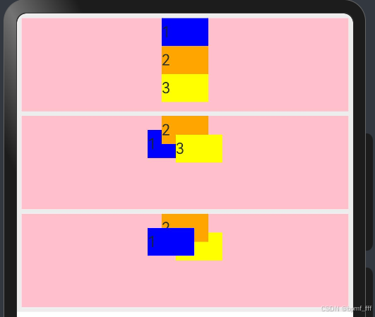
1.3 主轴对齐方式 justifyContent
参数 justifyContent 的值:枚举FlexAlign;与线性布局主轴对齐方式相同。
justifyContent : FlexAlign.Start、Center、End、SpaceBetween、SpaceAround、SpaceEvenly。
1.4 交叉轴对齐方式 alignItems
参数 alignItems 的值:枚举ItemAlign
alignItems : ItemAlign.Start、Center、End、Stretch、Baseline。
子组件的alignSelf属性也可以设置子组件在父容器交叉轴的对齐格式,且会覆盖Flex布局容器中的alignItems配置。
示例代码:
@Entry
@Component
struct Index {
  build() {
    //Flex布局,主轴justifyContent、交叉轴alignItems对齐方式及alignSelf属性测试
    Column({space:10}){
      //设主轴布局方式为SpaceBetween,交叉轴居中Center,子组件Text(2)Stretch拉伸
      Flex({
        justifyContent:FlexAlign.SpaceBetween,
        alignItems:ItemAlign.Center
      }){
        Text('1')
          .width(80)
          .height(30)
          .backgroundColor(Color.Yellow)
        Text('2')
          .width(80)
          .height(30)
          .backgroundColor(Color.Yellow)
          .alignSelf(ItemAlign.Stretch)
        Text('3')
          .width(80)
          .height(30)
          .backgroundColor(Color.Yellow)
      }
        .width('100%')
        .height(200)
        .backgroundColor(Color.Orange)
    }
      .padding(10)
  }
}
预览器效果:
DevEco代码上下换行快捷键:Alt+Shift+↑/↓
241005
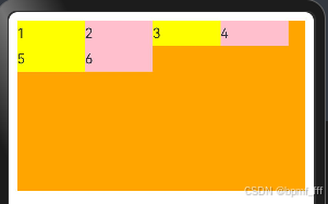
1.5 布局换行 wrap
弹性布局分为单⾏布局和多⾏布局。默认情况下,Flex容器中的⼦元素都排在⼀条线(⼜称“轴线”)上。⼦元素尺⼨总和⼤于Flex容器尺⼨时,⼦元素尺⼨会⾃动挤压。
wrap属性控制当⼦元素主轴尺⼨之和⼤于容器主轴尺⼨时,Flex是单⾏布局还是多⾏布局。在多⾏布局时,通过交叉轴⽅向,确认新⾏排列⽅向。
参数 wrap 的值:枚举FlexWrap,默认NoWrap
示例代码:
@Entry
@Component
struct Index {
  build() {
    Column(){
      Flex({
        wrap:FlexWrap.Wrap
      }){
        Text('1')
          .width(80)
          .height(30)
          .backgroundColor(Color.Yellow)
        Text('2')
          .width(80)
          .height(30)
          .backgroundColor(Color.Pink)
        Text('3')
          .width(80)
          .height(30)
          .backgroundColor(Color.Yellow)
        Text('4')
          .width(80)
          .height(30)
          .backgroundColor(Color.Pink)
        Text('5')
          .width(80)
          .height(30)
          .backgroundColor(Color.Yellow)
        Text('6')
          .width(80)
          .height(30)
          .backgroundColor(Color.Pink)
      }
      .width('100%')
      .height(200)
      .backgroundColor(Color.Orange)
    }
      .padding(10)
  }
}
预览器效果:
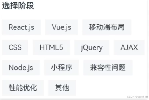
1.6 综合案例-阶段选择菜单
示例代码:
import { colorSpaceManager } from '@kit.ArkGraphics2D'

@Entry
@Component
struct Index {
  build() {
    Column(){
      //案例内容练习
      Column(){
        //标题
        Text('阶段选择')
          .width('100%')
          .fontSize(24)
          .fontWeight(700)
          .padding(10)
        //弹性布局练习
        Flex({
          //子组件自动换行
          wrap:FlexWrap.Wrap,
        }){
          //练习中Text文本内容可改可不改,重点练习布局属性及参数,后期调用数据库
          Text('ArkUI')
            .padding(10)
            .margin(5)
            .backgroundColor('#f6f7f9')
          Text('ArkTS')
            .padding(10)
            .margin(5)
            .backgroundColor('#f6f7f9')
          Text('界面开发')
            .padding(10)
            .margin(5)
            .backgroundColor('#f6f7f9')
          Text('系统能力')
            .padding(10)
            .margin(5)
            .backgroundColor('#f6f7f9')
          Text('权限控制')
            .padding(10)
            .margin(5)
            .backgroundColor('#f6f7f9')
          Text('元服务')
            .padding(10)
            .margin(5)
            .backgroundColor('#f6f7f9')
        }
      }
      .width('100%')
      .height('100%')
      .padding(10)
    }
  }
}
预览器效果:
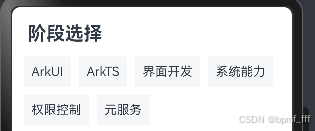
案例中遇到问题:对padding和margin组合使用后效果不熟悉,造成自己独立完成时卡壳。
1.7 自适应拉伸
1.7.1 flexGrow
作用:设置父容器的剩余空间分配给此属性所在组件的比例。
属性flexGrow的参数为数字,即占用父级剩余尺寸的份数。
示例代码:
@Entry
@Component
struct Index {
  build() {
    Column(){
      //flexGrow:分配父组件剩余尺寸,数字表示占用份数。
      Flex(){
        Text('1')
          .width(50)
          .height(30)
          .backgroundColor(Color.Yellow)
        Text('2')
          .height(30)
          .backgroundColor(Color.Pink)
          .flexGrow(2)
        Text('3')
          .height(30)
          .backgroundColor(Color.Yellow)
          .flexGrow(1)
      }
      .width('100%')
      .height(100)
      .backgroundColor(Color.Orange)
    }
      .padding(10)
  }
}
预览器效果:
1.7.2 flexBasis
作⽤:设置⼦元素在⽗容器主轴⽅向上的基准尺⼨。flexBasis可以设置为具体的长度值(如50px、10%)或者auto。当设置为具体长度值时,它决定了项目在分配多余空间之前的基础大小。
效果:flexBasis是在弹性盒子布局(Flexbox)中使用的,它允许项目在保持一定基础大小的同时,还能根据可用空间进行伸缩。
flexBasis是设置项目的基础大小,而不是最终大小。最终大小还取决于flexGrow和flexShrink以及容器的总空间。
属性:flexBasis(数字)
参数:数字,基准尺⼨(单位vp)。
2. 定位
作用:改变组件位置。
- 绝对定位:position,相对父组件左上角进行修改。
- 相对定位:offset,相对自身左上角进行偏移。
2.1 绝对定位 position
position(){ x:水平偏移量, y:垂直偏移量}
偏移量取值:数字,单位为vp;百分比,参照父组件尺寸计算结果。
绝对定位特点:
- 参照父组件左上角进行偏移
- 绝对定位后的组件不再占用自身原有位置
示例代码:
@Entry
@Component
struct Index {
  build() {
    Column({space:10}){
      //无position属性值
      Column(){
        Text('1')
          .width(50)
          .height(30)
          .backgroundColor(Color.Blue)
        Text('2')
          .width(50)
          .height(30)
          .backgroundColor(Color.Orange)
        Text('3')
          .width(50)
          .height(30)
          .backgroundColor(Color.Yellow)
      }
      .width('100%')
      .height(100)
      .backgroundColor(Color.Pink)

      //对Text('1')子组件设置position,查看对比效果
      Column(){
          Text('1')
            .width(50)
            .height(30)
            .backgroundColor(Color.Blue)
            .position({x:0,y:0})
          Text('2')
            .width(50)
            .height(30)
            .backgroundColor(Color.Orange)
          Text('3')
            .width(50)
            .height(30)
            .backgroundColor(Color.Yellow)
      }
      .width('100%')
      .height(100)
      .backgroundColor(Color.Pink)
    }
    .padding(10)
  }
}
预览器效果:
2.2 相对定位 offset
offset(){ x:水平偏移量, y:垂直偏移量}
偏移量取值:数字,单位为vp;百分比,参照父组件尺寸计算结果。
相对定位特点:
- 相对自身左上角进行偏移
- 相对定位后的组件仍然占用自身原有位置
示例代码:
@Entry
@Component
struct Index {
  build() {
    Column({space:10}){
      //无offset属性值
      Column(){
        Text('1')
          .width(50)
          .height(30)
          .backgroundColor(Color.Blue)
        Text('2')
          .width(50)
          .height(30)
          .backgroundColor(Color.Orange)
        Text('3')
          .width(50)
          .height(30)
          .backgroundColor(Color.Yellow)
      }
      .width('100%')
      .height(100)
      .backgroundColor(Color.Pink)

      //对Text('1')子组件设置offset,查看对比效果
      Column(){
          Text('1')
            .width(50)
            .height(30)
            .backgroundColor(Color.Blue)
            .offset({x:10,y:10})
          Text('2')
            .width(50)
            .height(30)
            .backgroundColor(Color.Orange)
          Text('3')
            .width(50)
            .height(30)
            .backgroundColor(Color.Yellow)
      }
      .width('100%')
      .height(100)
      .backgroundColor(Color.Pink)
    }
    .padding(10)
  }
}
预览器效果:
2.3 案例-人气热播故事

示例代码:
@Entry
@Component
struct Index {
  build() {
    Column(){
      //喜马拉雅-人气热播故事,简单案例自主练习
      Column(){
        //主图
        Image($r('app.media.moco'))
          .width(300)
          .borderRadius(15)
        //左上角VIP样式标识
        Text('VIP')
          .padding({
            top:3,bottom:3,left:5,right:5})
          .fontWeight(600)
          .fontColor(Color.White)
          .fontStyle(FontStyle.Italic) //斜体
          .position({
            x:0,y:0
          })
          .border({width:3,color:Color.White})
          .borderRadius({topLeft:15,bottomRight:15})
          .backgroundColor(Color.Orange)
          //遗漏,二次补齐属性
          /*.textAlign(TextAlign.Center)
          .fontSize(15)
          .width(34)
          .height(20)*/

        //下方简单介绍
        Row({space:20
        }){
          Image($r('app.media.ic_device_earphone_roc_filled'))
            .fillColor(Color.White)
            .width(40)
            .backgroundColor('#ADD8E6')
            .borderRadius(25)
            .padding(5)
          Text('飞狗MOCO')
            .fontWeight(700)
            .fontSize(28)
        }
        .padding(10)
        .width(300)
        //遗漏,二次补齐属性,交叉轴对齐方式
        .alignItems(VerticalAlign.Top)
      }
      // .borderRadius({topLeft:15,topRight:15})
      .backgroundColor(Color.White)
      .padding({left:5,right:5})
    }
    .width('100%')
    .height('100%')
    .padding(10)
    .backgroundColor('#ededed')
  }
}
预览器效果:

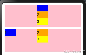
2.4 Z序控制 zIndex
定义后的组件,默认后定义的组件在最上面显示,可以通过zIndex属性调整显示层级。用于控制元素在页面上的层叠顺序。
zIndex(),特点:取值为整数数字;取值越大,显示层级越高。
示例代码:
@Entry
@Component
struct Index {
  build() {
    Column({space:5}){
      //无position无zIndex
      Column(){
        Text('1')
          .width(50)
          .height(30)
          .backgroundColor(Color.Blue)
        Text('2')
          .width(50)
          .height(30)
          .backgroundColor(Color.Orange)
        Text('3')
          .width(50)
          .height(30)
          .backgroundColor(Color.Yellow)
      }
      .width('100%')
      .height(100)
      .backgroundColor(Color.Pink)

      //Text1,3有绝对定位position,无zIndex设置
      //从上到下覆盖效果为321,按Text组件顺序显示,默认"后来者居上"
      Column(){
        Text('1')
          .width(50)
          .height(30)
          .backgroundColor(Color.Blue)
          .position({x:135,y:15})
        Text('2')
          .width(50)
          .height(30)
          .backgroundColor(Color.Orange)
        Text('3')
          .width(50)
          .height(30)
          .backgroundColor(Color.Yellow)
          .position({x:165,y:20})
      }
      .width('100%')
      .height(100)
      .backgroundColor(Color.Pink)

      //Text1,3有绝对定位position,且有zIndex设置
      //从上到下覆盖效果为123,按zIndex属性值大小显示
      Column(){
        Text('1')
          .width(50)
          .height(30)
          .backgroundColor(Color.Blue)
          .position({x:135,y:15})
          .zIndex(2)
        Text('2')
          .width(50)
          .height(30)
          .backgroundColor(Color.Orange)
          .zIndex(1)
        Text('3')
          .width(50)
          .height(30)
          .backgroundColor(Color.Yellow)
          .position({x:165,y:20})
      }
      .width('100%')
      .height(100)
      .backgroundColor(Color.Pink)
    }
    .padding(5)
    .backgroundColor('#ededed')
  }
}
预览器效果:
241006
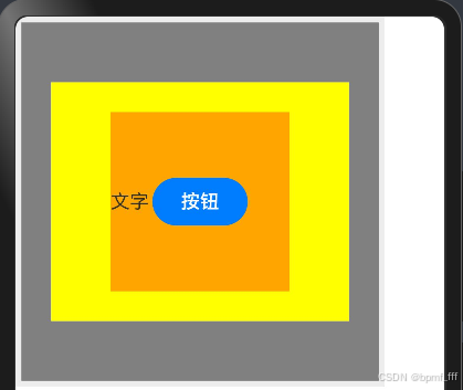
3. 层叠布局 StackLayout
层叠布局用于在屏幕上预留一块区域来显示组件中的元素,提供元素可以重叠的布局。层叠布局通过Stack容器组件实现位置的固定定位与层叠,容器中的子元素依次入栈,后一个子元素覆盖前一个子元素,子元素可以叠加,也可以设置位置。
层叠布局具有较强的页面层叠、位置定位能力,其使用场景有广告、卡片层叠效果等。
3.1 基本使用
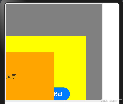
Stack组件为容器组件,容器内可包含各种子元素。其中子元素默认进行居中堆叠。子元素被约束在Stack下,进行自己的样式定义及排列。
示例代码:
@Entry
@Component
struct Index {
  build() {
    Column(){
      //4.3.1 层叠布局,添加三个子组件,默认层叠效果显示
      //层叠效果默认后来者居上,且其默认对齐方式为center,效果居中层叠
      Stack(){
        Column(){
        }
        .width(250)
        .height(200)
        .backgroundColor(Color.Yellow)

        Text('文字')
          .width(150)
          .height(150)
          .backgroundColor(Color.Orange)

        Button('按钮')
          .width(80)
          .height(40)
      }
      .width(300)
      .height(300)
      .backgroundColor(Color.Gray)
    }
    .padding(5)
    .backgroundColor('#ededed')
  }
}
预览器效果:
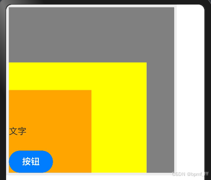
3.2 对齐方式 alignContent
参数alignContent取值为枚举Alignment,前几个章节有提到过,Alignment枚举以下简单略过。
TopStart、Top、TopEnd、Start、Center、End、BottomStart、Bottom、BottonEnd。
示例代码:
@Entry
@Component
struct Index {
  build() {
    Column(){
      //4.3.2 层叠布局,三个子组件,添加对齐方式alignContent后其层叠效果显示
      //层叠效果默认后来者居上(可添加zIndex改变默认层叠效果)
      Stack({
        //对齐方式以左下作为起始段
        alignContent:Alignment.BottomStart
      }){
        Column(){
        }
        .width(250)
        .height(200)
        .backgroundColor(Color.Yellow)

        Text('文字')
          .width(150)
          .height(150)
          .backgroundColor(Color.Orange)

        Button('按钮')
          .width(80)
          .height(40)
      }
      .width(300)
      .height(300)
      .backgroundColor(Color.Gray)
    }
    .padding(5)
    .backgroundColor('#ededed')
  }
}
预览器效果:
3.3 Z序控制 zIndex
(此节2.4)
定义后的组件,默认后定义的组件在最上面显示,可以通过zIndex属性调整显示层级。用于控制元素在页面上的层叠顺序。
zIndex(),特点:取值为整数数字;取值越大,显示层级越高。
示例代码:
@Entry
@Component
struct Index {
  build() {
    Column(){
      //4.3.3 层叠布局,三个子组件,添加对齐方式alignContent后其层叠效果显示
      //层叠效果默认后来者居上(可添加zIndex改变默认层叠效果)
      //添加zIndex使Text组件在最上层
      Stack({
        //对齐方式以左下作为起始端
        alignContent:Alignment.BottomStart
      }){
        Column(){
        }
        .width(250)
        .height(200)
        .backgroundColor(Color.Yellow)

        Text('文字')
          .width(150)
          .height(150)
          .backgroundColor(Color.Orange)
          .zIndex(1)

        Button('按钮')
          .width(80)
          .height(40)
          //添加相对定位属性更方便查看层叠效果
          .offset({
            x:120,y:0
          })
      }
      .width(300)
      .height(300)
      .backgroundColor(Color.Gray)
    }
    .padding(5)
    .backgroundColor('#ededed')
  }
}
预览器效果:
4. 综合案例-B站视频推荐卡片

示例代码:
@Entry
@Component
struct Index {
  build() {
    Column(){
      /*布局思路:
        1.Stack容器,Image+Row(图标+文字),zIndex层叠效果
        2.Row(){Text组件,文本超长显示方式textOverflow
                Row(文字+图标)
              }
      */

      //案例B站视频推荐卡片练习
      Column(){
        //1.图片区域 Stack层叠布局
        Stack({ //层叠对齐方式,alignContent底端对齐
          alignContent:Alignment.Bottom}) {
          //视频封面
          Image($r('app.media.tieyi'))
            .width('100%')
            .height(125)
            //图片缩放
            // .objectFit(ImageFit.Contain)
            .borderRadius({topLeft:15,topRight:15})

          Row(){
            //左方播放数量及弹幕数量显示
            Row({space:5}){
              Image($r('app.media.ic_bofangshu'))
                .width(15)
                .fillColor(Color.White)
              Text('282万')
                .fontColor(Color.White)
              Image($r('app.media.ic_danmu'))
                .width(15)
                .fillColor(Color.White)
              Text('8655')
                .fontColor(Color.White)
            }
            //右方视频时长
            Text('4:33')
              .fontColor(Color.White)
          }
          .padding(5)
          .width('100%')
          //主轴对齐方式SpaceBetween
          .justifyContent(FlexAlign.SpaceBetween)
          //此效果也可用Blank()空白填充组件来实现,占用剩余空间

          // .backgroundColor(Color.Black)
        }

        //2.文字区域 Row
        Column({space:5}){
          //标题文字及简单介绍
          Text('【凤凰传奇新歌】欢迎来到国风统治区:唢呐一响神曲《铁衣》')
            .fontSize(14)
            .width('100%')
            .maxLines(2)
            .textOverflow({overflow:TextOverflow.Ellipsis})
          //点赞数量及‘更多’图标
          Row(){
            Text('19万点赞')
              .backgroundColor(Color.Pink)
              .fontSize(13)
              .fontColor(Color.Red)
              .padding(2)
            Image($r('app.media.ic_gengduo'))
              .width(15)
          }
          .width('100%')
          .justifyContent(FlexAlign.SpaceBetween)
        }
        .padding({top:8,left:5,right:5,bottom:10})
      }
      .width(200)
      .backgroundColor('#fff')
      .borderRadius(15)

    }
    .padding(10)
    .width('100%')
    .height('100%')
    .backgroundColor('#ededed')
  }
}
预览器效果:


 扫一扫
扫一扫


 1257
1257

 被折叠的 条评论
为什么被折叠?
被折叠的 条评论
为什么被折叠?
 到【灌水乐园】发言


