


此节核心:
- 1. 设计资源-图标库
- 2. 属性:布局属性、背景属性
- 3. 线性布局
240928
1. 设计资源-图标库
1.1 下载图标
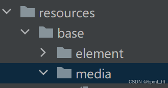
进入图标库网站,下载SVG格式,存到项目文件resources/base/media/...
1.2 使用图标
@Entry
@Component
struct Index {
build() {
Column(){
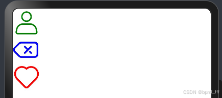
//本地设计师给的图片(假如)
Image($r('app.media.ic_personal'))
//fillColor填充颜色
.fillColor(Color.Green)
.width(50)
//鸿蒙图标库下载
Image($r('app.media.ic_contacts_delete'))
.fillColor(Color.Blue)
.width(50)
//阿里图标库下载
Image($r('app.media.ic_like'))
.fillColor(Color.Red)
.width(50)
}
}
}
240930
2. 布局属性
组件布局
| 属性 | 描述 |
| padding | 内边距 |
| margin | 外边距 |
| border | 边框线 |
| borderRadius | 边框圆角 |
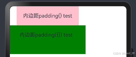
2.1 内边距 padding
在组件内添加间距,拉开内容于组件边缘之间的距离。
属性:数字或对象{}
- 数字:上下左右内边距相同
- 对象{}:left、right、top、bottom可单独设置某个方向上的内边距
@Entry
@Component
struct Index {
  build() {
    Column(){
      Text('内边距padding() test')
        .backgroundColor(Color.Pink)
        .padding(20)
      Text('内边距padding({}) test')
        .backgroundColor(Color.Green)
        .padding({
          top:20,
          left:30,
          right:40,
          bottom:50
        })
    }
  }
}
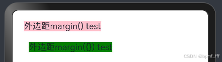
2.2 外边距 margin
在组件外面添加间距,拉开两个组件之间的距离。
属性:数字或对象{};使用方法同上padding。
@Entry
@Component
struct Index {
  build() {
    Column(){
      Text('外边距margin() test')
        .backgroundColor(Color.Pink)
        .margin(20)
      Text('外边距margin({}) test')
        .backgroundColor(Color.Green)
        .margin({
          left:30
        })
    }
  }
}
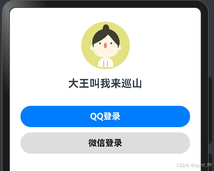
2.3 案例-QQ音乐登录
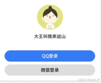
@Entry
@Component
struct Index {
  build() {
    Column(){
      Image($r('app.media.ic_user'))
        .width(100)
      Text('大王叫我来巡山')
        .fontSize(20)
        .fontWeight(FontWeight.Bold)
        .margin(10)
      Button('QQ登录')
        .fontWeight(FontWeight.Bold)
        .width('100%')
        .margin({
          top:20
        })
      Button('微信登录')
        .fontWeight(FontWeight.Bold)
        .backgroundColor('#ddd')
        .fontColor(Color.Black)
        .width('100%')
        .margin({
          top:10
        })
    }
    .width('100%')
    .padding(20)
  }
}
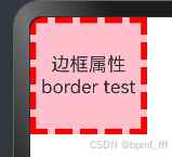
2.4 边框属性 border
2.4.1 四个方向上边框属性相同
参数:{width ?: 数字 , color ?: ' ', style ?: BorderStyle}
- width:边框宽度,默认值为0,即不显示边框
- color:边框颜色,默认黑色
- style:边框样式,BorderStyle枚举类型;Solid实线(默认),Dashed虚线,Dotted点线
@Entry
@Component
struct Index {
  build() {
    Column(){
      Text('边框属性border test')
        .width(100)
        .height(100)
        .textAlign(TextAlign.Center)
        .backgroundColor(Color.Pink)
        .border(
          {width: 5,
          color: 'red',
          style: BorderStyle.Dashed})
    }
  }
}
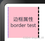
2.4.2 四个方向上边框属性不同
书写方法
.border({
 width: {},
 color: {},
 style: {}
}@Entry
@Component
struct Index {
build() {
Column(){
Text('边框属性border test')
.width(100)
.height(100)
.textAlign(TextAlign.Center)
.backgroundColor(Color.Pink)
.border({
//左:蓝色点线宽度2;右:橙色虚线宽度3;上下无边框
width: {left:2,right:3 },
color: {left:'blue',right:'orange'},
style: {left:BorderStyle.Dotted,right:BorderStyle.Dashed}
})
}
.padding(10)
}
}
241001
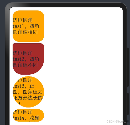
2.5 边框圆角 borderRadius
参数:数值或{};topLeft左上角,topRight右上角,bottomLeft左下角,bottomRight右下角
@Entry
@Component
struct Index {
  build() {
    Column(){
      Text('边框圆角test1,四角圆角值相同')
        .width(100)
        .aspectRatio(1)
        .backgroundColor(Color.Orange)
        .borderRadius(20)
        .margin({bottom:5})
      Text('边框圆角test2,四角圆角值不同')
        .width(100)
        .aspectRatio(1)
        .backgroundColor(Color.Brown)
        .margin({bottom:5})
        .borderRadius({
          topLeft:5,
          topRight:10,
          bottomLeft:30,
          bottomRight:50
        })

      Text('边框圆角test3,正圆,圆角值为正方形边长的1/2')
        .width(100)
        .aspectRatio(1)
        .backgroundColor(Color.Orange)
        .borderRadius(50)
        .margin({bottom:5})

      Text('边框圆角test4,胶囊状,圆角值为高度的1/2')
        .width(100)
        .height(40)
        .backgroundColor(Color.Orange)
        .borderRadius(20)
    }
    .padding(10)
  }
}
3. 背景属性
| 属性 | 描述 |
| backgroundColor | 背景颜色 |
| backgroundImage | 背景图片 |
| backgroundImageSize | 背景图片尺寸 |
| backgroundImagePosition | 背景图片位置 |
3.1 背景颜色 backgroundColor
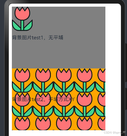
3.2 背景图片 backgroundImage
- NoRepeat:不平铺,默认
- X:水平平铺
- Y:垂直平铺
- XY:水平垂直均平铺
@Entry
@Component
struct Index {
  build() {
    Column(){
      Text('背景图片test1,无平埔')
        .width(300)
        .height(200)
        .backgroundColor(Color.Grey)
        .backgroundImage($r('app.media.flower'))
      Text('背景图片test2,平埔方式XY')
        .width(300)
        .height(200)
        .backgroundColor(Color.Orange)
        .backgroundImage($r('app.media.flower'),ImageRepeat.XY)
    }
    .padding(10)
  }
}
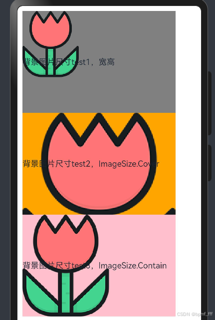
3.3 背景图片尺寸 backgroundImageSize
作用:背景图片缩放
参数:
- 设置背景图宽高尺寸:{width:num,height:num}(单设置宽或高,另一个尺寸等比例缩放)
- 枚举ImageSize:Cover完全覆盖时停止缩放;Contain,宽或高与组件尺寸相同时停止缩放;Auto,默认原图尺寸。
@Entry
@Component
struct Index {
  build() {
    Column(){
      Text('背景图片尺寸test1,宽高')
        .width(300)
        .height(200)
        .backgroundColor(Color.Grey)
        .backgroundImage($r('app.media.flower'))
        .backgroundImageSize({width:110})
      Text('背景图片尺寸test2,ImageSize.Cover')
        .width(300)
        .height(200)
        .backgroundColor(Color.Orange)
        .backgroundImage($r('app.media.flower'))
        .backgroundImageSize(ImageSize.Cover)
      Text('背景图片尺寸test3,ImageSize.Contain')
        .width(300)
        .height(200)
        .backgroundColor(Color.Pink)
        .backgroundImage($r('app.media.flower'))
        .backgroundImageSize(ImageSize.Contain)
    }
    .padding(10)
  }
}
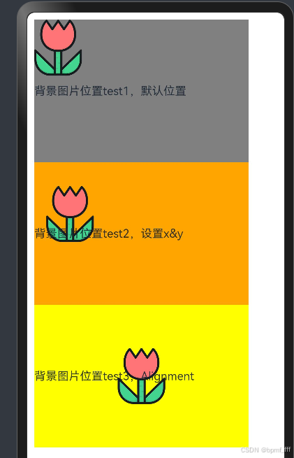
3.4 背景图片位置 backgroundImagePosition
| TopStart | 顶部起始端(默认) |
| Top | 顶部横向居中 |
| TopEnd | 顶部尾端 |
| Start | 起始端纵向居中 |
| Center | 居中 |
| End | 尾端纵向居中 |
| BottomStart | 底部起始端 |
| Bottom | 底部横向居中 |
| BottomEnd | 底部尾端 |
@Entry
@Component
struct Index {
  build() {
    Column(){
      Text('背景图片位置test1,默认位置')
        .width(300)
        .height(200)
        .backgroundColor(Color.Grey)
        .backgroundImage($r('app.media.flower'))
      Text('背景图片位置test2,设置x&y')
        .width(300)
        .height(200)
        .backgroundColor(Color.Orange)
        .backgroundImage($r('app.media.flower'))
        .backgroundImagePosition({x:50,y:100})
        //vp转px vp2px()
        //.backgroundImagePosition({x:vp2px(150),y:vp2px(100)})
      Text('背景图片位置test3,Alignment')
        .width(300)
        .height(200)
        .backgroundColor(Color.Yellow)
        .backgroundImage($r('app.media.flower'))
        .backgroundImagePosition(Alignment.Center)
    }
    .padding(10)
  }
}
241002
4. 线性布局
线性布局(LinearLayout)是开发中最常用的布局,通过线性容器Row和Column构建。Column容器内子元素按照垂直方向排列,Row容器内子元素按照水平方向排列。根据不同的排列方向,开发者可选择使用Row和Column容器创建线性布局。
4.1 基本概念
- 布局容器:具有布局能力的容器组件,可以承载其他元素作为其子元素。
- 布局子元素:布局容器内部的元素。
- 主轴:线性布局容器在布局方向上的轴线,子元素默认沿主轴排列。Row容器主轴为横向,Column容器主轴为纵向。
- 交叉轴:垂直于主轴方向的轴线。Row容器交叉轴为纵向,Column容器交叉轴为横向。
- 间距:布局子元素的间距。
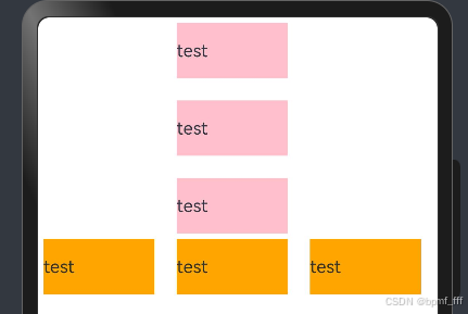
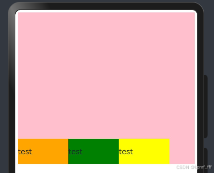
4.2 主轴方向的间距 space
在布局容器内,可以通过space属性设置主轴方向上子元素的间距,使各子元素在主轴方向上有等间距效果。
@Entry
@Component
struct Index {
  build() {
    Column(){
      //Column主轴方向上间距测试
      Column({space:20}){
        Text('test')
          .width(100)
          .height(50)
          .backgroundColor(Color.Pink)
        Text('test')
          .width(100)
          .height(50)
          .backgroundColor(Color.Pink)
        Text('test')
          .width(100)
          .height(50)
          .backgroundColor(Color.Pink)
      }
        .margin({bottom:5})

      //Row主轴方向上间距测试
      Row({space:20}){
        Text('test')
          .width(100)
          .height(50)
          .backgroundColor(Color.Orange)
        Text('test')
          .width(100)
          .height(50)
          .backgroundColor(Color.Orange)
        Text('test')
          .width(100)
          .height(50)
          .backgroundColor(Color.Orange)
      }
    }
    .padding(5)
  }
}
241003
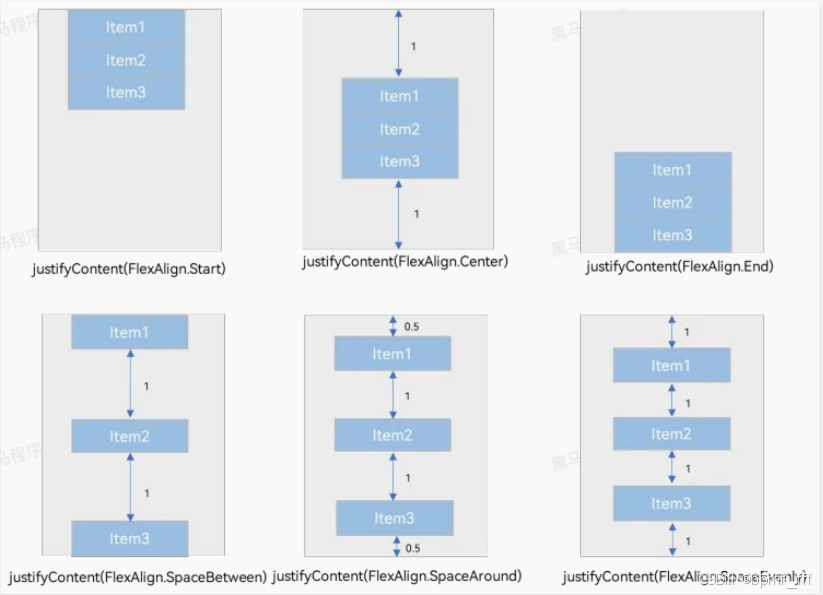
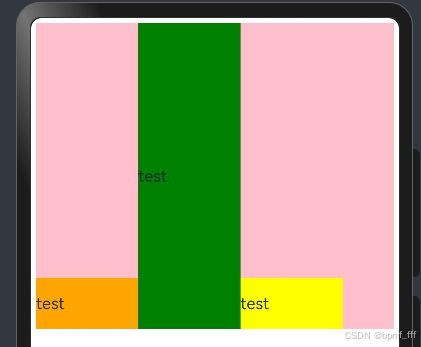
4.3 主轴对齐方式 justifyContent
参数:FlexAlign
Column和Row组件的justifyContent属性效果相似,以下以Column为例。
@Entry
@Component
struct Index {
  build() {
    Column(){
      Column(){
        Text('test')
          .width(100)
          .height(50)
          .backgroundColor(Color.Orange)
        Text('test')
          .width(100)
          .height(50)
          .backgroundColor(Color.Green)
        Text('test')
          .width(100)
          .height(50)
          .backgroundColor(Color.Yellow)
      }
      .width(300)
      .height(300)
      .backgroundColor(Color.Pink)
      .justifyContent(FlexAlign.SpaceAround)
    }
    .padding(5)
  }
}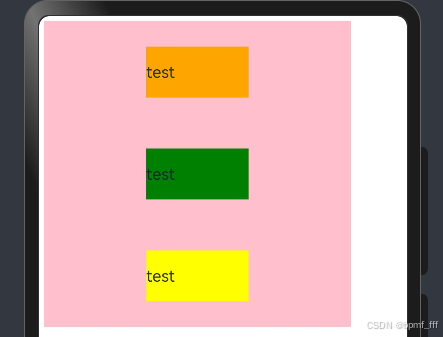
4.4 交叉轴对齐方式 alignItems
alignItems默认center;参数:枚举类型
- 交叉轴在水平方向:HorizontalAlign -> Column
- 交叉轴在垂直方向:VerticalAlign -> Row
注:布局容器在交叉轴要有足够空间,否则无法生效。
4.4.1 Column
@Entry
@Component
struct Index {
  build() {
    Column(){
      Column(){
        Text('test')
          .width(100)
          .height(50)
          .backgroundColor(Color.Orange)
        Text('test')
          .width(100)
          .height(50)
          .backgroundColor(Color.Green)
        Text('test')
          .width(100)
          .height(50)
          .backgroundColor(Color.Yellow)
      }
      .width(300)
      .height(300)
      .backgroundColor(Color.Pink)
      .alignItems(HorizontalAlign.Start)
    }
    .padding(5)
  }
}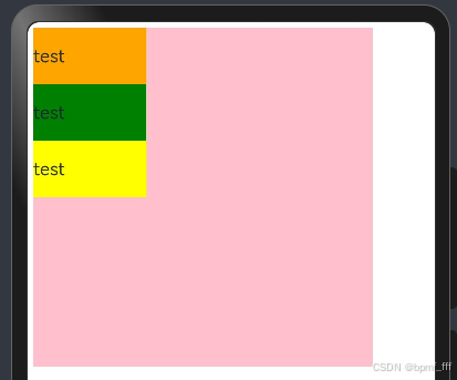
4.4.2 Row
@Entry
@Component
struct Index {
  build() {
    Column(){
      Row(){
        Text('test')
          .width(100)
          .height(50)
          .backgroundColor(Color.Orange)
        Text('test')
          .width(100)
          .height(50)
          .backgroundColor(Color.Green)
        Text('test')
          .width(100)
          .height(50)
          .backgroundColor(Color.Yellow)
      }
      .width('100%')
      .height(300)
      .backgroundColor(Color.Pink)
      .alignItems(VerticalAlign.Bottom)
    }
    .padding(5)
  }
}
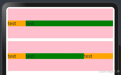
4.5 单个子元素交叉轴对齐方式 alignSelf
参数:枚举ItemAlign (Stretch拉伸,交叉轴拉伸效果)
@Entry
@Component
struct Index {
  build() {
    Column(){
      Row(){
        Text('test')
          .width(100)
          .height(50)
          .backgroundColor(Color.Orange)
        Text('test')
          .width(100)
          .height(50)
          .backgroundColor(Color.Green)
          //交叉轴拉伸,Stretch常用
          .alignSelf(ItemAlign.Stretch)
        Text('test')
          .width(100)
          .height(50)
          .backgroundColor(Color.Yellow)
      }
      .width('100%')
      .height(300)
      .backgroundColor(Color.Pink)
      .alignItems(VerticalAlign.Bottom)
    }
    .padding(5)
  }
}
4.6 自适应缩放 layoutWeight
layoutWeight是用于指定一个元素在父容器中所占空间的比例。它是一种相对值,表示当父容器有剩余空间时,如何在子元素之间按照权重分配这些空间。(主轴)
@Entry
@Component
struct Index {
  build() {
    Column({space:10}){
      Row(){
        Text('test')
          .width(60)
          .backgroundColor(Color.Orange)
        Text('test')
          .layoutWeight(1)
          .backgroundColor(Color.Green)
      }
      .width('100%')
      .height(100)
      .backgroundColor(Color.Pink)

      Row(){
        Text('test')
          .width(60)
          .backgroundColor(Color.Orange)
        Text('test')
          .layoutWeight(2)
          .backgroundColor(Color.Green)
        Text('test')
          .layoutWeight(1)
          .backgroundColor(Color.Orange)
      }
      .width('100%')
      .height(100)
      .backgroundColor(Color.Pink)
    }
    .padding(5)
  }
}
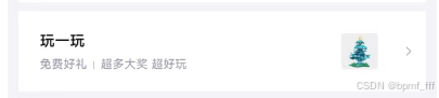
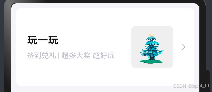
5. 综合案例-得物探索页
@Entry
@Component
struct Index {
  build() {
    //布局思路:先外后内,先左后右,先上后下
    Column(){
      Row(){
        //左侧:两行文字,竖排
        Column({space:10}){
          Text('玩一玩')
            .fontColor('#14151a')
            .fontWeight(FontWeight.Bold)
            .fontSize(20)
          Text('签到兑礼 | 超多大奖 超好玩')
            .fontSize(14)
            .fontColor('#c4c4d1')
        }
          .alignItems(HorizontalAlign.Start)

        //右侧:两个图片,横排
        Row({space:10}){
          Image($r('app.media.du'))
            .width(80)
            .aspectRatio(1)
            .backgroundColor('#efefef')
            .borderRadius(8)
          Image($r('app.media.ic_public_arrow_right'))
            .width(20)
            .fillColor('#b7b6be')
        }
      }
        .width('100%')
        .height(150)
        .backgroundColor('#fff')
        .padding({left:20,right:10})
        .borderRadius(8)
        .justifyContent(FlexAlign.SpaceBetween)
    }
      .width('100%')
      .height('100%')
      .padding(10)
      .backgroundColor('#f5f4f9')
  }
}
6. 综合案例-得物产品卡片
@Entry
@Component
struct Index {
  build() {
    Column(){
      //产品推荐页面从上到下:图、文字、row(图、文字、图标、数字)
      Column({space:5}){
        //产品图片
        Image($r('app.media.nick'))
          .width('100%')
          .aspectRatio(1)
          .borderRadius({topLeft:8,topRight:8})

        Column({space:5}){
          //产品简单介绍,标题
          Text('今天介绍这个 | 每日穿搭分享鞋子篇')
            .fontSize(18)
            .fontWeight(FontWeight.Medium)
            .fontColor('#414141')

          Row(){
            //发布者个人信息显示
            Row(){
              Image($r('app.media.ic_user'))
                .width(15)
                .aspectRatio(1)
                .borderRadius(10)
              Text('插画师分享聚集地')
                .fontSize(12)
                .fontColor('#787a7d')
            }
            //点赞量显示
            Row(){
              Image($r('app.media.ic_like1'))
                .width(10)
                .fillColor('#c2c0ca')
              Text('2300')
                .fontSize(12)
                .fontColor('#787a7d')
            }
          }
            .width('100%')
            .justifyContent(FlexAlign.SpaceBetween)
        }
          .padding({left:10,right:10,bottom:10})
      }
        .width(250)
        .alignItems(HorizontalAlign.Start)
        .backgroundColor('#fff')
        .borderRadius(8)
    }
      .width('100%')
      .height('100%')
      .padding(10)
      .backgroundColor('#f5f4f9')
  }
}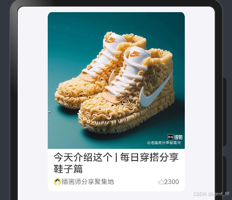
案例中遇到的问题:Row容器组件未设置主轴方向上width数据,使用主轴对齐方式justifyContent(FlexAlign.SpaceBetween)时无效果,加上width属性问题解决。


 扫一扫
扫一扫


 2791
2791

 被折叠的 条评论
为什么被折叠?
被折叠的 条评论
为什么被折叠?
 到【灌水乐园】发言


