


241015
Flex布局也叫弹性布局,是浏览器提倡的布局模型,非常适合结构化布局,提供了强大的空间分布和对齐能力。
Flex模型不会产生浮动布局中脱标现象,布局网页更简单、更灵活。
1. Flex组成
<!DOCTYPE html>
<html lang="en">
<head>
    <meta charset="UTF-8">
    <meta name="viewport" content="width=device-width, initial-scale=1.0">
    <title>Flex基本使用</title>
    <style>
        /*
        display: inline-block 转换为行内块元素
        但会导致相邻标签之间有空格。
        这是因为浏览器把行内元素和行内块元素当作文字处理,
        换行书写会识别出空格。
        */

        /* 引入Flex布局 避开上述问题 */
        /* Flex 主轴默认在水平方向,交叉轴默认在垂直方向 */
        .box{
            height: 200px;
            background-color: lightgreen;
            /* 弹性布局 */
            display: flex;
            /* 弹性容器的主轴对齐方式 */
            justify-content: space-between;
        }
        .box div{
            width: 100px;
            height: 100px;
            background-color: lightcoral;
            /* display: inline-block; */
        }
    </style>
</head>
<body>
    <div class="box">
        <div>1</div>
        <div>2</div>
        <div>3</div>
        <div>4</div>
    </div>
</body>
</html>
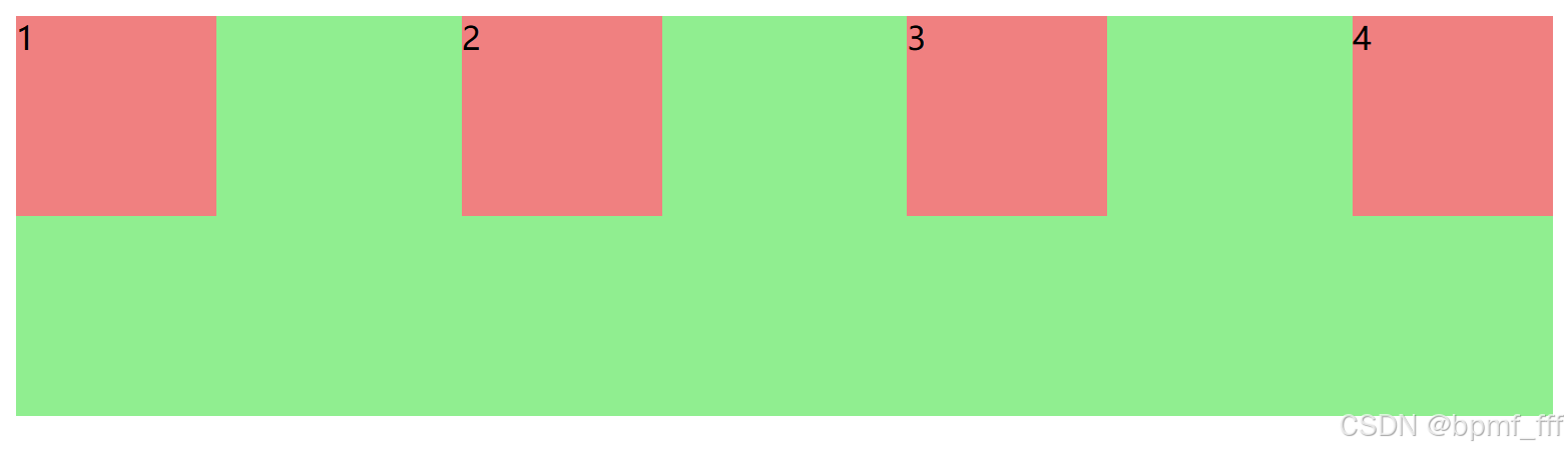
2. 主轴对齐方式 justify-content
<!DOCTYPE html>
<html lang="en">
<head>
    <meta charset="UTF-8">
    <meta name="viewport" content="width=device-width, initial-scale=1.0">
    <title>主轴对齐方式</title>
    <style>
        .box{
            height: 200px;
            background-color: lightgreen;
            display: flex;

            /* 主轴对齐方式 */
            justify-content: flex-start;
            justify-content: flex-end;
            justify-content: center;

            /* space-xxx 把父级剩余尺寸进行再分配 */
            /* 常用 最外两侧无间距,中间均分剩余空间 */
            justify-content: space-between;
            /* 中间间距为最外侧两边的两倍 */
            justify-content: space-around;
            /* 所有间距都相同 */
            justify-content: space-evenly;
        }
        .box div{
            width: 100px;
            height: 100px;
            background-color: lightcoral;
        }
    </style>
</head>
<body>
    <div class="box">
        <div>1</div>
        <div>2</div>
        <div>3</div>
        <div>4</div>
    </div>
</body>
</html>
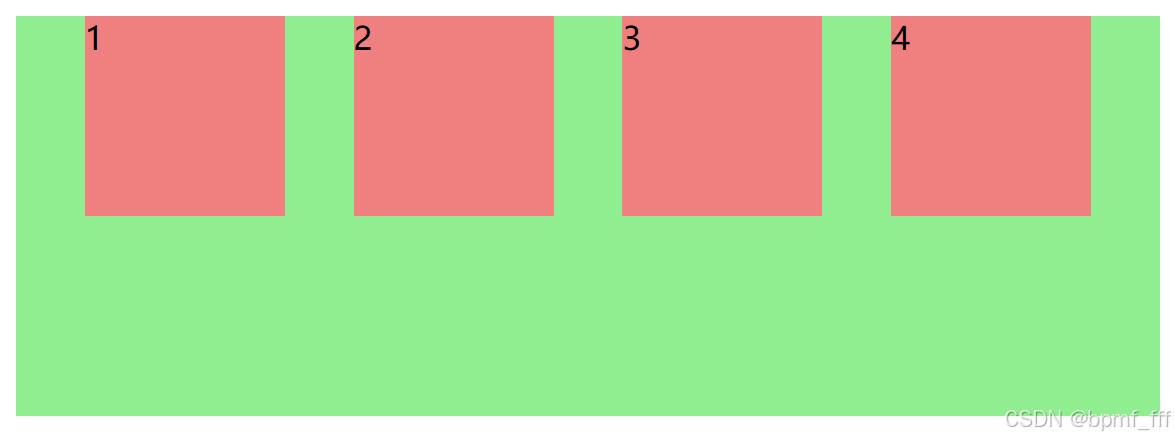
3. 交叉轴对齐方式 align-items&align-self
<!DOCTYPE html>
<html lang="en">
<head>
    <meta charset="UTF-8">
    <meta name="viewport" content="width=device-width, initial-scale=1.0">
    <title>交叉轴对齐方式</title>
    <style>
        .box{
            height: 200px;
            background-color: lightgreen;
            display: flex;
            justify-content: space-between;

            /*Flex默认主轴在水平方向,交叉轴在垂直方向  */
            /*
            1. 交叉轴对齐方式align-items
            当前弹性容器内所有弹性盒子的主轴轴对齐方式(给弹性容器设置)
            */
            align-items: flex-start;
            align-items: flex-end;
            align-items: center;
            /* stretch拉伸,子元素在交叉轴方向上未设置尺寸时可生效 */
            align-items: stretch;
        }
        .box div{
            width: 100px;
            /* height: 100px; */
            background-color: lightcoral;
        }
        .two{
            /*
            2. 交叉轴对齐方式align-self
            单独控制某个弹性盒子的交叉轴对齐方式(给弹性盒子设置)
            */
            align-self: start;
        }
    </style>
</head>
<body>
    <div class="box">
        <div>1</div>
        <div class="two">2</div>
        <div>3</div>
    </div>
</body>
</html>
4. 修改主轴方向 flex-direction
<!DOCTYPE html>
<html lang="en">
<head>
    <meta charset="UTF-8">
    <meta name="viewport" content="width=device-width, initial-scale=1.0">
    <title>修改主轴方向</title>
    <style>
        .box{
            width: 100px;
            height: 100px;
            background-color: lightsalmon;
            display: flex;
            /* 修改主轴方向为垂直 */
            flex-direction: column;
            /* 主轴对齐方式 */
            justify-content: center;
            /* 交叉轴对齐方式 */
            align-items: center;
        }
        .box img{
            width: 50px;
        }
        .box span{
            font-size: 14px;
            font-style: italic;
            color: rgb(155, 63, 122);
        }
    </style>
</head>
<body>
    <!-- div.box 可快捷生成 -->
    <div class="box">
        <img src="./maxresdefault.jpg" alt="">
        <span>图片</span>
    </div>
</body>
</html>
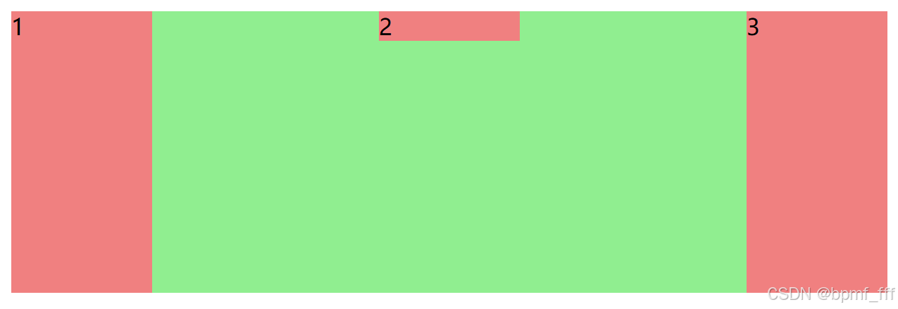
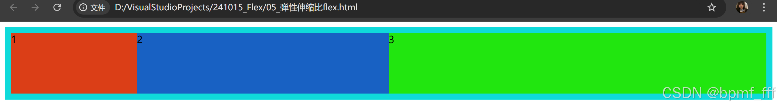
5. 弹性伸缩比 flex
<!DOCTYPE html>
<html lang="en">
<head>
    <meta charset="UTF-8">
    <meta name="viewport" content="width=device-width, initial-scale=1.0">
    <title>弹性伸缩比</title>
    <style>
        /*
            弹性伸缩比flex:控制弹性盒子的主轴方向的尺寸
            值:整数数字,表示占用父级剩余尺寸的份数
        */
        .box{
            /* height: 200px; */
            background-color: rgb(15, 218, 218);
            display: flex;
            padding: 10px;
        }
        .box div{
            /* width: 100px; */
            height: 100px;
        }
        .box .one{
            background-color: #db3e17;
            /* 设盒子1 flex值为1份 */
            flex: 1;
        }
        .box .two{
            background-color: #1d18b69f;
            /* 设盒子2 flex值为2份 */
            flex: 2;
        }
        .box .three{
            background-color: #21e60f;
            /* 设盒子3 flex值为3份 */
            flex: 3;
        }
    </style>
</head>
<body>
    <dix class="box">
        <div class="one">1</div>
        <div class="two">2</div>
        <div class="three">3</div>
    </dix>
</body>
</html>
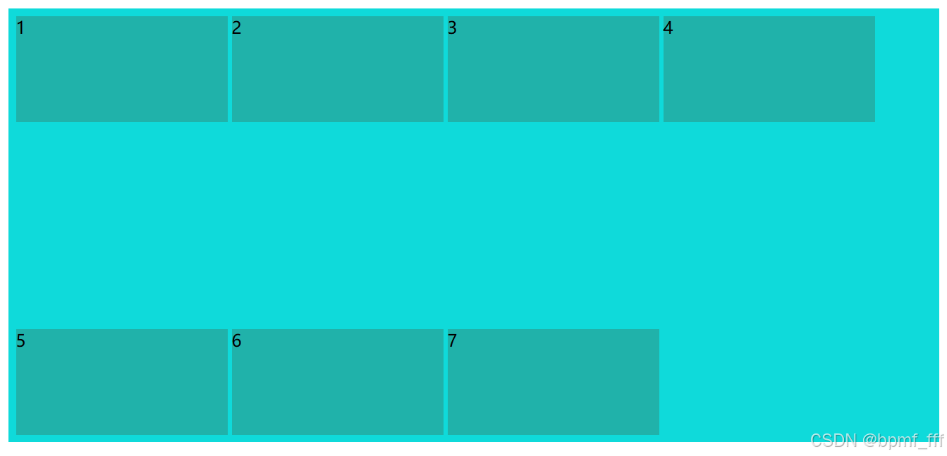
6. 弹性换行 flex-wrap
行对齐方式 align-content
<!DOCTYPE html>
<html lang="en">
<head>
    <meta charset="UTF-8">
    <meta name="viewport" content="width=device-width, initial-scale=1.0">
    <title>弹性换行</title>
    <style>
        /*
            弹性盒子可以自动挤压或拉伸,
            默认情况下,所有弹性盒子都在一行显示。
            可通过flex-wrap实现换行
        */

        .box{
            height: 400px;
            background-color: rgb(15, 218, 218);
            display: flex;
            padding: 5px;

            /* 换行 */
            flex-wrap: wrap;
            /* 行对齐方式 单行不生效 */
            align-content: space-between;
        }
        .box div{
            width: 200px;
            height: 100px;
            background-color: lightseagreen;
            margin: 2px;
        }
    </style>
</head>
<body>
    <dix class="box">
        <div class="one">1</div>
        <div class="two">2</div>
        <div class="three">3</div>
        <div>4</div>
        <div>5</div>
        <div>6</div>
        <div>7</div>
    </dix>
</body>
</html>
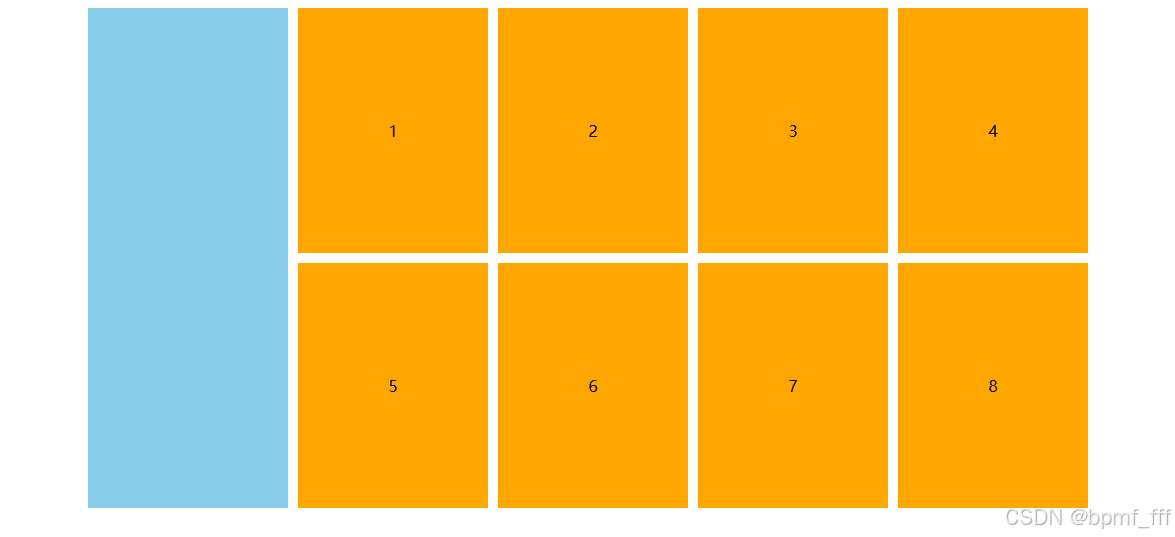
7. 案例-布局
<!DOCTYPE html>
<html lang="en">
<head>
    <meta charset="UTF-8">
    <meta name="viewport" content="width=device-width, initial-scale=1.0">
    <title>案例布局</title>
    <style>
        /*
            布局思路:
            弹性布局,大div嵌套两个小div,水平排列
            右边的小div 多个子元素div?
        */
        .box{
            width: 1000px;
            height: 500px;
            display: flex;
            margin: 0 auto;
        }
        .left{
            background-color: #88CEEB;
            width: 200px;
            height: 100%;
            margin-right: 10px;
        }
        .right{
            flex: 1;
            height: 100%;
            /* 弹性布局 */
            display: flex;
            /* 主轴对齐方式 */
            justify-content: space-between;
            /* 行对齐方式 */
            align-content: space-between;
            /* 弹性换行 */
            flex-wrap: wrap;
        }
        .right div{
            width: 190px;
            height: 245px;
            background-color: #FFA600;
            text-align: center;
            line-height: 245px;
        }
    </style>
</head>
<body>
    <div class="box">
        <div class="left"></div>
        <div class="right">
            <!-- div*8 8个div
                div{$}*8 div1-8
            -->
            <div>1</div>
            <div>2</div>
            <div>3</div>
            <div>4</div>
            <div>5</div>
            <div>6</div>
            <div>7</div>
            <div>8</div>
        </div>
    </div>
</body>
</html>
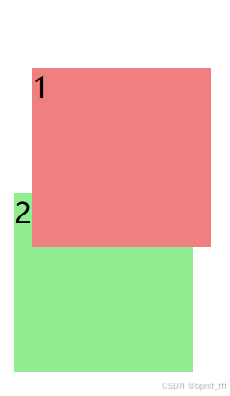
8. 定位 position
8.1 相对定位 relative
<!DOCTYPE html>
<html lang="en">
<head>
    <meta charset="UTF-8">
    <meta name="viewport" content="width=device-width, initial-scale=1.0">
    <title>相对定位</title>
    <style>
        div{
            width: 100px;
            height: 100px;
        }
        .one{
            background-color: lightcoral;

            /* 相对定位 */
            /*
                1. 占用原有位置
                2. 设置偏移量相对自身进行移动
                2. 显示模式保持不变
            */
            position: relative;
            left: 10px;
            top: 30px;
        }
        .two{
            background-color: lightgreen;
        }
    </style>
</head>
<body>
    <div class="one">1</div>
    <div class="two">2</div>
</body>
</html>
8.2 绝对定位 absolute
<!DOCTYPE html>
<html lang="en">
<head>
    <meta charset="UTF-8">
    <meta name="viewport" content="width=device-width, initial-scale=1.0">
    <title>绝对定位</title>
    <style>
        div{
            width: 100px;
            height: 100px;
        }
        .one{
            background-color: rgba(240, 128, 128, 0.386);

            /* 绝对定位 */
            /* 使用场景:子级绝对定位,父级相对定位(子绝父相) */
            /*
                1. 绝对定位不占用原有位置
                2. 有已定位的父级块,偏移量以父级为参考进行定位;
                   没有已定位的父级,偏移量以浏览器为参考进行定位
                3. 改变显示模式为行内块元素(加宽高生效,无宽高属性靠自身内容撑开)
            */
            position: absolute;
            left: 0px;
            top: 0px;
        }
        .two{
            background-color: lightgreen;
        }
    </style>
</head>
<body>
    <div class="one">1</div>
    <div class="two">2</div>
</body>
</html>
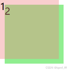
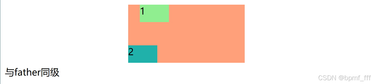
8.3 相对绝对定位配合 子绝父相
<!DOCTYPE html>
<html lang="en">
<head>
    <meta charset="UTF-8">
    <meta name="viewport" content="width=device-width, initial-scale=1.0">
    <title>绝对定位居中</title>
    <style>
        /* 子绝父相 */
        .father{
            width: 200px;
            height: 100px;
            background-color: lightsalmon;
            margin: 5px auto;
            /* border: 1px solid #000; */
            /* 相对定位占用原有位置 */
            position: relative;
        }
        .father div{
            width: 50px;
            height: 30px;
        }
        .son1{
            background-color: lightgreen;
            /* 绝对定位不占用原有位置 */
            position: absolute;
            left: 20px;
            right: 10px;
        }
        .son2{
            background-color: lightseagreen;
            /* 快捷 po a */
            position: absolute;
            /* 绝对定位中,当left和right同时书写时以left为准
                top和bottom以top为准
            */
            left: 0px;
            right: 0px;
            bottom: 0px;
        }
    </style>
</head>
<body>
    <div class="father">
        <div class="son1">1</div>
        <div class="son2">2</div>
    </div>
    <div class="father1">与father同级</div>
</body>
</html>
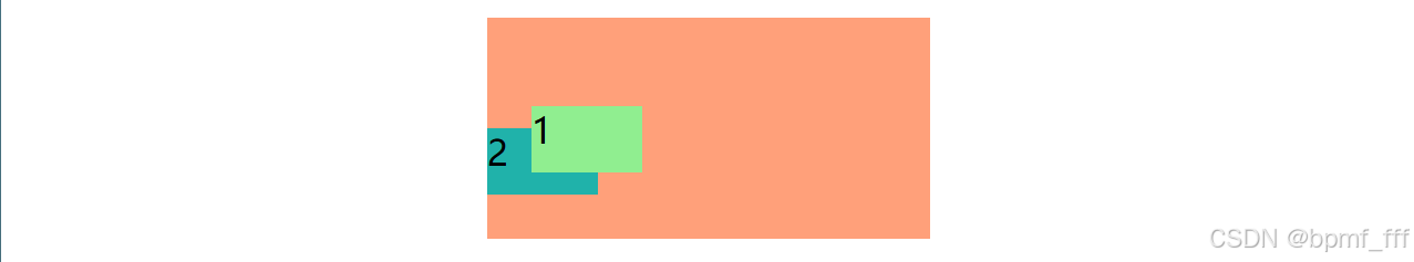
8.4 层叠顺序 z-index
<!DOCTYPE html>
<html lang="en">
<head>
    <meta charset="UTF-8">
    <meta name="viewport" content="width=device-width, initial-scale=1.0">
    <title>层叠顺序</title>
    <style>
        .father{
            width: 200px;
            height: 100px;
            background-color: lightsalmon;
            margin: 5px auto;
            position: relative;
        }
        .father div{
            width: 50px;
            height: 30px;
        }
        .son1{
            background-color: lightgreen;
            position: absolute;
            left: 20px;
            top: 40px;
            /*
            改变层叠顺序
            默认效果:按照标签书写顺序,后来者居上
            通过z-index改变层叠顺序,数值越大,层级越高
            */
            z-index: 1;
        }
        .son2{
            background-color: lightseagreen;
            position: absolute;
            left: 0px;
            bottom: 20px;
        }
    </style>
</head>
<body>
    <div class="father">
        <div class="son1">1</div>
        <div class="son2">2</div>
    </div>
</body>
</html>
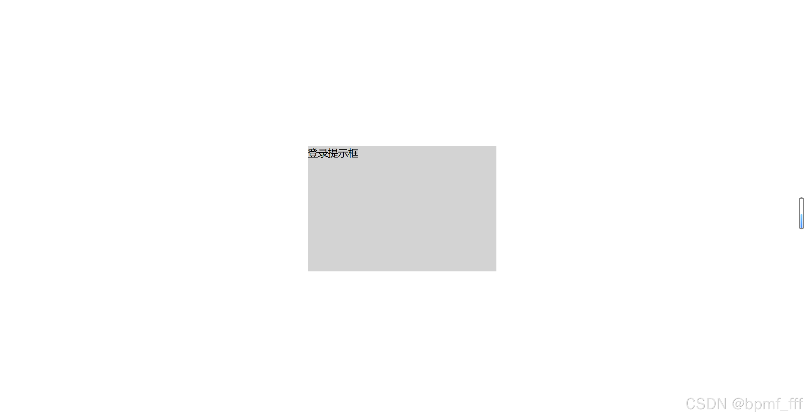
8.5 绝对定位居中
<!DOCTYPE html>
<html lang="en">
<head>
    <meta charset="UTF-8">
    <meta name="viewport" content="width=device-width, initial-scale=1.0">
    <title>绝对定位居中</title>
    <style>
        .box{
            width: 300px;
            height: 200px;
            background-color: lightgray;
            /* 绝对定位使得盒子左上角在浏览器正中心 */
            position: absolute;
            left: 50%;
            top: 50%;
            /* 1. 使用外边距达到正中效果 */
            /* margin-left: -150px;
            margin-top: -100px; */
            /* 2. 使用平移达到正中效果,百分比是参照为自身的 */
            transform: translate(-50%,-50%);

        }
    </style>
</head>
<body>
    <div class="box">登录提示框</div>
</body>
</html>
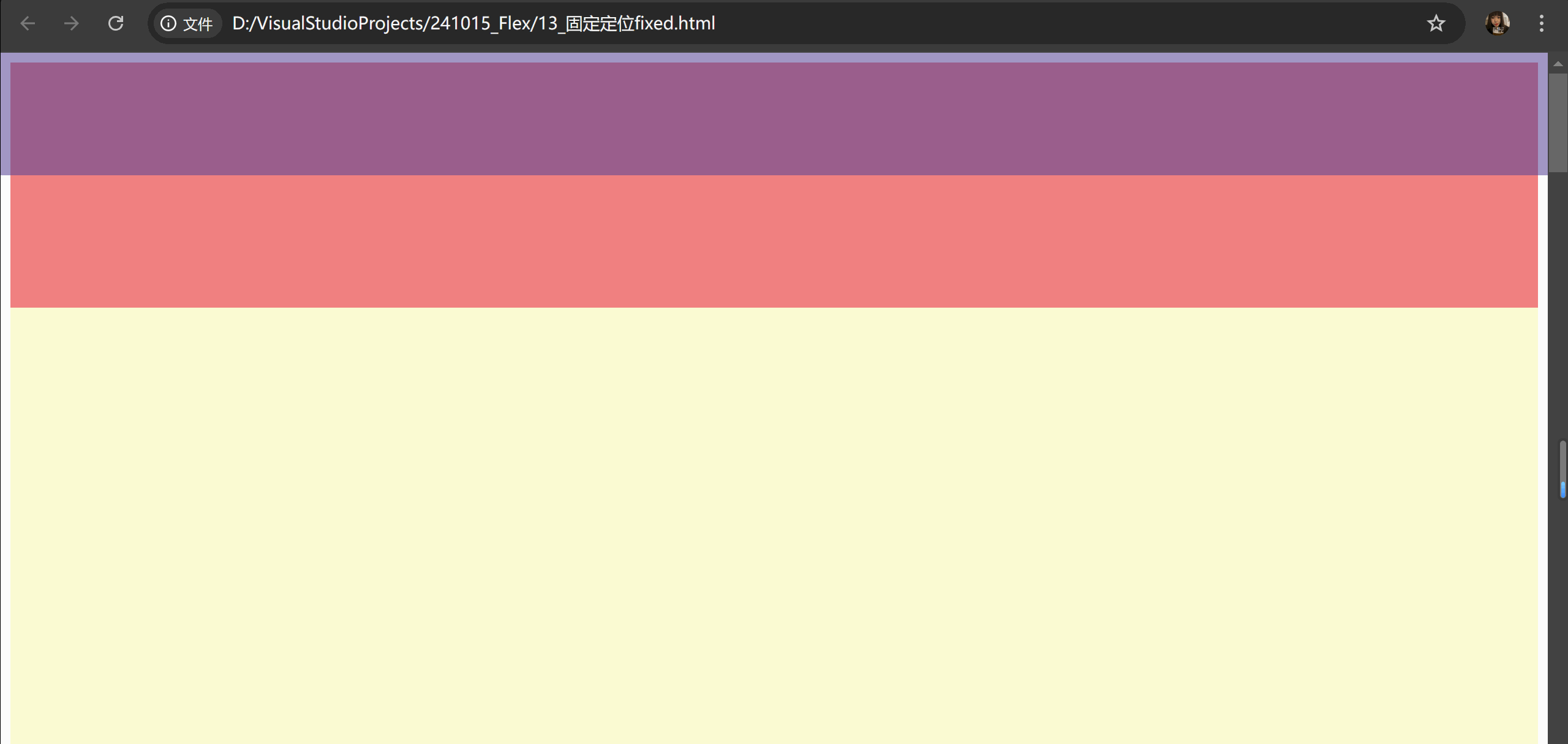
8.6 固定定位 fixed
<!DOCTYPE html>
<html lang="en">
<head>
    <meta charset="UTF-8">
    <meta name="viewport" content="width=device-width, initial-scale=1.0">
    <title>固定定位</title>
    <style>
        /* 元素的位置在网页滚动时不会改变 */
        /*
            1. 脱标,不占位
            2. 显示模式具备行内块特点
            3. 设置偏移量相对浏览器窗口改变位置
        */
        .one{
            width: 100%;
            height: 100px;
            background-color: #5844958f;
            /* 固定定位 */
            position: fixed;
            left: 0;
            top: 0;
        }
        .two{
            width: 100%;
            height: 200px;
            background-color: rgb(240, 128, 128);
        }
        .three{
            width: 100%;
            height: 5000px;
            background-color: lightgoldenrodyellow;
        }
    </style>
</head>
<body>
    <div class="one"></div>
    <div class="two"></div>
    <div class="three"></div>
</body>
</html>
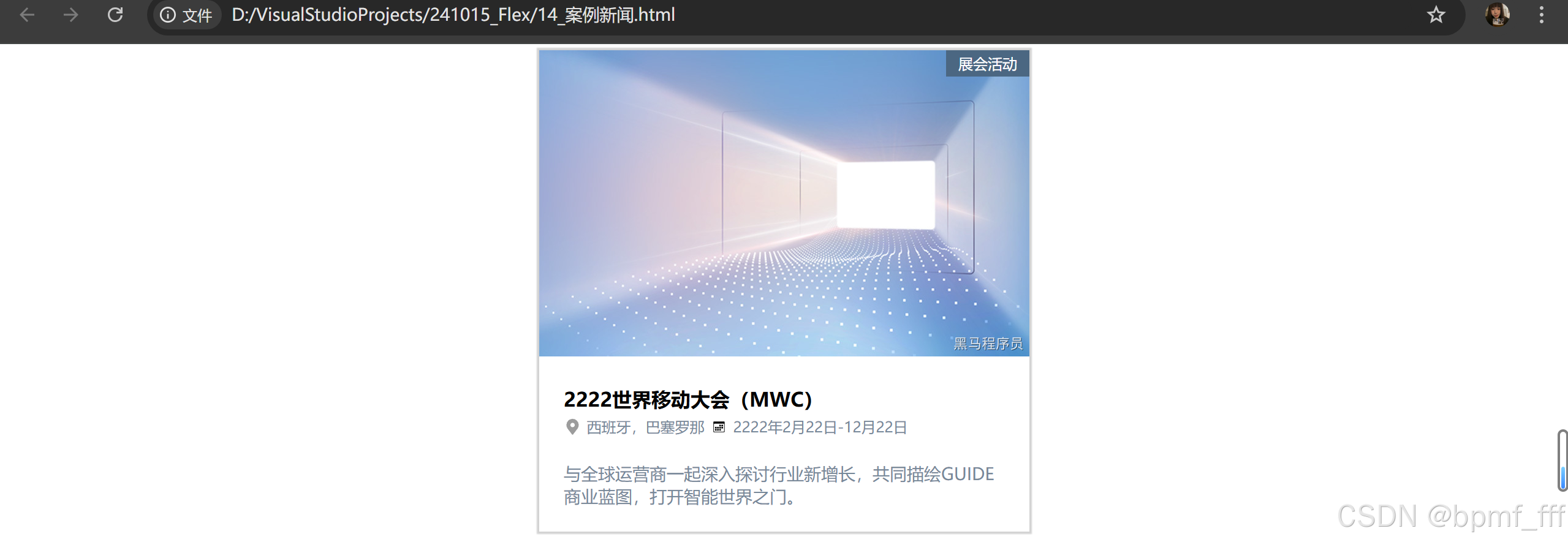
9. 案例-新闻
<!DOCTYPE html>
<html lang="en">
<head>
    <meta charset="UTF-8">
    <meta name="viewport" content="width=device-width, initial-scale=1.0">
    <title>案例新闻</title>
    <style>
        *{
            margin: 0;
            padding: 0;
            box-sizing: border-box;
        }
        .news{
            width: 400px;
            /* height: 300px; */
            margin: 5px auto;
            /* background-color: lightblue; */
            position: relative;
            box-shadow: 0 0 1px 2px lightgray;
        }
        .news .main{
            width: 100%;
        }
        .news .righttop{
            color: white;
            background-color: #4B6782;
            padding: 3px 10px;
            font-size: 12px;
            /* 绝对定位到父元素右上角

            */
            position: absolute;
            right: 0;
            top: 0;
        }
        .text{
            padding: 20px;
        }
        h3{
            font-size: 16px;
        }

        .text .one{
            width: 100%;
        }
        .one img{
            height: 14px;

            vertical-align: middle;
            /* 用于指定行内元素或表格单元格中内容的垂直对齐方式
            当图像与文本在同一行时,由于图像的基线默认与文本的基线对齐,可能会导致图像下方出现间隙。
            此时,可以通过调整vertical-align属性的值或设置父元素的行高来解决这个问题。 */
        }
        .one span{
            font-size: 12px;
            color: lightslategray;
        }

        .text .two{
            margin-top: 20px;
            font-size: 14px;
            color: lightslategray;
        }
    </style>
</head>
<body>
    <div class="news">
        <img src="./news.jpg" alt="" class="main">
        <span class="righttop">展会活动</span>
        <div class="text">
            <h3>2222世界移动大会(MWC)</h3>
            <p class="one">
                <img src="./ic_map.svg" alt="">
                <span>西班牙,巴塞罗那</span>
                <img src="./ic_calendar.svg" alt="">
                <span>2222年2月22日-12月22日</span>
            </p>
            <p class="two">与全球运营商一起深入探讨行业新增长,共同描绘GUIDE商业蓝图,打开智能世界之门。</p>
        </div>
    </div>
</body>
</html>
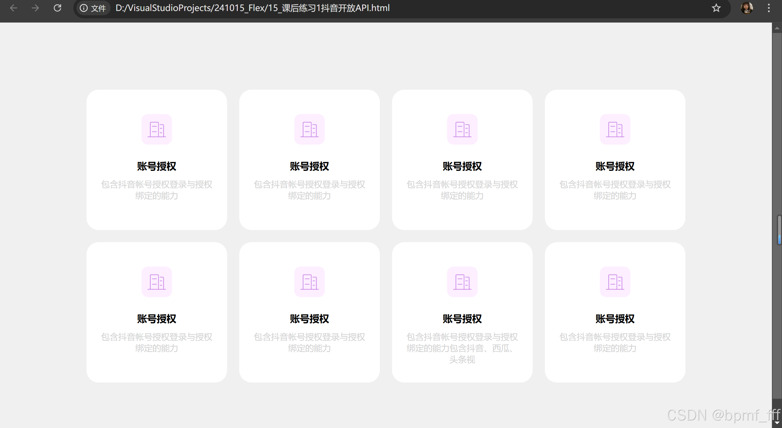
10. 课后练习1抖音开放API
<!DOCTYPE html>
<html lang="en">
<head>
    <meta charset="UTF-8">
    <meta name="viewport" content="width=device-width, initial-scale=1.0">
    <title>抖音开放API</title>
    <style>
        html{
            background-color: #F0F0F0;
        }
        *{
            margin: 0;
            padding: 0;
            box-sizing: border-box;
        }
        .box{
            width: 1000px;
            /* background-color: lightcoral; */
            margin: 100px auto;
        }
        ul{
            list-style: none;
            display: flex;
            flex-wrap: wrap;
            justify-content: space-between;
            align-content: space-between;
        }
        ul li{
            width: 23%;
            aspect-ratio: 1;
            border-radius: 20px;
            background-color: #FFFFFF;
            margin: 10px;
            padding: 20px;
            text-align: center;
        }
        li img{
            width: 50px;
            margin: 20px;
        }
        li p{
            font-size: 14px;
            margin-top: 10px;
            color: lightgray;
        }
    </style>
</head>
<body>
    <div class="box">
        <ul>
            <li>
                <img src="./business.svg" alt="">
                <h4>账号授权</h4>
                <p>包含抖音帐号授权登录与授权绑定的能力</p>
            </li>
            <li>
                <img src="./business.svg" alt="">
                <h4>账号授权</h4>
                <p>包含抖音帐号授权登录与授权绑定的能力</p>
            </li>
            <li>
                <img src="./business.svg" alt="">
                <h4>账号授权</h4>
                <p>包含抖音帐号授权登录与授权绑定的能力</p>
            </li>
            <li>
                <img src="./business.svg" alt="">
                <h4>账号授权</h4>
                <p>包含抖音帐号授权登录与授权绑定的能力</p>
            </li>
            <li>
                <img src="./business.svg" alt="">
                <h4>账号授权</h4>
                <p>包含抖音帐号授权登录与授权绑定的能力</p>
            </li>
            <li>
                <img src="./business.svg" alt="">
                <h4>账号授权</h4>
                <p>包含抖音帐号授权登录与授权绑定的能力</p>
            </li>
            <li>
                <img src="./business.svg" alt="">
                <h4>账号授权</h4>
                <p>包含抖音帐号授权登录与授权绑定的能力包含抖音、西瓜、头条视</p>
            </li>
            <li>
                <img src="./business.svg" alt="">
                <h4>账号授权</h4>
                <p>包含抖音帐号授权登录与授权绑定的能力</p>
            </li>
        </ul>
    </div>
</body>
</html>
241017
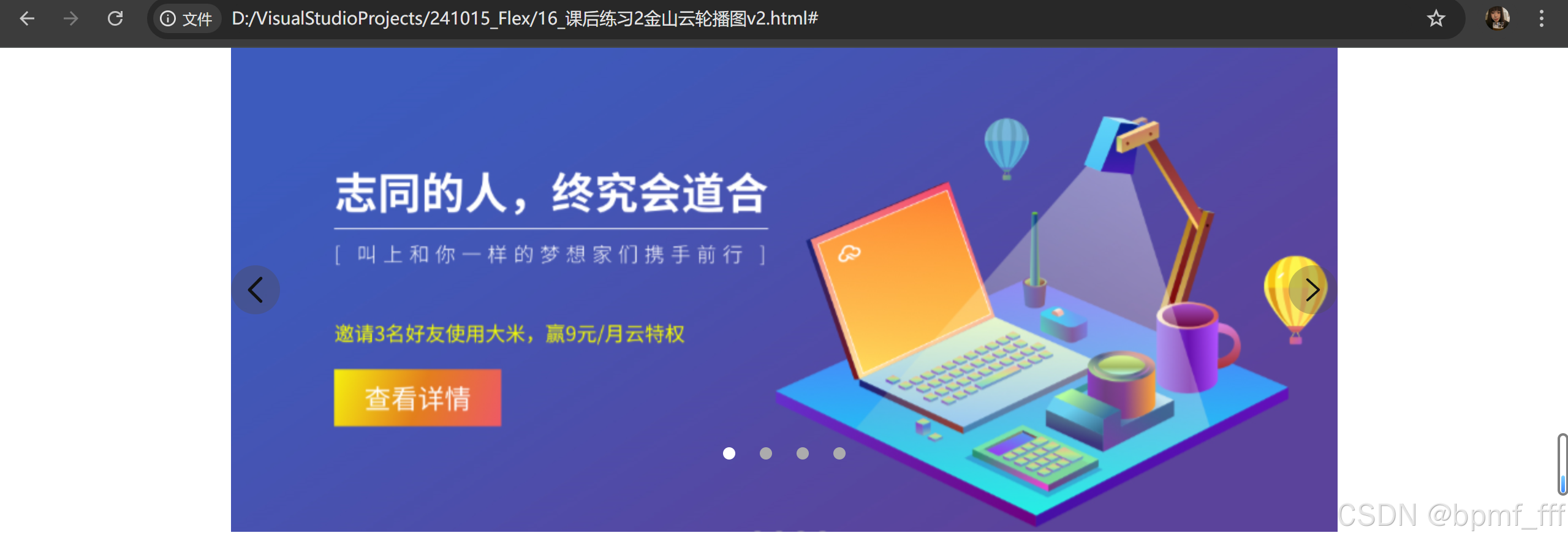
11. 课后练习2金山云轮播图
<!DOCTYPE html>
<html lang="en">
<head>
    <meta charset="UTF-8">
    <meta name="viewport" content="width=device-width, initial-scale=1.0">
    <title>金山云轮播图</title>
    <style>
        *{
            margin: 0;
            padding: 0;
            box-sizing: border-box;
        }
        .banner{
            width: 903px;
            height: 395px;
            background-color: pink;
            margin: 0 auto;
            /* 子绝父相 */
            position: relative;
        }
        li{
            list-style: none;
        }
        .images li{
            width: 100%;
            height: 100%;
        }
        span{
            width: 40px;
            height: 40px;
            border-radius: 50%;
            background-color: rgba(77, 73, 73, 0.334);
            padding: 5px;
            position: absolute;
            top: 50%;
            transform: translate(0,-50%);

            /* 改变鼠标形状 手 */
            cursor: pointer;
        }
        span img{
            width: 100%;
            height: 100%;
        }
        .left{
            left: 0;
        }
        .right{
            right: 0;
        }
        .dots{
            /* width: 80px; */
            display: flex;
            justify-content: space-between;
            position: absolute;
            top: 80%;
            left: 50%;
            transform: translate(-50%);
        }
        .dots li{
            width: 10px;
            height: 10px;
            margin: 10px;
            border-radius: 50%;
            background-color: #ACACAD;
            cursor: pointer;
        }
        .dots .one{
            background-color: #fff;
        }
    </style>
</head>
<body>
    <div class="banner">
        <!-- 轮播图 无序列表 -->
        <ul class="images">
            <li><a href="#"><img src="16.jpg" alt=""></a></li>
            <!-- <li></li> -->
        </ul>

        <!-- 左右切换 -->
        <span class="left"><img src="返回.svg" alt=""></span>
        <span class="right"><img src="进入.svg" alt=""></span>

        <!-- 圆点 有序列表 -->
        <ol class="dots">
            <li class="one"></li>
            <li></li>
            <li></li>
            <li></li>
        </ol>
    </div>
</body>
</html>


 扫一扫
扫一扫


 2176
2176

 被折叠的 条评论
为什么被折叠?
被折叠的 条评论
为什么被折叠?
 到【灌水乐园】发言


