


241017
1. 视口
- 手机屏幕尺寸不同,网页宽度均为100%
- 网页的宽度和逻辑分辨率尺寸相同
视口:显示HTML网页的区域,用来约束HTML尺寸。
2. vw适配
2.1 vw
vw是相对单位,相对视口尺寸的计算结果。
vw:viewport width;1vw = 1/100视口宽度
<!DOCTYPE html>
<html lang="en">
<head>
    <meta charset="UTF-8">
    <meta name="viewport" content="width=device-width, initial-scale=1.0">
    <title>视口</title>
    <style>
        div{
            /* vw相对视口宽度计算结果 1vw = 1/100视口宽度 */
            width: 50vw;
            height: 30vw;
            background-color: lightsalmon;
        }
    </style>
</head>
<body>
    <div></div>
</body>
</html>
2.2 适配
① 确定设计稿对应的vw尺寸 (1/100视口宽度)
查看设计稿宽度→ 确定参考设备宽度 (视口宽度)→ 确定 vw尺寸 (1/100 视口宽度)
② vw单位的尺寸 =px单位数值 /(1/100 视口宽度 )
3. less
Less是一个CSS预处理器, Less文件后缀是.less。扩充了 CSS 语言, 使 CSS 具备一定的逻辑性、计算能力。
注意:浏览器不识别 Less 代码,目前阶段,网页要引入对应的 CSS 文件。
VS Code 插件:Easy LESS,保存 less文件后自动生成对应的 CSS 文件。
241018
3.1 注释
less
// Ctrl + / 单行注释

/*
shift + alt + A
多行注释 可在生成的.css文件中显示
*/
css
/*
shift + alt + A
多行注释 可在生成的.css文件中显示
*/
3.2 运算
less
/*
加+减-乘*可直接运算
除/ 放到()里,单位写到括号内
*/

//一个表达式出现一个单位 以第一个出现的为准

div{
    width: 100+20px;
    width: 100-20px;
    width: 100*3px;
    // 除法加括号
    width: (300/3.75vw);

    // 多个单位,先来居上
    height: 100px+200vw;
}
css
/*
加+减-乘*可直接运算
除/ 放到()里,单位写到括号内
*/
div {
  width: 120px;
  width: 80px;
  width: 300px;
  width: 80vw;
  height: 300px;
}
3.3 嵌套
less 快速生成后代选择器
// less可嵌套css样式,自动生成的后代选择器
div{
    width: 300px;
    height: 300px;
    background-color: lightcoral;
    p{
        font-size: 20px;
        color: red;
        span{
            font-weight: 700;
        }
    }
}
css
div {
  width: 300px;
  height: 300px;
  background-color: lightcoral;
}
div p {
  font-size: 20px;
  color: red;
}
div p span {
  font-weight: 700;
}
3.4 变量
less
/* 常用的属性可定变量
存储数据,方便使用和修改 */

// 变量的定义
@mycolor:rgb(192, 255, 193);

// 变量的使用
div{
    width: 300px;
    height: 300px;
    background-color: @mycolor;
}
p{
    color: @mycolor;
}
css
/* 常用的属性可定变量
存储数据,方便使用和修改 */
div {
  width: 300px;
  height: 300px;
  background-color: #c0ffc1;
}
p {
  color: #c0ffc1;
}
3.5 导入
less
// out: ./css/daochu5.css
// 导入 less文件后缀名可省略
// import和路径中间要有空格
@import './base.less';

div{
    width: 300px;
    height: 300px;
    background-color: palevioletred;
}
css
* {
  margin: 0;
  padding: 0;
}
div {
  width: 300px;
  height: 300px;
  background-color: palevioletred;
}
3.6 导出
less
// out: ./css/daochu.css
3.7 禁止导出
less
// out:false
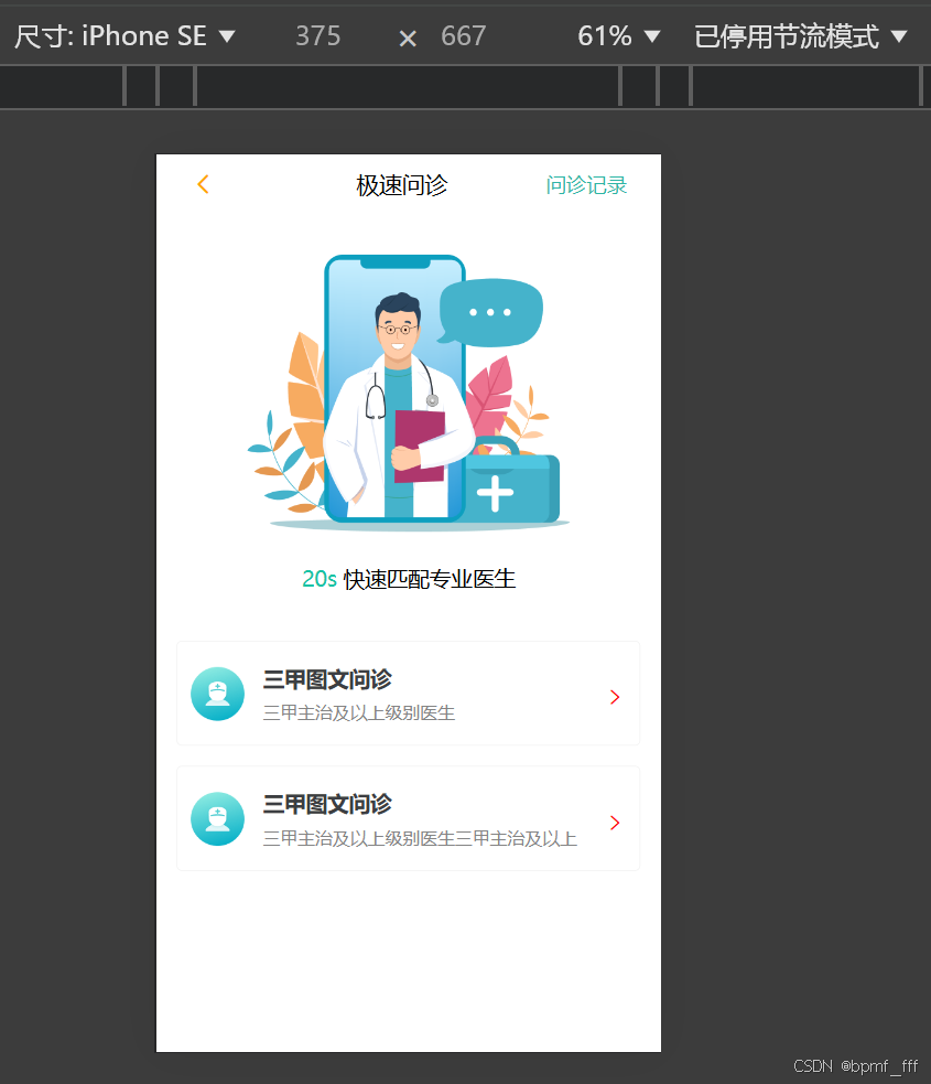
4. 移动端页面练习(在线问诊)
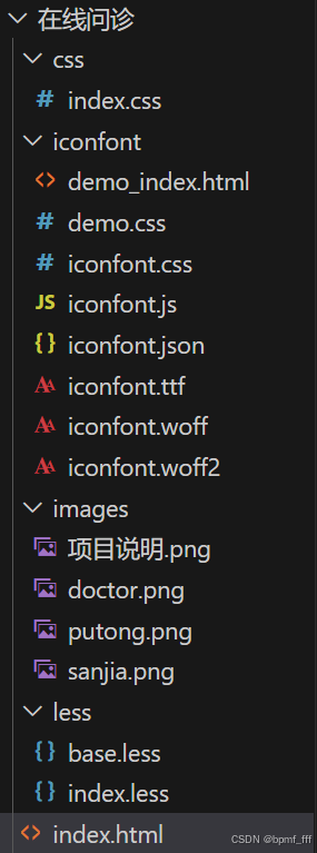
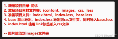
index.html
<!DOCTYPE html>
<html lang="en">
<head>
    <meta charset="UTF-8">
    <meta name="viewport" content="width=device-width, initial-scale=1.0">
    <title>首页</title>
    <link rel="stylesheet" href="./css/index.css">
    <link rel="stylesheet" href="./iconfont/iconfont.css">
</head>
<body>
    <div class="box">
        <!-- 头部标题栏 -->
        <div class="header">
            <span class="iconfont icon-fanhui"></span>
            <h3>极速问诊</h3>
            <a>问诊记录</a>
        </div>

        <!-- 介绍图片 -->
        <img src="./images/doctor.png" alt="" class="zhutu">
        <p><span>20s</span> 快速匹配专业医生</p>

        <!-- <div class="wenzhen">
            <div class="left">
                <img src="./images/sanjia.png" alt="">
                <div class="txt">
                    <h4>三甲图文问诊</h4>
                    <p>三甲主治及以上级别医生</p>
                </div>
            </div>
            <span class="iconfont icon-jinru"></span>
        </div>
        <div class="wenzhen"></div> -->


        <!-- 外观相同,内容不同,用ul嵌套li -->
        <!-- 问诊类型 用ul li 无序列表 -->
        <div class="type">
            <ul>
                <li>
                    <!-- 直接分三部分即可,img、div、span, .left块可去掉 -->
                    <div class="left">
                        <img src="./images/sanjia.png" alt="">
                        <div class="txt">
                            <!-- 文字区域字多字少不能确定,不能设置确切的宽度 引入flex -->
                            <h4>三甲图文问诊</h4>
                            <p>三甲主治及以上级别医生</p>
                        </div>
                    </div>
                    <span class="iconfont icon-jinru"></span>
                </li>
                <li>
                    <div class="left">
                        <img src="./images/sanjia.png" alt="">
                        <div class="txt">
                            <h4>三甲图文问诊</h4>
                            <p>三甲主治及以上级别医生三甲主治及以上级别医生</p>
                        </div>
                    </div>
                    <span class="iconfont icon-jinru"></span>
                </li>
            </ul>
        </div>
    </div>
</body>
</html>
index.less
// out: ../css/
@import './base.less';

// 定义变量
@vw:3.75vw;
.box{
    text-align: center;
}

.header{
    height: (44/@vw);
    // background-color: lightcoral;
    padding: 0 (25/@vw);
    line-height: (44/@vw);
    display: flex;
    justify-content: space-between;
    .iconfont{
        font-size: (20/@vw);
        margin-right: (30/@vw);
        color: orange;
    }
    h3{
        font-size: (17/@vw);
        font-weight: 400;
    }
    a{
        font-size: (15/@vw);
        color: #2CB5A5;
        text-decoration: none;
    }
}

.zhutu{
    width: (240/@vw);
    height: (206/@vw);
    margin-top: (30.5/@vw);
    margin-bottom: (18/@vw);
}

p{
    font-size: (16/@vw);
    line-height: (25/@vw);
    span{
        color: #16C2A3;
    }
}

// .wenzhen{
//     width: (345/@vw);
//     height: (78/@vw);
//     display: flex;
//     padding: (10/@vw);
//     margin-top: (33.5/@vw);
//     .left{

//         display: flex;
//     }
//     img{
//         width: (40/@vw);
//         height: (40/@vw);
//     }
// }

.type{
    // background-color: rgb(206, 218, 181);
    width: (345/@vw);
    margin: (34/@vw) auto;
    li{
        height: (78/@vw);
        margin-bottom: (15/@vw);
        border-radius: (4/@vw);
        border: (0.5/@vw) solid #EDEDEDE5;
        // border: 1px solid #000;
        display: flex;
        justify-content: space-between;
        padding: (5/@vw) 0;
        .left{
            // width: (197.5/@vw);
            height: (68/@vw);
            // background-color: red;
            display: flex;
            // justify-content: space-between;
            flex: 1;
            margin-left: (10/@vw);
            // 交叉轴方向垂直居中
            align-items: center;
            img{
                width: (40/@vw);
                height: (40/@vw);
                // margin: (14/@vw) 0;
            }
            .txt{
                flex: 1;
                // background-color: lightgreen;
                text-align: left;
                // width: (144/@vw);
                height: (48/@vw);
                margin-left: (13.5/@vw);
                overflow: hidden;
                // margin: (10/@vw) 0;
                h4{
                    color: #3C3E42;
                    font-size: (16/@vw);
                    line-height: (24/@vw);
                    margin-bottom: (4/@vw);
                }
                p{
                    // text-overflow: ellipsis;
                    color: #848484;
                    font-size: (13/@vw);
                    line-height: (20/@vw);
                }
            }
        }

        span{
            width: (17/@vw);
            margin: (28/@vw) (10/@vw);
        }
        .iconfont{
            font-size: (17/@vw);
            color: red;
        }
    }
}
241019
4. 课后练习_游乐园
html
<!DOCTYPE html>
<html lang="en">

<head>
    <meta charset="UTF-8">
    <meta name="viewport" content="width=device-width, initial-scale=1.0">
    <title>游乐园</title>
    <link rel="stylesheet" href="./iconfont/iconfont.css">
    <link rel="stylesheet" href="./css/index.css">
</head>

<body>
    <!-- 头部标题区域 -->
    <div class="header">
        <!-- 左上 -->
        <div class="lefttop">
            <span class="iconfont icon-fanhui"></span>
            <span>返回</span>
        </div>

        <!-- 中间 flex1 -->
        <h3>游乐园</h3>

        <!-- 右上 -->
        <span class="iconfont icon-gengduo"></span>
    </div>

    <!-- logo -->
    <div class="logo">
        <span>FC</span>
    </div>

    <!-- 标题 -->
    <h4 class="title">FC游乐园</h4>

    <!-- 水平线
            hr元素是一个块级元素,它在网页中用于插入水平线以分隔内容。
        -->
    <!-- <hr> -->


    <!-- 文字区域 -->
    <div class="txt">
        <h4>网页由该公众号开发,请确认授权以下信息</h4>
        <ul>
            <li>获得你的公开信息(昵称、头像等)</li>
        </ul>
    </div>
    <button>确认登陆</button>
</body>

</html>
less
//out: ../css/
@import './base.less';

// 定义变量vw
@vw: 3.75vw;


// 顶栏区域
.header {
    // width: 100%;
    height: (50/@vw);
    background-color: #262626;
    display: flex;
    align-items: center;
    padding: 0 (14/@vw);
    color: white;
    margin-bottom: (36/@vw);

    .lefttop {
        span {
            font-size: (16/@vw);
        }
    }

    h3 {
        flex: 1;
        text-align: right;
        padding-right: (123/@vw);
        // text-align: center;
        font-size: (18/@vw);
        font-weight: 400;
    }

    span {
        font-size: (22/@vw);
    }
}

// logo
.logo {
    width: (75/@vw);
    height: (75/@vw);
    background-color: #F2D40E;
    text-align: center;
    align-content: center;
    margin: 0 auto;

    span {
        font-family: ArialRoundedMTBold;
        font-size: (36/@vw);
        color: white;
    }
}

// 标题
.title {
    margin-top: (13/@vw);
    margin-bottom: (34/@vw);
    text-align: center;
    font-size: (18/@vw);
    font-weight: normal;
    color: #242424;
}

// 水平分割线
// hr{
//     width: (313/@vw);
//     height: (3/@vw);
//     // background-color: #DEDEDE;
//     font-weight: (1/@vw);
//     color: #DEDEDE;
//     // border: none;
//     margin: 0 auto;
// }

.txt {
    width: (313/@vw);
    margin: 0 auto;
    padding: (29/@vw) (12/@vw) 0;
    // background-color: lightblue;
    border-top: 1px solid #DEDEDE;

    h4 {
        font-size: (17/@vw);
        color: #242424;
        line-height: (22/@vw);
        font-weight: normal;
        margin-bottom: (17/@vw);
    }

    ul {
        width: (301/@vw);
        color: #979797;
        margin-bottom: (48/@vw);
        font-size: (15/@vw);

        li {
            list-style: disc;
            list-style-position: inside;
        }
    }
}

button {
    width: (313/@vw);
    height: (47/@vw);
    display: block;
    margin: 0 auto;
    background-color: #02BE00;
    border-radius: (5/@vw);
    border: none;
    color: white;
    font-size: (18/@vw);
}


 扫一扫
扫一扫


 859
859

 被折叠的 条评论
为什么被折叠?
被折叠的 条评论
为什么被折叠?
 到【灌水乐园】发言


