


1. 列表 List
列表是一种复杂的容器,当列表项达到一定数量,内容超过屏幕大小时,可以自动提供滚动功能。它适合用于呈现同类数据类型或数据类型集,例如图片和文本。在列表中显示数据集合是许多应用程序中的常见要求(如通讯录、音乐列表、购物清单等)。
使用列表可以轻松高效地显示结构化、可滚动的信息。通过在list组件中按垂直或者水平方向线性排列子组件。
列表作为一种容器,会自动按其滚动方向排列子组件,向列表中添加组件或从列表中移除组件会重新排列子组件。
垂直滚动列表
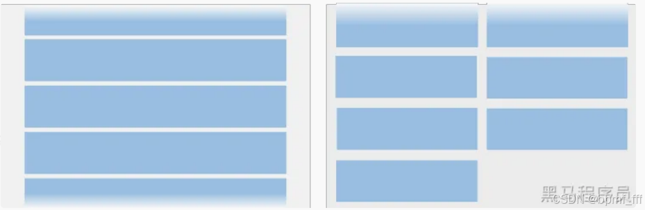
水平滚动列表
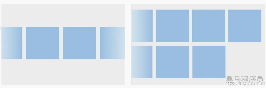
List表示列表容器,ListItem表示单个列表项,可以包含单个子组件。
1.1 基本使用
基本使用:
List() {
listItem() {}
 .....
}
示例代码:
@Entry
@Component
struct Index {
  build() {
    List({space:5}){
      ListItem(){
        Text('List滚动测试1')
          .width(120)
          .height(60)
          .backgroundColor(Color.Orange)
          .padding(10)
      }
      //中间重复代码省略
    }
    .padding(5)
  }
}
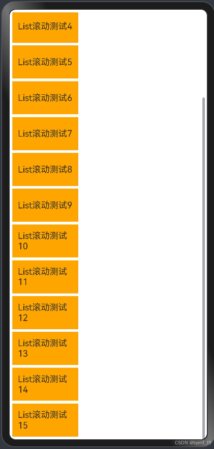
预览器效果:
1.2 开发布局
1.2.1 设置主轴方向 listDirection
List组件主轴默认为垂直方向Vertical,可通过listDirection属性改变主轴方向为水平Horizontal。
属性listDirection的参数为枚举Axis。
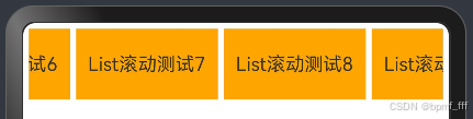
将上述1.1示例列表主轴方向变为水平
代码实现:
@Entry
@Component
struct Index {
  build() {
    List({space:5}){
      ListItem(){
        Text('List滚动测试1')
          .width(120)
          .height(60)
          .backgroundColor(Color.Orange)
          .padding(10)
      }
      //中间重复代码省略
    }
    .listDirection(Axis.Horizontal)
    .padding(5)
  }
}
预览器效果:
1.2.2 设置交叉轴布局
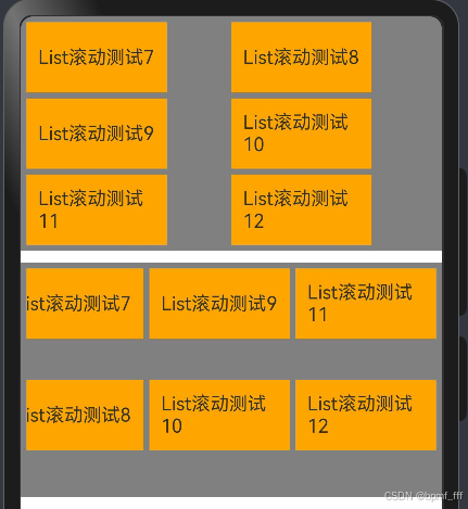
1.2.2.1 列模式 lanes
lanes(交叉轴方向列数,交叉轴方向列间距)
List() {
 listItem()
 ......
}
// 参数1:交叉轴⽅向列数
// 参数2: 交叉轴⽅向列间距
 .lanes(3, 10)
示例代码:
@Entry
@Component
struct Index {
  build() {
    Column({ space: 10 }) {
      List({ space: 5 }) {
        ListItem() {
          Text('List滚动测试1')
            .width(120)
            .height(60)
            .backgroundColor(Color.Orange)
            .padding(10)
        }

        //中间重复代码省略
      }
      .height(200)
      //list主轴方向为垂直,默认值;交叉轴方向则为水平
      .listDirection(Axis.Vertical)
      .padding(5)
      .backgroundColor(Color.Gray)
      //交叉轴方向为2列
      .lanes(2)

      List({ space: 5 }) {
        ListItem() {
          Text('List滚动测试1')
            .width(120)
            .height(60)
            .backgroundColor(Color.Orange)
            .padding(10)
        }

        //中间重复代码省略
      }
      .height(200)
      //设置list主轴方向为水平;交叉轴方向则为垂直
      .listDirection(Axis.Horizontal)
      .padding(5)
      .backgroundColor(Color.Gray)
      //交叉轴方向为2行
      .lanes(2)
    }
  }
}
预览器效果:
1.2.2.2 列对齐方式 alignListItem
此属性参数为枚举ListItemAlign;Start、Center、End。
示例代码:
@Entry
@Component
struct Index {
  build() {
    Column({ space: 10 }) {
      List({ space: 5 }) {
        ListItem() {
          Text('List滚动测试1')
            .width(120)
            .height(60)
            .backgroundColor(Color.Orange)
            .padding(10)
        }

        //中间重复代码省略
      }
      .height(200)
      //交叉轴默认对齐方式为首部对齐
      .alignListItem(ListItemAlign.Start)
      //list主轴方向为垂直,默认值;交叉轴方向则为水平
      .listDirection(Axis.Vertical)
      .padding(5)
      .backgroundColor(Color.Gray)
      //交叉轴方向为2列
      .lanes(2)

      List({ space: 5 }) {
        ListItem() {
          Text('List滚动测试1')
            .width(120)
            .height(60)
            .backgroundColor(Color.Orange)
            .padding(10)
        }

        //中间重复代码省略
      }
      .height(200)
      //设置交叉轴对齐方式为居中
      .alignListItem(ListItemAlign.Center)
      //list主轴方向为垂直,默认值;交叉轴方向则为水平
      .listDirection(Axis.Vertical)
      .padding(5)
      .backgroundColor(Color.Gray)
      //交叉轴方向为2列
      .lanes(2)

      List({ space: 5 }) {
        ListItem() {
          Text('List滚动测试1')
            .width(120)
            .height(60)
            .backgroundColor(Color.Orange)
            .padding(10)
        }

        //中间重复代码省略
      }
      .height(200)
      //设置交叉轴对齐方式为尾部对齐
      .alignListItem(ListItemAlign.End)
      //list主轴方向为垂直,默认值;交叉轴方向则为水平
      .listDirection(Axis.Vertical)
      .padding(5)
      .backgroundColor(Color.Gray)
      //交叉轴方向为2列
      .lanes(2)
    }
  }
}
预览器效果:

1.3 自定义列表样式
1.3.1 滚动条状态 scrollBar
属性scrollBar的参数为枚举BarState;Off不显示、On常驻显示、Auto触摸时显示。
//默认,滚动条按需显示(触摸时显示,2s后消失)
      .scrollBar(BarState.Auto)

//滚动条不显示
      .scrollBar(BarState.Off)

//滚动条常驻显示
      .scrollBar(BarState.On)
1.3.2 分割线样式 divider
列表默认没有分割线
@Entry
@Component
struct Index {
  build() {
    Column(){
      List({ space: 10 }) {
        ListItem() {
          Text('List滚动测试1')
            .width(120)
            .height(60)
            .backgroundColor(Color.Orange)
            .padding(10)
        }

       //中间重复代码省略
      }
      .height(200)
      //list主轴方向为垂直,默认值;交叉轴方向则为水平
      .listDirection(Axis.Vertical)
      .padding(5)
      .backgroundColor(Color.Gray)
      //交叉轴方向为2列
      .lanes(2)
      //分割线divider
      .divider({
        strokeWidth:2,
        color:Color.Blue,
        startMargin:10,
        endMargin:10
      }
      )
    }
  }
}
预览器效果:

241010
2. 综合案例-京东频道列表

示例代码:
@Entry
@Component
struct Index {
  build() {
    Column(){
      //5.2 综合案例-京东频道列表
      /*布局思路:
       可滑动列表,主轴为水平方向,交叉轴布局为两行,滚动条隐藏
       */
      List() {
        ListItem() {
          Column({space:5}) {
            Image($r('app.media.chaoshi'))
              .height(25)
            Text('京东超市')
              .fontSize(14)
              .fontColor('#727070')
          }
        }
        .width('20%')

        ListItem() {
          Column({space:5}) {
            Image($r('app.media.fushi'))
              .height(25)
            Text('美妆服饰')
              .fontSize(14)
              .fontColor('#727070')
          }
        }
        .width('20%')

        //中间重复代码省略

        ListItem() {
          Column({space:5}) {
            Image($r('app.media.gengduo'))
              .height(25)
            Text('更多频道')
              .fontSize(14)
              .fontColor('#727070')
          }
        }
        .width('20%')

      }
      .width('100%')
      .height(120)
      .listDirection(Axis.Horizontal)
      .lanes(2)
      .scrollBar(BarState.Off)
      .backgroundColor(Color.White)
      .alignListItem(ListItemAlign.Center)
      // .padding({top:5})
    }
    .height('100%')
    .backgroundColor('#ededed')
    .padding(10)
  }
}
预览器效果:


3. 通用属性
3.1 颜色渐变

作用:设置组件颜色渐变效果;分为线性渐变和径向渐变。

3.1.1 线性渐变 linearGradient
{
angle?: 线性渐变的起始⻆度,
direction?: 线性渐变的⽅向,
colors: [[颜⾊1, 颜⾊1所处位置], [颜⾊2, 颜⾊2所处位置], ......],
repeating?: 是否重复着⾊
}
angle:线性渐变的起始角度。0点方向顺时针旋转为正向角度,默认值为180;
direction:线性渐变的方向,设置angle后不生效,值为枚举类型GradientDirection。例.Left
渐变方向为向左。
示例代码:
@Entry
@Component
struct Index {
  build() {
    Column(){
      //线性渐变test
      Text('linearGradient')
        .width(200)
        .height(100)
        .backgroundColor(Color.Red)
        .linearGradient({
          //渐变方向,默认为从上到下
          direction:GradientDirection.Right,
          colors:[['#f00',0],['#fc0',0.6]]
        })
    }
    .padding(10)
  }
}
预览器效果:

3.1.2 径向渐变 radialGradient
{
center: 径向渐变的中⼼点坐标,
radius: 径向渐变的半径,
colors: [[颜⾊1, 颜⾊1所处位置], [颜⾊2, 颜⾊2所处位置], ......],
repeating?: 是否重复着⾊
}
示例代码:
@Entry
@Component
struct Index {
  build() {
    Column(){
      //径向渐变test
      Text('radialGradient')
        .width(200)
        .height(100)
        .backgroundColor(Color.Blue)
        .radialGradient({
          center:[100,10],
          radius:80,
          colors:[
            ['rgba(255, 255, 255, 0.6)',0],
            ['rgba(255, 255, 255, 0)',1]
          ]
        })

    }
    .padding(10)
  }
}
预览器效果:

3.2 阴影 shadow
作用:为组件添加阴影效果。
{
 radius: 模糊半径,
 type?: 阴影类型,
 color?: 阴影颜⾊,
 offsetX?: X轴偏移,
 offsetY?: Y轴偏移,
 fill?: 是否内部填充
}
示例代码:
@Entry
@Component
struct Index {
  build() {
    Column(){
      //阴影shadow test
      Text('radialGradient')
        .width(200)
        .height(100)
        //为组件添加阴影效果
        .shadow({
          //模糊半径
          radius:10,
          //阴影类型
          type:ShadowType.COLOR,
          //阴影颜色
          color:'rgba(0,0,0,0.5)',
          //X轴偏移
          offsetX:5,
          //Y轴偏移
          offsetY:5
        })

    }
    .padding(10)
  }
}
预览器效果:

3.3 多态样式 stateStyles
.stateStyles({
 状态: {
 属性
 }
})
| 参数 | 描述 |
| normal | 无状态时(默认状态) |
| pressed | 按下状态时 |
| disabled | 禁用状态时 |
| focused | 获焦状态时 |
| clicked | 点击状态时 |
示例代码:
@Entry
@Component
struct Index {
  build() {
    Column(){
      Text('radialGradient')
        .width(200)
        .height(100)
        .backgroundColor(Color.Pink)
        //多态样式
        .stateStyles({
          pressed:{
            .width(300)
        }
        })

    }
    .padding(10)
  }
}
预览器效果:


3.4 动画 animation
| 参数 | 描述 |
| duration | 设置动画时长,默认1000,单位毫秒 |
| curve | 设置动画曲线,默认Curve.EaseInOut |
| delay | 设置动画延迟执行的时长,默认0不延迟,单位毫秒 |
| iterations | 设置播放次数,默认1,-1为无限播放,0为无动画效果。 |
示例代码:
@Entry
@Component
struct Index {
  build() {
    Column(){
      Text('radialGradient')
        .width(200)
        .height(100)
        .backgroundColor(Color.Pink)
        .stateStyles({
          pressed:{
            .width(300)
          }
        })
        //动画,设置动画变化时长为1000毫秒
        .animation({
          duration:1000
        })
    }
    .padding(10)
  }
}
预览器效果:

3.5 图形变换
⽤于对组件进⾏平移、旋转、缩放、矩阵变换等操作。
3.5.1 平移 translate
作⽤:可使组件在以组件左上⻆为坐标原点的坐标系中进⾏移动

参数:{x?: X轴移动距离, y?: Y轴移动距离, z?: Z轴移动距离}
示例代码:
@Entry
@Component
struct Index {
  build() {
    Column(){
      Text('文字')
        .width(200)
        .height(100)
        .backgroundColor(Color.Pink)
        .stateStyles({
          clicked:{
            .width(300)
            //组件平移translate,“100%”是相对于自身的
            //默认为向右向下平移,加“-”可实现向左向上平移
            .translate({
              x:'50%',
              y:'200'
            })
          }
        })
    }
    .padding(10)
  }
}
预览器:

241013
3.5.2 缩放 scale
作用:分别设置X轴、Y轴、Z轴的缩放比例,默认值为1。
@Entry
@Component
struct Index {
  build() {
    Column(){
      Text('缩放scale')
        .textAlign(TextAlign.Center)
        .width(200)
        .height(100)
        .stateStyles({
          // 设置默认状态时
          normal:{
            .backgroundColor(Color.Pink)
            .scale({x:1,y:1})
          },
          // 设置点击状态时
          clicked:{
            .backgroundColor(Color.Blue)
            // 设置点击状态时缩放效果
            .scale({x:0.5,y:0.5})
          }
        })
        // 设置动画变换时长为2s
        .animation({
          duration:2000,
        })
    }
    .padding(10)
  }
}

3.5.3 旋转 rotate
作用:可使组件在以自身左上角为坐标原点的坐标系中进行旋转。
@Entry
@Component
struct Index {
  build() {
    Column(){
      Text('缩放scale')
        .textAlign(TextAlign.Center)
        .width(200)
        .height(100)
        .stateStyles({
          // 设置默认状态时
          normal:{
            .backgroundColor(Color.Pink)
            .scale({x:1,y:1})
            // 旋转
            .rotate({ angle:0 })
          },
          // 设置点击状态时
          clicked:{
            .backgroundColor(Color.Blue)
            // 设置点击状态时缩放效果
            .scale({x:0.5,y:0.5})
            .rotate({ angle:49 })
          }
        })
        // 设置动画变换时长为2s
        .animation({
          duration:2000,
        })
    }
    .padding(30)
  }
}

4. 综合案例-微店卡片
Text 组件可作为容器组件使用,里面可以放行内图片ImageSpan和行内文字Span,ImageSpan不能设置fillColor,Text不能使用Space。
代码:
import { curves } from '@kit.ArkUI'

@Entry
@Component
struct Index {
  build() {
    Column() {
      // 微店卡片
      /*布局思路
        总体垂直布局:图片、文字、row(图片、文字、图标、文字)。
        外加按压卡片时的缩放效果
       */
      Column({ space: 10 }) {
        Image($r('app.media.actor'))
          .width('100%')
          .borderRadius(10)

        Text('看到游本昌年轻时候,终于知道他为啥看见胡歌眼泛泪光,两人真的好像啊,谁看见年轻时候不会感慨万千呢?')
          .width('100%')
          .fontSize(13)
          .fontColor('#898989')
          .maxLines(2)
          .padding({ left: 5, right: 5 })
          .textOverflow({ overflow: TextOverflow.Ellipsis })

        Row() {
          // 左侧
          Text(){
            // 行内图片
            ImageSpan($r('app.media.avatar'))
              .height(20)
              .aspectRatio(1)
              .borderRadius(10)
              .margin({right:5})

            // 行内文本
            Span('娱小鱼')
              .fontSize(15)
              .fontColor('#898989')
          }

          /*Row({ space: 5 }) {
            Image($r('app.media.avatar'))
              .height(20)
              .aspectRatio(1)
              .borderRadius(10)
            Text('娱小鱼')
              .fontColor('#898989')
              .fontSize(15)
          }*/

          // 右侧
          Text(){
            ImageSpan($r('app.media.ic_browse'))
              .height(20)
              .margin({right:5})
            Span('6万')
              .fontSize(15)
              .fontColor('#898989')
          }
          /*Row({ space: 5 }) {
            Image($r('app.media.ic_browse'))
              .height(20)
            Text('6万')
              .fontSize(15)
              .fontColor('#898989')
          }*/
        }
        .width('100%')
        .justifyContent(FlexAlign.SpaceBetween)

      }
      .width(200)
      .padding(5)
      // 给卡片加阴影
      .shadow({
        //模糊半径
        radius: 10,
        //阴影类型
        type: ShadowType.COLOR,
        //阴影颜色
        color: 'rgba(0,0,0,0.5)',
      })
      // 给整个卡片加动态效果
      .stateStyles({
        normal: {
          .scale({ x: 1, y: 1 })
        },
        clicked: {
          .scale({ x: 0.95, y: 0.95 })
        }
      })
      .animation({
        duration: 500,
        // 设置动画曲线
        curve:curves.springMotion()
      })

      // .backgroundColor(Color.Pink)
    }
    .padding(10)
  }
}
预览器:


 1486


 扫一扫


 被折叠的 条评论
为什么被折叠?
 到【灌水乐园】发言


