


 该博客介绍了如何利用CSS的媒体查询@media和Flexbox布局技术,根据屏幕尺寸动态调整页面中按钮的排列方式,实现从单列到多列的响应式设计。在不同屏幕宽度下,按钮的宽度会变化以适应屏幕,从而达到良好的移动端适配效果。
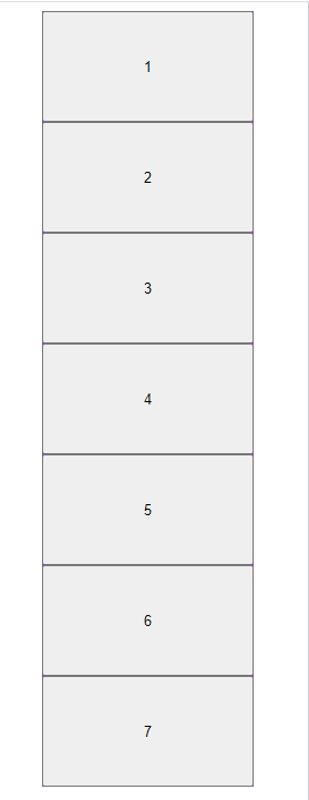
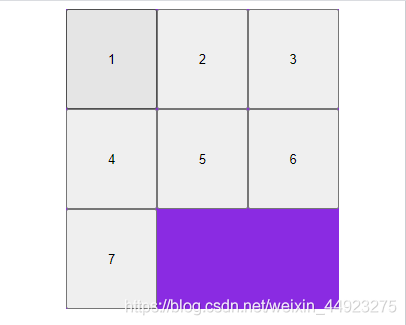
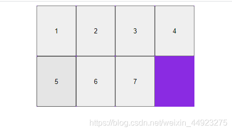
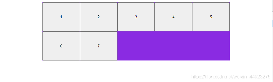
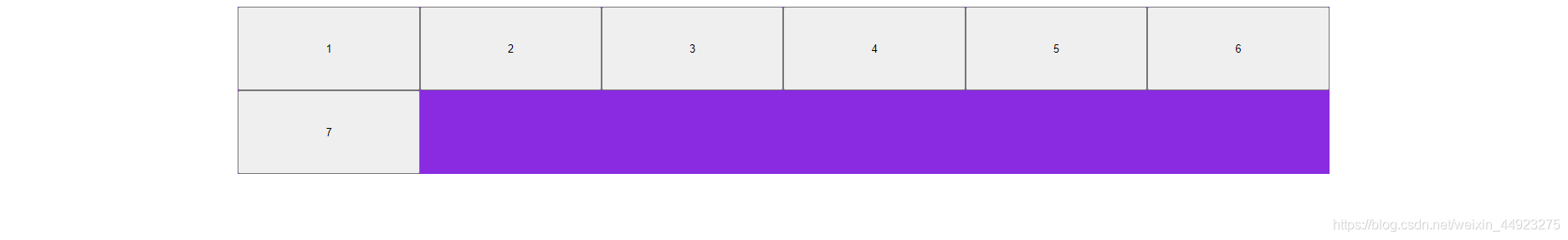
结果展示:
实现思路:
· 媒体查询 来实现适配不同尺寸屏幕
· flex 来实现多行多列
代码如下:
        .father {
            display: flex;
            flex-wrap: wrap;
            width: 70%;
            margin: auto;
            background-color: blueviolet;
        }

        @media screen and (min-width: 100px) {
            .father button {
                width: 100%;
                height: 100px;
            }
        }

        @media screen and (min-width: 300px) {
            .father button {
                width: 33.33%;
                height: 100px;
            }
        }

        @media screen and (min-width: 414px) {
            .father button {
                width: 25%;
                height: 100px;
            }
        }

        @media screen and (min-width: 750px) {
            .father button {
                width: 20%;
                height: 100px;
            }
        }

        @media screen and (min-width: 1024px) {
            .father button {
                width: calc(100%/6);
                height: 100px;
            }
        }
    <div class="father">
        <button>1</button>
        <button>2</button>
        <button>3</button>
        <button>4</button>
        <button>5</button>
        <button>6</button>
        <button>7</button>
    </div>


 扫一扫
扫一扫


 6762
6762

 被折叠的 条评论
为什么被折叠?
被折叠的 条评论
为什么被折叠?
 到【灌水乐园】发言


