


写在前面
台风天,适合敲代码。前两天正好看到一个有意思的核密度图,使用的是seaborn绘制的。之前了解过这个包,但是一致没有去绘制相关的图,这次正好去学习一下相关的函数。
绘制结果如下所示:
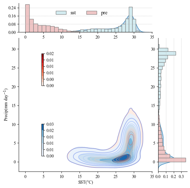
主要两个有意思的地方
- 在一张图上同时绘制两次填色图,一个有意思的实现
- 在核密度填色图的两侧分别绘制数量占比的柱形图
seaborn
seaborn是一个可以方便绘制多种图片的工具包,包括重叠密度(“山脊图”),带注释的热图,也包括本次分享的核密度图等
之前我绘图用的比较多的是第一选择为cartopy+matplotlib,第二次选是basemap+matploylib,第三次选为proplot,一般都是带投影的地图比较多。感觉seaborn可能更适用于不是投影的地图。
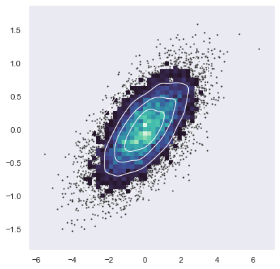
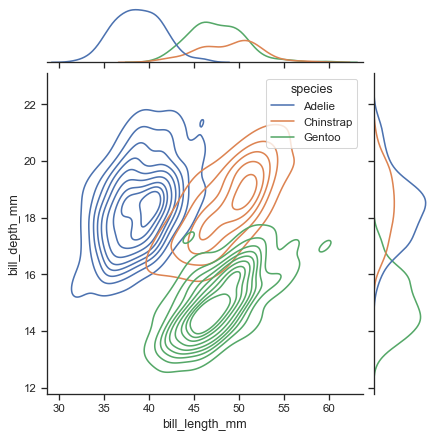
其官网也列举了一些示例,方便学习
- https://seaborn.pydata.org/examples/index.html
安装
安装非常方便,如果你使用的是anaconda的话,支持pip或者conda
- https://seaborn.pydata.org/installing.html
pip
pip install seaborn
conda
conda install seaborn
主要学习的例子来自官网:主要用到的两个绘图函数为 sns.kdeplot
- https://seaborn.pydata.org/examples/layered_bivariate_plot.html
和 sns.jointplot
- https://seaborn.pydata.org/examples/joint_kde.html
这里在官网的基础上读取了sst和gpcp月平均资料进行绘制
代码
import numpy as np
import xarray as xr
import seaborn as sns
import matplotlib.pyplot as plt
from matplotlib.gridspec import GridSpec
from mpl_toolkits.axes_grid1.inset_locator import inset_axes
from sklearn.preprocessing import MinMaxScaler
from matplotlib.ticker import FormatStrFormatter
from matplotlib.ticker import MaxNLocator

# 读取 NetCDF 文件
pre_path = r'I://precip.mon.mean.nc'
sst_path = r'I://sst.mon.mean_2016-2020.nc'
ds = xr.open_dataset(pre_path).sortby('lat')
da = xr.open_dataset(sst_path).sortby('lat')

# 选择时间和经纬度范围,并进行插值和填充 NaN 值
pre = (ds.sel(time=slice('2016-01-01', '2020-12-01'), lat=slice(-40, 40),
             lon=slice(100, 180)).precip.interp(lat=np.arange(-40, 40+2.5, 2.5),
                                                lon=np.arange(100, 120+2.5, 2.5))).interpolate_na(dim='time', method="linear", fill_value="extrapolate")
sst = da.sel(time=slice('2016-01-01', '2020-12-01'), lat=slice(-40, 40), lon=slice(100, 180)).sst.interp(lat=np.arange(-40, 40+2.5, 2.5),
                                                lon=np.arange(100, 120+2.5, 2.5)).interpolate_na(dim='time', method="linear", fill_value="extrapolate")

# 提取第一个和最后一个时间点的数据
x1 = sst.sel(time=slice( '2016-01-01', '2017-12-01'   )).values.flatten()
y1 = pre.sel(time=slice( '2016-01-01', '2017-12-01'   )).values.flatten()
x2 = sst.sel(time=slice( '2018-01-01', '2019-12-01'   )).values.flatten()
y2 = pre.sel(time=slice( '2018-01-01', '2019-12-01'   )).values.flatten()

plt.rcParams['font.family'] = 'Times New Roman'
# 创建图形和 GridSpec
fig = plt.figure(figsize=(15, 10), dpi=300)


g = sns.jointplot(
    x=x1, y=y1,
    fill=True,
    levels=11,
    kind="kde",
    cmap="Reds",
    marginal_ticks=True,
    dropna=True,
    joint_kws={'gridsize':100},
    ratio=4,
    zorder=1
    ,
    # 设置 hist 图参数
)

sns.kdeplot(x=x1, y=y1,
            # fill=True,
            levels=11,
            cmap="coolwarm",
             alpha=0.5,
             ax=g.ax_joint)

sns.kdeplot(x=x2, y=y2,
            fill=True,
            levels=6,
             cmap="Blues",
             ax=g.ax_joint) # 在主图上叠加第二组数据的 kde

_ = g.ax_marg_x.hist(x1, bins=20, color="#D3EBF0", edgecolor='gray', label='sst',density=True)
_ = g.ax_marg_x.hist(y1, bins=20, color="#EEC5C5", edgecolor='gray', label='pre',density=True)
_ = g.ax_marg_y.hist(x2, bins=20, color="#D3EBF0", orientation="horizontal", edgecolor='gray', label='2018-2019 X',density=True)
_ = g.ax_marg_y.hist(y2, bins=20, color="#EEC5C5", orientation="horizontal", edgecolor='gray', label='2018-2019 Y',density=True)

# 第一个bar图
g.ax_marg_x.tick_params(labelbottom=True)
g.ax_marg_x.tick_params(labelleft=True)
g.ax_marg_x.grid(True, axis='y', ls=':')
g.ax_marg_x.yaxis.set_major_locator(MaxNLocator(4))

# 第2个bar图

g.ax_marg_y.tick_params(labeltop=False)
g.ax_marg_y.tick_params(labelleft=True)
g.ax_marg_y.grid(True, axis='x', ls=':')
g.ax_marg_y.xaxis.set_major_locator(MaxNLocator(4))

# 设置colorbat的位置 | 显示标签的有效数值
axins1 = inset_axes(g.ax_joint, width="15%", height="60%", loc='upper right', bbox_to_anchor=(0.1, 0.5, 0.1, 0.4), bbox_transform=g.ax_joint.transAxes)
axins2 = inset_axes(g.ax_joint, width="15%", height="60%", loc='lower right', bbox_to_anchor=(0.1, 0.1, 0.1, 0.4), bbox_transform=g.ax_joint.transAxes)

cbar1 = plt.colorbar(g.ax_joint.collections[0], cax=axins1, orientation="vertical")
cbar2 = plt.colorbar(g.ax_joint.collections[2], cax=axins2, orientation="vertical")
cbar1.formatter = FormatStrFormatter('%.2f')
cbar2.formatter = FormatStrFormatter('%.2f')
cbar1.update_ticks()
cbar2.update_ticks()

# 设置轴标签
g.set_axis_labels("SST(°C)", "Precip(mm day$^{-1}$)")


# 添加图例
g.ax_marg_x.legend(loc='upper right',frameon=False,bbox_to_anchor=(0.7, 0.9),ncol=2,prop={'size': 'large'},)


plt.show()
数据地址
相关具体的python文件以及代码放到了GitHub网址:
文件名称为:python-核密度图.ipynb
- https://github.com/Blissful-Jasper/jianpu_record


 1万+
1万+

 被折叠的 条评论
为什么被折叠?
被折叠的 条评论
为什么被折叠?
 到【灌水乐园】发言


