


01 数据样式
这是数据样式:
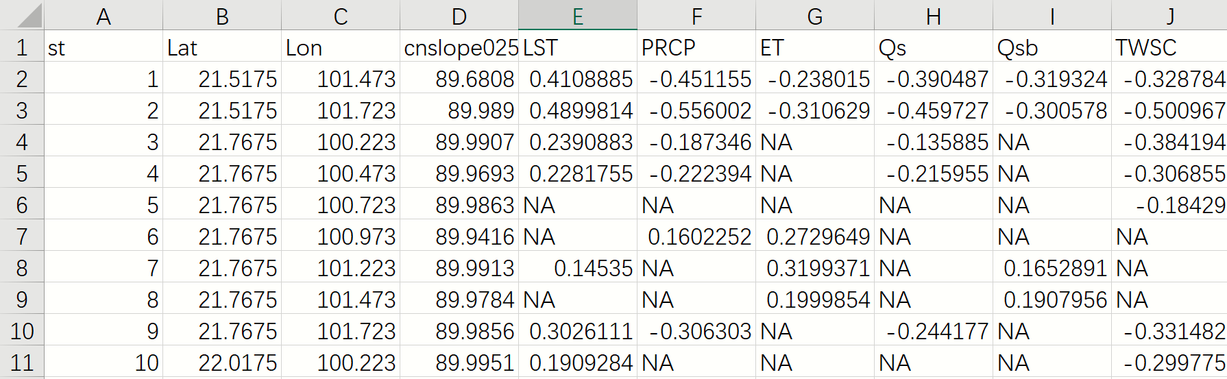
要求(我就懒得再复述一遍了,直接贴图):

Note:数据中存在无效值NA(包括后续的DEM),需要注意
02 提取DEM
这里我就使用gdal去提取一下DEM列,思路很简单:
首先,提取DEM(GCS_WGS_84)栅格矩阵以及仿射参数,主要是角点经纬度(代码中是左上角经纬度)和经纬度分辨率。接着依据excel中存在的
Lat和Lon列在栅格矩阵中对应的行列号,最后通过行列号检索出所有excel行在栅格矩阵中对应的DEM栅格值。
代码如下:
import numpy as np
import pandas as pd
from osgeo import gdal

# 准备
in_path = r'H:\Datasets\Objects\Veg\Plot\cor_by_st.csv'
dem_path = r'H:\Datasets\Objects\Veg\DEM\dem_1km.tif'

# 加载数据
df = pd.read_csv(in_path)
dem = gdal.Open(dem_path)
dem_raster = dem.GetRasterBand(1).ReadAsArray()  # 获取dem栅格矩阵
dem_nodata_value = dem.GetRasterBand(1).GetNoDataValue()  # 获取无效值
lon_ul, lon_res, _, lat_ul, _, lat_res_negative = dem.GetGeoTransform()  # [左上角经度, 经度分辨率, 旋转角度, 左上角纬度, 旋转角度, -纬度分辨率]
lat_res = -lat_res_negative

# 添加DEM列
cols = np.floor((df['Lon'] - lon_ul) / lon_res).astype(int)
rows = np.floor((lat_ul - df['Lat']) / lat_res).astype(int)
df['DEM'] = dem_raster[rows, cols]
df[df['DEM'] == dem_nodata_value] = np.nan
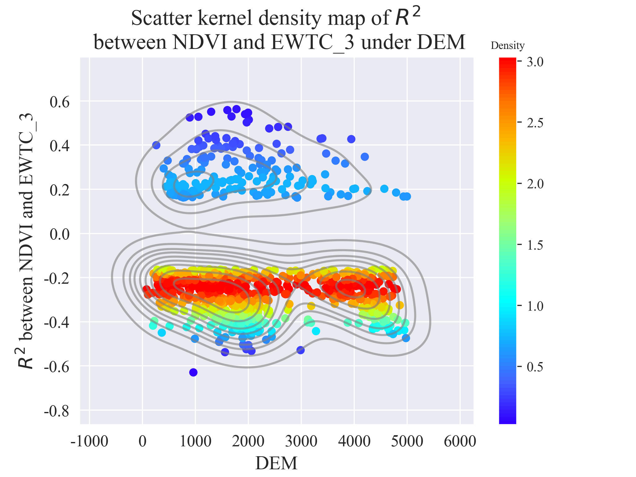
03 绘制核密度散点图
由于matplotlib模块绘制的图需要精调一些参数才会好看,这里直接使用seaborn模块配合matplotlib进行绘制。
由于各个变量都需要与DEM绘制一幅散点核密度图,因此需要循环各个变量。
iter_columns_name = df.columns[4:]
for column_name in iter_columns_name:
	plt.figure(dpi=321)
    cur_ds = df[['DEM', column_name]].dropna(how='any')
    cur_ds['Density'] = gaussian_kde(cur_ds[column_name])(cur_ds[column_name])

    scatter = plt.scatter(x='DEM', y=column_name, c='Density', cmap=cm, linewidth=0, data=cur_ds)
    # scatter = sns.scatterplot(x='DEM', y=column_name, hue='Density', palette='viridis', linewidth=0, data=cur_ds)
    clb = plt.colorbar(scatter)
    clb.ax.set_title('Density', fontsize=8)  # 为色带添加标题
    sns.kdeplot(x='DEM', y=column_name, fill=False, color='gray', data=cur_ds, alpha=0.6)
    title_name = 'Scatter kernel density map of $R^2$ \n between NDVI and {} under DEM'.format(column_name)
    plt.title(title_name, fontsize=16)
    plt.xlabel('DEM', fontsize=14)
    plt.ylabel('$R^2$ between NDVI and {}'.format(column_name), fontsize=14)
    plt.xticks(fontsize=12)
    plt.yticks(fontsize=12)
    plt.show()
绘制的结果如下:
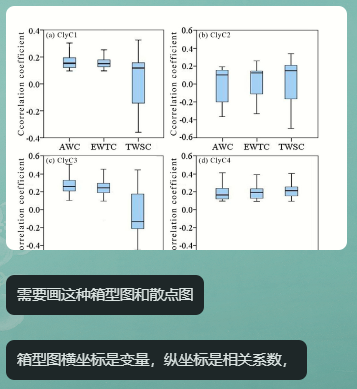
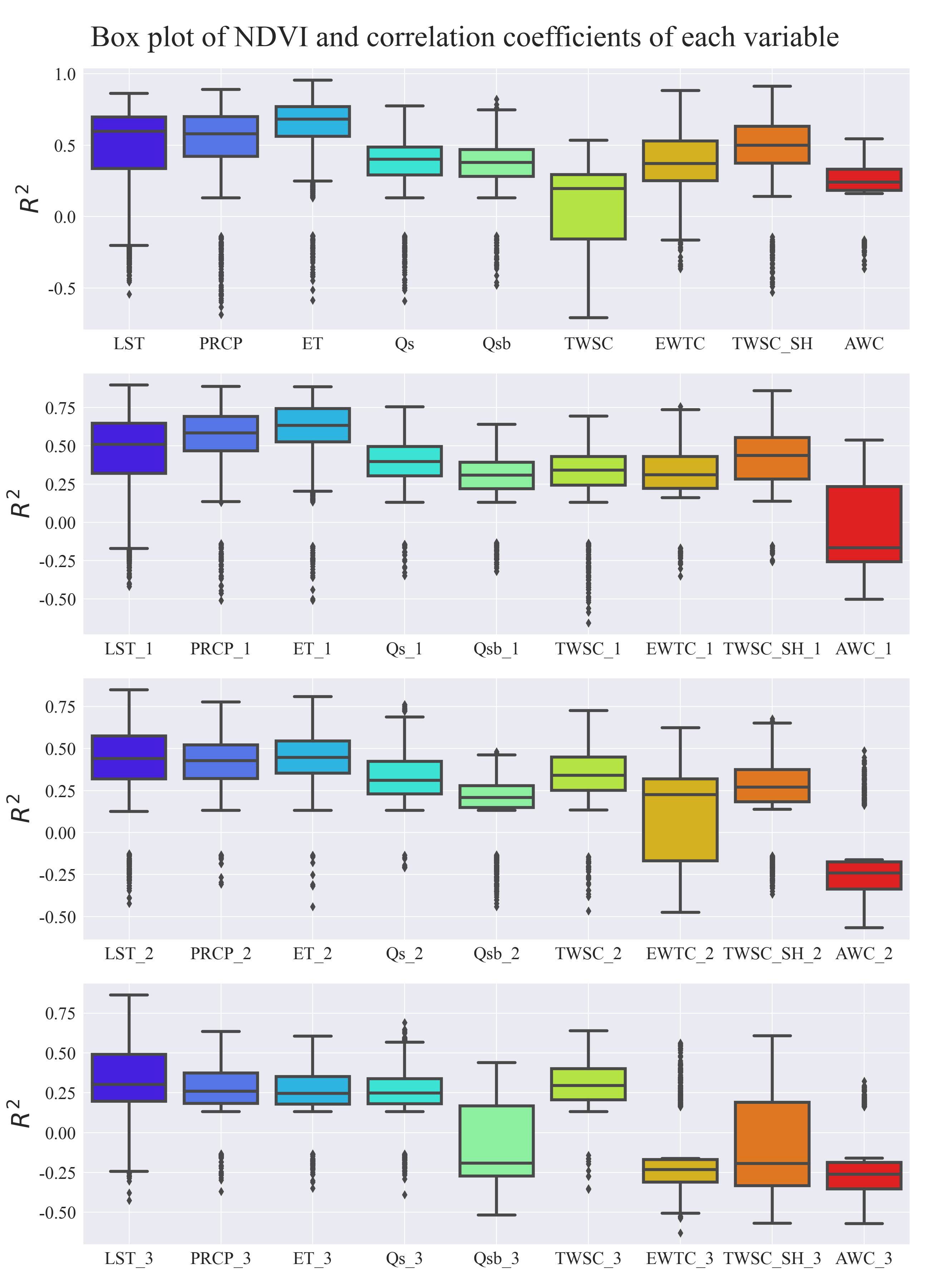
04 绘制箱线图
箱线图由于变量太多太长了,所以分割成几个子图进行绘制了,如下:
# 绘制箱线图
fig, axs = plt.subplots(4, 1, figsize=(13, 18), dpi=200)
axs = axs.flatten()
fig.suptitle('Box plot of NDVI and correlation coefficients of each variable', fontsize=30, va='top')
for ix, ax in enumerate(axs):
    # ax.figure(figsize=(26, 9), dpi=321)
    df_melt = pd.melt(df, value_vars=iter_columns_name[(ix * 9):((ix + 1) * 9)]).dropna(how='any')
    sns.boxplot(data=df_melt, x='variable', y='value', palette=cm(np.linspace(0, 1, 9)), ax=ax, linewidth=3)
    ax.set_xlabel('', fontsize=25)
    ax.set_ylabel('$R^2$', fontsize=25)
    ax.tick_params(axis='x', labelsize=18)  # x轴标签旋转90度
    ax.tick_params(axis='y', labelsize=18)
    ax.grid(True)
plt.tight_layout(pad=2)
fig.savefig(os.path.join(out_dir, 'Box_R2.png'))
plt.show()
绘制的箱线图如下:
05 完整代码
# @Author   : ChaoQiezi
# @Time     : 2024/3/11  18:58
# @Email    : chaoqiezi.one@qq.com

"""
This script is used to 是用来绘图滴,主要是箱线图和核密度散点图
"""

import os
import numpy as np
import pandas as pd
import matplotlib.pyplot as plt
from scipy.stats import gaussian_kde
import seaborn as sns
from osgeo import gdal
from matplotlib.colors import LinearSegmentedColormap

# 准备
in_path = r'H:\Datasets\Objects\Veg\Plot\cor_by_st.csv'
dem_path = r'H:\Datasets\Objects\Veg\DEM\dem_1km.tif'
out_dir =r'H:\Datasets\Objects\Veg\Plot'
sns.set_style('darkgrid')  # 设置风格
plt.rcParams['font.sans-serif'] = ['Times New Roman']
plt.rcParams['axes.unicode_minus'] = False  # 允许负号正常显示

# 加载数据
df = pd.read_csv(in_path)
dem = gdal.Open(dem_path)
dem_raster = dem.GetRasterBand(1).ReadAsArray()  # 获取dem栅格矩阵
dem_nodata_value = dem.GetRasterBand(1).GetNoDataValue()  # 获取无效值
lon_ul, lon_res, _, lat_ul, _, lat_res_negative = dem.GetGeoTransform()  # [左上角经度, 经度分辨率, 旋转角度, 左上角纬度, 旋转角度, -纬度分辨率]
lat_res = -lat_res_negative
iter_columns_name = df.columns[4:]
# 色带
colors = ['#ff0000', '#ff6f00', '#fbb700', '#cdff00', '#a1ff6e', '#52ffc7', '#00ffff', '#15acff', '#4261ff', '#3100fe']
colors.reverse()
cm = LinearSegmentedColormap.from_list('common', colors, 100)

# 添加DEM列
cols = np.floor((df['Lon'] - lon_ul) / lon_res).astype(int)
rows = np.floor((lat_ul - df['Lat']) / lat_res).astype(int)
df['DEM'] = dem_raster[rows, cols]
df[df['DEM'] == dem_nodata_value] = np.nan
# 绘制散点核密度图
for column_name in iter_columns_name:
    plt.figure(dpi=321)
    cur_ds = df[['DEM', column_name]].dropna(how='any')
    cur_ds['Density'] = gaussian_kde(cur_ds[column_name])(cur_ds[column_name])

    scatter = plt.scatter(x='DEM', y=column_name, c='Density', cmap=cm, linewidth=0, data=cur_ds)
    # scatter = sns.scatterplot(x='DEM', y=column_name, hue='Density', palette='viridis', linewidth=0, data=cur_ds)
    clb = plt.colorbar(scatter)
    clb.ax.set_title('Density', fontsize=8)  # 为色带添加标题
    sns.kdeplot(x='DEM', y=column_name, fill=False, color='gray', data=cur_ds, alpha=0.6)
    title_name = 'Scatter kernel density map of $R^2$ \n between NDVI and {} under DEM'.format(column_name)
    plt.title(title_name, fontsize=16)
    plt.xlabel('DEM', fontsize=14)
    plt.ylabel('$R^2$ between NDVI and {}'.format(column_name), fontsize=14)
    plt.xticks(fontsize=12)
    plt.yticks(fontsize=12)
    plt.savefig(os.path.join(out_dir, 'R2_{}.png'.format(column_name)))
    plt.show()
# 绘制箱线图
fig, axs = plt.subplots(4, 1, figsize=(13, 18), dpi=200)
axs = axs.flatten()
fig.suptitle('Box plot of NDVI and correlation coefficients of each variable', fontsize=30, va='top')
for ix, ax in enumerate(axs):
    # ax.figure(figsize=(26, 9), dpi=321)
    df_melt = pd.melt(df, value_vars=iter_columns_name[(ix * 9):((ix + 1) * 9)]).dropna(how='any')
    sns.boxplot(data=df_melt, x='variable', y='value', palette=cm(np.linspace(0, 1, 9)), ax=ax, linewidth=3)
    ax.set_xlabel('', fontsize=25)
    ax.set_ylabel('$R^2$', fontsize=25)
    ax.tick_params(axis='x', labelsize=18)  # x轴标签旋转90度
    ax.tick_params(axis='y', labelsize=18)
    ax.grid(True)
plt.tight_layout(pad=2)
fig.savefig(os.path.join(out_dir, 'Box_R2.png'))
plt.show()


 723
723

 被折叠的 条评论
为什么被折叠?
被折叠的 条评论
为什么被折叠?
 到【灌水乐园】发言


