


 本文深入探讨了CSS中负margin的原理及其在布局中的应用,包括如何利用负margin实现图片与文字对齐、自适应两列布局以及元素的垂直居中。通过具体实例展示了负margin如何影响普通文档流元素和浮动元素。
一. 原理解释
当margin为负数时,对普通文档流元素和浮动元素的影响是不同的。负margin元素对普通流文档元素的影响分为两种情况。
- 当margin-top或者margin-left为负数时,‘当前元素’会被拉向指定的方向。
- 当margi-bottom或者margin-right为负数时,‘后续元素’会被拉拉向指定的方向。
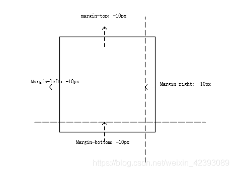
margin-top和margin-left都是将当前元素拉出,然后覆盖其他元素。margin-right和
margin-bottom是将后续元素拉入覆盖当前元素。
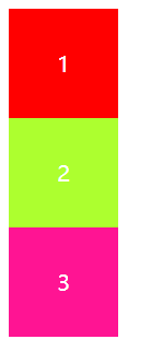
来看一段代码
<!DOCTYPE html>
<html lang="en">
<head>
    <meta charset="UTF-8">
    <title>负margin技术</title>
    <style>
        .wrapper{
            width: 500px;
            height: 90px;
            color: white;
            font-size: 20px;
            text-align: center;
            line-height: 100px;
        }
        .first{
           background-color:  red;
            height: 100px;
            width: 100px;
        }
        .second{
            background-color:  greenyellow;
            height: 100px;

            width: 100px;
        }
        .third{
            background-color:  deeppink;
            height: 100px;
            width: 100px;
        }
    </style>
</head>
<body>
<div class="wrapper">
    <div class="first">1</div>
    <div class="second">2</div>
    <div class="third">3</div>
</div>
</body>
</html>
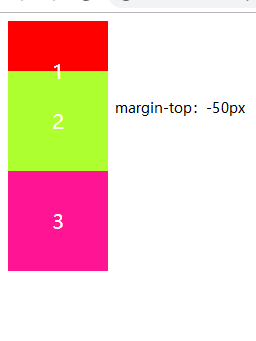
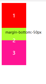
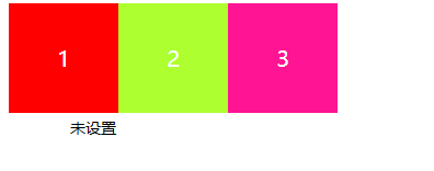

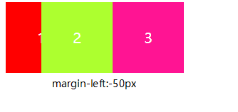
总结:从图中可以看出margin-right和margin-bottom的操作方式都是将后一块元素往前一块拉动覆盖当前块元素。margin-top和margin-left都是将本块元素拉动去覆盖其他元素。
技巧使用
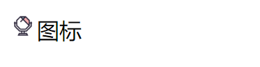
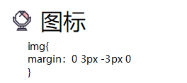
图片与文字对齐
当图片和文字放在一起时,图片和文字往往是对不起的,这是因为图片和文字默认为基线对齐。如果要想图片和文字基线(vertical-aligin:baseline)对齐有两种方法
- vertical-aligin:text-bottom
*用margin设置
默认情况
<!DOCTYPE html>
<html lang="en">
<head>
    <meta charset="UTF-8">
    <title>图片与文字对齐</title>
    <style>
        img{
            height: 20px;
            /*margin: 0 3px -3px 0;*/
            /*vertical-align: text-bottom;*/
        }
    </style>
</head>
<body>
<img src="./img/镜子.png" alt="">图标
</body>
</html>
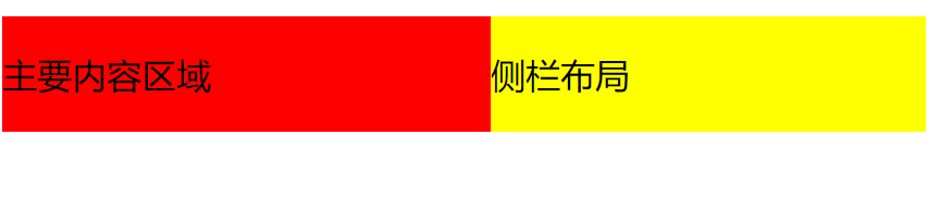
自适应两列布局
自适应两列布局是指在左右两列中,其中一列的宽度自适应,另外一列的宽度是固定的。float一般只使用于固定布局。
<!DOCTYPE html>
<html lang="en">
<head>
    <meta charset="UTF-8">
    <title>自适应两列布局</title>
    <style>
        .content,
        .sidebar{
            float: left;
        }
        .content{
            width: 100%;
            margin-right: -200px;
            background-color: red;
        }
     .sidebar{
         width: 200px;
         background-color: yellow;
     }
    </style>
</head>
<body>
<div class="wrapper">
    <div class="content"><p>主要内容区域</p></div>
    <div class="sidebar"><p>侧栏布局</p></div>
</div>
</body>
</html>
元素垂直居中
首先我们需要给父元素设置position:relative,这样再给子元素添加position:absolute来实现
父元素{
position:relative
}
子元素{
position:absolute
top:50%
left:50%
margin-top:“负的height的一半值”
margin-left:“负的width的一半值”
}
<!DOCTYPE html>
<html lang="en">
<head>
    <meta charset="UTF-8">
    <title>title</title>
    <style>
        .wrapper{
            height: 300px;
            width: 300px;
           border: solid 1px black;
            position: relative;
        }
        .box{
            height: 50px;
            width: 50px;
            background-color: red;
            position: absolute;
            top: 50%;
            left: 50%;
            margin-top: -25px;
            margin-left: -25px;
        }
    </style>
</head>
<body>
<div class="wrapper">
    <div class="box"></div>
</div>
</body>
</html>
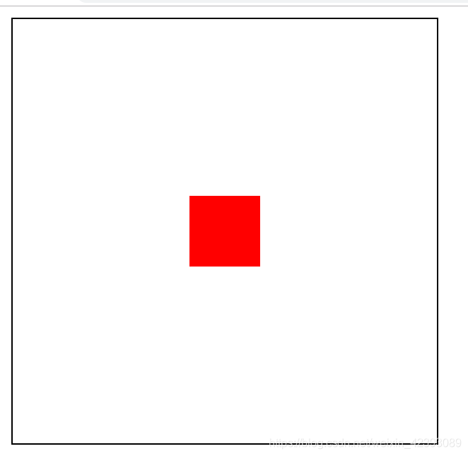
这种方法是万能的可以适用于block,inline-block,inline元素。


 扫一扫
扫一扫


 5983
5983

 被折叠的 条评论
为什么被折叠?
被折叠的 条评论
为什么被折叠?
 到【灌水乐园】发言


