


目的:从彩色图变黑白图
思路:
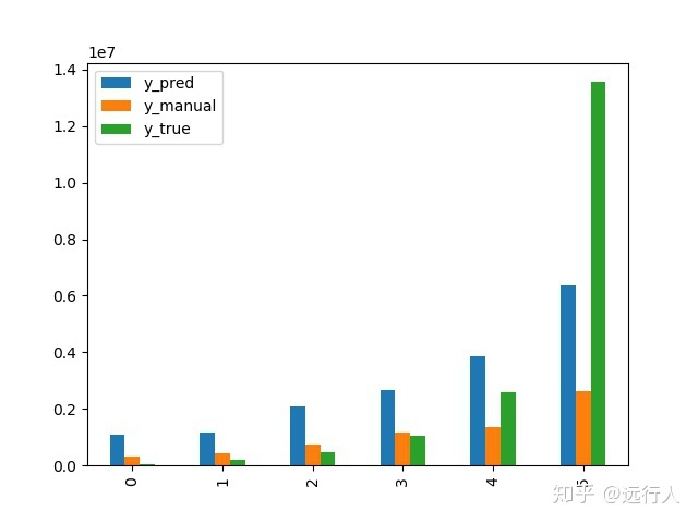
我到要出图这步骤时,是pandas的dataframe。
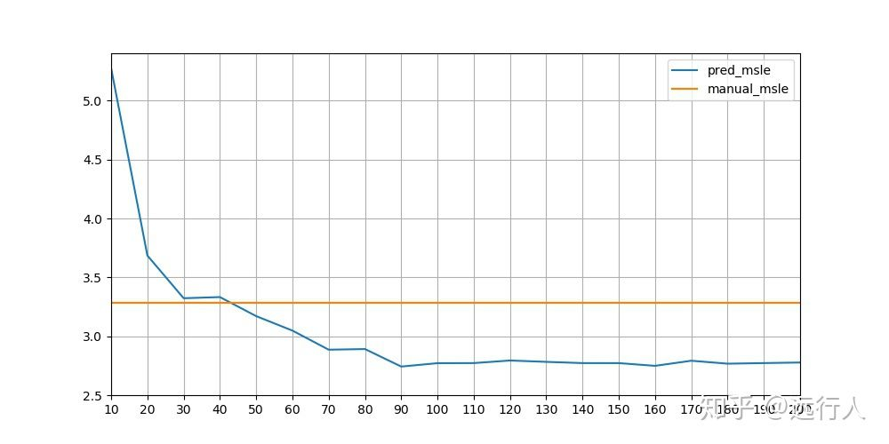
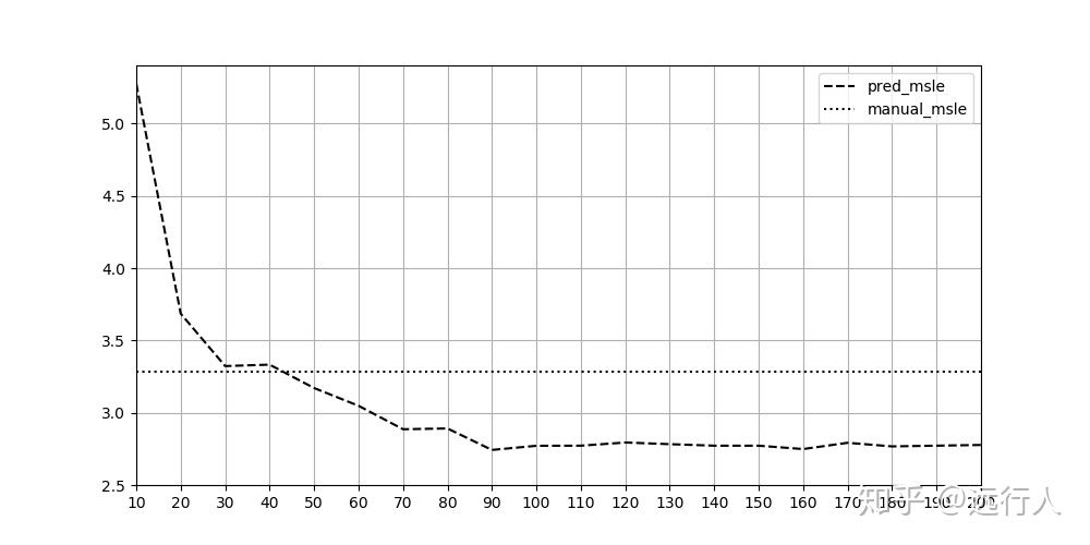
如果是要出曲线图,则直接在df.plot里改参数style即可。就能出图4。
fig = df.plot(kind='line', color='k', style=['--', ':', '-']
fig.savefig(r'xx/xxx/xx/xxx.jpg')
其中线性共有这些选项: ‘-’, ‘–’, ‘-.’, ‘:’, ‘None’, ’ ', ‘’, ‘solid’, ‘dashed’, ‘dashdot’, ‘dotted’
其实总共就4种,‘solid’, ‘dashed’, ‘dashdot’, ‘dotted’ 就是 ‘-’, ‘–’, ‘-.’, ‘:’。
如果你要用4中以上,资料显示可以调整黑白程度,就可以无数种。
fix,ax = plt.subplots()
ax.set_prop_cycle(
    cycler(color=[(.8,.8,.8), (.5,.5,.5), (.2,.2,.2)]) *
    cycler(linestyle=['-', '--', '-.'])
    ) #repeats after 9 columns

df.plot(ax=ax)
详见:https://stackoverflow.com/questions/62500859/how-to-have-black-white-gray-shade-lines-in-pandas-dataframe-plot
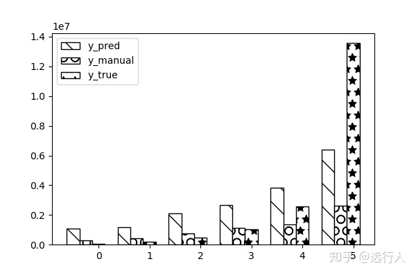
但柱状图就不能用df.plot简单改动就可以了。我查了较多资料,自己也百般尝试也不成。只能用plt一点一点加上:
width = 0.25
location = np.arange(6)
name_list = range(6)

plt.figure(figsize=(6, 4))

## ('-', '+', 'x', '\\', '*', 'o', 'O', '.')

plt.bar(
    location + width * 0,
    df_sum['y_pred'],
    tick_label = name_list,
    width = width,
    label="y_pred",
    # alpha=0.8,
    color="w",
    edgecolor="k",
    hatch='\\'
  )

plt.bar(
    location + width * 1,
    df_sum['y_manual'],
    tick_label = name_list,
    width = width,
    label="y_manual",
    # alpha=0.8,
    color="w",
    edgecolor="k",
    hatch="O"
  )

plt.bar(
    location + width * 2,
    df_sum['y_true'],
    tick_label = name_list,
    width = width,
    label="y_true",
    # alpha=0.8,
    color="w",
    edgecolor="k",
    hatch="*"
  )

# plt.ylim(0,1)
plt.legend(loc=2)
# plt.legend(loc='lower right', fontsize=40)
plt.show()
详见:https://blog.youkuaiyun.com/qq_37616870/article/details/80107545


 688
688

 被折叠的 条评论
为什么被折叠?
被折叠的 条评论
为什么被折叠?
 到【灌水乐园】发言


