


import pandas as pd
import matplotlib.pyplot as plt
plt.rcParams['font.sans-serif'] = ['SimHei'] # 指定默认字体 SimHei为黑体
'''
筛选数据
'''
cell = pd.read_csv(r'D:\data\python_examlples\highway85\highway_speed_202407.csv')
user_cols = ['TIMESTAMP', 'ROAD_ID', 'SPEED', 'SOURCE']
cell = cell[user_cols]
cell_5 = cell[(cell['SOURCE'] == 5) & (cell['ROAD_ID'] == 32699)]
'''
排序,取分位数
'''
cell_5 = cell_5.sort_values(by='SPEED')
p85 = cell_5['SPEED'].quantile(0.85)
'''
设置索引
'''
cell_5 = cell_5.reset_index(drop=True) # 重新生产索引
cell_5 = cell_5.reset_index(drop=False) # 将新的索引作为一列加入dataframe
'''
作图
'''
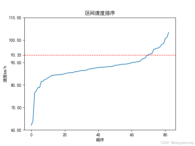
ax = line = cell_5.plot(x='index', y='SPEED', title='区间速度排序', legend=False)
plt.xlabel('顺序')
plt.ylabel('速度km/h')
ax.axhline(y=p85, linewidth=1, color='r', linestyle='--') # 增加水平线
yticks = list(range(60, 120, 10))
yticks.append(p85)
ax.set_yticks(yticks)
plt.show()
效果图如下:


 822
822

 被折叠的 条评论
为什么被折叠?
被折叠的 条评论
为什么被折叠?
 到【灌水乐园】发言


