


前言:本文源起于产品说要做一个甘特图。
甘特图作为一种时间管理工具,在项目管理中有着广泛的应用。对比传统的列表视图,它通过图形化的方式展示任务的进度和时间范围,更加直观,日期调整交互更方便,能更好的避免任务重叠和时间冲突。
产品主要需求
1.分为左右面板,左侧为树形表格结构展现id,名称等基本信息,可展开折叠,右侧为甘特图。左右面板可调整宽度
2.为了便于修改日期:小横条可整行横向拖动,可按住一段拉长或缩短。用户调整后需要自适应坐标格子(不能出现半格的情况)
3.按日/周/月/季度/年查看
说干就干,立马去找轮子。
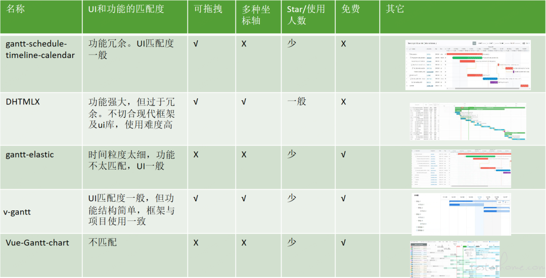
坏消息,无可直接用的工具库,好消息,v-gantt的ui和功能比较贴近,并且整体项目简洁,可借鉴实现思路。
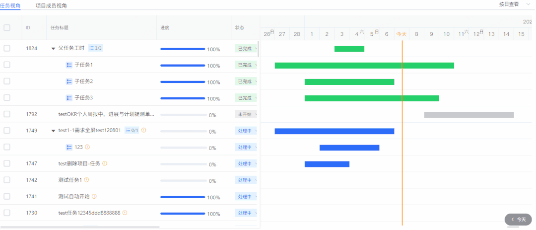
先展示一下完成后的效果:
实现思路
1.左右面板,可调整宽度 -> 整体=普通表格+甘特图
①. 问题:既然分成了两部分,那么如何同步两边的状态(某项是折叠还是展开,hover高亮,滚动同步)
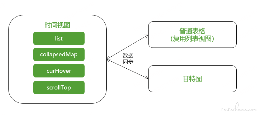
字段说明:
list - 列表数据
collapsedMap – 树形结构中展开折叠的状态。监听三角形的点击事件,折叠则记录 id
curHover – 当前 hover 高亮的 id
scrollTop – 滚动的高度
②. 面板大小调整的实现
<div class="container">
  <div class="container-left">
    ...
  </div>

  <div class="resize"></div>

  <div class="container-right">
  ...
  </div>
</div>


<script>
const dragResize = function () {
  const resizeEl = document.querySelector(".resize");
  const leftEl = document.querySelector(".container-left");
  const rightEl = document.querySelector(".container-right");
  const containerEl = document.querySelector(".container");

  resizeEl.onmousedown = function (e) {
    resizeEl.classList.add("active");
    const startX = e.clientX;
    resizeEl.left = resizeEl.offsetLeft;

    document.onmousemove = function (e) {
      const endX = e.clientX;
      let moveLen = resizeEl.left + (endX - startX);

      if (moveLen < 380) moveLen = 380; // 左边区域的最小宽度为380px
      if (moveLen > 908) moveLen = 908; // 左边区域的最大宽度为908px

      resizeEl.style.left = moveLen + "px";
      leftEl.style.width = moveLen + "px";
      rightEl.style.width = (containerEl.clientWidth - moveLen - 10) + "px";
    };

    document.onmouseup = function (evt) {
      resizeEl.classList.remove("active");
      document.onmousemove = null;
      document.onmouseup = null;
      resizeEl.releaseCapture && resizeEl.releaseCapture();
    };
    resizeEl.setCapture && resizeEl.setCapture();
    return false;
  };
};
</script>


<style>
.container {
  display: flex;
  height: 100%;
  overflow: hidden;
  position: relative;
}

.container-left {
  width: calc(50% - 1px);
  box-shadow: 1px 0 4px rgba(0, 0, 0, 0.1%);
}

.container-right {
  margin-left: 2px;
  width: calc(50% - 1px);
}

.resize {
  position: absolute;
  top: 0;
  bottom: 0;
  left: calc(50% - 1px);
  width: 2px;
  height: 100%;
  cursor: col-resize;
  z-index: 10;
}

.resize:hover,
.resize.active {
  background-color: #2d6cf9;
}
</style>
2. 普通表格比较简单,重点关注右侧的甘特图部分。
可拖动,可调整长短 -> 两个图层(时间坐标轴+可拖动的小横条)
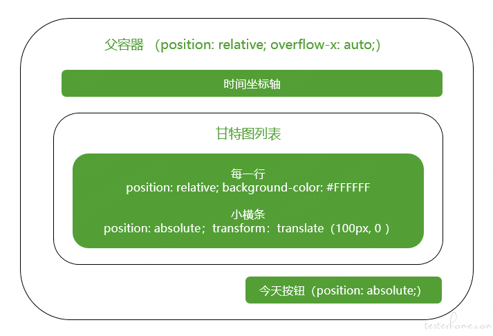
坐标轴就是用dayjs 去生成然后展示即可。
// gantt中日期的生成函数
import dayjs from "dayjs";
import { generateUUID } from "@/common/utils.js";

/**
 * 年-半年模式gantt标题
 */
export function yearTitleDate (start, end) {
  const start_year = dayjs(start).year();
  const end_year = dayjs(end).year();

  const list = [];
  for (let i = start_year; i <= end_year; i++) {
    list.push({
      name: `${i}年`,
      id: generateUUID(),
      children: [{
        name: `${i}上半年`,
        range: [dayjs(`${i}-01-01`).format("YYYY-MM-DD"), dayjs(`${i}-06-30`).format("YYYY-MM-DD")],
        id: generateUUID()
      }, {
        name: `${i}下半年`,
        range: [dayjs(`${i}-07-01`).format("YYYY-MM-DD"), dayjs(`${i}-12-31`).format("YYYY-MM-DD")],
        id: generateUUID()
      }]
    });
  }

  return list;
}

/**
 * 年-季度模式gantt标题
 */
export function quarterTitleDate (start, end) {
  const start_year = dayjs(start).year();
  const start_month = dayjs(start).month() + 1;
  const end_year = dayjs(end).year();
  const end_month = dayjs(end).month() + 1;

  // 处理年份
  const year_diff = end_year - start_year;
  if (year_diff === 0) { // 年间隔为同一年
    const quarters = generationQuarters(start_year, start_month, end_month + 1); // 处理月份
    return quarters;
  }
  // 处理开始年
  const start_quartes = generationQuarters(start_year, start_month, 12);

  // 处理结束年
  const end_quartes = generationQuarters(end_year, 1, end_month + 1);

  // 间隔一年
  if (year_diff === 1) {
    return start_quartes.concat(end_quartes);
  }

  // 年间隔大于1年
  if (year_diff > 1) {
    let quarters = start_quartes;
    for (let i = 1; i < year_diff; i++) {
      const item_year = start_year + i;
      const onYearQuart
最低0.47元/天 解锁文章


 680
680

 被折叠的 条评论
为什么被折叠?
被折叠的 条评论
为什么被折叠?
 到【灌水乐园】发言


