


Content views display custom app content. Because the look of most content views is not provided by the system, visual changes in iOS 7 have almost no effect on them. The main exception is the grouped-style table view, which has a significantly changed default appearance in iOS 7.
视图的内容展示的是应用的自定义内容。因为打多少的自定义视图看起来不是系统提供的,IOS7的视觉上的变化大多不会影响他们。最大的例外是分组风格的表格视图,它在IOS 7里面有一个非常明显的变化。
Activity
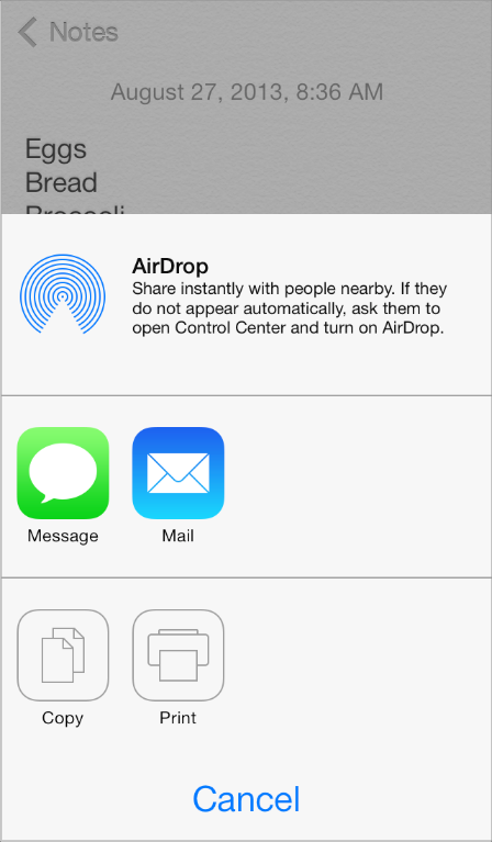
An activity represents a system-provided or custom feature that can act on the currently selected content. Users can access these features in the system-provided activity view controller that appears when they tap the Share button.
一个activity 代表了系统提供的或者自定义功能,可以作用在当前选中的内容。当点击分享按钮的时候,用户可以选择这些功能系统提供的活动视图控制器。
System-provided activities can use either of two icon styles:
系统提供两种 activities :
-
A style that looks like a fully rendered app icon—such as the Mail icon shown below 。看起来像完全使用应用图标。
-
A style that looks similar to a bar button item—such as the Copy and Print items shown below 。看起来像BAR上的按钮。
Third-party features always use the second style. 第三方的功能都是使用第二种风格。
To offer a service within your app, create a simple, streamlined template image that represents it and a short title that describes it. Follow these guidelines to create a template image that looks good in the activity view controller:
为在你应用里添加服务,创建一个简单的、流线型的图片来展示它,并且用简短的标题来描述它。下面是如何创建一个好的活动视图控制器的建议:
-
Use black or white with appropriate alpha transparency使用黑色或者白色并且带恰当的透明度
-
Don’t include a drop shadow 不要包含下投阴影
-
Use anti-aliasing 用图形保真
An activity template image should be centered in an area that measures about 70 x 70 pixels (high resolution).
活动模板图片应该在区域的中间,并且尺寸在 70*70 (高清)
Collection View
A collection view manages an ordered collection of items and presents them in a customizable layout.
集合视图,管理一批有序的集合,并且按自定义的布局来展示
In iOS 7, collection views support custom animated transitions between layouts. To learn more, seeUICollectionViewTransitionLayout Class Reference.
在IOS 7,集合视图支持多个布局之间的自定义的动画切换。要了解更多,请看seeUICollectionViewTransitionLayout Class Reference.
Photos uses collection views to display groups of photos and support transitions between them.
图片使用了集合视图来显示图片组,并且支持它们之间的切换。
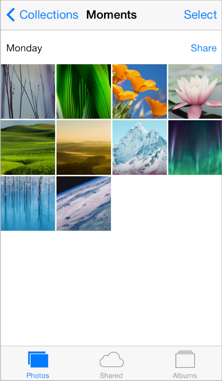
Image View
An image view displays one image or an animated series of images.
In iOS 7, UIImageView includes the tintColor property. When the image view contains a template image—that is, an image that specifies the UIImageRenderingModeAlwaysTemplate rendering mode—tintColor is applied to the image.
图片视图
图片视图显示一个图片或者一个动画序列上的图片。
在IOS 7, UIImageView 包含了 tintColor属性,当这个图片包含一个模板图片(指定了UIImageRenderingModeAlwaysTemplate 渲染模式的图片),tintColor会应用到图形。
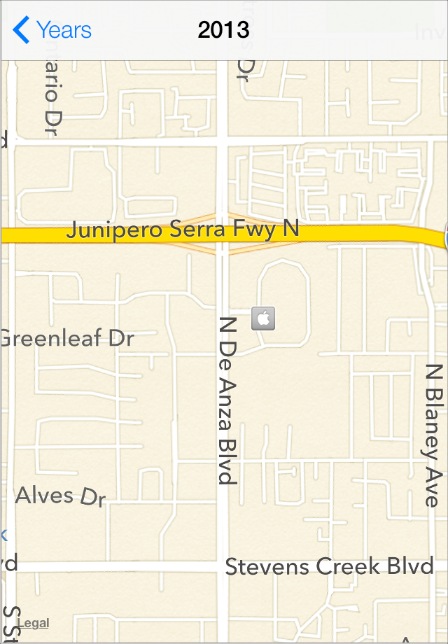
Map View
A map view presents geographical data and supports most of the features provided by the built-in Maps app.
Photos uses a map view to help users view location information for a photo.
地图视图将地理位置数据展示并且支持绝大多数的内置地图功能。相册使用了一个地图视图来帮助用户查看照片的地理位置。
In iOS 7, use the new MKOverlayRenderer class to create an overlay to draw on top of a map view.
To add a 3D appearance to a map view, assign a camera object—that is, an instance of MKMapCamera—to a map view’s camera property. To learn more, see MKMapView Class Reference.
在IOS 7,使用新的MKOverlayRenderer 类来创建地图的覆盖层。
如要增加3D展示到地图视图中,赋一个camera对象给MAP VIEW的 camera 属性。了解更多:MKMapView Class Reference.
Page View Controller
A page view controller manages multipage content using either a scrolling or page-curl transition style.
页面视图控制器管理了多页的内容(使用滑动翻页或者单页翻页的切换风格)
In iOS 7, use the pageViewControllerPreferredInterfaceOrientationForPresentation andpageViewControllerSupportedInterfaceOrientations methods to specify preferred and supported orientations, respectively.
在IOS 7里面,使用 XXX 和 YYY 两方法可以指定使用各自不同方向。
Below, you can see the default appearance of a page view controller in iOS 7 Simulator:
下面,你可以看到默认的页面控制器的展示:
Scroll View
A scroll view helps people see content that is larger than the scroll view’s boundaries.
The only visual difference in the scroll view between iOS 7 and iOS 6 is the appearance of the scroller.
ScrollView,可以让用户看到比如果边界更多的更多的内容。
IOS 6和IOS7 唯一的区别是,滚动条不一样了。
iOS 7
iOS 6
In iOS 7, you can manage scroll view insets yourself by using the automaticallyAdjustsScrollViewInsetsproperty of UIViewController.
在IOS 7,你可以管理滚动视图的insets ,使用automaticallyAdjustsScrollViewInsetsproperty 属性。 insets 是什么?这里的意思应该是往 Scrollview上面增加的子视图。
Table View
A table view presents data in a single-column list of multiple rows.
iOS 7 introduces several changes to the appearances of both plain and grouped table views.
表格视图展示了一列的多行数据。
IOS 7引入了多个显示上的变化,包括PLAIN类型和GROUPED类型。
iOS 7 (grouped table)
iOS 6 (grouped table
| Feature | Appearance in iOS 7 |
|---|---|
| Cell separator (both styles) | Separators in iOS 7 are thinner, narrower, and lighter in color than separators in iOS 6. By default, the separator is inset from the left edge of the table view when the cell contains text. |
| Section index (plain style) | By default, the section index includes a translucent white background (use the |
| Header and footer text (both styles) | By default, headers display text using all-capital letters; footers display text using sentence-style capitalization. You can use a custom |
| Cell group (grouped style) | Each group extends the full width of the screen. |
| Cell selection appearance | Noninverted content on a subtle gray background. |
| Background appearance (grouped style) | The background is a solid light gray. |
Table-view elements also have a different appearance in iOS 7.
表格元素的展示也不同了:
| Table-view element | Appearance in iOS 7 | Appearance in iOS 6 |
|---|---|---|
| Checkmark | | |
| Disclosure indicator | | |
| Detail Disclosure button | | |
| Row reorder | | |
| Row insert | | |
| Delete button control | | |
| Delete button | | |

Text View
A text view accepts and displays multiple lines of text.
Be sure to use the UIFont method preferredFontForTextStyle to get the text for display in a text view.
文本VIEW接受并显示多行文字。请务必使用 UIFont的preferredFontForTextStyle属性来获取显示在TEXT VIEW里面的文字。
Web View
A web view is a region that can display rich HTML content.
In iOS 7, UIWebView supports displaying content in a paginated layout.
WEB VIEW是用来展示HTML的。
在IOS 7,它支持显示分页布局


 扫一扫
扫一扫


 19
19

 被折叠的 条评论
为什么被折叠?
被折叠的 条评论
为什么被折叠?
 到【灌水乐园】发言


