


 本文介绍了Python数据可视化库matplotlib的使用,包括如何安装、基础用法、散点图和3D图形的绘制。通过实例展示了如何设置颜色、坐标轴范围、添加注释以及创建散点图和3D图形。
matplotlib
Matplotlib 是一个非常强大的 Python 画图工具;
支持图像:线图、散点图、等高线图、条形图、柱状图、3D 图形、甚至是图形动画
本文将会给大家介绍最常用的
散点图及3D图形
1.matplotlib 安装
首先 你得有一个python+pip
然后 升级安装工具(pip 是 Python 的包管理工具)
python -m pip install -U
pip setuptools
安装matplotlib
python -m pip install matplotlib
查看安装包
python -m pip list
2.基础用法
#使用import导入模块matplotlib.pyplot
import matplotlib.pyplot as plt
import numpy as np
#x:范围是(-1,1);个数是50
x = np.linspace(-1, 1, 50)
#y:一维数组
y = 2*x + 1
plt.figure()#定义一个图像窗口
plt.plot(x, y)#画(x ,y)曲线
plt.show()#显示图像

多次使用figure命令来产生多个图
#x:范围是(-3,3);个数是50
x = np.linspace(-3, 3, 50)
y1 = 2*x + 1
y2 = x**2
#创建第一个figure
plt.figure()
plt.plot(x, y1)
#创建第二个figure
plt.figure(num=3, figsize=(8, 5),)
plt.plot(x, y2)
plt.show()
一个figure多个参数
#figsize:图像窗口:编号为3;大小为(8, 5)
plt.figure(num=3, figsize=(8, 5),)
plt.plot(x, y2)
#color:曲线的颜色属性
#linewidth:曲线的宽度
#linestyle:曲线的类型
plt.plot(x, y1, color='red', linewidth=10, linestyle='--')
plt.show()

linestyle:曲线的类型
|
线条风格 |
描述 |
线条风格 |
描述 |
|
'-' |
实线 |
':'或'--' |
虚线 |
|
'–' |
破折线 |
'None' |
什么都不画 |
|
'-.' |
点划线 |
|
|
颜色
使用HTML十六进制字符串 color='#eeefff'
使用合法的HTML颜色名字(’red’,’chartreuse’等)。
也可以传入一个归一化到[0,1]的RGB元祖。 color=(0.3,0.3,0.4)
|
别名 |
颜色 |
别名 |
颜色 |
|
b |
蓝色 |
g |
绿色 |
|
r |
红色 |
y |
黄色 |
|
c |
青色 |
k |
黑色 |
|
m |
洋红色 |
w |
白色 |
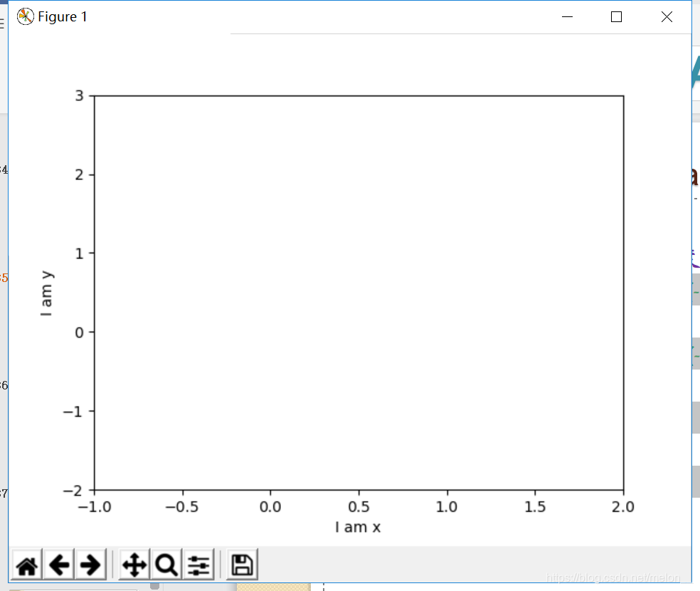
设置坐标轴的范围, 单位长度, 替代文字
#plt.xlim设置x坐标轴范围:(-1, 2)

plt.xlim((-1, 2))

#plt.ylim设置y坐标轴范围:(-2, 3)

plt.ylim((-2, 3))

#plt.xlabel设置x坐标轴名称:’I am x’

plt.xlabel('I am x')

#plt.ylabel设置y坐标轴名称:’I am y’

plt.ylabel('I am y')

plt.show()
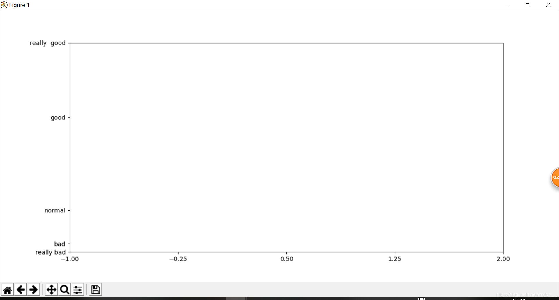
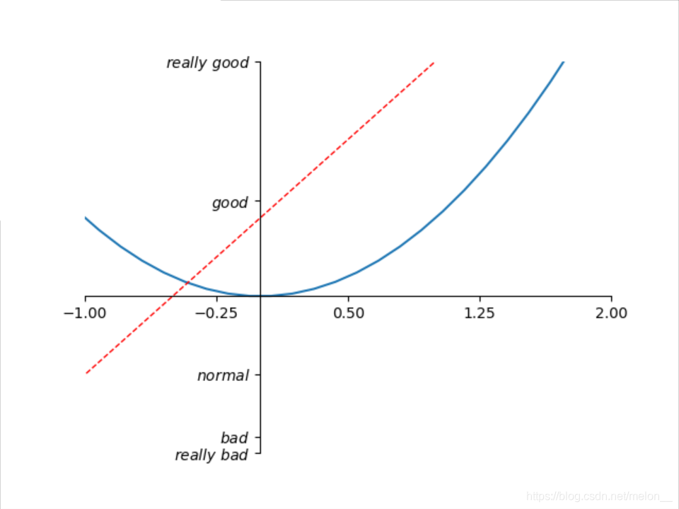
设置坐标轴
new_ticks = np.linspace(-1, 2, 5)
#plt.xticks设置x轴刻度:范围是(-1,2);个数是5
plt.xticks(new_ticks)
#设置y轴刻度以及名称:刻度为[-2, -1.8, -1, 1.22, 3];对应刻度的名称为[‘really bad’,’bad’,’normal’,’good’, ‘really good’]
plt.yticks([-2, -1.8, -1, 1.22, 3],['really bad', 'bad', 'normal', 'good', 'really  good'])
plt.show()
调整坐标轴1
#plt.gca获取当前坐标轴信息(get current axis)
ax = plt.gca()
#使用.spines设置边框
#边框 left right bottom top
#使用.set_color设置边框颜色
ax.spines['right'].set_color('none')
ax.spines['top'].set_color('none')
plt.show()
调整坐标轴2
#使用.xaxis.set_ticks_position设置x坐标刻度数字或名称的位置:bottom.(所有位置:top,bottom,both,default,none)
ax.xaxis.set_ticks_position('bottom')
#使用.spines设置边框:x轴;使用.set_position设置边框位置:y=0的位置;(位置所有属性:outward(相对当前的位置的移动数),axes(相对坐标轴的百分比),data(指定位置))
ax.spines['bottom'].set_position(('data', 0))
plt.show()
例子:
import matplotlib.pyplot as plt
import numpy as np

x = np.linspace(-3, 3, 50)
y1 = 2*x + 1
y2 = x**2

plt.figure()
plt.plot(x, y2)
# plot the second curve in this figure with certain parameters
plt.plot(x, y1, color='red', linewidth=1.0, linestyle='--')
# set x limits
plt.xlim((-1, 2))
plt.ylim((-2, 3))

# set new ticks
new_ticks = np.linspace(-1, 2, 5)
plt.xticks(new_ticks)
# set tick labels
plt.yticks([-2, -1.8, -1, 1.22, 3],
           ['$really\ bad$', '$bad$', '$normal$', '$good$', '$really\ good$'])
# to use '$ $' for math text and nice looking, e.g. '$\pi$'

# gca = 'get current axis'
ax = plt.gca()
ax.spines['right'].set_color('none')
ax.spines['top'].set_color('none')


ax.xaxis.set_ticks_position('bottom')
# ACCEPTS: [ 'top' | 'bottom' | 'both' | 'default' | 'none' ]

ax.spines['bottom'].set_position(('data', 0))
# the 1st is in 'outward' | 'axes' | 'data'
# axes: percentage of y axis
# data: depend on y data

ax.yaxis.set_ticks_position('left')
# ACCEPTS: [ 'left' | 'right' | 'both' | 'default' | 'none' ]

ax.spines['left'].set_position(('data',0))
plt.show()
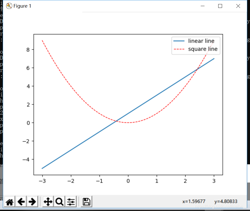
legend:展示每个数据对应的图像名称
#legend将要显示的信息来自于的 label
#plt.plot() 返回的是一个列表
x = np.linspace(-3, 3, 50)
y1 = 2*x + 1
y2 = x**2
l1 = plt.plot(x, y1, label='linear line')
l2 = plt.plot(x, y2, color='red', linewidth=1.0, linestyle='--', label='square line')
#参数 loc='upper right' 表示图例将添加在图中的右上角
plt.legend(loc='upper right')
plt.show()
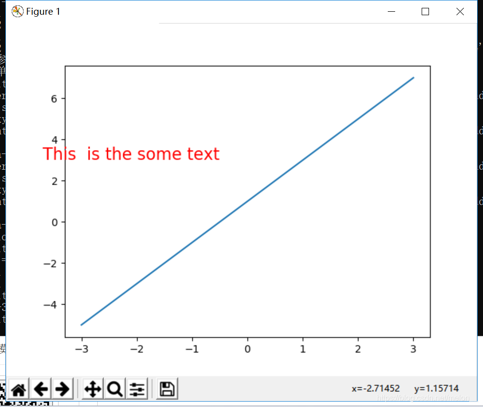
text:添加注释
-3.7, 3,是选取text的位置
fontdict设置文本字体
plt.text(-3.7, 3, 'This is the some text',fontdict={'size': 16, 'color': 'r'})
x = np.linspace(-3, 3, 50)
y1 = 2*x + 1
l1 = plt.plot(x, y1, label='linear line')
plt.text(-3.7, 3, 'This  is the some text',fontdict={'size': 16, 'color': 'r'})
plt.show()
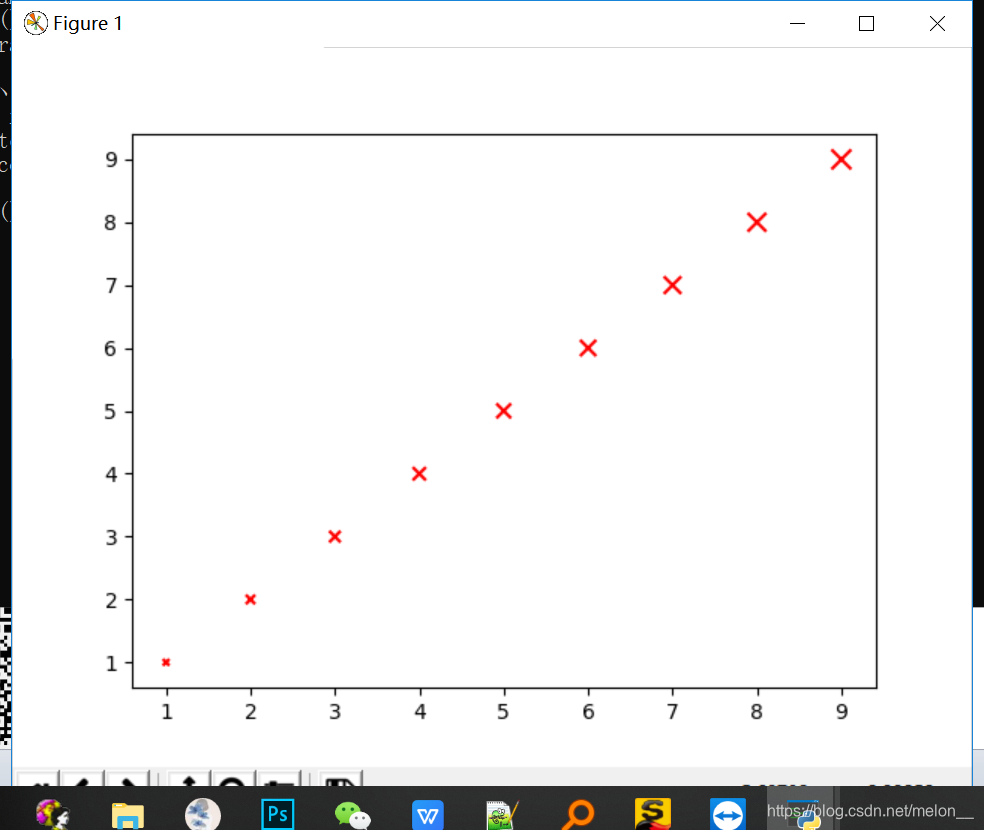
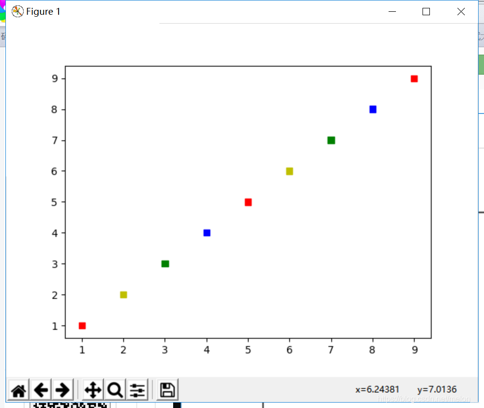
3.散点图
函数原型
scatter(x, y, s=None, c=None, marker=None, cmap=None, norm=None, vmin=None, vmax=None, alpha=None, linewidths=None, verts=None, edgecolors=None, hold=None, data=None, **kwargs)
x,y 形如shape(n,)的数组
s 当s是同x大小的数组,表示x中的每个点对应s中一个大小
c 颜色或颜色序列
marker 散点形状参数 “o” “.”“^”
例子:
x = np.arange(1,10)
y = x
#不同大小
sValue = x*10
plt.scatter(x,y,s=sValue,c='r',marker='x')
cValue = ['r','y','g','b','r','y','g','b','r']
plt.show()

#s 正方形 不同颜色
plt.scatter(x,y,c=cValue,marker='s')
plt.show()
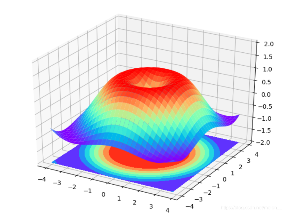
4.3D图
import numpy as np
import matplotlib.pyplot as plt
from mpl_toolkits.mplot3d import Axes3D

fig = plt.figure()
ax = Axes3D(fig)
# X, Y value
X = np.arange(-4, 4, 0.25)
Y = np.arange(-4, 4, 0.25)
X, Y = np.meshgrid(X, Y)
R = np.sqrt(X ** 2 + Y ** 2)
# height value
Z = np.sin(R)

#rstride 和 cstride 分别代表 row 和 column 的跨度
ax.plot_surface(X, Y, Z, rstride=1, cstride=1, cmap=plt.get_cmap('rainbow'))
"""
============= ================================================
        Argument      Description
        ============= ================================================
        *X*, *Y*, *Z* Data values as 2D arrays
        *rstride*     Array row stride (step size), defaults to 10
        *cstride*     Array column stride (step size), defaults to 10
        *color*       Color of the surface patches
        *cmap*        A colormap for the surface patches.
        *facecolors*  Face colors for the individual patches
        *norm*        An instance of Normalize to map values to colors
        *vmin*        Minimum value to map
        *vmax*        Maximum value to map
        *shade*       Whether to shade the facecolors
        ============= ================================================
"""

#添加 XY 平面的等高线
# I think this is different from plt12_contours
ax.contourf(X, Y, Z, zdir='z', offset=-2, cmap=plt.get_cmap('rainbow'))
"""
==========  ================================================
        Argument    Description
        ==========  ================================================
        *X*, *Y*,   Data values as numpy.arrays
        *Z*
        *zdir*      The direction to use: x, y or z (default)
        *offset*    If specified plot a projection of the filled contour
                    on this position in plane normal to zdir
        ==========  ================================================
"""

ax.set_zlim(-2, 2)

plt.show()


 3万+
3万+

 被折叠的 条评论
为什么被折叠?
被折叠的 条评论
为什么被折叠?
 到【灌水乐园】发言


