


dialog组件用于创建自定义弹窗,通常用来展示用户当前需要或用户必须关注的信息或操作。
创建dialog组件
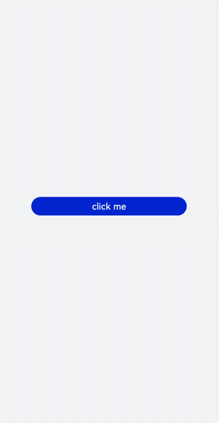
在pages/index目录下的hml文件中创建一个dialog组件,并添加Button组件来触发dialog。dialog组件仅支持width、height、margin、margin-[left|top|right|bottom]、margin-[start|end]样式。
<!-- xxx.hml -->
<div class="doc-page">
  <dialog class="dialogClass" id="dialogId" dragable="true">
    <div class="content">
      <text>this is a dialog</text>
    </div>
  </dialog>
  <button value="click me" onclick="opendialog"></button>
</div>
/* xxx.css */
.doc-page {
  width:100%;
  height:100%;
  flex-direction: column;
  align-items: center;
  justify-content: center;
  background-color: #F1F3F5;
}
.dialogClass{
  width: 80%;
  height: 250px;
  margin-start: 1%;
}
.content{
  width: 100%;
  height: 250px;
  justify-content: center;
  background-color: #e8ebec;
  border-radius: 20px;
}
text{
  width: 100%;
  height: 100%;
  text-align: center;
}
button{
  width: 70%;
  height: 60px;
}
// xxx.js
export default {
  //Touch to open the dialog box.
  opendialog(){
    this.$element('dialogId').show()
  },
}
设置弹窗响应
开发者点击页面上非dialog的区域时,将触发cancel事件而关闭弹窗。同时也可以通过对dialog添加show和close方法来显示和关闭弹窗。
<!-- xxx.hml -->
<div class="doc-page">
  <dialog class="dialogClass" id="dialogId" oncancel="canceldialog">
    <div class="dialogDiv">
      <text>dialog</text>
      <button value="confirm" onclick="confirmClick"></button>
    </div>
  </dialog>
  <button value="click me" onclick="opendialog"></button>
</div>
/* xxx.css */
.doc-page {
  width:100%;
  height:100%;
  flex-direction: column;
  align-items: center;
  justify-content: center;
  background-color: #F1F3F5;
}
.dialogClass{
  width: 80%;
  height: 300px;
  margin-start: 1%;
}
.dialogDiv{
  width: 100%;
  flex-direction: column;
  justify-content: center;
  align-self: center;
}
text{
  height: 1
最低0.47元/天 解锁文章


 扫一扫
扫一扫


 1009
1009

 被折叠的 条评论
为什么被折叠?
被折叠的 条评论
为什么被折叠?
 到【灌水乐园】发言


