食品添加剂销售数据分析与可视化设计
以下数据从淘宝网爬取
有相关需求可看主页联系
一.食品添加剂量数据分析
1.加载数据
import pandas as pd
import matplotlib.pyplot as plt
import numpy as np

# 设置 Matplotlib 支持中文
plt.rcParams['font.sans-serif'] = ['SimHei']  # 使用黑体或其他支持中文的字体
plt.rcParams['axes.unicode_minus'] = False  # 解决负号显示为方块的问题

# 读取 CSV 文件
file_path = '食品添加剂.csv'  # 替换为你的文件路径
try:
    data = pd.read_csv(file_path, encoding='utf-8')  # 尝试 utf-8 编码
except UnicodeDecodeError:
    data = pd.read_csv(file_path, encoding='gbk')  # 如果 utf-8 失败,尝试 gbk

# 提取 Price 和 Sales 列
price = data['价格']
sales = data['销售量']
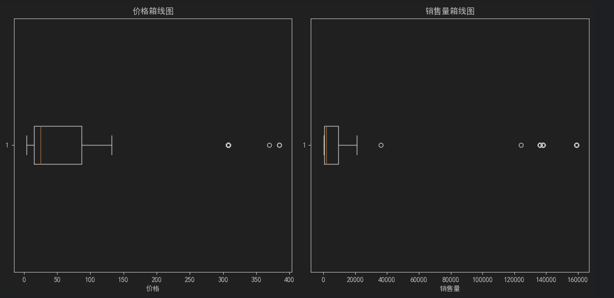
2.创建 价格&销量箱线图
# 创建箱线图
plt.figure(figsize=(12, 6))

# 子图 1: 价格分布
plt.subplot(1, 2, 1)
plt.boxplot(price.dropna(), vert=False)  # 水平箱线图,去除空值
plt.title('价格箱线图')
plt.xlabel('价格')

# 子图 2: 销量分布
plt.subplot(1, 2, 2)
plt.boxplot(sales.dropna(), vert=False)  # 水平箱线图,去除空值
plt.title('销售量箱线图')
plt.xlabel('销售量')

# 显示图形
plt.tight_layout()
plt.show()
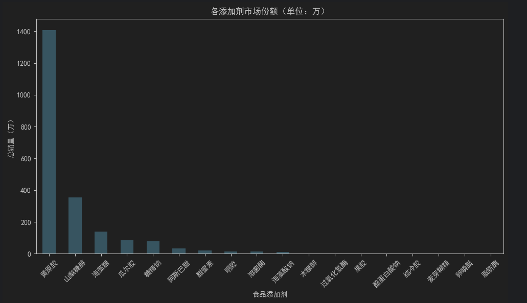
3.添加剂市场份额柱状图跟饼状图
# 计算总销量并转换为“万”单位
market_share = data.groupby("食品添加剂")["销售量"].sum().div(10000).sort_values(ascending=False)
# 绘制柱状图
market_share.plot(kind='bar', figsize=(10, 6), color='skyblue')
plt.title('各添加剂市场份额(单位:万)')
plt.xlabel('食品添加剂')
plt.ylabel('总销量(万)')
plt.xticks(rotation=45)
plt.tight_layout()
plt.show()
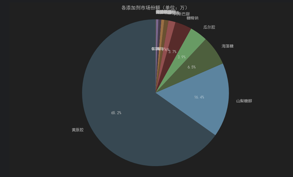
# 绘制饼状图
plt.figure(figsize=(10, 6))
plt.pie(
market_share,
labels=market_share.index,
autopct='%1.1f%%', # 显示百分比
startangle=90, # 从顶部开始绘制
colors=plt.cm.Paired.colors # 使用配色方案
)
plt.title('各添加剂市场份额(单位:万)')
plt.axis('equal') # 确保饼图为正圆
plt.tight_layout()
plt.show()
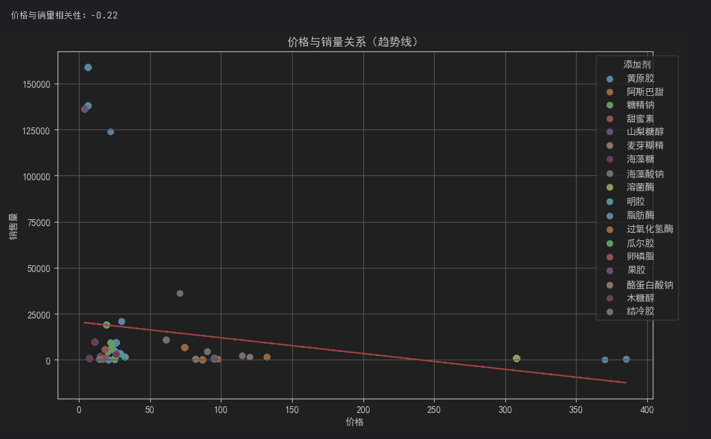
4.价格与销量相关性分析
## 价格与销量相关性分析
# 计算皮尔逊相关系数
corr = data[['价格', '销售量']].corr()
print(f"\n价格与销量相关性:{corr.iloc[0,1]:.2f}")

# 散点图增强版(添加趋势线)
plt.figure(figsize=(10, 6))
for product in data['食品添加剂'].unique():
    subset = data[data['食品添加剂'] == product]
    plt.scatter(subset['价格'], subset['销售量'], label=product)

# 添加趋势线
z = np.polyfit(data['价格'], data['销售量'], 1)
p = np.poly1d(z)
plt.plot(data['价格'], p(data['价格']), "r--", lw=1.5)

plt.title('价格与销量关系(趋势线)')
plt.xlabel('价格')
plt.ylabel('销售量')
plt.legend(title='添加剂', bbox_to_anchor=(1.05, 1))
plt.grid(True)
plt.tight_layout()
plt.show()
二.品牌名称数据分析
1.加载数据
import pandas as pd
import matplotlib.pyplot as plt
from itertools import combinations
from collections import Counter
import networkx as nx

# 设置 Matplotlib 支持中文
plt.rcParams['font.sans-serif'] = ['SimHei']  # 使用黑体或其他支持中文的字体
plt.rcParams['axes.unicode_minus'] = False  # 解决负号显示为方块的问题

# . 数据预处理
# 首先将多品牌数据拆分为独立条目(允许重复计算销量和价格):
file_path = '品牌名称.csv'
try:
    df = pd.read_csv(file_path, encoding='utf-8')  # 尝试 utf-8 编码
except UnicodeDecodeError:
    df = pd.read_csv(file_path, encoding='gbk')  # 如果 utf-8 失败,尝试 gbk

# 拆分品牌列并展开数据
df["品牌"] = df["品牌"].str.split(", ")
expanded_df = df.explode("品牌").reset_index(drop=True)
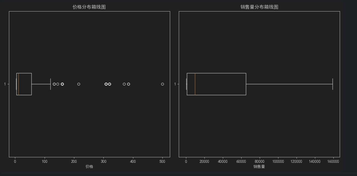
2.创建 价格&销量箱线图
# 基础统计分析
# 价格与销量分布箱线图
plt.figure(figsize=(12, 6))

# 子图 1: 价格分布
plt.subplot(1, 2, 1)
plt.boxplot(expanded_df["价格"], vert=False)  # 水平箱线图
plt.title('价格分布箱线图')
plt.xlabel('价格')

# 子图 2: 销量分布
plt.subplot(1, 2, 2)
plt.boxplot(expanded_df["销售量"], vert=False)  # 水平箱线图
plt.title('销售量分布箱线图')
plt.xlabel('销售量')

plt.tight_layout()
plt.show()
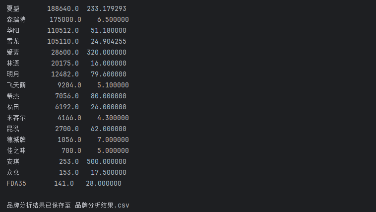
3.计算各品牌总销量与平均价格
# 各品牌总销量与平均价格
brand_stats = expanded_df.groupby("品牌").agg(
    总销量=("销售量", "sum"),
    平均价格=("价格", "mean")
).sort_values(by="总销量", ascending=False)

print("\n各品牌总销量与平均价格:")
print(brand_stats)
# 保存结果到新文件
output_file = '品牌分析结果.csv'
brand_stats.to_csv(output_file, encoding='utf-8-sig')

print(f"\n品牌分析结果已保存至 {output_file}")
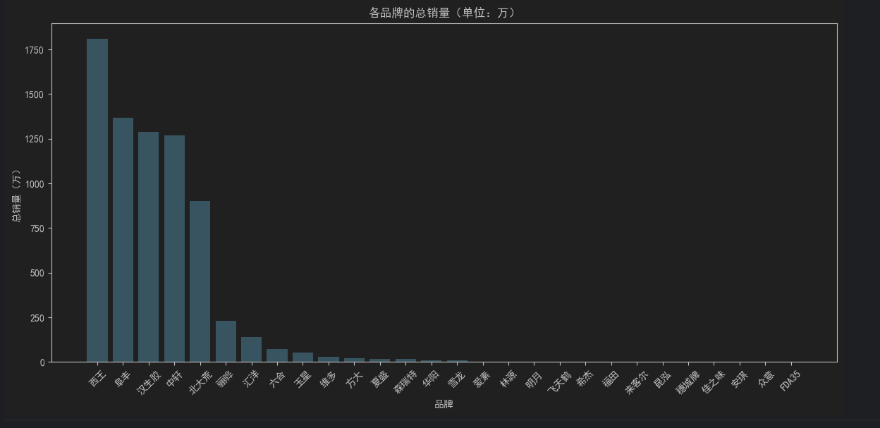
4.各品牌的总销量柱状图
# 将总销量单位转换为“万”
brand_stats["总销量_万"] = brand_stats["总销量"] / 10000

# 可视化 1: 柱状图 - 各品牌的总销量(单位:万)
plt.figure(figsize=(12, 6))
plt.bar(brand_stats.index, brand_stats["总销量_万"], color='skyblue')
plt.title('各品牌的总销量(单位:万)')
plt.xlabel('品牌')
plt.ylabel('总销量(万)')
plt.xticks(rotation=45)  # 旋转标签以避免重叠
plt.tight_layout()
plt.show()
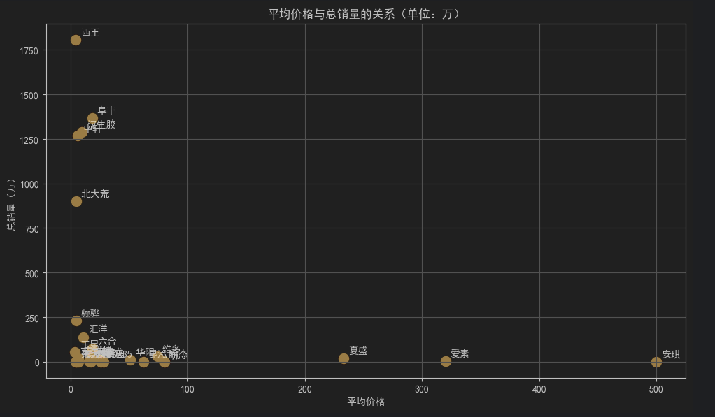
5.散点图 - 平均价格与总销量的关系(单位:万)
plt.figure(figsize=(10, 6))
for i in range(len(brand_stats)):
    txt = brand_stats.index[i]  # 获取品牌名称
    avg_price = brand_stats["平均价格"].iloc[i]  # 使用 .iloc 按位置索引获取平均价格
    total_sales = brand_stats["总销量_万"].iloc[i]  # 使用 .iloc 按位置索引获取总销量
    plt.scatter(avg_price, total_sales, color='orange', s=100)
    plt.annotate(txt, (avg_price, total_sales), textcoords="offset points", xytext=(5, 5))

plt.title('平均价格与总销量的关系(单位:万)')
plt.xlabel('平均价格')
plt.ylabel('总销量(万)')
plt.grid(True)
plt.tight_layout()
plt.show()
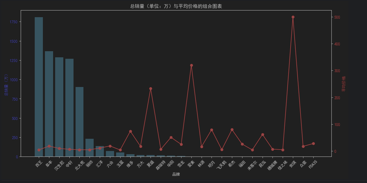
6.组合图表 - 总销量(柱状图,单位:万)+ 平均价格(折线图)
fig, ax1 = plt.subplots(figsize=(12, 6))

# 柱状图 - 总销量(单位:万)
ax1.bar(brand_stats.index, brand_stats["总销量_万"], color='skyblue', label='总销量(万)')
ax1.set_xlabel('品牌')
ax1.set_ylabel('总销量(万)', color='blue')
ax1.tick_params(axis='x', rotation=45)
ax1.tick_params(axis='y', labelcolor='blue')

# 折线图 - 平均价格
ax2 = ax1.twinx()
ax2.plot(brand_stats.index, brand_stats["平均价格"], color='red', marker='o', label='平均价格')
ax2.set_ylabel('平均价格', color='red')
ax2.tick_params(axis='y', labelcolor='red')

# 图例
fig.tight_layout()
plt.title('总销量(单位:万)与平均价格的组合图表')
plt.show()
三.分词统计词云
import pandas as pd
from wordcloud import WordCloud
import matplotlib.pyplot as plt

# 设置 Matplotlib 支持中文
plt.rcParams['font.sans-serif'] = ['SimHei']  # 使用黑体或其他支持中文的字体
plt.rcParams['axes.unicode_minus'] = False  # 解决负号显示为方块的问题

# 读取 CSV 文件
file_path = '分词.csv'  # 替换为你的输入文件路径
try:
    df = pd.read_csv(file_path, encoding='utf-8')  # 尝试 utf-8 编码
except UnicodeDecodeError:
    df = pd.read_csv(file_path, encoding='gbk')  # 如果 utf-8 失败,尝试 gbk

# 检查数据是否正确加载
print("原始数据预览:")
print(df.head())

# 提取名称和个数列
words = df.set_index('名称')['个数'].to_dict()

# 读取停用词文件
stopwords_file = 'stopwords.txt'
with open(stopwords_file, 'r', encoding='utf-8') as f:
    stopwords = set(f.read().splitlines())

# 过滤掉停用词
filtered_words = {word: count for word, count in words.items() if word not in stopwords}

# 生成词云
wordcloud = WordCloud(
    font_path='simhei.ttf',  # 中文字体路径(确保支持中文)
    width=800,
    height=400,
    background_color='white',
    max_words=100,
    colormap='viridis'  # 配色方案
).generate_from_frequencies(filtered_words)

# 绘制词云图
plt.figure(figsize=(12, 6))
plt.imshow(wordcloud, interpolation='bilinear')
plt.axis('off')  # 关闭坐标轴
plt.title('', fontsize=16)
plt.tight_layout()
plt.show()


 1094
1094

 被折叠的 条评论
为什么被折叠?
被折叠的 条评论
为什么被折叠?
 到【灌水乐园】发言


