


 本文介绍了如何使用HTML实现简单的动画过渡效果,包括盒子的移动和图片的动态展示,通过实例演示帮助理解。
1.实现盒子的移动
<!DOCTYPE html>
<html lang="en">

<head>
    <meta charset="UTF-8">
    <meta http-equiv="X-UA-Compatible" content="IE=edge">
    <meta name="viewport" content="width=device-width, initial-scale=1.0">
    <title>Document</title>

    <style>


        /* 动画案例 */
        .one {
            width: 200px;
            height: 200px;
            background-color: rgb(5, 159, 183);
            animation: move 3s infinite;
        }

        /* 动画声明块 */
        @keyframes move {
            0% {
                transform: translate(0px, 0px);
            }

            25% {
                transform: translate(300px, 0px);

            }

            50% {
                transform: translate(300px, 300px);

            }

            75% {
                transform: translate(0px, 300px);


            }
            100% {
                transform: translate(0px, 0px);
            }
        }
    </style>
</head>

<body>
    <div class="one"></div>
</body>

</html>
效果展示

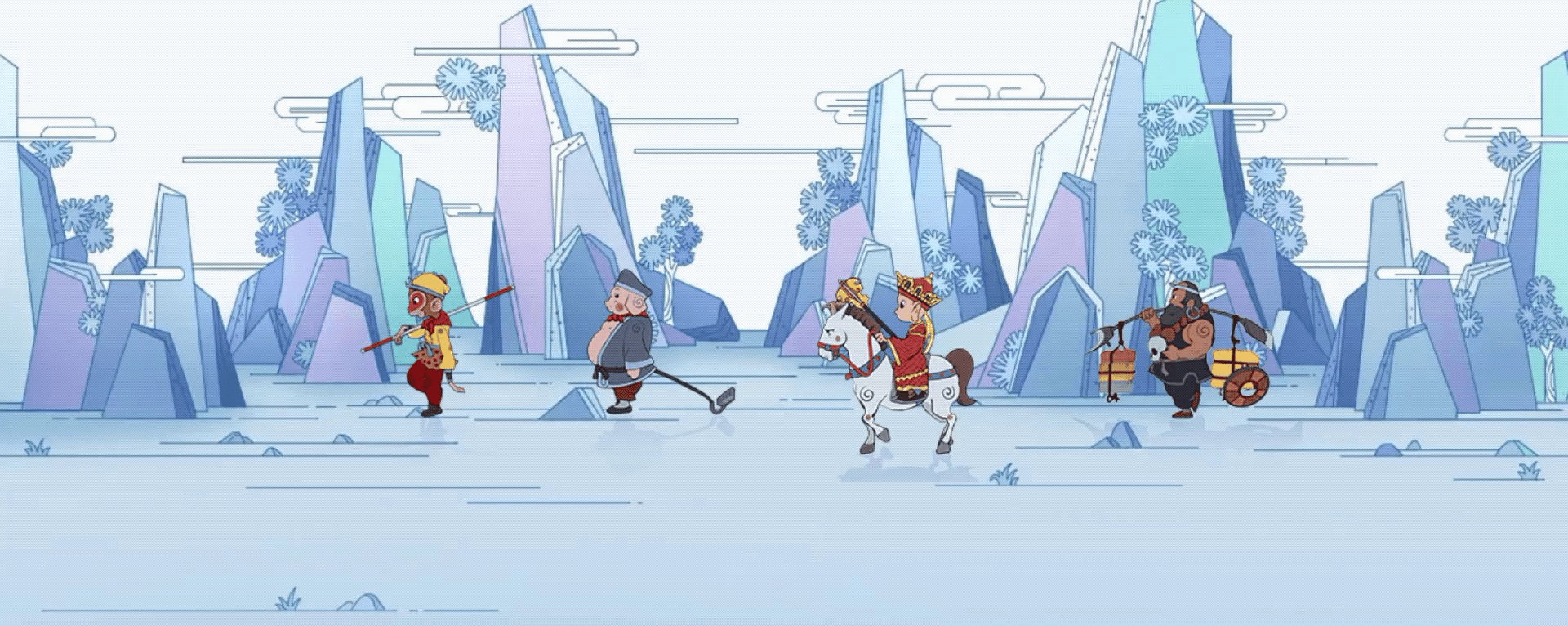
2.图片制作动态
<!DOCTYPE html>
<html lang="en">
<head>
    <meta charset="UTF-8">
    <meta http-equiv="X-UA-Compatible" content="IE=edge">
    <meta name="viewport" content="width=device-width, initial-scale=1.0">
    <title>Document</title>
    <style>

        div{
            width: 200px;
            height: 180px;
            position: absolute;
            margin-left: 50%;
            margin-top: 20%;
            transform: translateX(-200%);
            background-image: url(./西游记/image/west_01.png);
            animation: run 1s steps(8) infinite;
        }

        @keyframes run{
            from{
                background-position: 0px 0px;
            }
            to{
                background-position: -1600px 0px;
            }
        }
        @keyframes run2{
            from{
                background-position: 0px 0px;
            }
            to{
                background-position: -1360px 0px;
            }
        }
        @keyframes run3{
            from{
                background-position: 0px 0px;
            }
            to{
                background-position: -1680px 0px;
            }
        }
        .one{
            width: 200px;
            height: 180px;
            position: absolute;
            margin-left: 50%;
            margin-top: 20%;
            transform: translateX(-100%);
            background-image: url(./西游记/image/west_02.png);
            animation: run 1s steps(8) infinite;
        }
        .tow{
            width: 170px;
            height: 180px;
            position: absolute;
            margin-left: 50%;
            margin-top: 20%;
            transform: translateX(0%);
            background-image: url(./西游记/image/west_03.png);
            animation: run2 1s steps(8) infinite;
        }
        .three{
            width: 210px;
            height: 180px;
            position: absolute;
            margin-left: 50%;
            margin-top: 20%;
            transform: translateX(100%);
            background-image: url(./西游记/image//west_04.png);
            animation: run3 1s steps(8) infinite;
        }
        .bj{
            width: 100px;
            height: 100px;
        }
        body{
            background-image: url(./西游记/image/11.jpg);background-repeat: no-repeat;
        }

    </style>
</head>
<body>
    <div></div>
    <div class="one"></div>
    <div class="tow"></div>
    <div class="three"></div>
</body>
</html>
效果演示


 扫一扫
扫一扫


 4648
4648

 被折叠的 条评论
为什么被折叠?
被折叠的 条评论
为什么被折叠?
 到【灌水乐园】发言


