


 本文介绍了如何使用HTML和CSS3实现各种简单的动画效果,包括大小变化、形状变化、旋转、位移、边框、阴影、透明度、圆角和颜色变化等。作者鼓励读者参考开源项目并用自己的方式实现,同时提供了代码库的GitHub链接,供读者学习和参考。
1.前言
在月初的时候,发了CSS3热身实战--过渡与动画(实现炫酷下拉,手风琴,无缝滚动)。js的代码库也发过两次,两篇文章。之前也写了css3的热身实战,既然热身完了,是时候开始封装css3的代码库了,相比起js的代码库,css3的代码库的逻辑性就更加简单了!可以说只要打上注释和一张效果图就可以让大家明白了其中的原理了!
我写代码库的时候,动画效果主要是参考了三个开源项目,nec,hover.css,animate.css这三个项目的质量非常的高,建议大家去了解。
源码已经放到github上面了,大家可以去看,也欢迎大家star一下!ec-css。
我指出这三个库并不是叫大家去拿别人的代码,稍微修改一下,或者直接拷贝到自己的项目上,然后就说是自己的项目。我是让大家去看别人的代码,学习别人的实现方式或者动画效果,然后再用自己的方式实现,当然如果把别人的项目,增删改查到面目全非的地步,这个我个人觉得可以说是自己的项目了!强调一点,不要直接复制别人的代码,放到自己的项目上,然后说是自己开发的,这是不尊重别人的成果,对自己的技术水平提升的帮助也较少。我写文章,虽然也会给出代码,但是我的目的是提供大家参考的,希望给让大家学习到知识或者发散思维,写出更好的作品。之前也说过,我写文章的目的是授人以渔,不是授人以鱼。
声明
1.下面将会看到很多个 类似这样的举行,都是span标签,样式都是给出的css
span{
cursor: pointer;
height: 40px;
line-height: 40px;
text-align: center;
display: inline-block;
color: #333;
background: #ccc;
min-width: 80px;
padding: 0 10px;
margin: 10px;
}
2.关于class命名方式,l代表left,r代表right,t代表top,b代表bottom,c代表center,m代表middle。切记
文章比较长,但是说得就是两点,大家看得也应该会很快
1.写出一些hover动画和预设动画的运行效果,并且贴出代码
2.发现几个动画组合,和加上无限动画,反向动画,会有不一样的效果,并且继续研究,看下能不能研究出不一样的东西!
2.hover动画
说了那么多,是时候进入正文了,
首先是hover动画,关于这个概念,我解释下,就是鼠标移上去触发的动画,就是触发了鼠标的hover事件时能看到的动画!下面,按照类型,一个一个的写!
2-1.简单动画
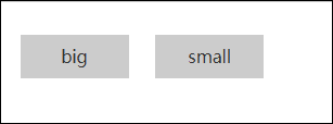
2-1-1大小变化
html
big
small
css
.ech-big,.ech-small {
transition: all .4s;
}
.ech-big:hover{
transform: scale(1.2);
}
.ech-small:hover{
transform: scale(.9);
}
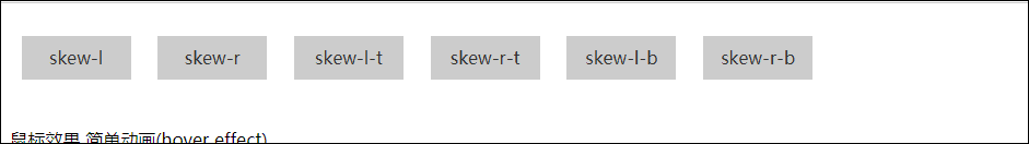
2-1-2形状变化
html
skew-l
skew-r
skew-l-t
skew-r-t
skew-l-b
skew-r-b
css
.ech-skew-l, .ech-skew-r, .ech-skew-l-t, .ech-skew-r-b, .ech-skew-l-b, .ech-skew-r-t{
transition: all .4s;
}
.ech-skew-r-t, .ech-skew-l-t {
transform-origin: 0 100%;
}
.ech-skew-r-b, .ech-skew-l-b {
transform-origin: 100% 0;
}
.ech-skew-l:hover {
transform: skew(-15deg);
}
.ech-skew-r:hover {
transform: skew(15deg);
}
.ech-skew-l-t:hover {
transform: skew(-15deg);
}
.ech-skew-r-t:hover {
transform: skew(15deg);
}
.ech-skew-l-b:hover {
transform: skew(15deg);
}
.ech-skew-r-b:hover {
transform: skew(-15deg);
}
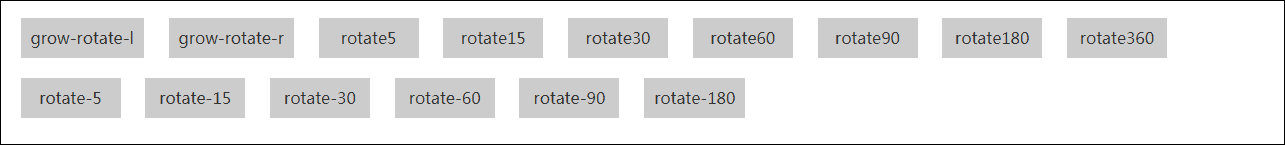
2-1-3旋转角度变化
html
grow-rotate-l
grow-rotate-r
rotate5
rotate15
rotate30
rotate60
rotate90
rotate180
rotate360
rotate-5
rotate-15
rotate-30
rotate-60
rotate-90
rotate-180
css
.ech-grow-rotate-l,.ech-grow-rotate-r, .ech-rotate5, .ech-rotate15, .ech-rotate30, .ech-rotate60, .ech-rotate90, .ech-rotate180, .ech-rotate360, .ech-rotate-5,.ech-rotate-15, .ech-rotate-30, .ech-rotate-60, .ech-rotate-90, .ech-rotate-180{
transition: all .4s;
}
.ech-grow-rotate-l:hover {
transform: scale(1.1) rotate(4deg);
}
.ech-grow-rotate-r:hover {
transform: scale(1.1) rotate(-4deg);
}
.ech-rotate-5:hover {
transform: rotate(-5deg);
}
.ech-rotate-15:hover {
transform: rotate(-15deg);
}
.ech-rotate-30:hover {
transform: rotate(-30deg);
}
.ech-rotate-60:hover {
transform: rotate(-60deg);
}
.ech-rotate-90:hover {
transform: rotate(-90deg);
}
.ech-rotate-180:hover {
transform: rotate(-180deg);
}
.ech-rotate5:hover {
transform: rotate(5deg);
}
.ech-rotate15:hover {
transform: rotate(15deg);
}
.ech-rotate30:hover {
transform: rotate(30deg);
}
.ech-rotate60:hover {
transform: rotate(60deg);
}
.ech-rotate90:hover {
transform: rotate(90deg);
}
.ech-rotate180:hover {
transform: rotate(180deg);
}
.ech-rotate360:hover {
transform: rotate(360deg);
}
2-1-4位移变化

html
up
bottom
left
right
css
.ech-t,.ech-bottom,.ech-top,.ech-right{
transition: all .4s;
}
.ech-t:hover {
transform: translate3d(0, -10px, 0);
}
.ech-b:hover {
transform: translate3d(0, 10px, 0);
}
.ech-l:hover {
transform: translate3d(-10px, 0, 0);
}
.ech-r:hover {
transform: translate3d(10px, 0, 0);
}
2-1-5边框变化
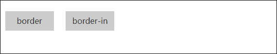
html
border
border-in
css
.ech-border,.ech-border-in{
transition: all .4s;
}
.ech-border:hover {
box-shadow: 0 0 0 4px #09f, 0 0 1px transparent;
}
.ech-border-in:hover {
box-shadow: inset 0 0 0 4px #09f, 0 0 1px transparent;
}
2-1-6阴影变化
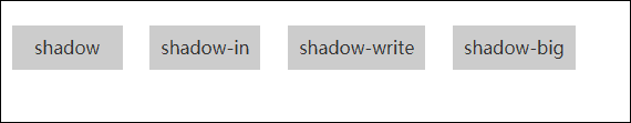
(gif图看得效果太难看了,大家可以去github下载看)
html
shadow
shadow-in
shadow-write
shadow-big
css
.ech-shadow,.ech-shadow-in,.ech-shadow-write,.ech-shadow-big{
transition: all .4s;
}
.ech-shadow:hover {
box-shadow: 0 0 10px #333;
}
.ech-shadow-in:hover {
box-shadow: inset 0 0 10px #333;
}
.ech-shadow-write:hover {
box-shadow: inset 0 0 20px #fff;
}
.ech-shadow-big:hover {
box-shadow: 0 10px 10px -10px rgba(0, 0, 0, 0.5);
transform: scale(1.1);
}
2-1-7透明度变化
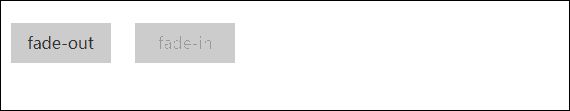
html
fade-out
fade-in
css
.ech-fade-out,.ech-fade-in{
transition: all .4s;
}
.ech-fade-out:hover {
opacity: .6;
}
.ech-fade-in {
opacity: .5;
}
.ech-fade-in:hover {
opacity: 1;
}
2-1-8圆角变化
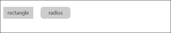
html
rectangle
radius
css
.ech-radius,.ech-rectangle{
transition: all .4s;
}
.ech-radius {
border-radius: 10px;
}
.ech-radius:hover {
border-radius: 0;
}
.ech-rectangle:hover {
border-radius: 10px;
}
2-2.颜色动画效果
这部分的动画主要是利用:before和:after进行实现的,所以,大家如果使用的时候,切记:before和:after没有被占用,否则会显示不正常
2-2-1.颜色块变化

因为这块内容很像,我就一大块一起说,大家看代码的时候要留神注意。看代码看不明白,直接在github下载,然后运行文件,边调试边看效果!这样大家就很容易明白了!
html
fade
fade-t
fade-b
fade-l
fade-r
bounce-t
bounce-b
bounce-l
bounce-r
fade-c-out
fade-c-in
fade-m-out
<
 最低0.47元/天 解锁文章


 扫一扫
扫一扫


 317
317

 被折叠的 条评论
为什么被折叠?
被折叠的 条评论
为什么被折叠?
 到【灌水乐园】发言


