


<style>
    .wrapper {
        width: 200px;
        height: 150px;
        position: relative;
    }
    .mask {
        position: absolute;
        top: 0;
        left: 0;
        width: 100%;
        height: 100%;
    }
    .mask::before{
        content: '';
        position: absolute;
        top: 0;
        left: 0;
        width: 100%;
        height: 100%;
        background-image: url("../images/index2.jpeg");
        background-position: center;
        background-size: 100% 100%;
        opacity: 0.8;
    }
    .content {
        display: flex;
        flex-direction: column;
        align-items: center;
        justify-content: space-evenly;
        z-index: 1;
    }
    img {
        width: 100%;
        height: 100%;
    }
    .name {
        font-size: 16px;
        color: white;
    }
</style>
<body>
    <div class="wrapper">
        <img src="../images/index1.jpeg" alt="">
        <div class="mask">
            <div class="content mask">
                <div class="name">onezero</div>
                <div class="name">onezero</div>
                <div class="name">onezero</div>
            </div>
        </div>
    </div>
</body>
实现效果:
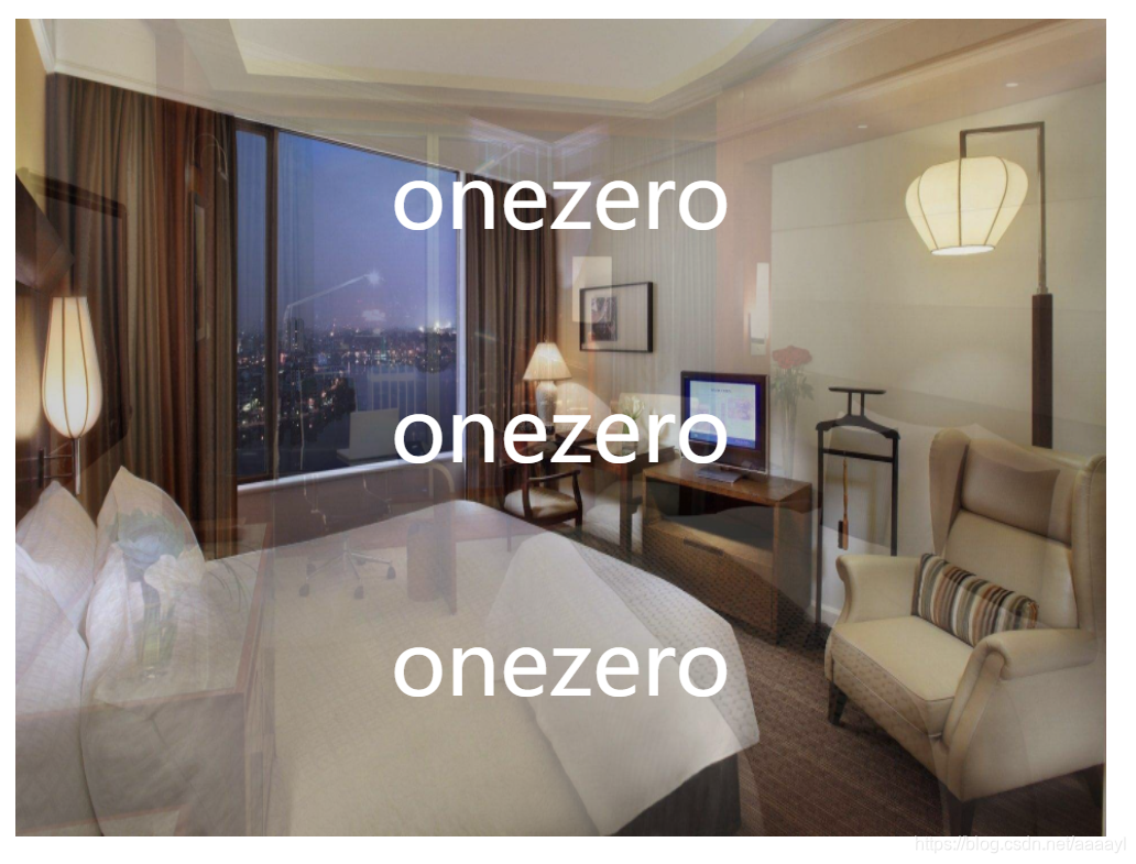
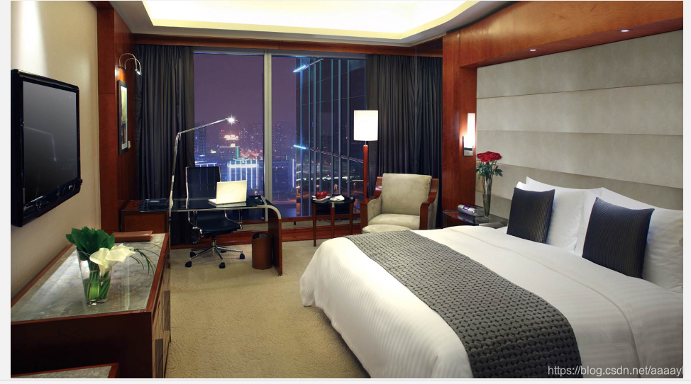
这是最底下的图片index1:
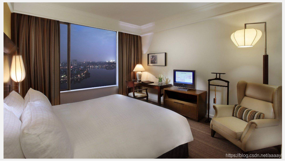
index2:
通过使用伪元素,给底层的图片加了个图片蒙层,设置伪元素的透明度,而不会影响文字的显示。


 扫一扫
扫一扫


 2万+
2万+

 被折叠的 条评论
为什么被折叠?
被折叠的 条评论
为什么被折叠?
 到【灌水乐园】发言


