


代谢物热图绘制
代谢物热图说明
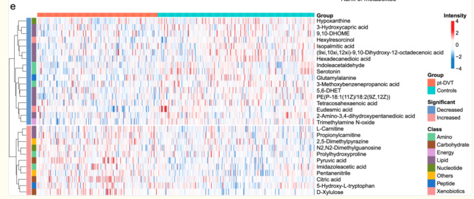
如图是一张代谢物热图(heatmap),常用于展示不同样本之间代谢物相对丰度的变化趋势和聚类关系,关于图的说明如下:
横轴(列):表示不同的样本,每一列是一个样本。
顶部颜色条标注了分组:
红色(pt-DVT):患者组
蓝绿色(Controls):对照组
纵轴(行):表示不同的代谢物,每一行为一个代谢物。
右侧列出代谢物名称。
颜色强度表示代谢物在样本中的表达水平(强度):
红色:上调(表达增加)
蓝色:下调(表达减少)
白色:中间值(无显著差异)
左侧树状图(dendrogram):是层次聚类分析(hierarchical clustering)结果,表示代谢物在不同样本中表达模式的相似性。
左侧的色条表示每个代谢物的分类(Class):
如绿色:Amino(氨基酸类)、橙色:Carbohydrate(碳水化合物类)等
右下角的图例说明:
Group:样本分组
Significant:显著性变化方向
Class:代谢物的功能分类
绘制流程
1.数据准备
| Compounds | Class I | Type | 样本1 | 样本2 | ··· |
|---|---|---|---|---|---|
| 代谢物1 | 代谢物类别 | up | 123 | 456 | ··· |
| 代谢物2 | 代谢物类别 | down | 123 | 456 | ··· |
| ··· | ··· | ··· | ··· | ··· | ··· |
2.绘制代码
library(ComplexHeatmap)
library(circlize)
library(RColorBrewer)

# ========= 读取数据 =========
data <- read.csv("你的路径/你的文件.csv", check.names = FALSE)
# 4代表从第四列开始为样本数据
expr_raw <- data[, 4:ncol(data)]
rownames(expr_raw) <- data$Compound

# ========= 标准化 =========
expr_norm <- sweep(expr_raw, 2, colSums(expr_raw), FUN = "/")
expr_log <- log10(expr_norm + 1)
expr_scaled <- t(scale(t(expr_log)))

# ========= 样本注释 =========
sample_names <- colnames(expr_scaled)
# 这里要修改140这2个值,140代表从第1个样本到第140个样本为Cancer样本,140之后的为健康样本
# 注意是从第1个样本到第140个样本,不是从第1列到第140列
group_info <- data.frame(Group = c(rep("Cancer", 140), rep("Control", length(sample_names) - 140)))
rownames(group_info) <- sample_names

# ========= 代谢物注释 =========
row_anno <- data.frame(
  Significant = data$Type,
  Class = data$`Class I`
)
rownames(row_anno) <- data$Compound

# ========= 自定义颜色 =========
col_fun <- colorRamp2(c(-4, 0, 4), c("#4575B4", "white", "#D73027"))
group_col <- c("Cancer" = "#EF8A62", "Control" = "#67A9CF")
sig_col <- c("up" = "#EF8A9E", "down" = "#9ECAE1")
class_levels <- unique(row_anno$Class)
class_col <- setNames(brewer.pal(n = length(class_levels), "Set3"), class_levels)

# ========= 顶部注释(仅颜色条,无图例)=========
top_anno <- HeatmapAnnotation(
  Group = group_info$Group,
  col = list(Group = group_col),
  show_annotation_name = TRUE,               # ✅ 显示标签
  annotation_name_side = "right",             # ✅ 标签在颜色条左侧
  show_legend = FALSE
)

# ========= 行侧注释(显示颜色块,无图例)=========
left_anno <- rowAnnotation(
  Class = row_anno$Class,
  Significant = row_anno$Significant,
  col = list(Class = class_col, Significant = sig_col),
  show_annotation_name = FALSE,
  show_legend = FALSE
)

# ========= 热图主体 =========
ht <- Heatmap(expr_scaled,
              name = "Intensity",
              col = col_fun,
              show_row_names = TRUE,
              row_names_side = "right",
              row_names_gp = gpar(fontsize = 7),
              show_column_names = FALSE,
              cluster_rows = TRUE,
              cluster_columns = FALSE,
              top_annotation = top_anno,
              left_annotation = left_anno,
              show_heatmap_legend = FALSE,
              column_title = "Differential Metabolites Expression Heatmap",
              column_title_gp = gpar(fontsize = 14, fontface = "bold"),
              heatmap_legend_param = list(
                title = "Intensity",
                title_gp = gpar(fontsize = 12, fontface = "bold"),
                labels_gp = gpar(fontsize = 10),
                at = c(-4, -2, 0, 2, 4),
                direction = "vertical"
              ))

# ========= 图例打包,显示在右侧 =========
# 提取主图例(Intensity)
lgd_intensity <- Legend(
  title = "Intensity",
  at = c(-4, -2, 0, 2, 4),
  col_fun = col_fun,
  direction = "vertical",
  title_gp = gpar(fontsize = 12, fontface = "bold"),
  labels_gp = gpar(fontsize = 10)
)

# 打包所有图例,Intensity 放最上面
packed_lgd <- packLegend(
  list = list(
    Legend(title = "Group", at = names(group_col), legend_gp = gpar(fill = group_col),
           title_gp = gpar(fontface = "bold", fontsize = 10), labels_gp = gpar(fontsize = 9)),
    lgd_intensity,
    Legend(title = "Significant", at = names(sig_col), legend_gp = gpar(fill = sig_col),
           title_gp = gpar(fontface = "bold", fontsize = 10), labels_gp = gpar(fontsize = 9)),
    Legend(title = "Class", at = names(class_col), legend_gp = gpar(fill = class_col),
           title_gp = gpar(fontface = "bold", fontsize = 10), labels_gp = gpar(fontsize = 8), ncol = 1)
  ),
  direction = "vertical",
  gap = unit(4, "mm")  # 控制图例之间间距
)

# 绘图
draw(ht,
     annotation_legend = packed_lgd,
     annotation_legend_side = "right")


 2371
2371

 被折叠的 条评论
为什么被折叠?
被折叠的 条评论
为什么被折叠?
 到【灌水乐园】发言


