


线性回归模型拟合的可视化分析
学习目标
在本课程中,我们通过验证线性回归的基本假设(线性、独立性、常数方差和正态性)来检查拟合优度,实现了在拟合线性回归模型后应运行的基本可视化分析和诊断测试。
相关知识点
- 线性回归模型拟合的可视化分析
学习内容
1 线性回归模型拟合的可视化分析
具体来说,有以下分析:
- 数据矩阵的成对散点图
- 相关矩阵和热图
- 创建预测特征及其统计显著性的新数据集(基于 p 值)
- 残差与预测变量图
- 拟合与残差图
- 归一化残差的直方图
- 归一化残差的 Q-Q 图
- 残差的 Shapiro-Wilk 正态性检验
- 残差的 Cook 距离图
- 预测特征的方差膨胀因子 (VIF)
在本课程中,我们分析了来自UCI机器学习仓库的混凝土抗压强度数据集 Concrete Compressive Strength Data Set。
混凝土是土木工程中最重要的材料。混凝土的抗压强度是年龄和成分的高度非线性函数。
1.1 数据集导入与预处理
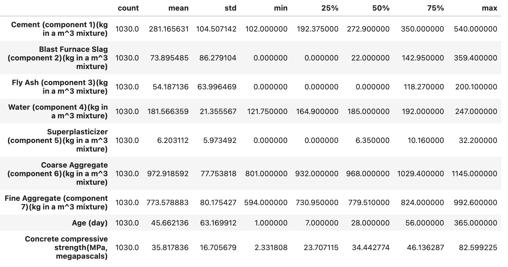
这里我们导入库并读取混凝土抗压强度数据集,使用pandas 库中DataFrame方法可以快速查看数据的相关信息。该数据集包含混凝土的多种成分(如水泥、高炉炉渣、粉煤灰等的质量,单位为 kg/m³)、天数(天)以及混凝土抗压强度(MPa)的数据等9个属性。describe()方法统计分析了混凝土的多个属性的范围、分布、集中趋势和离散程度。
!wget "https://model-community-picture.obs.cn-north-4.myhuaweicloud.com/ascend-zone/notebook_datasets/3eb7a406fd5711ef96e2fa163edcddae/Concrete_Data.xls" --no-check-certificate
# 安装依赖
%pip install seaborn
%pip install statsmodels
%pip install xlrd
import numpy as np
import pandas as pd
import matplotlib.pyplot as plt
import statsmodels.formula.api as sm
from seaborn import pairplot
from statsmodels.graphics.correlation import plot_corr

# 选择数据路径
df = pd.read_excel("Concrete_Data.xls")
df.head(10)
df.describe().T
1.2 可视化分析
探究预测变量与响应变量之间的关系
接下来为每个特征创建一个单独的散点图,来可视化数据集中8个特征属性(水泥、高炉炉渣、粉煤灰、水、高效减水剂、粗骨料、细骨料、天数)与混凝土抗压强度之间的关系,从而窥视预测变量和响应之间的关系。
for c in df.columns[:-1]:
    plt.figure(figsize=(8,5))
    plt.title("{} vs. \nConcrete Compressive Strength".format(c),fontsize=16)
    plt.scatter(x=df[c],y=df['Concrete compressive strength(MPa, megapascals) '],color='blue',edgecolor='k')
    plt.grid(True)
    plt.xlabel(c,fontsize=14)
    plt.ylabel('Concrete compressive strength\n(MPa, megapascals)',fontsize=14)
    plt.show()
为使用 statsmodels.OLS() 处理而创建具有合适列名的副本
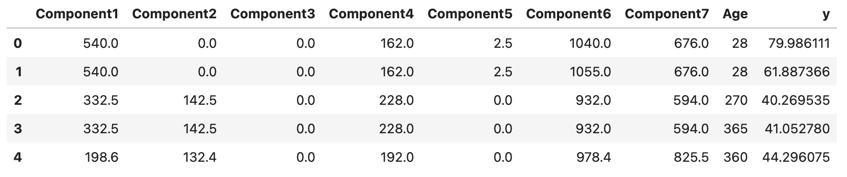
为了方便执行普通最小二乘法(Ordinary Least Squares,OLS)回归分析,这里我们创建数据帧 df 的一个副本 df1,接着对前七列的列名依次重命名为 Component1 到 Component7,添加 Age 和 y 作为后续的列名。
df1 = df.copy()
df1.columns=['Component'+str(i) for i in range(1,8)]+['Age']+['y']
df1.head()
生成散点图
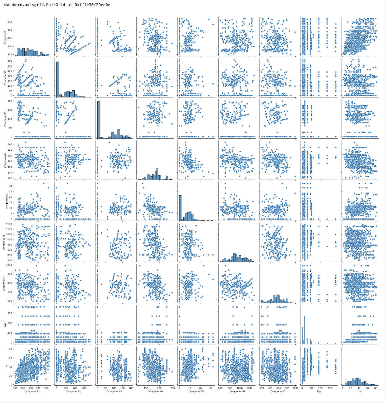
安装从 seaborn 库中导入 pairplot 函数,绘制副本 df1 成对变量之间的散点图。
pairplot(df1)
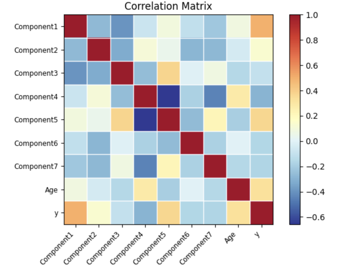
相关性矩阵和热图,用于直观检查多重共线性
接着选取 df1 数据帧中除了最后一行的所有行,计算数据帧中各列之间的相关性系数矩阵。我们用皮尔逊相关系数表示,其取值范围在 -1 到 1 之间,其中:
- 1 表示完全正相关,即两个变量的变化趋势完全一致。
- -1 表示完全负相关,即两个变量的变化趋势完全相反。
- 0 表示两个变量之间不存在线性相关关系。
为了更直观地了解数据集中各变量之间的线性相关性,我们使用 statsmodels 中的 plot_corr 函数将该相关性矩阵以热图的形式进行可视化,通过颜色深浅展示不同变量间相关性的强弱。
corr = df1[:-1].corr()
fig=plot_corr(corr,xnames=corr.columns)
在 statsmodels.OLS() 中创建公式字符串
构建一个用于 statsmodels.OLS() 的公式字符串,将数据框 df1 的最后一列作为因变量,其余列作为自变量。
formula_str = df1.columns[-1]+' ~ '+'+'.join(df1.columns[:-1])
formula_str
构建并拟合模型,打印拟合模型的概览
下面用 formula_str 公式和数据副本 df1 构建 OLS 回归模型,并进行拟合操作。
model=sm.ols(formula=formula_str, data=df1)

fitted = model.fit()

# 打印出拟合模型的详细摘要信息,包括系数估计、标准误差、t 统计量、p 值、R² 和调整后的 R² 等
print(fitted.summary())

新的 Result 数据框:特征的 p 值和统计显著性
为了更清晰地将与统计显著性判断相关的信息组织在一起,我们创建新的数据帧 df_result ,将从拟合模型 fitted 中提取的 p 值和原数据帧 df 的特征名称(除最后一列)单独存储其中,更方便地检查哪些特征对于模型的影响在统计上是显著的。
df_result=pd.DataFrame()
df_result['pvalues']=fitted.pvalues[1:]
df_result['Features']=df.columns[:-1]
df_result.set_index('Features',inplace=True)
def yes_no(b):
    if b:
        return 'Yes'
    else:
        return 'No'

df_result['Statistically significant?']= df_result['pvalues'].apply(yes_no)
df_result
从表格中,可以观察到:所有预测变量都是统计量显著的,阈值为 p 值 <0.01。
残差与预测变量图
绘制残差 vs. 预测变量散点图,其中 x 轴为 fitted.fittedvalues(模型的拟合值),y 轴为 fitted.resid(模型的残差),为了辅助观察残差是否围绕 0 轴分布,我们绘制一条红色虚线的水平直线。
for c in df.columns[:-1]:
    plt.figure(figsize=(8,5))
    plt.title("{} vs. \nModel residuals".format(c),fontsize=16)
    plt.scatter(x=df[c],y=fitted.resid,color='blue',edgecolor='k')
    plt.grid(True)
    xmin=min(df[c])
    xmax = max(df[c])
    plt.hlines(y=0,xmin=xmin*0.9,xmax=xmax*1.1,color='red',linestyle='--',lw=3)
    plt.xlabel(c,fontsize=14)
    plt.ylabel('Residuals',fontsize=14)
    plt.show()
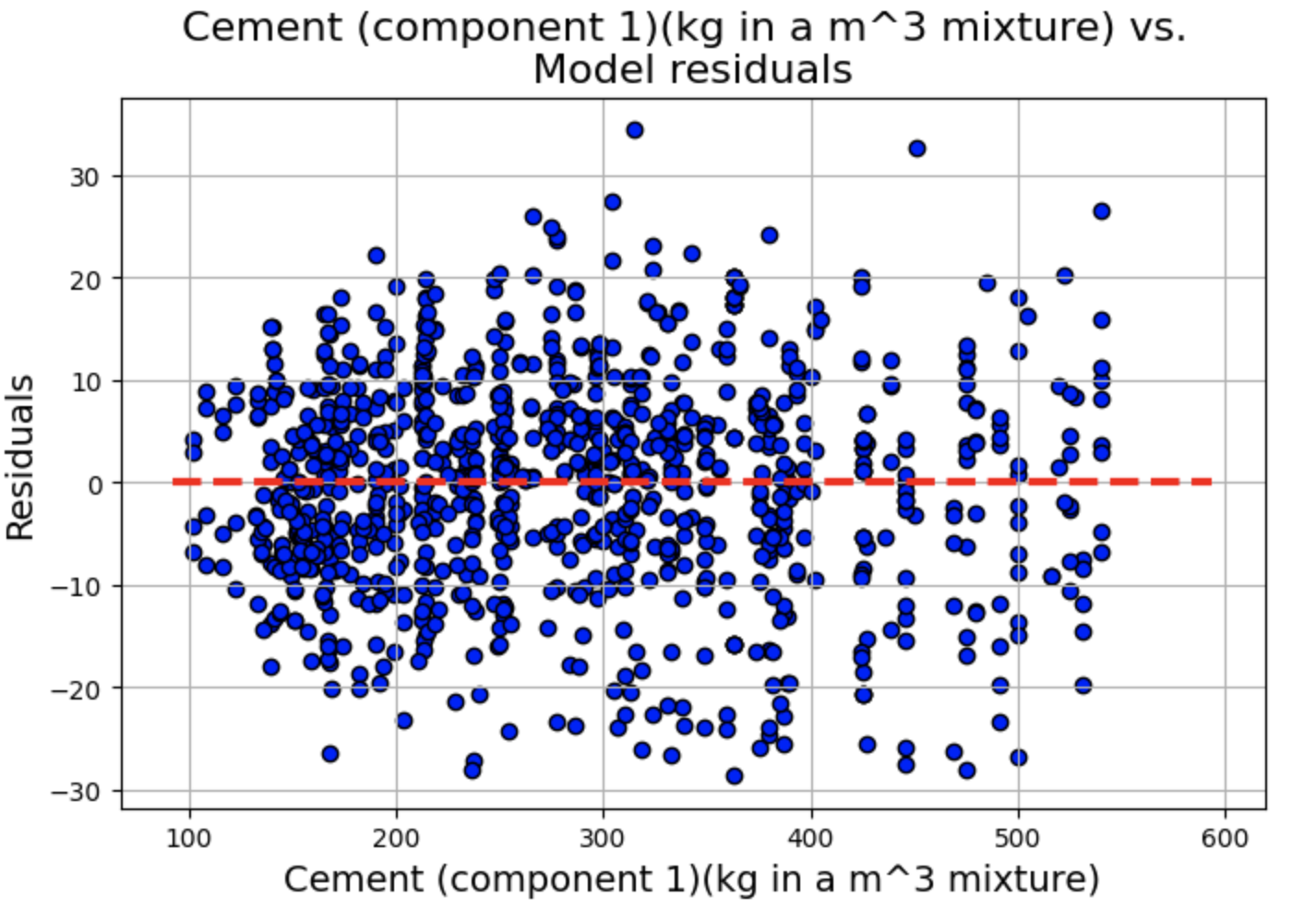
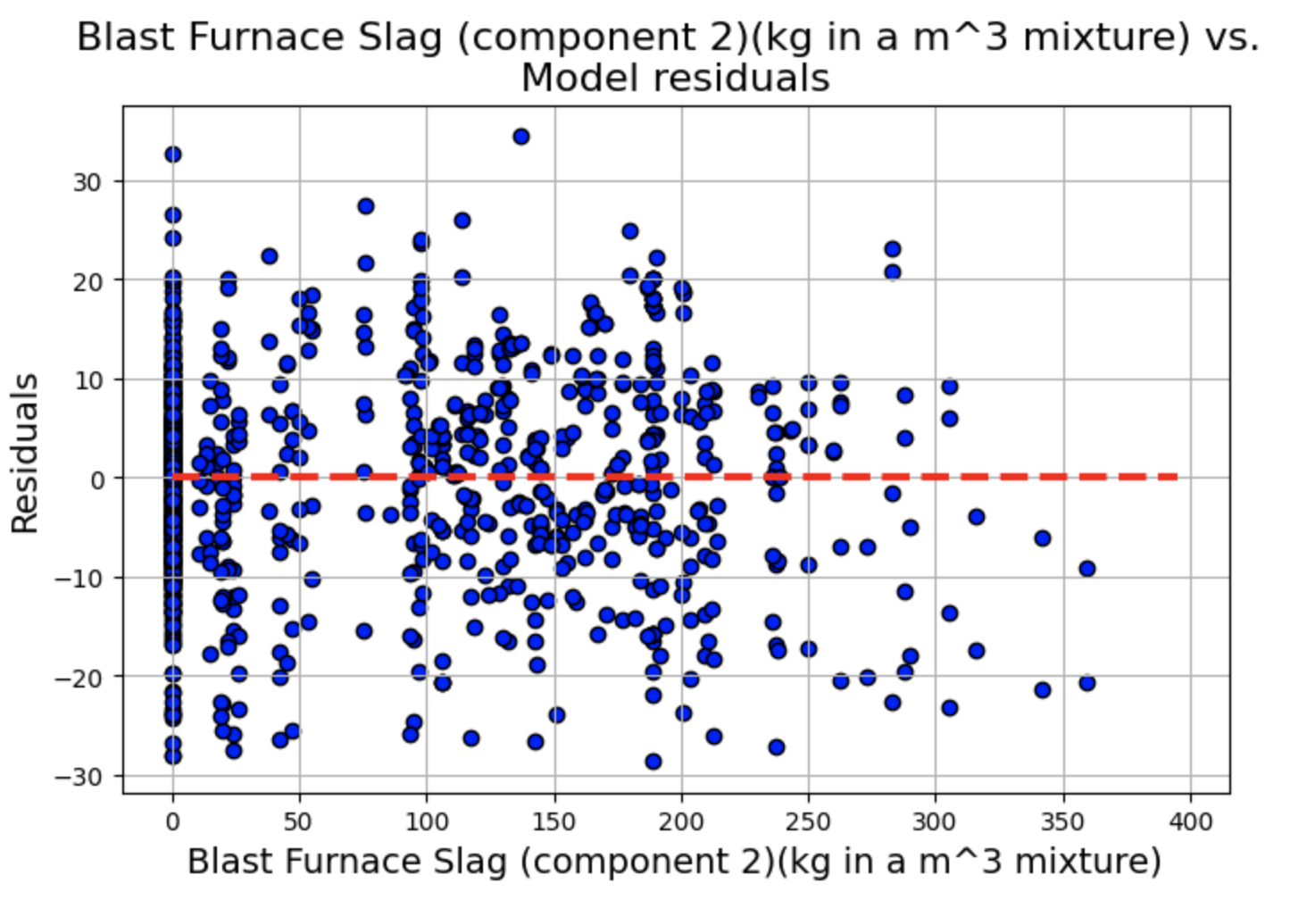
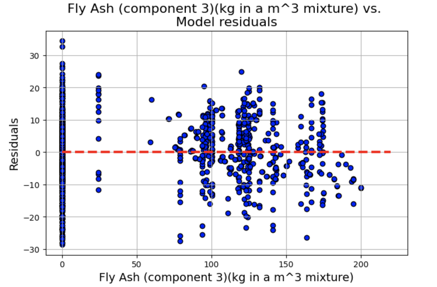
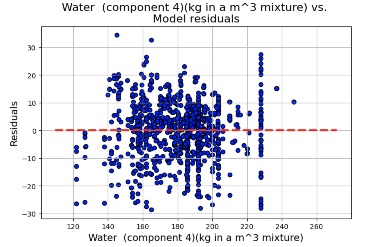
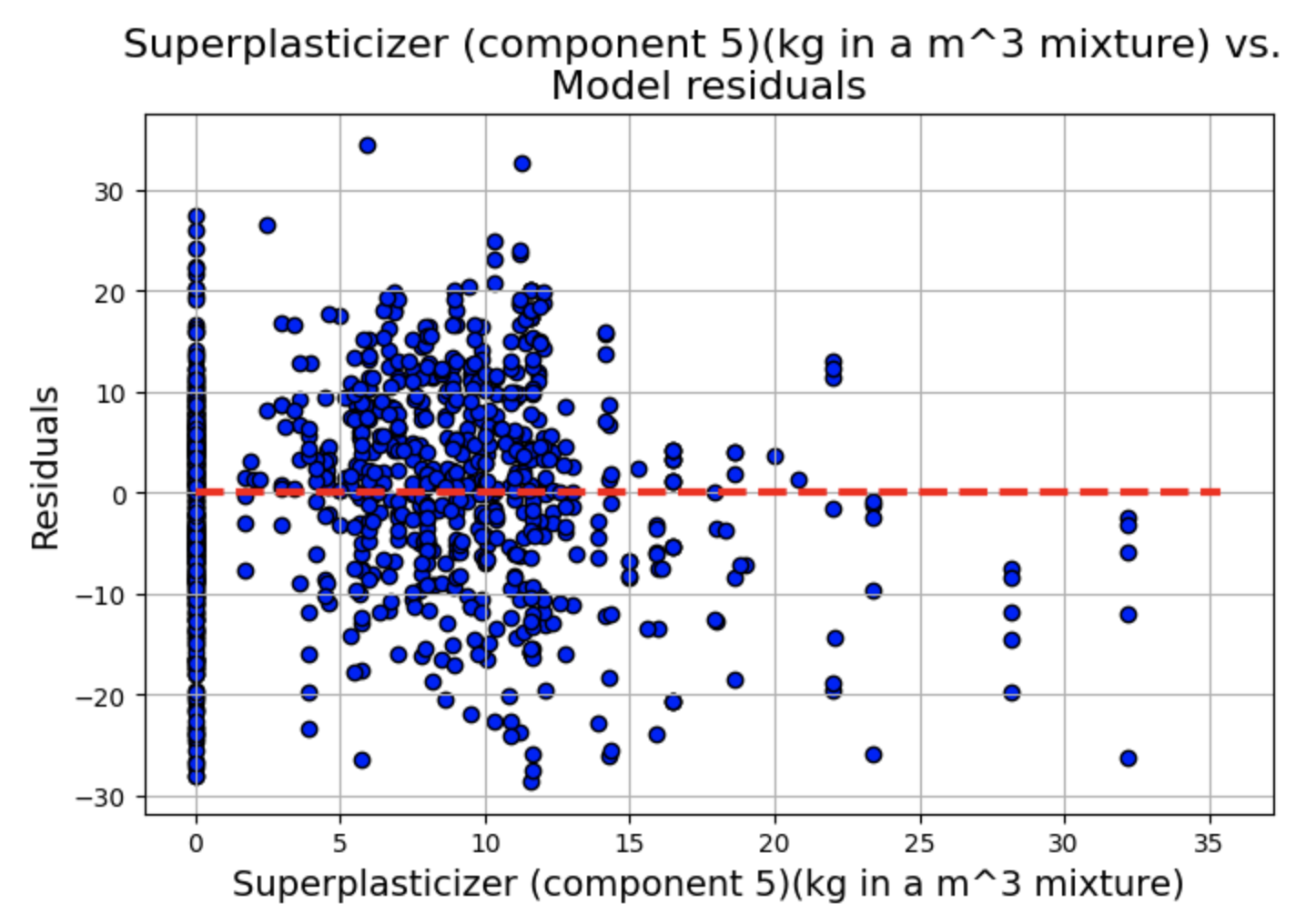
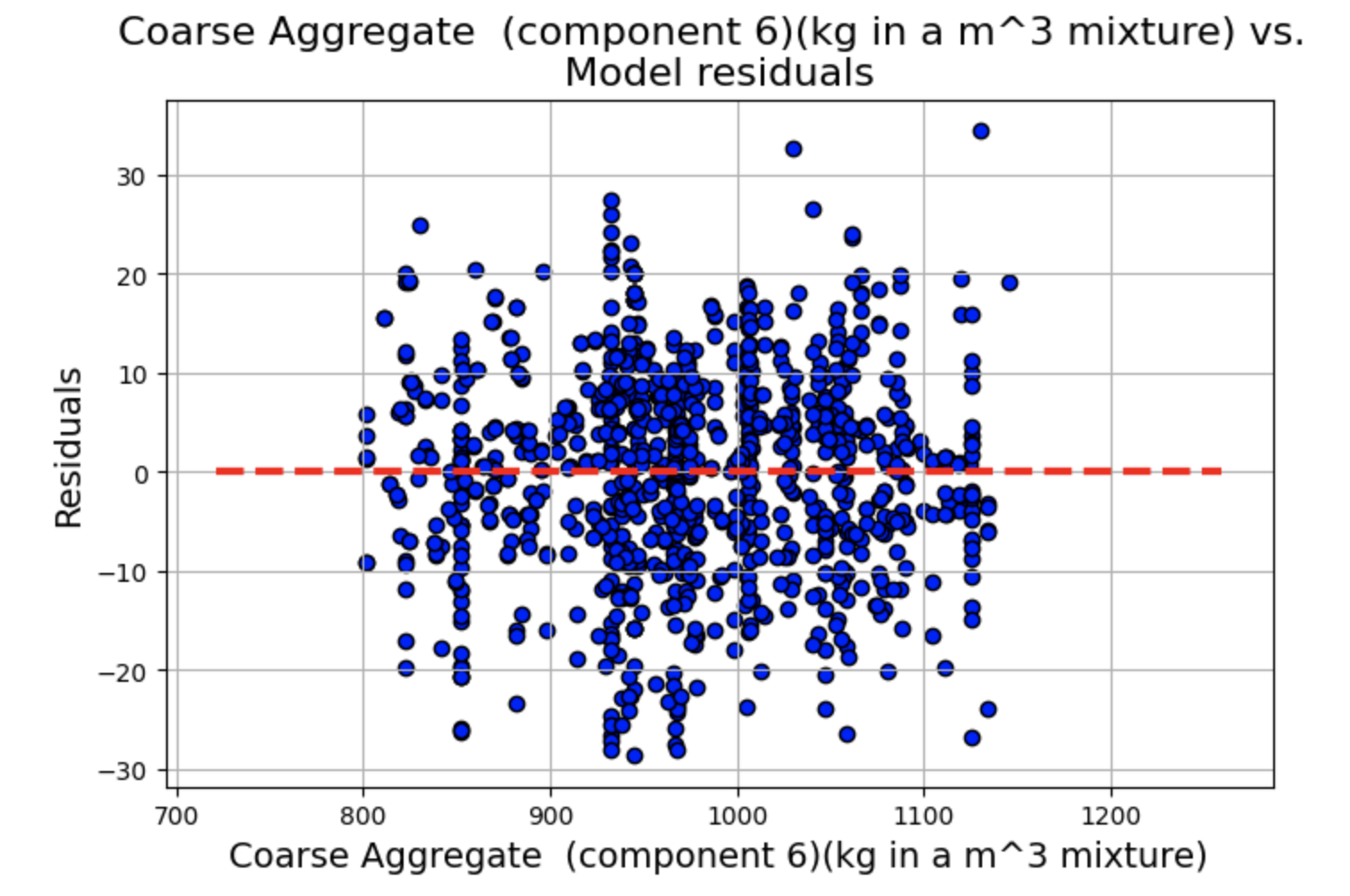
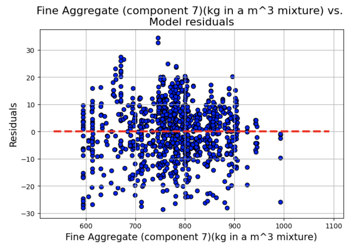
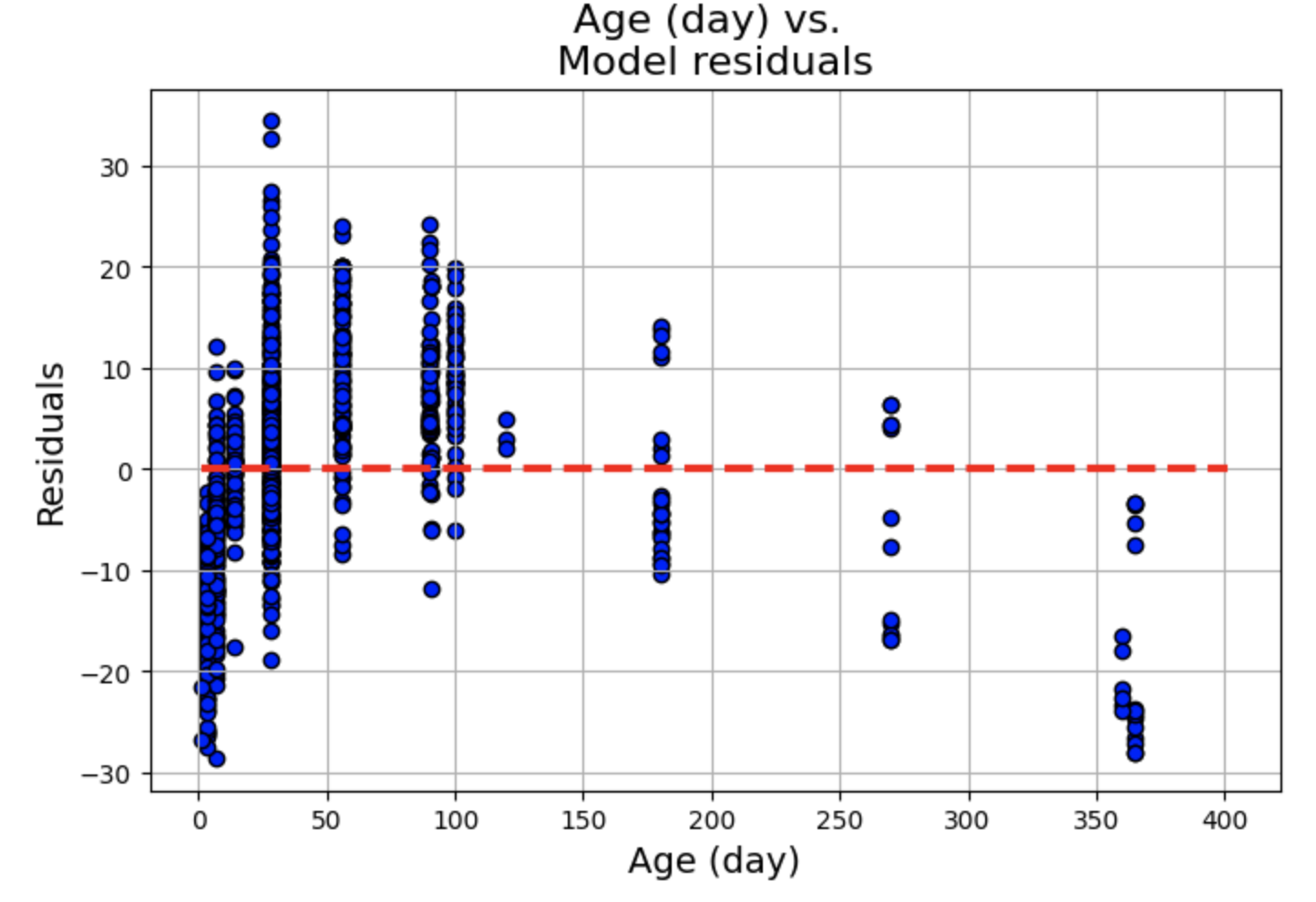
残差图显示了一些聚类,但总体而言,线性和独立性假设似乎成立,因为分布似乎围绕 0 轴是随机的。
拟合值与残差
绘制拟合值与残差图,同样添加一条水平辅助线。
plt.figure(figsize=(8,5))
p=plt.scatter(x=fitted.fittedvalues,y=fitted.resid,edgecolor='k')
xmin=min(fitted.fittedvalues)
xmax = max(fitted.fittedvalues)
plt.hlines(y=0,xmin=xmin*0.9,xmax=xmax*1.1,color='red',linestyle='--',lw=3)
plt.xlabel("Fitted values",fontsize=15)
plt.ylabel("Residuals",fontsize=15)
plt.title("Fitted vs. residuals plot",fontsize=18)
plt.grid(True)
plt.show()
可以看出,拟合与残差图显示违反了常数方差假设,即存在异方差性。
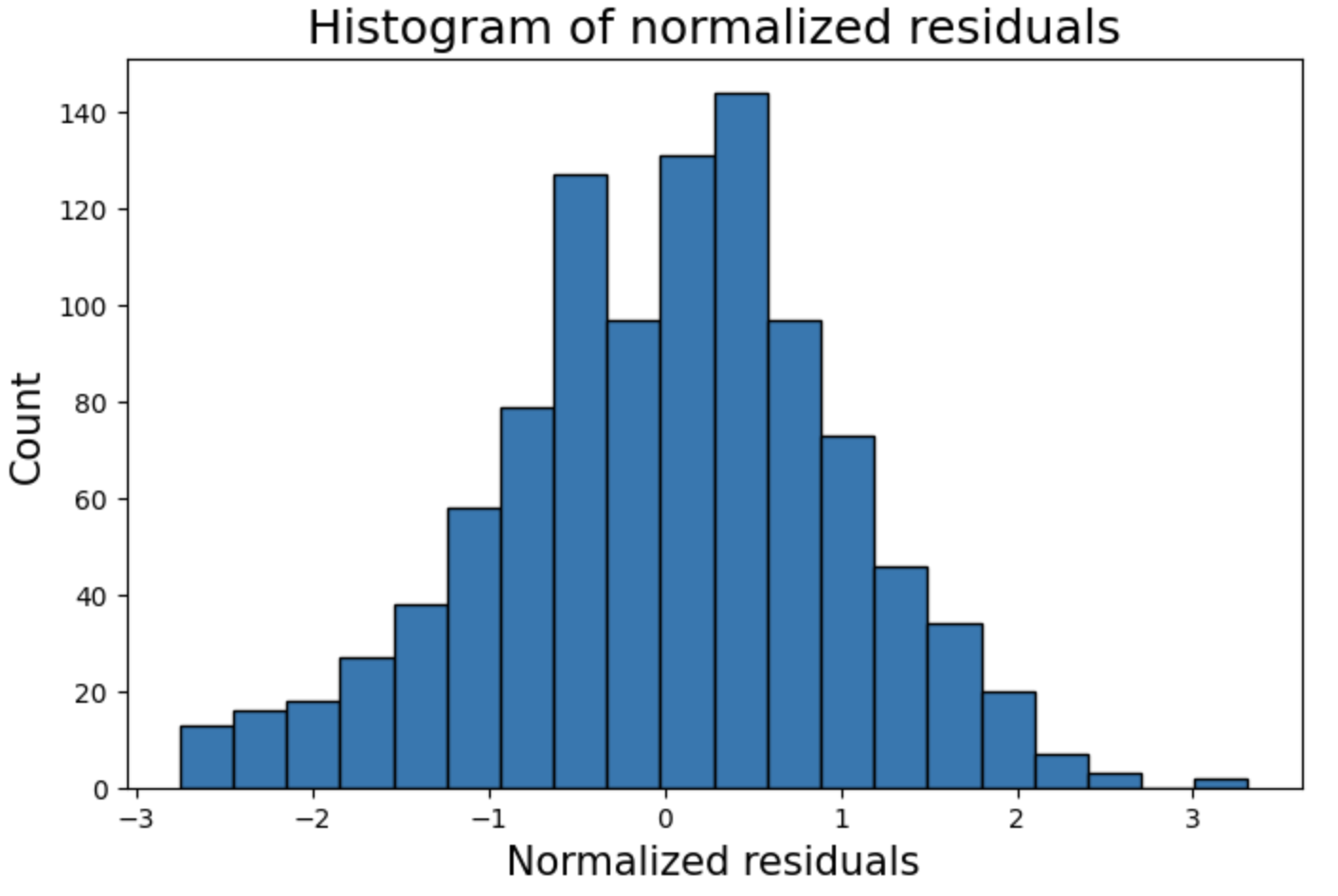
标准化残差直方图
plt.figure(figsize=(8,5))
plt.hist(fitted.resid_pearson,bins=20,edgecolor='k')
plt.ylabel('Count',fontsize=15)
plt.xlabel('Normalized residuals',fontsize=15)
plt.title("Histogram of normalized residuals",fontsize=18)
plt.show()
残差的Q-Q图
from statsmodels.graphics.gofplots import qqplot
plt.figure(figsize=(8,5))
fig=qqplot(fitted.resid_pearson,line='45',fit='True')
plt.xticks(fontsize=13)
plt.yticks(fontsize=13)
plt.xlabel("Theoretical quantiles",fontsize=15)
plt.ylabel("Sample quantiles",fontsize=15)
plt.title("Q-Q plot of normalized residuals",fontsize=18)
plt.grid(True)
plt.show()

上面的直方图显示,正态性假设得到了很好的满足。
检验残差的正态性(Shapiro-Wilk)
from scipy.stats import shapiro
_,p=shapiro(fitted.resid)
if p<0.01:
    print("The residuals seem to come from Gaussian process")
else:
    print("The normality assumption may not hold")
库克距离(检查残差中的异常值)
from statsmodels.stats.outliers_influence import OLSInfluence as influence
inf=influence(fitted)

(c, p) = inf.cooks_distance
plt.figure(figsize=(8,5))
plt.title("Cook's distance plot for the residuals",fontsize=16)
plt.stem(np.arange(len(c)), c, markerfmt=",")
plt.grid(True)
plt.show()
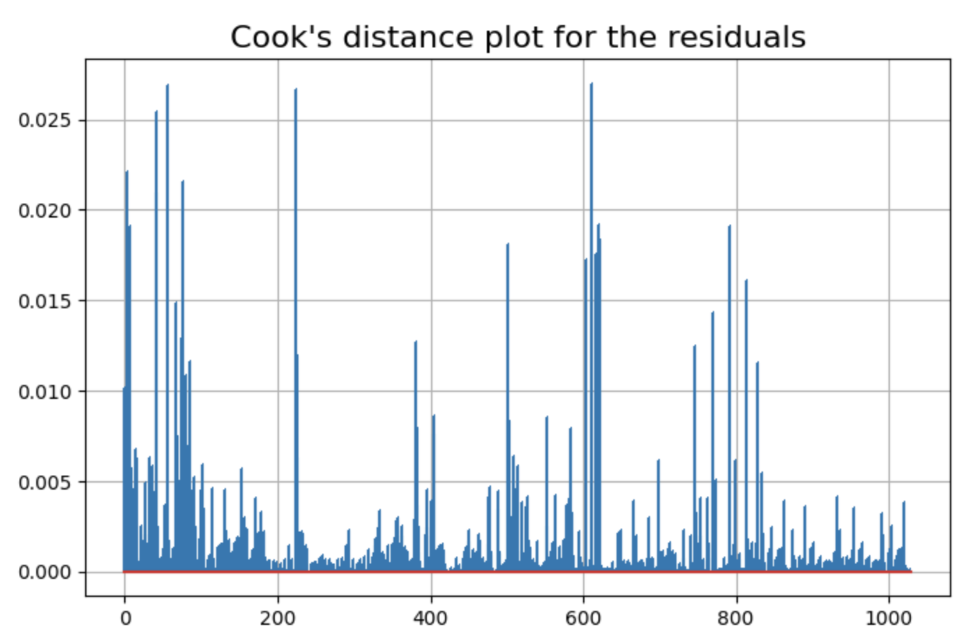
有一些数据点的残差可能是异常值。
方差膨胀因子(Variance Inflation Factor, VIF)
from statsmodels.stats.outliers_influence import variance_inflation_factor as vif
for i in range(len(df1.columns[:-1])):
    v=vif(np.matrix(df1[:-1]),i)
    print("Variance inflation factor for {}: {}".format(df.columns[i],round(v,2)))
Result:
Variance inflation factor for Cement (component 1)(kg in a m^3 mixture): 26.23
Variance inflation factor for Blast Furnace Slag (component 2)(kg in a m^3 mixture): 4.44
Variance inflation factor for Fly Ash (component 3)(kg in a m^3 mixture): 4.56
Variance inflation factor for Water  (component 4)(kg in a m^3 mixture): 92.59
Variance inflation factor for Superplasticizer (component 5)(kg in a m^3 mixture): 5.52
Variance inflation factor for Coarse Aggregate  (component 6)(kg in a m^3 mixture): 85.97
Variance inflation factor for Fine Aggregate (component 7)(kg in a m^3 mixture): 73.46
Variance inflation factor for Age (day): 2.43
很少有特征的方差膨胀因子(VIF)大于10,因此这表明不存在显著的多重共线性。


 5万+
5万+

 被折叠的 条评论
为什么被折叠?
被折叠的 条评论
为什么被折叠?
 到【灌水乐园】发言


