


欢迎关注微信公众号(医学生物信息学),医学生的生信笔记,记录学习过程。
加载包及读取示例数据
library(ggplot2)
data("ToothGrowth")
ToothGrowth$dose<-factor(ToothGrowth$dose)
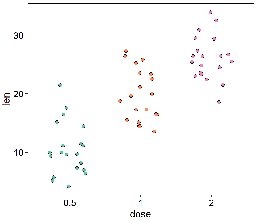
散点抖动图
ggplot(ToothGrowth, aes(dose, len))+
  geom_jitter(aes(fill = dose),position = position_jitter(0.3),shape=21, size = 2)+
  scale_fill_manual(values=c(brewer.pal(7,"Set2")[c(1,2,4)]))+
  theme_classic()+
  theme(panel.background=element_rect(fill="white",colour="black",linewidth=0.25),
        axis.line=element_line(colour="black",linewidth=0.25),
        axis.title=element_text(size=13,face="plain",color="black"),
        axis.text = element_text(size=12,face="plain",color="black"),
        legend.position="none"
  )
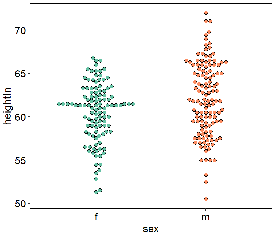
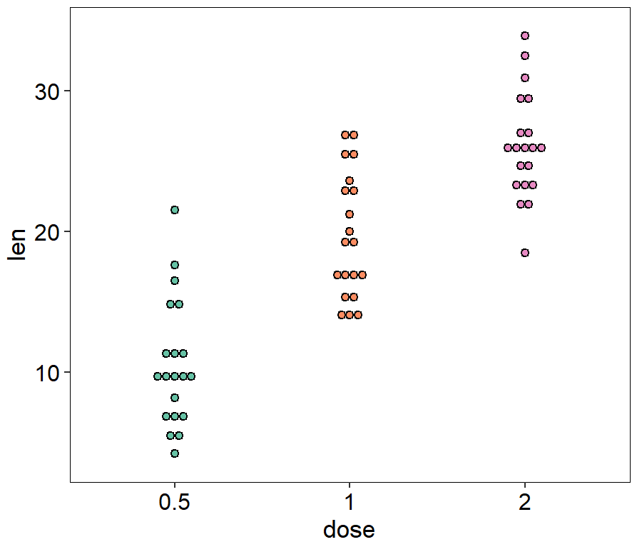
蜂群图
library(ggbeeswarm)
ggplot(ToothGrowth, aes(dose, len))+
  geom_beeswarm(aes(fill = dose),shape=21,colour="black",size=2,cex=2)+
  scale_fill_manual(values= c(brewer.pal(7,"Set2")[c(1,2,4)]))+
  xlab("dose")+
  ylab("len")+
  theme_classic()+
  theme(panel.background=element_rect(fill="white",colour="black",size=0.25),
        axis.line=element_line(colour="black",size=0.25),
        axis.title=element_text(size=13,face="plain",color="black"),
        axis.text = element_text(size=12,face="plain",color="black"),
        legend.position="none"
  )
library(gcookbook)
library(ggbeeswarm)
ggplot(heightweight, aes(x = sex, y = heightIn))+
  geom_beeswarm(aes(fill = sex),shape=21,colour="black",size=2,cex=2)+
  scale_fill_manual(values= c(brewer.pal(7,"Set2")[c(1,2)]))+
  xlab("sex")+
  ylab("heightIn")+
  theme_classic()+
  theme(panel.background=element_rect(fill="white",colour="black",size=0.25),
        axis.line=element_line(colour="black",size=0.25),
        axis.title=element_text(size=13,face="plain",color="black"),
        axis.text = element_text(size=12,face="plain",color="black"),
        legend.position="none"
  )
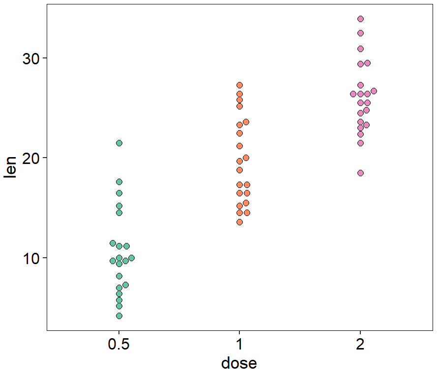
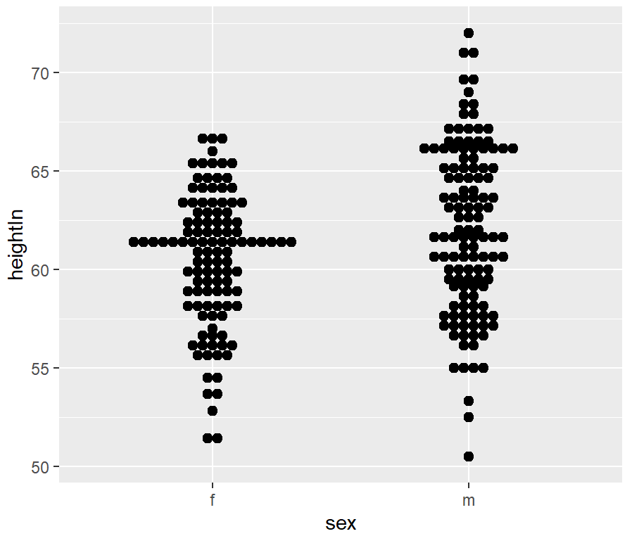
点阵图
ggplot(ToothGrowth, aes(dose, len))+
  geom_dotplot(aes(fill = dose),binaxis='y', stackdir='center', dotsize = 0.6)+
  scale_fill_manual(values=c(brewer.pal(7,"Set2")[c(1,2,4)]))+
  theme_classic()+
  theme(panel.background=element_rect(fill="white",colour="black",size=0.25),
        axis.line=element_line(colour="black",size=0.25),
        axis.title=element_text(size=13,face="plain",color="black"),
        axis.text = element_text(size=12,face="plain",color="black"),
        legend.position="none"
  )
library(gcookbook)
ggplot(heightweight, aes(x = sex, y = heightIn)) +
  geom_dotplot(binaxis = "y", binwidth = .5, stackdir = "center")
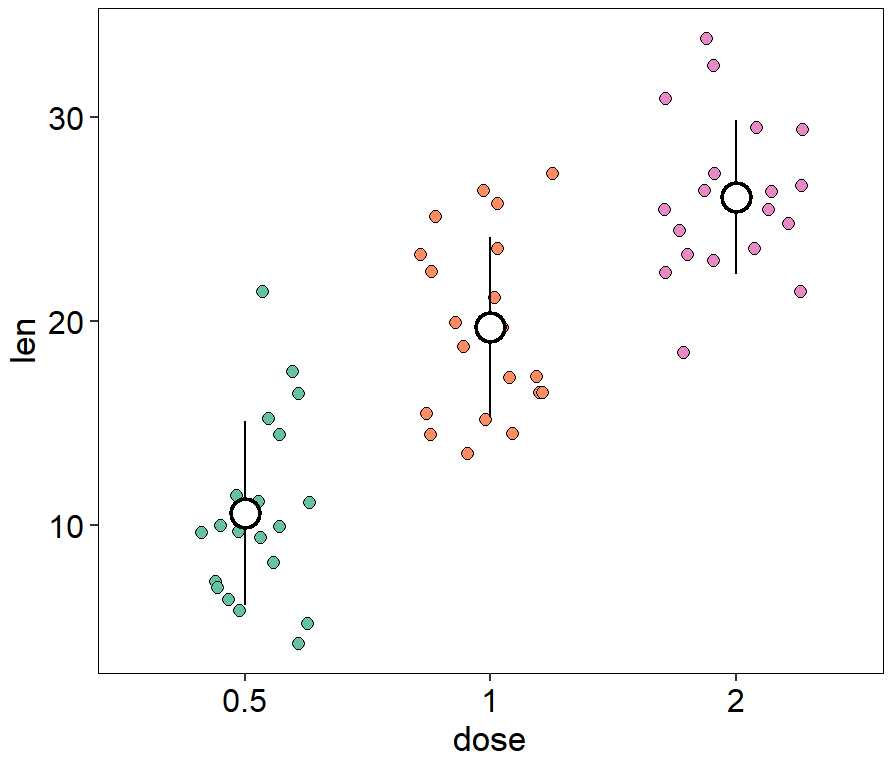
带误差线的抖动散点图
ggplot(ToothGrowth, aes(dose, len))+
  #添加抖动散点
  geom_jitter(aes(fill = dose),position = position_jitter(0.3),shape=21, size = 2,color="black")+
  scale_fill_manual(values=c(brewer.pal(7,"Set2")[c(1,2,4)]))+
  #添加误差线
  stat_summary(fun.data="mean_sdl", fun.args = list(mult=1), geom="pointrange", color = "black",size = 1.2)+
  #添加均值散点
  stat_summary(fun="mean", fun.args = list(mult=1), geom="point", color = "white",size = 4)+
  theme_light()
ggplot(ToothGrowth, aes(dose, len))+
  geom_jitter(aes(fill = dose),position = position_jitter(0.3),shape=21, size = 2,color="black")+
  scale_fill_manual(values=c(brewer.pal(7,"Set2")[c(1,2,4)]))+
  stat_summary(fun.data="mean_sdl", fun.args = list(mult=1),
               geom="pointrange", color = "black",size = 1.2)+
  stat_summary(fun="mean", fun.args = list(mult=1),
               geom="point", color = "white",size = 4)+
  theme_classic()+
  theme(panel.background=element_rect(fill="white",colour="black",size=0.25),
        axis.line=element_line(colour="black",size=0.25),
        axis.title=element_text(size=13,face="plain",color="black"),
        axis.text = element_text(size=12,face="plain",color="black"),
        legend.position="none"
  )
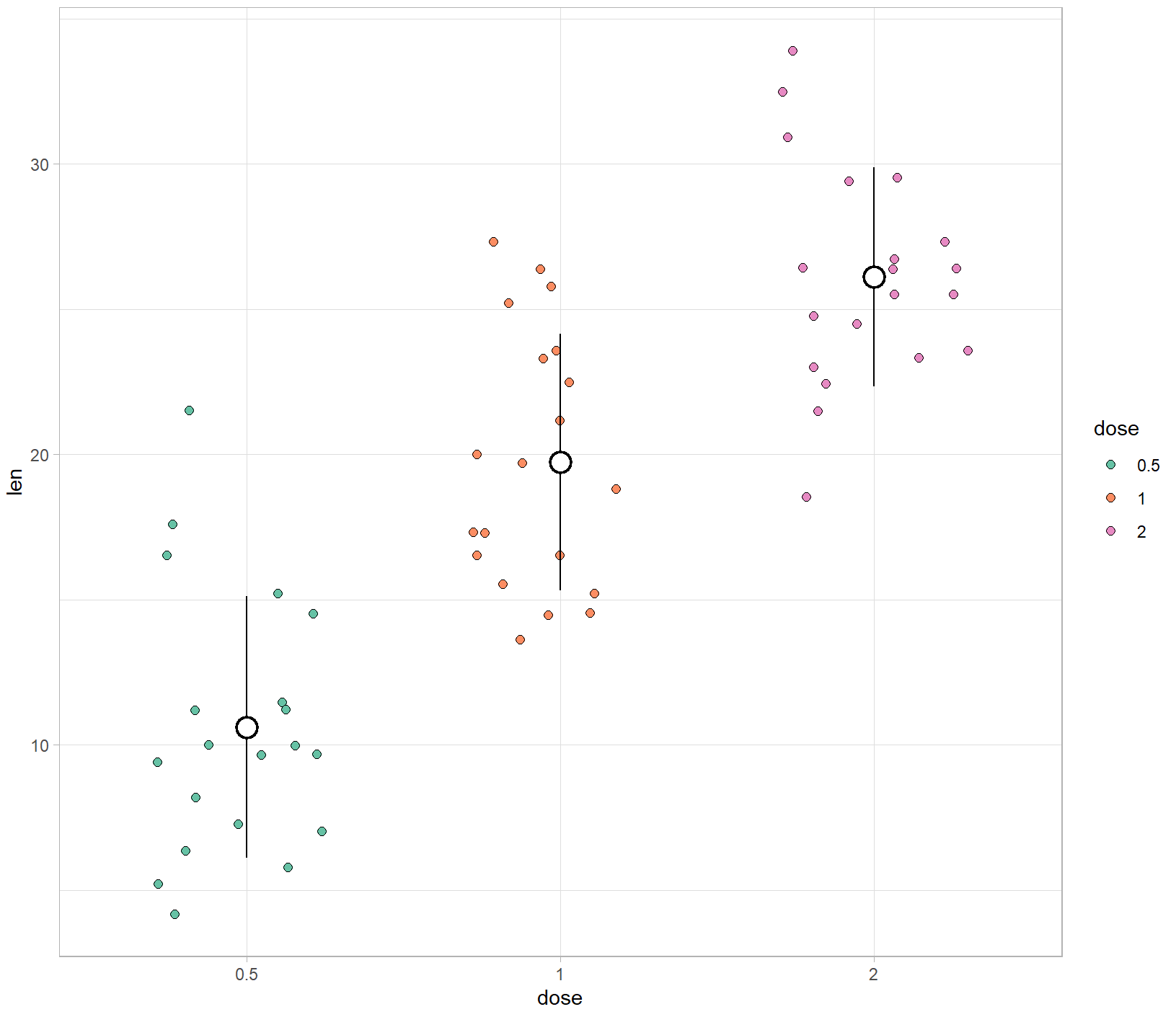
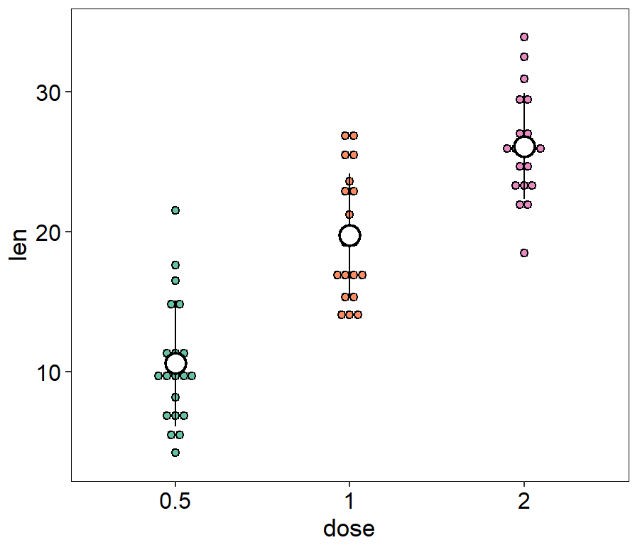
带误差线散点与点阵组合图
ggplot(ToothGrowth, aes(dose, len,fill = dose))+
  geom_dotplot(binaxis='y', stackdir='center', dotsize = 0.6)+

  scale_fill_manual(values=c(brewer.pal(7,"Set2")[c(1,2,4)]))+
  geom_pointrange(stat="summary", fun.data="mean_sdl",fun.args = list(mult=1),
                  color = "black",size = 1.2)+
  geom_point(stat="summary", fun="mean",fun.args = list(mult=1),
             color = "white",size = 4)+
  theme_classic()+
  theme(panel.background=element_rect(fill="white",colour="black",size=0.25),
        axis.line=element_line(colour="black",size=0.25),
        axis.title=element_text(size=13,face="plain",color="black"),
        axis.text = element_text(size=12,face="plain",color="black"),
        legend.position="none"
  )
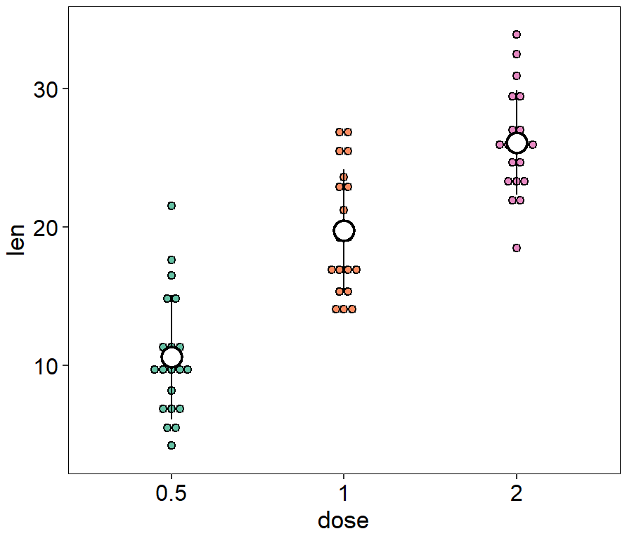
ggplot(ToothGrowth, aes(dose, len,fill = dose))+
  geom_dotplot(binaxis='y', stackdir='center', dotsize = 0.6)+
  scale_fill_manual(values=c(brewer.pal(7,"Set2")[c(1,2,4)]))+
  stat_summary(fun.data="mean_sdl", fun.args = list(mult=1),
               geom="pointrange", color = "black",size = 1.2)+
  stat_summary(fun="mean", fun.args = list(mult=1),
               geom="point", color = "white",size = 4)+
  theme_classic()+
  theme(panel.background=element_rect(fill="white",colour="black",size=0.25),
        axis.line=element_line(colour="black",size=0.25),
        axis.title=element_text(size=13,face="plain",color="black"),
        axis.text = element_text(size=12,face="plain",color="black"),
        legend.position="none"
  )
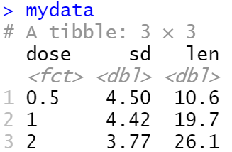
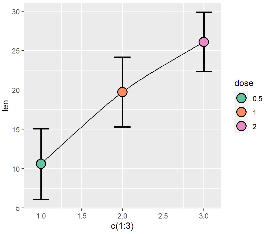
带连接线的带误差线散点图
library(ggalt)
library(dplyr)
mydata <- ToothGrowth %>%
  group_by(dose) %>%
  summarise(sd = sd(len),len = mean(len))
ggplot(mydata, aes(x = c(1:3), y = len, ymin = len-sd, ymax = len+sd))+
  geom_xspline(spline_shape = -0.5,size=1) +

  geom_errorbar(colour="black", width=0.2,size=1)+
  geom_point(aes(fill = dose),shape=21,size=5,stroke=1)+

  scale_fill_manual(values=c(brewer.pal(7,"Set2")[c(1,2,4)]))
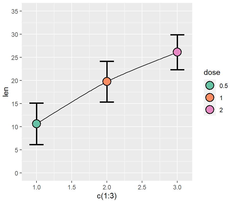
ggplot(mydata, aes(x = c(1:3), y = len, ymin = len-sd, ymax = len+sd))+
  geom_xspline(spline_shape = -0.5,size=1) +

  geom_errorbar(colour="black", width=0.2,size=1)+
  geom_point(aes(fill = dose),shape=21,size=5,stroke=1)+

  scale_fill_manual(values=c(brewer.pal(7,"Set2")[c(1,2,4)]))+
  scale_y_continuous(breaks=seq(0,35,5),lim=c(0,35))
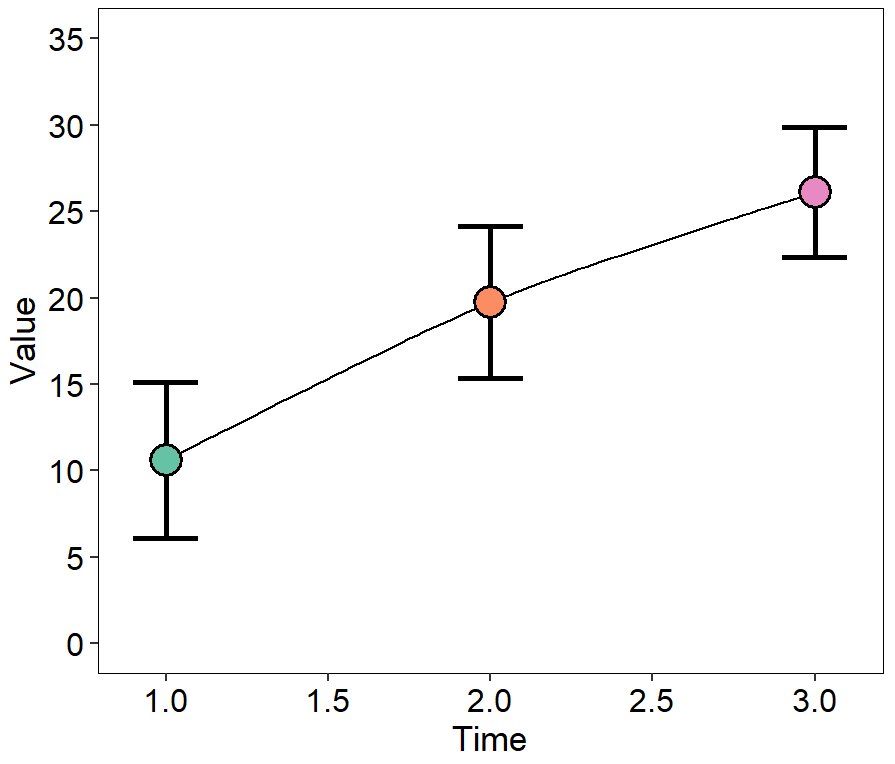
ggplot(mydata, aes(x = c(1:3), y = len, ymin = len-sd, ymax = len+sd))+
  geom_xspline(spline_shape = -0.5,size=1) +

  geom_errorbar(colour="black", width=0.2,size=1)+
  geom_point(aes(fill = dose),shape=21,size=5,stroke=1)+

  scale_fill_manual(values=c(brewer.pal(7,"Set2")[c(1,2,4)]))+
  scale_y_continuous(breaks=seq(0,35,5),lim=c(0,35))+
  xlab("Time")+
  ylab("Value")+
  theme_classic()+
  theme(panel.background=element_rect(fill="white",colour="black",size=0.25),
        axis.line=element_line(colour="black",size=0.25),
        axis.title=element_text(size=13,face="plain",color="black"),
        axis.text = element_text(size=12,face="plain",color="black"),
        legend.position="none"
  )
参考资料
[1] https://r-graphics.org/recipe-bar-graph-labels
[2] https://github.com/EasyChart/Beautiful-Visualization-with-R
[3] R语言数据可视化之美:专业图表绘制指南(增强版) (张杰)


 1226
1226

 被折叠的 条评论
为什么被折叠?
被折叠的 条评论
为什么被折叠?
 到【灌水乐园】发言


