


第 5 章:主题(Theme)系统 —— Light / Dark / System 三主题完整实现
现代前端应用几乎都需要支持深色模式(Dark Mode)。但在企业级后台系统中,主题模式不仅仅是“切换颜色”这么简单:
-
必须支持 Light / Dark / System 三种模式
-
必须与 Tailwind 的 darkMode=class 完整配合
-
必须能在所有组件中生效(包括 shadcn/ui)
-
必须能够被用户手动选择,并持久保存
-
必须支持系统主题跟随( prefers-color-scheme )
-
必须兼容 SSR / CSR(本项目是 CSR,无需额外工作)
本章将带你从 0 构建一个完整的主题系统:
-
next-themes初始化 -
全局主题上下文
-
主题切换组件 ThemeSwitcher
-
在 Tailwind 中实现自动 dark class
-
shadcn 风格主题色生效
-
用 Zustand 添加可选主题状态(支持未来扩展)
-
将主题持久化到 localStorage
完成后,你的项目将具备媲美现代 SaaS 的主题能力。
5.1 为什么选择 next-themes?
next-themes 是当前业界最优秀的主题切换库:
| 特性 | 说明 |
|---|---|
| 支持 Light / Dark / System | 自动识别系统主题 |
| 自动管理 HTML class | 与 Tailwind 完美组合 |
| 可以存储用户选择 | localStorage 自动持久化 |
| 与 shadcn/ui 原生兼容 | 官方推荐组合 |
| 零配置 / 零侵入 | 只需要包裹 Provider |
5.2 在main.tsx 中集成ThemeProvider
在 main.tsx 中添加:
import { ThemeProvider } from "next-themes";

<ThemeProvider attribute="class">
  <App />
</ThemeProvider>
完整的main.tsx代码
import { ThemeProvider } from 'next-themes';
import { StrictMode } from 'react';
import { createRoot } from 'react-dom/client';
import './index.css';
import App from './App.tsx';
import './i18n';

createRoot(document.getElementById('root')!).render(
  <StrictMode>
    <ThemeProvider attribute="class">
      <App />
    </ThemeProvider>
  </StrictMode>,
);
attribute="class" 是关键,会在 <html> 上添加:
-
class="light" -
class="dark"
Tailwind 的 dark: 工具类依赖这个行为。
5.3 创建主题切换组件(ThemeSwitcher)
在 src/components/ThemeSwitcher.tsx 创建:
import { useTheme } from "next-themes";

const themes = [
  { value: "light", label: "Light" },
  { value: "dark", label: "Dark" },
  { value: "system", label: "System" },
];

export const ThemeSwitcher = () => {
  const { theme, setTheme } = useTheme();

  return (
    <select
      className="border px-2 py-1 rounded-md"
      value={theme || "system"}
      onChange={(e) => setTheme(e.target.value)}
    >
      {themes.map((item) => (
        <option key={item.value} value={item.value}>
          {item.label}
        </option>
      ))}
    </select>
  );
};
用ShadCn实现
import { useTheme } from 'next-themes';
import {
  Select,
  SelectContent,
  SelectItem,
  SelectTrigger,
  SelectValue,
} from '@/components/ui/select';

const themes = [
  { value: 'light', label: 'Light' },
  { value: 'dark', label: 'Dark' },
  { value: 'system', label: 'System' },
];

export const ThemeSwitcher = () => {
  const { theme, setTheme } = useTheme();

  return (
    <Select value={theme || 'system'} onValueChange={(value) => setTheme(value)}>
      <SelectTrigger className="w-[100px]">
        <SelectValue placeholder="Select theme" />
      </SelectTrigger>
      <SelectContent>
        {themes.map((item) => (
          <SelectItem key={item.value} value={item.value}>
            {item.label}
          </SelectItem>
        ))}
      </SelectContent>
    </Select>
  );
};
特点:
-
主题显示:当前主题
-
切换主题:setTheme("light")
-
自动写入 localStorage:
theme=xxx -
与 Tailwind 的 dark class 自动联动
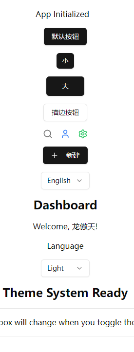
5.4 在 App 中测试主题切换
修改 src/App.tsx:
import { ThemeSwitcher } from "./components/ThemeSwitcher";
import { LanguageSwitcher } from "./components/LanguageSwitcher";

export default function App() {
  return (
    <div className="p-4 space-y-6">
      <div className="flex items-center space-x-4">
        <LanguageSwitcher />
        <ThemeSwitcher />
      </div>

      <h1 className="text-2xl font-bold">Theme System Ready</h1>

      <div className="p-4 rounded-md border bg-card text-card-foreground">
        This box will change when you toggle theme.
      </div>
    </div>
  );
}
App.tsx完整代码
import { Search, User, Settings, Plus } from 'lucide-react';
import { useTranslation } from 'react-i18next';
import { Button } from '@/components/ui/button';
import { LanguageSwitcher } from './components/LanguageSwitcher';
import { ThemeSwitcher } from './components/ThemeSwitcher';

function App() {
  const { t } = useTranslation();

  return (
    <div className="flex min-h-screen flex-col items-center justify-center gap-4 space-x-3 p-4">
      <div>App Initialized</div>
      <Button>默认按钮</Button>
      <Button size="sm">小</Button>
      <Button size="lg">大</Button>
      <Button variant="outline">描边按钮</Button>
      <IconDemo />
      <CreateButton />
      <LanguageSwitcher />
      <h1 className="text-2xl font-bold">{t('dashboard.title')}</h1>
      <p>{t('dashboard.welcome', { name: '龙傲天' })}</p>
      <div>{t('common.language')}</div>
      <ThemeSwitcher />
      <h1 className="text-2xl font-bold">Theme System Ready</h1>
      <div className="rounded-md border bg-card p-4 text-card-foreground">
        This box will change when you toggle theme.
      </div>
    </div>
  );
}

function IconDemo() {
  return (
    <div className="flex items-center gap-4">
      <Search className="h-5 w-5 text-muted-foreground" />
      <User className="h-5 w-5 text-blue-500" />
      <Settings className="h-5 w-5 text-green-500" />
    </div>
  );
}

function CreateButton() {
  return (
    <Button>
      <Plus className="mr-2 h-4 w-4" />
      新建
    </Button>
  );
}

export default App;
运行:
pnpm dev
你将看到:
-
一段文本随主题变色
-
shadcn 组件卡片风格自动同 theme 变化
5.5 Tailwind 的 darkMode(核心原理解释)
我们在 tailwind.config.cjs 中设置:
darkMode: 'class'
为什么是 class?
因为:
-
next-themes 会给 HTML 标签动态加
.dark或.light -
Tailwind 会根据这个 class 去应用 dark 主题下的所有样式
-
全局 CSS、组件、UI 元素都可自动响应
例如使用:
<div className="bg-white dark:bg-black"></div>
在 Light 模式下 → white
在 Dark 模式下 → black
不需要 JS 代码切换样式。
这就是现代 dark mode 的最佳实践。
5.6 主题持久化实现(由 next-themes 自动处理)
next-themes 会自动在 localStorage 中维护:
theme=light
三种值:
| mode | localStorage 值 |
|---|---|
| Light | theme=light |
| Dark | theme=dark |
| System | localStorage 不存储(或 theme=system) |
浏览器刷新 → 仍然保持上一次选择的主题。
无需自己写 Zustand。
5.7 为全局组件注入主题变量(未来可扩展)
你可以在 theme.css 中加入更多主题变量:
src/styles/theme.css
:root {
  --radius: 0.5rem;

  --primary: 240 5.9% 10%;
  --primary-foreground: 0 0% 98%;
}

.dark {
  --primary: 0 0% 98%;
  --primary-foreground: 240 5.9% 10%;
}
然后在 Tailwind 中使用:
<div className="bg-[hsl(var(--primary))] text-[hsl(var(--primary-foreground))]">
  主题变量测试
</div>
高级主题自定义将在后面高级章节介绍。
5.8 在 shadcn/ui 中主题自动生效
因为 shadcn 使用 CSS Variables(如 --background),所有主题颜色会自动在 dark mode 中切换。
例如:
<div className="bg-background text-foreground p-4 rounded-md">
  shadcn color system working
</div>
你会看到:
-
Light 模式:浅色背景
-
Dark 模式:深色背景
无需任何额外配置。
5.9 和 i18n 一起工作
你可以在 中放置:
<header className="flex items-center justify-between border-b p-4">
  <LanguageSwitcher />
  <ThemeSwitcher />
</header>
这将成为一个多语言 + 多主题控制中心。
5.10 常见问题与工程实践经验
Q1:为什么 UI 在加载时会闪烁?
因为主题还未从 localStorage 恢复。
解决方法(官方推荐):
在 index.html 添加:
<script>
  (function() {
    const theme = localStorage.getItem("theme");
    if (theme === "dark") {
      document.documentElement.classList.add("dark");
    }
  })();
</script>
Q2:如何让组件内部样式自动响应主题?
使用:
className="text-foreground bg-background"
shadcn 默认变量即可。
Q3:主题切换时如何过渡?
在 tailwind.css 添加:
html {
  transition: background-color 0.2s ease, color 0.2s ease;
}
5.11 本章小结
本章我们完成了:
✔ 使用 next-themes 集成主题系统
✔ 支持 Light / Dark / System 三种模式
✔ 添加主题切换组件 ThemeSwitcher
✔ Tailwind 的 darkMode 完整生效
✔ shadcn/ui 风格自动适配主题
✔ 主题持久化
✔ UI 响应主题示例展示
现在你的项目已经具备:
-
完整主题系统
-
配合 Tailwind 与 shadcn 的现代化设计
-
动态响应 + CSS Variable 体系
-
可扩展、可持久保存的主题体系


 扫一扫
扫一扫


 3050
3050

 被折叠的 条评论
为什么被折叠?
被折叠的 条评论
为什么被折叠?
 到【灌水乐园】发言


