


本章将正式实现你的框架需求之一:大 / 中 / 小 三种尺寸体系(Large / Medium / Small),并且做到:
-
全局控制(Zustand 管理)
-
组件级覆盖(Button、Input、Card 等自动适配)
-
与 shadcn/ui 的 variant 体系完美兼容
-
与主题与语言系统协同工作
-
支持未来扩展(如文字大小、行距、spacing 等)
-
保证企业级 UI 一致性
本章的尺寸体系将贯穿整个 UI 组件系统,是专业管理后台不可或缺的能力。
第 6 章:全局尺寸系统(sm / md / lg)—— 统一 UI 尺寸控制体系
现代后台系统通常需要两类尺寸:
-
全局尺寸(系统级别):例如后台全局切换“大号”字体或“紧凑模式”
-
组件尺寸(组件级别):例如 Button size="lg" 或 Card size="sm"
本章将实现一个:
-
全局尺寸(sm / md / lg)
-
默认组件尺寸为全局尺寸
-
组件允许单独覆盖尺寸
-
全局变化时所有组件同步更新
-
下拉切换控制器 UI(SizeSwitcher)
-
配合 Tailwind + CVA 实现可扩展的尺寸 token
最终效果:
-
App 顶部有一个尺寸切换器
-
切换后所有组件自动响应:按钮变大、输入框变大、卡片 padding 变大
-
单个组件仍可使用
size="sm"覆盖全局配置
6.1 使用 Zustand 管理全局尺寸状态
首先创建目录:
src/stores/ui.ts
写入:
import { create } from "zustand";

export type UISize = "sm" | "md" | "lg";

interface UIState {
  size: UISize;
  setSize: (size: UISize) => void;
}

export const useUIStore = create<UIState>((set) => ({
  size: "md", // 默认中等
  setSize: (size) => set({ size }),
}));
状态结构非常简单:
-
size: 当前全局尺寸 -
setSize: 切换尺寸方法
未来如果需要扩展(如 UI 密度、字体大小、圆角大小),可以继续放到这个 store 中。
6.2 创建尺寸切换组件
在:
src/components/SizeSwitcher.tsx
创建:
import { useUIStore } from '../stores/ui';

export const SizeSwitcher = () => {
  const { size, setSize } = useUIStore();

  return (
    <select
      className="rounded-md border px-2 py-1"
      value={size}
      onChange={(e) => setSize(e.target.value as 'sm' | 'md' | 'lg')}
    >
      <option value="sm">Small</option>
      <option value="md">Medium</option>
      <option value="lg">Large</option>
    </select>
  );
};
用ShadCn实现
import {
  Select,
  SelectContent,
  SelectItem,
  SelectTrigger,
  SelectValue,
} from '@/components/ui/select';
import { useUIStore } from '../stores/ui';

export const SizeSwitcher = () => {
  const { size, setSize } = useUIStore();

  return (
    <Select value={size} onValueChange={(value) => setSize(value as 'sm' | 'md' | 'lg')}>
      <SelectTrigger className="w-[180px]">
        <SelectValue placeholder="Select size" />
      </SelectTrigger>
      <SelectContent>
        <SelectItem value="sm">Small</SelectItem>
        <SelectItem value="md">Medium</SelectItem>
        <SelectItem value="lg">Large</SelectItem>
      </SelectContent>
    </Select>
  );
};
6.3 将 SizeSwitcher 集成到 App 里测试
修改 src/App.tsx:
import { Search, User, Settings, Plus } from 'lucide-react';
import { useTranslation } from 'react-i18next';
import { Button } from '@/components/ui/button';
import { LanguageSwitcher } from './components/LanguageSwitcher';
import { SizeSwitcher } from './components/SizeSwitcher';
import { ThemeSwitcher } from './components/ThemeSwitcher';
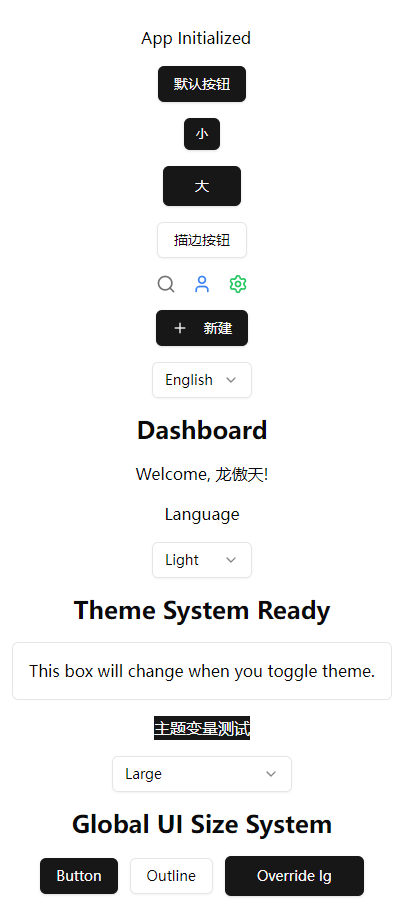
function App() {
const { t } = useTranslation();
return (
<div className="flex min-h-screen flex-col items-center justify-center gap-4 space-x-3 p-4">
<div>App Initialized</div>
<Button>默认按钮</Button>
<Button size="sm">小</Button>
<Button size="lg">大</Button>
<Button variant="outline">描边按钮</Button>
<IconDemo />
<CreateButton />
<LanguageSwitcher />
<h1 className="text-2xl font-bold">{t('dashboard.title')}</h1>
<p>{t('dashboard.welcome', { name: '龙傲天' })}</p>
<div>{t('common.language')}</div>
<ThemeSwitcher />
<h1 className="text-2xl font-bold">Theme System Ready</h1>
<div className="rounded-md border bg-card p-4 text-card-foreground">
This box will change when you toggle theme.
</div>
<div className="bg-[hsl(var(--primary))] text-[hsl(var(--primary-foreground))]">
主题变量测试
</div>
<SizeSwitcher />
<h1 className="text-2xl font-bold">Global UI Size System</h1>
<div className="space-x-3">
<Button>Button</Button>
<Button variant="outline">Outline</Button>
<Button size="lg">Override lg</Button>
</div>
</div>
);
}
function IconDemo() {
return (
<div className="flex items-center gap-4">
<Search className="h-5 w-5 text-muted-foreground" />
<User className="h-5 w-5 text-blue-500" />
<Settings className="h-5 w-5 text-green-500" />
</div>
);
}
function CreateButton() {
return (
<Button>
<Plus className="mr-2 h-4 w-4" />
新建
</Button>
);
}
export default App;
此时尺寸切换器已经能改变 Button 尺寸,但我们需要完善组件逻辑。
6.4 让组件自动读取全局尺寸(Button 示例)
你的 shadcn Button 文件如下(根据前几章):
在:
src/components/ui/button.tsx
修改:
import * as React from "react"
import { cn } from "@/lib/utils"
import { useUIStore } from "@/stores/ui"

const componentSizes = {
  sm: "px-2 py-1 text-sm",
  md: "px-3 py-2 text-base",
  lg: "px-4 py-3 text-lg",
}

export interface ButtonProps
  extends React.ButtonHTMLAttributes<HTMLButtonElement> {
  size?: "sm" | "md" | "lg" | "auto"; // auto = follow global
  variant?: "default" | "outline" | "ghost";
}

export const Button = React.forwardRef<HTMLButtonElement, ButtonProps>(
  ({ className, size = "auto", variant = "default", ...props }, ref) => {
    const globalSize = useUIStore((s) => s.size);
    const finalSize = size === "auto" ? globalSize : size;

    return (
      <button
        ref={ref}
        className={cn(
          "rounded-md font-medium transition-colors",
          componentSizes[finalSize],
          variant === "outline"
            ? "border border-input hover:bg-accent hover:text-accent-foreground"
            : "bg-primary text-primary-foreground hover:bg-primary/90",
          className
        )}
        {...props}
      />
    );
  }
);

Button.displayName = "Button";
现在 Button 有三种尺寸应用方式:
| 用法 | 说明 |
|---|---|
<Button /> | 使用全局尺寸 |
<Button size="lg" /> | 覆盖为大号尺寸 |
<Button size="sm" /> | 覆盖为小号尺寸 |
<SizeSwitcher /> | 控制全局尺寸 |
完美符合企业 UI 要求。
6.5 为 Input、Card 等组件添加全局尺寸支持(范例)
强烈推荐在组件目录中建立一个公共尺寸工具:
src/components/ui/useComponentSize.ts
内容:
import { useUIStore } from "@/stores/ui";

export const useComponentSize = (size?: "sm" | "md" | "lg" | "auto") => {
  const globalSize = useUIStore((s) => s.size);
  return size === "auto" || !size ? globalSize : size;
};
之后每个组件都可以这样写:
const finalSize = useComponentSize(size)
让我们为 Input 组件建立一个尺寸支持:
(生成 input):
pnpm dlx shadcn-ui@latest add input
编辑文件:
src/components/ui/input.tsx
添加:
import { useComponentSize } from "./useComponentSize";

const inputSizes = {
  sm: "h-7 px-2 text-sm",
  md: "h-9 px-3 text-base",
  lg: "h-11 px-4 text-lg",
};

export interface InputProps
  extends React.InputHTMLAttributes<HTMLInputElement> {
  size?: "sm" | "md" | "lg" | "auto";
}

const Input = React.forwardRef<HTMLInputElement, InputProps>(
  ({ className, type, size = "auto", ...props }, ref) => {
    const finalSize = useComponentSize(size);

    return (
      <input
        type={type}
        className={cn(
          "border rounded-md bg-background focus:ring-2",
          inputSizes[finalSize],
          className
        )}
        ref={ref}
        {...props}
      />
    );
  }
);
输入框也具备全局尺寸能力。
6.6 UI 尺寸系统设计原理(重要理解)
你的尺寸系统遵循 两层设计:
第一层:系统 UI 尺寸(sm / md / lg)
存储在 Zustand。
全局作用于所有组件的默认尺寸。
第二层:组件本身的尺寸参数(size="sm")
覆盖第一层。
优先级:
组件尺寸 > 全局尺寸
如:
<SizeSwitcher />    // 全局尺寸 = lg
<Button />          // 自动变成 lg
<Button size="sm" />// 单独变成 sm
非常灵活。
6.7 在顶级 Layout 中使用(后续章节会使用)
最终,你会在:
src/components/Layout.tsx
放置:
<header className="flex items-center justify-between p-4 border-b">
  <LanguageSwitcher />
  <ThemeSwitcher />
  <SizeSwitcher />
</header>
这是企业后台的经典“全局配置栏”。
6.8 本章小结
本章完成了:
✔ 全局尺寸状态(Zustand)
✔ 尺寸切换器(SizeSwitcher)
✔ Button 支持全局尺寸 + 局部覆盖
✔ 创建 useComponentSize 钩子
✔ Input 等组件也支持尺寸系统
✔ App 整体可响应大小变化
✔ 为后续所有 UI 组件奠定一致规范
至此,你的项目现在拥有 完整的 UI 三尺寸体系,并可与:
-
theme 主题系统
-
shadcn UI
-
Tailwind
-
i18n
-
动态路由
-
权限
协同工作。
项目已经具备成熟后台框架的视觉基础。


 扫一扫
扫一扫


 565
565

 被折叠的 条评论
为什么被折叠?
被折叠的 条评论
为什么被折叠?
 到【灌水乐园】发言


