


241012
CSS:层叠样式表 (Cascading Style Sheets,缩写为 CSS),是一种 样式表 语言,用来描述 HTML 文档的呈现(美化内容)
1. CSS 基本写法
在head标签里面。title标签下面添加一对style标签,style标签里面书写CSS代码。
选择器 { 属性名: 属性值; }
<!DOCTYPE html>
<html lang="en">

<head>
    <meta charset="UTF-8">
    <meta name="viewport" content="width=device-width, initial-scale=1.0">
    <title>CSS基本写法</title>
    <style>
        /*
        CSS美化样式
        内部样式表,在html文件中书写
        CSS基本写法:
        选择器{属性名:属性值;}
        */

        p {
            color: brown;
            /* font-size属性值单位为px */
            font-size: medium;
        }

        b {
            color: black;
        }

    </style>
</head>

<body>
    <p><b>加粗</b>段落标签</p>
</body>

</html>
2. CSS 引入方式
2.1 内部样式表
如上节所示
2.2 外部样式表
新建CSS文件,在HTML文件中 link 引入CSS文件。
html代码:
<!DOCTYPE html>
<html lang="en">
<head>
<meta charset="UTF-8">
<meta name="viewport" content="width=device-width, initial-scale=1.0">
<title>外部样式表</title>
<!-- 前端开发中,重复样式放到css文件内,多个html文件共用;并可缩短html文件长度 -->
<!-- 学习做简单例子用内部样式表 -->
<!-- rel关系,stylesheet样式表;href文件路径 -->
<link rel="stylesheet" href="./my.css">
</head>
<body>
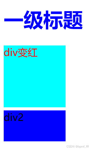
<h1>一级标题</h1>
<div class="test">div变红</div>
<div class="testt">div2</div>
</body>
</html>
css代码:
h1{
    color: blue;
}

.test{
    /* width和height属性值单位为px */
    width: 100px;
    height: 100px;
    background-color: aqua;
    color: red;
}

.testt {
    margin-top: 5px;
    width: 100px;
    height: 50px;
    background-color: blue;
}
3. CSS 基础选择器
3.1 标签选择器和类选择器
<!DOCTYPE html>
<html lang="en">
<head>
<meta charset="UTF-8">
<meta name="viewport" content="width=device-width, initial-scale=1.0">
<title>标签&类选择器</title>
<style>
/* 标签选择器,为相同标签设置相同样式 */
p{
font-size: 20px;
}
/* 引入类,为相同标签设置不同样式 */
/* 类选择器:差异化设置CSS样式
定义选择器:.类名{}
使用选择器:class=“类名1 类名2...”
*/
.green{
color: green;
}
.bgc{
background-color: aqua;
}
</style>
</head>
<body>
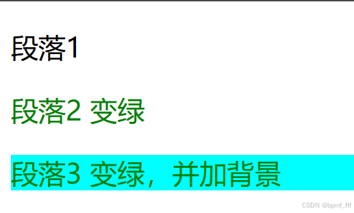
<p>段落1</p>
<p class="green">段落2 变绿</p>
<p class="green bgc">段落3 变绿,并加背景</p>
</body>
</html>
3.2 通配符选择器
<!DOCTYPE html>
<html lang="en">
<head>
<meta charset="UTF-8">
<meta name="viewport" content="width=device-width, initial-scale=1.0">
<title>通配符选择器</title>
<style>
/* 查找页面所有标签,设置相同样式 */
/* 使用方法
*{
属性1:属性值
属性2:属性值
}
*/
/* 常用使用场景:
清除标签的默认样式,如标签默认的内外边距。
*/
*{
margin: 0;
padding: 0;
}
</style>
</head>
<body>
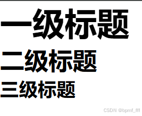
<h1>一级标题</h1>
<h2>二级标题</h2>
<h3>三级标题</h3>
</body>
</html>
4. 盒子div
<!DOCTYPE html>
<html lang="en">
<head>
<meta charset="UTF-8">
<meta name="viewport" content="width=device-width, initial-scale=1.0">
<title>div盒子</title>
<style>
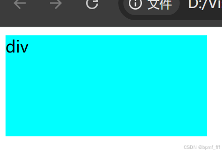
/* div默认换行,所占用宽度width默认为100% */
div{
background-color: aqua;
width: 200px;
height: 100px;
}
</style>
</head>
<body>
<div>div</div>
</body>
</html>
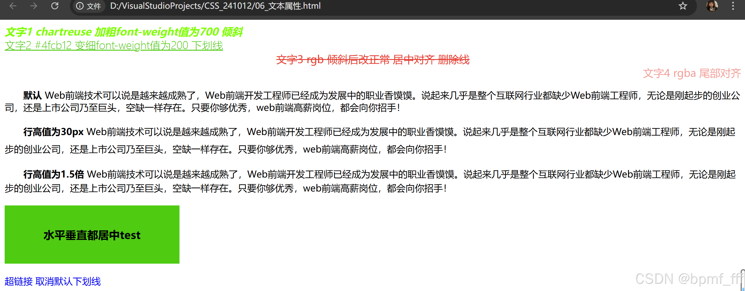
5. 文本属性
<!DOCTYPE html>
<html lang="en">
<head>
    <meta charset="UTF-8">
    <meta name="viewport" content="width=device-width, initial-scale=1.0">
    <title>文本属性</title>
    <style>
        /*
            文本属性:
            1.字体大小font-size,默认值为16px
            2.文字颜色color,默认黑色
            3.文字粗细font-weight,默认值为normal 400
            4.文字倾斜font-style,默认normal不倾斜
            5.行高line-height,取值举例:30px,1.5;后者为当前字号高的倍数
            6.文本缩进text-indent,属性值单位为em
            7.水平对齐方式text-align,left、center、right,默认居左对齐
            8.文本修饰线text-decoration,underline下划线、line-through删除线(如打折产品的原价)、none无(超链接)
        */

        /* 使用标签选择器对所有div标签设置字体大小 */
        div{
            font-size: 18px;
        }

        /* 类选择器 color不同类型的属性值练习 */
        .box1{
            color:chartreuse;
            font-weight: 700;
            font-style: italic;
        }
        .box2{
            /* 取色 HEX值 */
            color: #4fcb12;
            font-weight: 200;
            text-decoration: underline;
        }
        .box3{
            /* 取色 rgb */
            color: rgb(231, 64, 50);
            text-align: center;
            text-decoration: line-through;
        }
        em{
            /* 将倾斜文本更改为正常 */
            font-style: normal;
        }
        .box4{
            /* rgba a为透明度,取值0-1*/
            color: rgba(231, 64, 50, 0.5);
            text-align: end;
        }

        /* 行高 */
        .p1{
            line-height: 30px;
        }
        .p2{
            line-height: 1.5;
        }

        /* p标签加文本缩进2字符 */
        p{
            text-indent: 2em;
        }

        /* h3称为标签或块级元素 */
        h3{
            width: 300px;
            height: 100px;
            background-color: #4fcb12;
            text-align: center;
            /* 文字行高和盒子高度值一样时可实现垂直居中 */
            line-height: 100px;
        }

        a{
            text-decoration: none;
        }
    </style>
</head>
<body>
    <div class="box1">文字1 chartreuse 加粗font-weight值为700 倾斜</div>
    <div class="box2">文字2 #4fcb12 变细font-weight值为200 下划线</div>
    <div class="box3"><em>文字3 rgb 倾斜后改正常 居中对齐 删除线</em></div>
    <div class="box4">文字4 rgba 尾部对齐</div>

    <!-- 行高test -->
    <p><strong>默认</strong> Web前端技术可以说是越来越成熟了,Web前端开发工程师已经成为发展中的职业香馍馍。说起来几乎是整个互联网行业都缺少Web前端工程师,无论是刚起步的创业公司,还是上市公司乃至巨头,空缺一样存在。只要你够优秀,web前端高薪岗位,都会向你招手!</p>
    <p class="p1"><strong>行高值为30px</strong> Web前端技术可以说是越来越成熟了,Web前端开发工程师已经成为发展中的职业香馍馍。说起来几乎是整个互联网行业都缺少Web前端工程师,无论是刚起步的创业公司,还是上市公司乃至巨头,空缺一样存在。只要你够优秀,web前端高薪岗位,都会向你招手!</p>
    <p class="p2"><strong>行高值为1.5倍</strong> Web前端技术可以说是越来越成熟了,Web前端开发工程师已经成为发展中的职业香馍馍。说起来几乎是整个互联网行业都缺少Web前端工程师,无论是刚起步的创业公司,还是上市公司乃至巨头,空缺一样存在。只要你够优秀,web前端高薪岗位,都会向你招手!</p>

    <h3>水平垂直都居中test</h3>

    <a href="#">超链接 取消默认下划线</a>
</body>
</html>
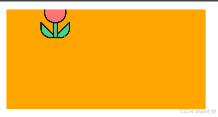
6. 背景
<!DOCTYPE html>
<html lang="en">

<head>
    <meta charset="UTF-8">
    <meta name="viewport" content="width=device-width, initial-scale=1.0">
    <title>背景</title>
    <style>
        /*
            背景属性:
            1.背景图background-image,url背景图路径
            2.背景图平铺background-repeat,默认xy都平铺
            3.背景图缩放background-size, contain、cover;数值如30px;百分数(根据盒子尺寸计算结果)
            4.背景图位置background-position,正数向右向下,负数向左向上
        */

        /*
            背景图在背景色上方显示,文字在背景图上方显示

        */

        div {
            width: 200px;
            height: 100px;
            background-color: orange;
            background-image: url('./flower.png');

            /* 背景图缩放,直接写数值可改变图片大小
                contain 等比缩放 留有空白
                cover 等比缩放至完全覆盖 图片部分丢失
            */
            background-size: 30px;
            /* background-size: contain; */
            /* background-si ze: cover; */

            /* 背景图平铺练习 */
            /* no-repeat常用 */
            background-repeat: no-repeat;
            /* 水平方向平铺 */
            /* background-repeat: repeat-x; */
            /* 垂直方向平铺 */
            /* background-repeat: repeat-y; */

            /* 背景图位置
                值为正数时向右向下,负数向左向上
                px单位数值;百分比;方向英文单词
            */
            /* 数值 */
            /* background-position: 30px 20px; */
            /* 百分数 */
            background-position: 20% -10%;
            /* 英文 */
            /* background-position: left bottom; */

        }
    </style>
</head>

<body>
    <div></div>
</body>

</html>
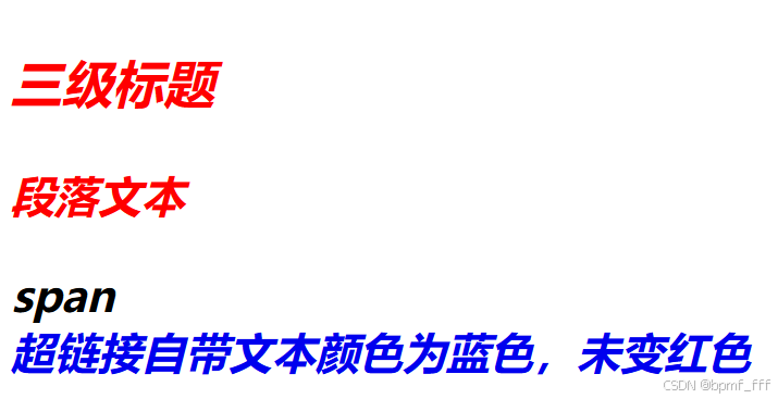
7. CSS特性
7.1 继承性
继承性是指子元素可以继承父元素的某些CSS样式属性。
7.2 层叠性
- 相同的属性会覆盖:后面的CSS属性覆盖前面的CSS属性
- 不同的属性会叠加:不同的CSS属性都生效
<!DOCTYPE html>
<html lang="en">
<head>
    <meta charset="UTF-8">
    <meta name="viewport" content="width=device-width, initial-scale=1.0">
    <title>CSS特性</title>
    <style>
        /*
            CSS特性
            1.继承性:子级继承父级元素的属性,子元素自带属性优先于父元素显示
            2.层叠性:相同属性会覆盖,就近原则;不同属性会叠加都生效

        */

        div{
            font-size: 20px;
            color: red;
            font-weight: 600;
            font-style: italic;
        }
        span{
            /* 层叠性属性相同时 后设置的生效 */
            color: aqua;
            color: black;
        }
        a{
            text-decoration: none;
        }
    </style>
</head>
<body>
    <div>
        <h3>三级标题</h3>
        <p>段落文本</p>
        <span>span</span>
        <br>
        <a href="#">超链接自带文本颜色为蓝色,未变红色</a>
    </div>
</body>
</html>
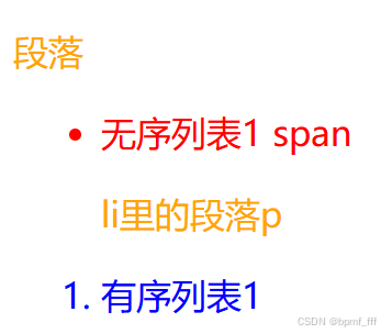
8. CSS 复合选择器
8.1 后代选择器
<!DOCTYPE html>
<html lang="en">
<head>
    <meta charset="UTF-8">
    <meta name="viewport" content="width=device-width, initial-scale=1.0">
    <title>后代选择器</title>
    <style>
        /*
            CSS复合选择器
            1.后代选择器

            2.伪类选择器
                伪类表示状态,hover为悬停状态
        */

        li{
            color: blue;
        }

        ul li{
            color: red;
        }

        p{
            color:orange;
        }
    </style>
</head>
<body>
    <!-- 后代选择器测试 -->
    <div>
        <p>段落</p>
        <ul>
            <li>
                无序列表1
                <span>span</span>
                <p>li里的段落p</p>
            </li>
        </ul>

        <ol>
            <li>有序列表1</li>
        </ol>
    </div>
</body>
</html>
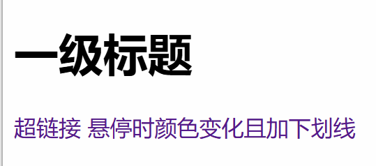
8.2 伪类选择器
<!DOCTYPE html>
<html lang="en">
<head>
    <meta charset="UTF-8">
    <meta name="viewport" content="width=device-width, initial-scale=1.0">
    <title>伪类选择器</title>
    <style>
        /* 伪类选择器
            伪类表状态
            如 新闻网页上超链接悬停上方时颜色变化且加下划线
        */
        h1:hover{
            color: blue;
        }

        a{
            text-decoration: none;
        }
        a:hover{
            color: orange;
            text-decoration: underline;
        }
    </style>
</head>
<body>
    <div>
        <h1>一级标题</h1>

        <a href="#">超链接 悬停时颜色变化且加下划线</a>
    </div>
</body>
</html>
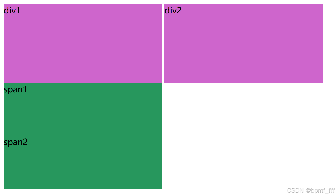
9. 显示模式 Display Mode
- 块元素:独占一行,可以设置宽度和高度。
- 行内元素:不会独占一行,宽度和高度由内容决定。
- 行内块元素:像行内元素一样排列,但可以设置宽度和高度。
<!DOCTYPE html>
<html lang="en">
<head>
    <meta charset="UTF-8">
    <meta name="viewport" content="width=device-width, initial-scale=1.0">
    <title>显示模式</title>
    <style>
        /* display 转行显示模式 */

        /*
            显示模式:标签(元素)的显示方式
            布局网页时,根据标签显示模式选择合适的标签摆放内容
            1.块级元素(Block Element)
            如div,p,h1-h6,ul,ol,li...
                独占一行
                宽度默认为父级的百分百
                设置宽高属性时生效
            2.行内元素(Inline Element)
            如span,a,img,strong,em,br,i...
                一行可显示多个
                设置宽高属性时不生效
                宽高尺寸靠内容撑开
            3.行内块元素(Inline-Block Element)
            常见的行内块元素可以是任何元素,
            如通过 display: inline-block; 将 <div> 设置为行内块元素。
                结合了块元素和行内元素的特点
                一行可多个
                设置宽高属性时生效
                宽高尺寸也可靠内容撑开
        */

        div{
            width: 300px;
            height: 150px;
            background-color: rgb(206, 101, 204);

            /* 转换为行内元素 */
            display: inline;

            /* 将 <div> 设置为行内块元素 */
            display: inline-block;
        }

        span{
            width: 300px;
            height: 100px;
            background-color: rgb(39, 151, 93);

            /* 转换为块级元素 */
            display: block;
        }
    </style>
</head>
<body>
    <div>div1</div>
    <div>div2</div>

    <span>span1</span>
    <span>span2</span>
</body>
</html>
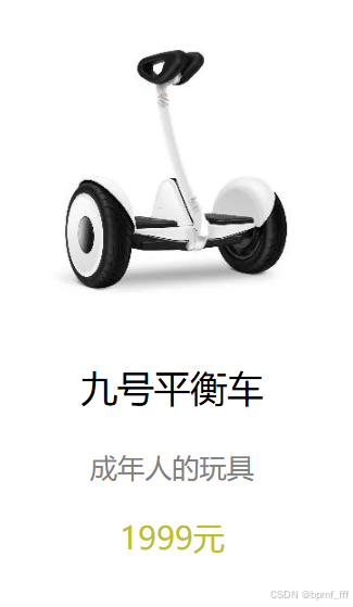
10. 综合案例-卡片
<!DOCTYPE html>
<html lang="en">
<head>
    <meta charset="UTF-8">
    <meta name="viewport" content="width=device-width, initial-scale=1.0">
    <title>卡片</title>
    <style>
        div{
            width: 200px;
            text-align: center;
            /* padding: 10px; */
            /* background-color: pink; */
        }

        img{
            width: 150px;
        }
        h3{
            font-weight: 500;
        }
        .introduction{
            font-size: 14px;
            color: gray;
        }
        .price{
            color: rgb(190, 190, 40);
        }
    </style>
</head>
<body>
    <div>
        <img src="./car.jpg" alt="九号平衡车">
        <h3>九号平衡车</h3>
        <p class="introduction">成年人的玩具</p>
        <p class="price">1999元</p>
    </div>
</body>
</html>
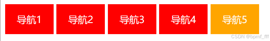
11. 课后练习1普通导航案例
<!DOCTYPE html>
<html lang="en">
<head>
    <meta charset="UTF-8">
    <meta name="viewport" content="width=device-width, initial-scale=1.0">
    <title>普通导航案例</title>
    <style>
        /* 行内块元素?
            将a转换为行内块元素

            实现效果:导航子栏悬停时颜色发生变化
        */
        a{
            width: 80px;
            height: 50px;
            color: white;
            background-color: red;
            display: inline-block;
            text-align: center;
            line-height: 50px;
            text-decoration: none;
        }

        a:hover{
            background-color: #ffa500;
        }
    </style>
</head>
<body>
    <!-- 独立练习时问题,导航栏内分块为a超链接,不是div块 -->
    <a href="#">导航1</a>
    <a href="#">导航2</a>
    <a href="#">导航3</a>
    <a href="#">导航4</a>
    <a href="#">导航5</a>
</body>
</html>
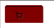
12. 课后练习2购物车效果
<!DOCTYPE html>
<html lang="en">
<head>
    <meta charset="UTF-8">
    <meta name="viewport" content="width=device-width, initial-scale=1.0">
    <title>购物车</title>
    <style>
        /*
            使用a标签,悬停时图片变化
        */

        /* 未完整做出! */

        /* a为行内元素,不能直接设置宽高属性,需通过display转换为块元素 */
        a{
            display: block;
            width: 67px;
            height: 31px;
            background-image: url('images/shopcar_01.png');
        }
        a:hover{
            background-image: url('images/shopcar_02.png');
        }
    </style>
</head>
<body>
    <a href="#"></a>
</body>
</html>
13. 课后练习3五彩导航案例
<!DOCTYPE html>
<html lang="en">
<head>
    <meta charset="UTF-8">
    <meta name="viewport" content="width=device-width, initial-scale=1.0">
    <title>五彩导航</title>
    <style>
        /* 行内块元素 */

        a{
            display:inline-block;
            width: 120px;
            height: 58px;
            color: white;
            text-align: center;
            line-height: 50px;
            text-decoration: none;
        }

        .daohang1{
            background-image: url('images/bg1.png');
        }

        /* 使用伪类选择器时 中间不要有空格 */
        .daohang1:hover{
            background-image: url('images/bg5.png');
        }

        .daohang2{
            background-image: url('images/bg2.png');
        }
        .daohang2:hover{
            background-image: url('images/bg6.png');
        }

        .daohang3{
            background-image: url('images/bg3.png');
        }
        .daohang3:hover{
            background-image: url('images/bg7.png');
        }

        .daohang4{
            background-image: url('images/bg4.png');
        }
        .daohang4:hover{
            background-image: url('images/bg8.png');
        }

    </style>
</head>
<body>
    <a href="#" class="daohang1">五彩导航</a>
    <a href="#" class="daohang2">五彩导航</a>
    <a href="#" class="daohang3">五彩导航</a>
    <a href="#" class="daohang4">五彩导航</a>
</body>
</html>

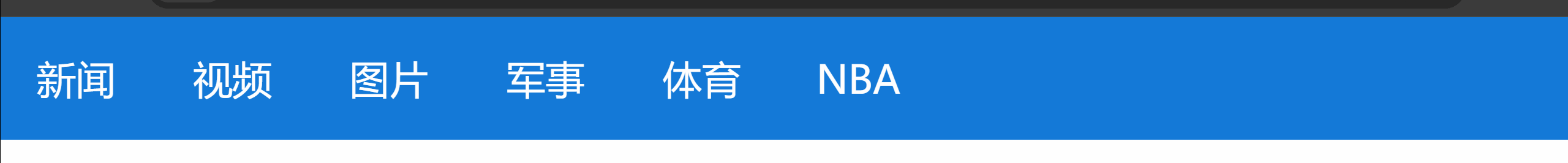
14. 课后练习4腾讯导航案例
<!DOCTYPE html>
<html lang="en">
<head>
    <meta charset="UTF-8">
    <meta name="viewport" content="width=device-width, initial-scale=1.0">
    <title>腾讯导航2.0</title>
    <!--
    自做时考虑不周的问题
        导航栏内为超链接
        导航栏内元素为无序列表
        无内外边距,需要去掉
    -->
    <style>
        /* 通配符选择器 */
        *{
            padding: 0;
            margin: 0;
        }

        /* 标签选择器 */
        div{
            height: 100px;
            background-color: #1479D7;
        }

        /* 后代选择器 */
        ul li{
            /* 转换为行内块元素,可设宽高也可同行显示 */
            display: inline-block;
            /* 设置列表样式为无 */
            list-style: none;
            /* width: ; */
            /* height: ; */
        }


        a{
            display: inline-block;
            color: white;
            font-size: 32px;
            width: 123px;
            height: 100px;
            line-height: 100px;
            text-align: center;
            text-decoration: none;
        }

        /* 伪类选择器 */
        /* 鼠标悬停时a背景颜色发生变化 */
        a:hover{
            background-color: #808080;
        }
    </style>
</head>
<body>
    <div>
        <!-- 引入无序列表 -->
        <ul>
            <!-- 导航列表项为可跳转页面,应设为超链接 -->
            <li><a href="#">新闻</a></li>
            <li><a href="#">视频</a></li>
            <li><a href="#">图片</a></li>
            <li><a href="#">军事</a></li>
            <li><a href="#">体育</a></li>
            <li><a href="#">NBA</a></li>
        </ul>
    </div>
</body>
</html>


 扫一扫
扫一扫


 1009
1009

 被折叠的 条评论
为什么被折叠?
被折叠的 条评论
为什么被折叠?
 到【灌水乐园】发言


