


 本文介绍了如何在Vue项目中引入Echarts库并创建环形图,包括安装Echarts,注册组件,以及在组件中使用Echarts的步骤。同时强调了环形图内外圈颜色对应的重要性,并提到数据处理的注意事项。
1、安装命令:npm install echarts -S
2、在main.js中引入,
- import ECharts from 'vue-echarts/components/ECharts'
- import 'echarts/lib/chart/pie'
- import 'echarts/lib/component/tooltip'
- Vue.component('v-chart', ECharts)
3、在组件中使用
<template>
  <div >
    <div style="width: 100%;height: 400px;" id="container"></div>
  </div>
</template>
<script>
export default {
    name: "circleCharts",
    data() {
      return {
        dataList:[
        {
            "value": 4830,
            "name": "etiology",
            "itemStyle": {
                "color": "rgb(125,230,190)"
            }
        },
        {
            "value": 3819,
            "name": "physiopathology",
            "itemStyle": {
                "color": "rgb(109,204,167)"
            }
        },
        {
            "value": 955,
            "name": "epidemiology",
            "itemStyle": {
                "color": "rgb(87,187,149)"
            }
        },
        {
            "value": 6548,
            "name": "drug therapy",
            "itemStyle": {
                "color": "rgb(52,146,160)"
            }
        },
        {
            "value": 4531,
            "name": "other therapy",
            "itemStyle": {
                "color": "rgb(91,187,202)"
            }
        },
        {
            "value": 1438,
            "name": "non drug therapy",
            "itemStyle": {
                "color": "rgb(68,169,185)"
            }
        },
        {
            "value": 239,
            "name": "general therapy",
            "itemStyle": {
                "color": "rgb(39,175,195)"
            }
        },
        {
            "value": 2389,
            "name": "complications",
            "itemStyle": {
                "color": "rgb(212,160,66)"
            }
        },
        {
            "value": 1313,
            "name": "auxiliary examination",
            "itemStyle": {
                "color": "rgb(187,140,55)"
            }
        },
        {
            "value": 62,
            "name": "diagnosis classification",
            "itemStyle": {
                "color": "rgb(236,180,77)"
            }
        }
    ],
        nameList:[ "drug therapy", "etiology", "other therapy", "physiopathology", "complications", "non drug therapy", "auxiliary examination", "epidemiology", "general therapy", "diagnosis classification", "therapy", "basic", "diagnosis" ],
        innerDataList:[ { "value": 10494, "name": "basic" }, { "value": 15202, "name": "therapy" }, { "value": 6074, "name": "diagnosis" } ]
      }
    },
   mounted(){
     this.renderPieChart(this.nameList,this.dataList,this.innerDataList)
    },
   methods: {
 renderPieChart(nameList,dataList,innerDataList) {

        let chart = this.$echarts.init(document.getElementById('container'), 'infographic');
        chart.setOption({
          tooltip: {
            trigger: 'item',
            axisPointer: {
              type: 'shadow'
            },
            formatter: "{b}: {c} ({d}%)"//设置鼠标移上时的内容
          },
          legend: {
            type: 'scroll',
            orient: 'vertical',
            right: 100,
            top: 20,
            bottom: 20,
            data:nameList//图注信息
          },
          series: [
            {
              name:'',
              type:'pie',
              selectedMode: 'single',
              radius: [0, '40%'],
              label: {
                normal: {
                  position: 'inner'
                }
              },
              color: ['rgb(87,187,149)', 'rgb(52,146,160)', 'rgb(248,192,90)'],
              labelLine: {
                normal: {
                  show: false
                }
              },
              data:innerDataList
            },

            {
              name:'',
              type:'pie',
              radius: ['60%', '85%'],
              color: color,
              // color: (value, index)=>{
              //   console.log(333,value, index)
              // },
              avoidLabelOverlap: false,
              data:dataList,
              labelLine: {
                normal: {
                  show: false
                }
              },
              label:{ //图形上的文本标签,可用于说明图形的一些数据信息,比如值,名称等,
                  normal:{
                  show:false,
                }
              },
            }
          ]
        })
      }
   }
}
3、结果如图所示:
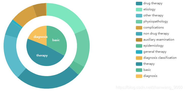
4、注意:环形图的内圈类型和外圈类型对应关系固定,这样颜色才能对应;
| basic | epidemiology | |
| physiopathology | ||
| etiology | ||
| therapy | drug therapy | |
| non drug therapy | ||
| general therapy | ||
| other therapy | ||
| diagnosis | Clinical manifestation | |
| diagnosis standard | ||
| diagnosis classification | ||
| complications | ||
| auxiliary examination | ||
5、可能用到的数据处理:
let outColor= {
  	"epidemiology":"rgb(87,187,149)",
  "physiopathology":"rgb(109,204,167)",
  "etiology":"rgb(125,230,190)",
  "drug therapy":"rgb(52,146,160)",
  "non drug therapy":"rgb(68,169,185)",
  "general therapy":"rgb(39,175,195)",
  "other therapy":"rgb(91,187,202)",
  "Clinical manifestation":"rgb(241,200,125)",
  "diagnosis standard":"rgb(152,10 6,22)",
  "diagnosis classification":"rgb(236,180,77)",
  "complications":"rgb(212,160,66)",
  "auxiliary examination":"rgb(187,140,55)"

  }
let outData="name":{
"epidemiology":"basic",
"physiopathology":"basic",
"etiology":"basic",
"drug therapy":"therapy",
"non drug therapy":"therapy",
"general therapy":"therapy",
"other therapy":"therapy",
"Clinical manifestation":"diagnosis",
"diagnosis standard":"diagnosis",
"diagnosis classification":"diagnosis",
"complications":"diagnosis",
"auxiliary examination":"diagnosis"

}
本博客由 博主原创,希望对前端小伙伴有帮助


 1207
1207

 被折叠的 条评论
为什么被折叠?
被折叠的 条评论
为什么被折叠?
 到【灌水乐园】发言


