


 本文介绍了数据可视化的常用库,如matplotlib、seaborn等,并详细解释了直方图、密度曲线及散点图等图表的绘制方法。同时,文中还探讨了核密度估计等非参数估计方法,并列举了一些交互式数据可视化工具。
Data Vistualization
libraries to plot:
matplotlib (plt)
pandas .plot()
seaborn (sns)
bar plot
rug plots
(easy to see distributions)
histograms
= bar + (areas represent proportions)
default: show counts on y-axis.
‘density = True’ : the total areas sums to 1
To decide the number of bins:
binwidth=2IQR(x)n3
bin width = 2 \frac{IQR(x)}{\sqrt[3]n}
binwidth=23nIQR(x)
IQR: 四分位距(interquartile range, IQR),又称四分差。是描述统计学中的一种方法,以确定第三四分位数和第一四分位数的区别。
IQR = third quartile - first quartile
can be used with linspace
Density curves
sns.displot(bweights, kind = 'kde')
sns.kdeplot(bweights)
KDE: kernel density estimation 核密度估计
密度估计的问题
由给定样本集合求解随机变量的分布密度函数问题是概率统计学的基本问题之一。解决这一问题的方法包括参数估计和非参数估计。参数估计
参数估计又可分为参数回归分析和参数判别分析。在参数回归分析中,人们假定数据分布符合某种特定的性态,如线性、可化线性或指数性态等,然后在目标函数族中寻找特定的解,即确定回归模型中的未知参数。在参数判别分析中,人们需要假定作为判别依据的、随机取值的数据样本在各个可能的类别中都服从特定的分布。经验和理论说明,参数模型的这种基本假定与实际的物理模型之间常常存在较大的差距,这些方法并非总能取得令人满意的结果。参数估计:最大似然估计MLE
非参数估计方法
由于上述缺陷,Rosenblatt和Parzen提出了非参数估计方法,即核密度估计方法。由于核密度估计方法不利用有关数据分布的先验知识,对数据分布不附加任何假定,是一种从数据样本本身出发研究数据分布特征的方法,因而,在统计学理论和应用领域均受到高度的重视。核密度估计(kernel density estimation)是在概率论中用来估计未知的密度函数,属于非参数检验方法之一,由Rosenblatt (1955)和Emanuel Parzen(1962)提出,又名Parzen窗(Parzen window)。Ruppert和Cline基于数据集密度函数聚类算法提出修订的核密度估计方法。
原文链接:https://blog.youkuaiyun.com/pipisorry/article/details/53635895
Describing Distributions:
terminology
modes:
local or global distribution (unimode, bimodal, multimodal)
skewness:
skewed right, skewed wrong, symmetric.
tails
outliers
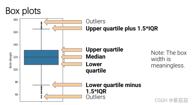
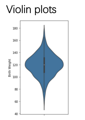
box plot and violin plots
Comparing Quantitative Distributions
overlaid histograms and density curves
side by side box plots and violin plots
Relationships between two quantitative variables
scatter plots:
derive relationship between pairs of numerical variables.
sns.lmplot(data = births, x = 'x', y = 'y', ci = False)
sns.jointplot(data = births, x = 'x', y = 'y')
hex plots:
two-dimensional version of density curve
sns.jointplot(data = births, x = 'x', y = 'y', kind = 'hex')
contour plots:
two-dimensional version of density curve
sns.jointplot(data = births, x = 'x', y = 'y', kind = 'kde', fill = True)
Interactive visualization
D3: https://d3js.org/
Tabulea: https://www.tableau.com/
Mpld3: https://mpld3.github.io/
Bokeh: https://bokeh.org/
Plotly: https://plotly.com/
Course: 6.859 : Interactive Data Visualization
http://vis.mit.edu/classes/6.859/
Network Data Analysis and visualization
terminology:
Centrality
a measure of nodes’ importance in the network
degree centrality
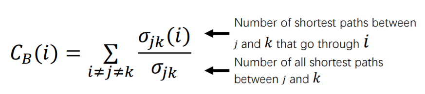
betweenness centrality
captures being part of shortest paths
想短时间获得较大转发量,就选betweenness 大的node
Closeness centrality
captures being close to all other nodes
[外链图片转存失败,源站可能有防盗链机制,建议将图片保存下来直接上传(img-mFaalVig-1648209538804)(C:\Users\16539\AppData\Roaming\Typora\typora-user-images\image-20211206115732019.png)]
Community detection
many network visualization libraries:
Gephi (written in Java)
gephi.org
igraph
graph-tool (cannot install on windows, must be linux or MacOS)
cytoscape
shp format: shapefile format
other geospatial file format: shapefile , GeoJSON, KML, GPKG
usually used for restore geographic data like a map.
import geopandas as gpd
#如果文件是geospatial的
world = gpd.read_file(path)

#如果文件是csv
birds_df = pd.read_csv("../input/geospatial-learn-course-data/purple_martin.csv", parse_dates=['timestamp'])
birds = gpd.GeoDataFrame(birds_df, geometry=gpd.points_from_xy(birds_df["location-long"], birds_df["location-lat"]))
CRS
coordinate reference system (CRS) is a coordinate-based local, regional or global system used to locate geographical entities.


 1377
1377

 被折叠的 条评论
为什么被折叠?
被折叠的 条评论
为什么被折叠?
 到【灌水乐园】发言


