


 这篇博客介绍了逻辑回归的基础知识,用于解决二分类问题。通过分析IRIS数据集,探讨了样本标签平衡性、变量分布,并使用sklearn的LogisticRegression进行训练和预测。文章还详细解释了模型评价指标,如混淆矩阵、ROC曲线和AUC,展示了一个完整的逻辑回归应用过程。
逻辑回归
- 逻辑回归是最简单的解决分类问题的方法
- 逻辑回归可以用来解决二分类问题,可以推广到多分类
- 逻辑回归的主要思想是将判断0或1,转化为判断该样本是1的概率
- 逻辑回归的结果容易受每个样本的影响
下面就开始吧,本次使用的是IRIS数据集,对鸢尾花进行分类。
变量信息如下:
- sepal length in cm
- sepal width in cm
- petal length in cm
- petal width in cm
- class:
- Iris Setosa
- Iris Versicolour
- Iris Virginica
import pandas as pd
from sklearn.linear_model import LogisticRegression
import seaborn as sns
import matplotlib.pyplot as plt
from sklearn.model_selection import train_test_split
import numpy as np
1. 数据初探
dataframe = pd.read_table('datasets/Iris/iris.data',header=None,sep=',')
dataframe.columns = ["sepal length","sepal width", "petal length","petal width", "class"]
dataframe.head()
/Users/yaochenli/anaconda3/lib/python3.7/site-packages/ipykernel_launcher.py:1: FutureWarning: read_table is deprecated, use read_csv instead.
  """Entry point for launching an IPython kernel.
| sepal length | sepal width | petal length | petal width | class | |
|---|---|---|---|---|---|
| 0 | 5.1 | 3.5 | 1.4 | 0.2 | Iris-setosa |
| 1 | 4.9 | 3.0 | 1.4 | 0.2 | Iris-setosa |
| 2 | 4.7 | 3.2 | 1.3 | 0.2 | Iris-setosa |
| 3 | 4.6 | 3.1 | 1.5 | 0.2 | Iris-setosa |
| 4 | 5.0 | 3.6 | 1.4 | 0.2 | Iris-setosa |
# 查看数据类型
dataframe.dtypes
sepal length    float64
sepal width     float64
petal length    float64
petal width     float64
class            object
dtype: object
这里可以看到最后一个标签是object类型,后面我们需要把它转换为标签
# 查看是否有缺失值
dataframe.isnull().describe()
| sepal length | sepal width | petal length | petal width | class | |
|---|---|---|---|---|---|
| count | 150 | 150 | 150 | 150 | 150 |
| unique | 1 | 1 | 1 | 1 | 1 |
| top | False | False | False | False | False |
| freq | 150 | 150 | 150 | 150 | 150 |
这个数据集总共150个样本,无缺失值
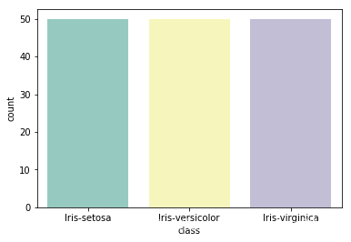
2. 判断样本标签平衡性
dataframe["class"].value_counts()
Iris-virginica     50
Iris-setosa        50
Iris-versicolor    50
Name: class, dtype: int64
# 这里平衡性很好,但我们还是用条形图展示
sns.countplot(x='class', data=dataframe, palette='Set3')
<matplotlib.axes._subplots.AxesSubplot at 0x1a1fad5128>
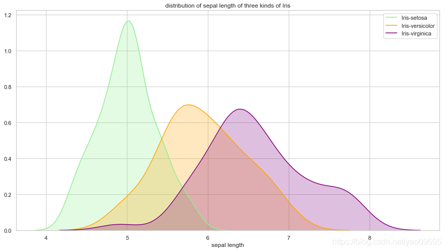
3. 查看变量的分布
-
- sepal length与class的关系
plt.figure(figsize=(15,8))
sns.set(style="white") #white background style for seaborn plots
sns.set(style="whitegrid", color_codes=True)
ax = sns.kdeplot(dataframe["sepal length"][dataframe["class"]=="Iris-setosa"], color='lightgreen', shade=True)
sns.kdeplot(dataframe["sepal length"][dataframe["class"]=="Iris-versicolor"], color='orange', shade=True)
sns.kdeplot(dataframe["sepal length"][dataframe["class"]=="Iris-virginica"], color="purple", shade=True)
plt.legend(["Iris-setosa", "Iris-versicolor", "Iris-virginica"])
plt.title("distribution of sepal length of three kinds of Iris")
ax.set(xlabel="sepal length")
plt.show()
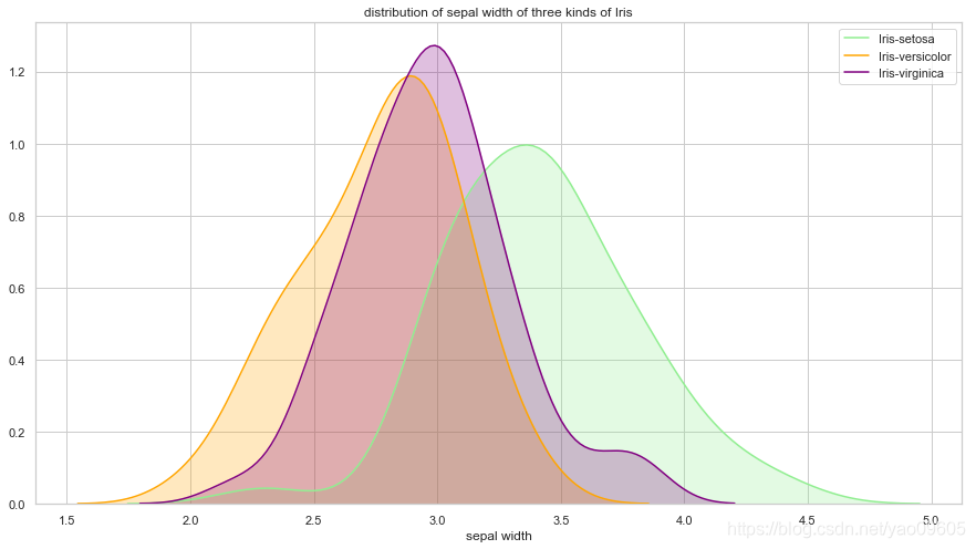
-
- sepal width与class的关系
plt.figure(figsize=(15,8))
ax = sns.kdeplot(dataframe["sepal width"][dataframe["class"]=="Iris-setosa"], color='lightgreen', shade=True)
sns.kdeplot(dataframe["sepal width"][dataframe["class"]=="Iris-versicolor"], color='orange', shade=True)
sns.kdeplot(dataframe["sepal width"][dataframe["class"]=="Iris-virginica"], color="purple", shade=True)
plt.legend(["Iris-setosa", "Iris-versicolor", "Iris-virginica"])
plt.title("distribution of sepal width of three kinds of Iris")
ax.set(xlabel="sepal width")
plt.show()
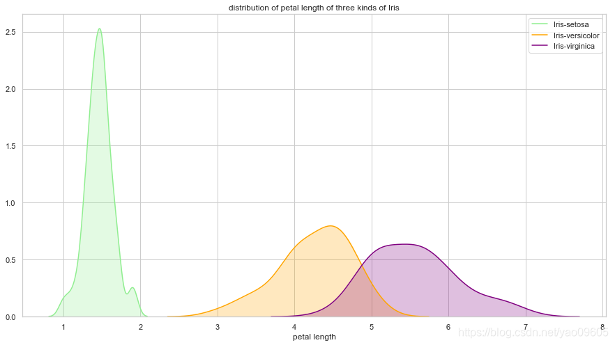
-
- petal length与class的关系
plt.figure(figsize=(15,8))
ax = sns.kdeplot(dataframe["petal length"][dataframe["class"]=="Iris-setosa"], color='lightgreen', shade=True)
sns.kdeplot(dataframe["petal length"][dataframe["class"]=="Iris-versicolor"], color='orange', shade=True)
sns.kdeplot(dataframe["petal length"][dataframe["class"]=="Iris-virginica"], color="purple", shade=True)
plt.legend(["Iris-setosa", "Iris-versicolor", "Iris-virginica"])
plt.title("distribution of petal length of three kinds of Iris")
ax.set(xlabel="petal length")
plt.show()
-
- petal width与class之间的关系
plt.figure(figsize=(15,8))
ax = sns.kdeplot(dataframe["petal width"][dataframe["class"]=="Iris-setosa"], color='lightgreen', shade=True)
sns.kdeplot(dataframe["petal width"][dataframe["class"]=="Iris-versicolor"], color='orange', shade=True)
sns.kdeplot(dataframe["petal width"][dataframe["class"]=="Iris-virginica"], color="purple", shade=True)
plt.legend(["Iris-setosa", "Iris-versicolor", "Iris-virginica"])
plt.title("distribution of petal width of three kinds of Iris")
ax.set(xlabel="petal width")
plt.show()
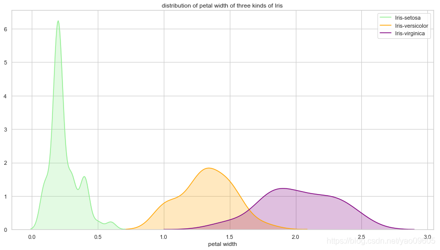
我们可以看到petal length和petal width对于Iris-setosa的区分度很大,而Iris-versicolor和Iris-virginica较难区分
4. 测试集与训练集划分
X = dataframe.drop(["class"],axis=1)
y = dataframe["class"]
y.replace("Iris-setosa", 0, inplace=True)
y.replace("Iris-versicolor", 1, inplace=True)
y.replace("Iris-virginica", 2, inplace=True)
X_train,X_test, y_train, y_test = train_test_split(X, y, test_size=0.15, random_state=42)
5. 进行训练
sklearn包里的LogisticRegression包支持多分类,multi_class参数可以选择:‘ovr’, ‘multinomial’, ‘auto’详见官网:https://scikit-learn.org/stable/modules/generated/sklearn.linear_model.LogisticRegression.html
clf = LogisticRegression(random_state=0, solver="lbfgs", multi_class='multinomial').fit(X_train, y_train)
6. 进行预测
# 结果的预测
y_pred = clf.predict(X_test)
y_pred
array([1, 0, 2, 1, 1, 0, 1, 2, 1, 1, 2, 0, 0, 0, 0, 1, 2, 1, 1, 2, 0, 2,
       0])
# 概率的预测
clf.predict_proba(X_test)
array([[3.71499433e-03, 8.28159245e-01, 1.68125761e-01],
       [9.49168310e-01, 5.08315319e-02, 1.58201962e-07],
       [6.58693483e-09, 1.28109353e-03, 9.98718900e-01],
       [6.33005033e-03, 7.91965568e-01, 2.01704381e-01],
       [1.39506349e-03, 7.68073090e-01, 2.30531847e-01],
       [9.58463748e-01, 4.15361152e-02, 1.37080150e-07],
       [7.85558896e-02, 9.07892142e-01, 1.35519687e-02],
       [1.41991454e-04, 1.42742085e-01, 8.57115924e-01],
       [2.19745934e-03, 7.59144329e-01, 2.38658211e-01],
       [2.85544175e-02, 9.46565162e-01, 2.48804202e-02],
       [4.00543200e-04, 2.31343025e-01, 7.68256432e-01],
       [9.70659240e-01, 2.93407029e-02, 5.74060629e-08],
       [9.74702324e-01, 2.52976505e-02, 2.52876097e-08],
       [9.64700592e-01, 3.52993258e-02, 8.24780506e-08],
       [9.80391011e-01, 1.96089393e-02, 4.93457026e-08],
       [4.37473489e-03, 7.08897352e-01, 2.86727913e-01],
       [6.15199565e-06, 2.18740960e-02, 9.78119752e-01],
       [2.77057042e-02, 9.48540913e-01, 2.37533831e-02],
       [8.15366071e-03, 8.33999499e-01, 1.57846841e-01],
       [1.23125773e-05, 3.27281096e-02, 9.67259578e-01],
       [9.66655848e-01, 3.33440075e-02, 1.44164833e-07],
       [1.24675391e-03, 3.90713583e-01, 6.08039664e-01],
       [9.63895358e-01, 3.61044415e-02, 2.00421093e-07]])
7. 模型评价
# 查看模型参数
clf.get_params()
{'C': 1.0,
 'class_weight': None,
 'dual': False,
 'fit_intercept': True,
 'intercept_scaling': 1,
 'l1_ratio': None,
 'max_iter': 100,
 'multi_class': 'multinomial',
 'n_jobs': None,
 'penalty': 'l2',
 'random_state': 0,
 'solver': 'lbfgs',
 'tol': 0.0001,
 'verbose': 0,
 'warm_start': False}
# 测试集上分数
clf.score(X_test, y_test)
1.0
# 训练集上分数
clf.score(X_train,y_train)
0.968503937007874
使用metrics进行评价
from sklearn import metrics
print(metrics.classification_report(y_test, y_pred))
              precision    recall  f1-score   support

           0       1.00      1.00      1.00         8
           1       1.00      1.00      1.00         9
           2       1.00      1.00      1.00         6

    accuracy                           1.00        23
   macro avg       1.00      1.00      1.00        23
weighted avg       1.00      1.00      1.00        23
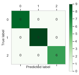
混淆矩阵及其可视化
# 混淆矩阵及其可视化
cm = metrics.confusion_matrix(y_test, y_pred)
print(cm)
[[8 0 0]
 [0 9 0]
 [0 0 6]]
plt.matshow(cm,cmap=plt.cm.Greens)
plt.grid(False)
plt.colorbar()
for x in range(len(cm)):
    for y in range(len(cm)):
        plt.annotate(cm[x,y],xy=(x,y),horizontalalignment='center',verticalalignment='center')
plt.ylabel('True label')# 坐标轴标签

plt.xlabel('Predicted label')# 坐标轴标签
Text(0.5, 0, 'Predicted label')
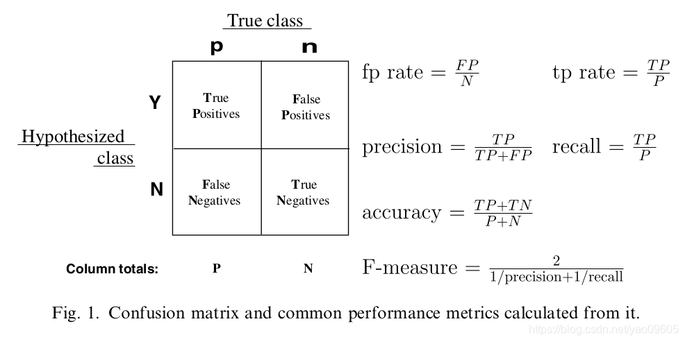
绘制ROC图并计算AUC
由图中公式可知各个指标的含义:
precision:预测为对的当中,原本为对的比例(越大越好,1为理想状态)
recall:原本为对的当中,预测为对的比例(越大越好,1为理想状态)
F-measure:F度量是对准确率和召回率做一个权衡(越大越好,1为理想状态,此时precision为1,recall为1)
accuracy:预测对的(包括原本是对预测为对,原本是错的预测为错两种情形)占整个的比例(越大越好,1为理想状态)
fp rate:原本是错的预测为对的比例(越小越好,0为理想状态)
tp rate:原本是对的预测为对的比例(越大越好,1为理想状态)
在了解了上述的一些指标的含义以及计算公式后,接下来就可以进入ROC曲线了。
如下示例图中,曲线的横坐标为false positive rate(FPR),纵坐标为true positive rate(TPR)。
要生成一个ROC曲线,只需要真阳性率(TPR)和假阳性率(FPR)。TPR决定了一个分类器或者一个诊断测试在所有阳性样本中能正确区分的阳性案例的性能.而FPR是决定了在所有阴性的样本中有多少假阳性的判断. ROC曲线中分别将FPR和TPR定义为x和y轴,这样就描述了真阳性(获利)和假阳性(成本)之间的博弈.而TPR就可以定义为灵敏度,而FPR就定义为1-特异度,因此ROC曲线有时候也叫做灵敏度和1-特异度图像.每一个预测结果在ROC曲线中以一个点代表.
有了ROC曲线后,可以引出AUC的含义:ROC曲线下的面积(越大越好,1为理想状态)
# 根据sklearn包中的解析要求,将结果拆成三列,1表示该样本落入此分类,0表示该样本不在此分类
y_roc=np.zeros([len(y_pred),3])
for i in range(len(y_pred)):
    for j in range(3):
        if y_pred[i]==j:
            y_roc[i,j]=1
        else:
            y_roc[i,j]=0
y_roc[:5]
array([[0., 1., 0.],
       [1., 0., 0.],
       [0., 0., 1.],
       [0., 1., 0.],
       [0., 1., 0.]])
y_roc_test=np.zeros([len(y_test),3])
for i in range(len(np.array(y_test))):
    for j in range(3):
        if np.array(y_test)[i]==j:
            y_roc_test[i,j]=1
        else:
            y_roc_test[i,j]=0
y_roc_test[:5]
array([[0., 1., 0.],
       [1., 0., 0.],
       [0., 0., 1.],
       [0., 1., 0.],
       [0., 1., 0.]])
fpr = dict()
tpr = dict()
roc_auc = dict()
for i in range(3):
    fpr[i], tpr[i], thress = metrics.roc_curve(y_roc_test[:, i], y_roc[:, i])
    roc_auc[i] = metrics.auc(fpr[i], tpr[i])
[fpr,tpr,thress]
[{0: array([0., 0., 1.]), 1: array([0., 0., 1.]), 2: array([0., 0., 1.])},
 {0: array([0., 1., 1.]), 1: array([0., 1., 1.]), 2: array([0., 1., 1.])},
 array([2., 1., 0.])]
from scipy import interp
all_fpr = np.unique(np.concatenate([fpr[i] for i in range(3)]))
mean_tpr = np.zeros_like(all_fpr)
for i in range(3):
    mean_tpr += interp(all_fpr, fpr[i], tpr[i])
mean_tpr /= 3
roc_auc_m = metrics.auc(all_fpr, mean_tpr)
from itertools import cycle
plt.plot(all_fpr, mean_tpr,
         label='ROC curve (area = {0:0.2f})'''.format(roc_auc_m),
         color='navy', linestyle=':', linewidth=4)
colors = cycle(['aqua', 'darkorange', 'cornflowerblue'])
for i, color in zip(range(3), colors):
    plt.plot(fpr[i], tpr[i], color=color, lw=2,
             label='ROC curve of class {0} (area = {1:0.2f})'
             ''.format(i, roc_auc[i]))
plt.plot([0, 1], [0, 1], 'k--', lw=2)
plt.xlim([0.0, 1.0])
plt.ylim([0.0, 1.05])
plt.xlabel('False Positive Rate')
plt.ylabel('True Positive Rate')
plt.title('Some extension of Receiver operating characteristic to multi-class')
plt.legend(loc="lower right")
<matplotlib.legend.Legend at 0x1a20a61e80>
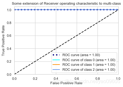
可以看到我们这个模型在测试集上的表现比训练集上还好,所以几根线都重叠了。


 被折叠的 条评论
为什么被折叠?
被折叠的 条评论
为什么被折叠?
 到【灌水乐园】发言


