


组件编程技巧
1. 样式复⽤
1.1 概述
当多个组件具有相同的样式时,若每个组件都单独设置,将会有⼤量的重复代码。为避免重复代码,开发者可使⽤ @Styles 或者 @Extend 装饰器将多条样式设置提炼成⼀个⽅法,然后直接在各组件声明的位置进⾏调⽤,这样就能完成样式的复⽤。
1.2 @Styles⽅法(不⽀持传参)
@Styles ⽅法可定义在组件内或者全局,具体语法如下
组件内声明
//代码块
@Entry
@Component
struct StylesPage {
build() {
Column() {
Row({ space: 50 }) {
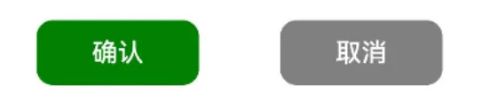
Button('确认')
.type(ButtonType.Normal)
.backgroundColor(Color.Green)
.compButtonStyle() //复⽤样式
.onClick(() => console.log('确认'))
Button('取消')
.type(ButtonType.Normal)
.backgroundColor(Color.Gray)
.compButtonStyle() //复⽤样式
.onClick(() => console.log('取消'))
}
}.width('100%')
.height('100%')
.justifyContent(FlexAlign.Center)
}
//组件内样式定义
@Styles compButtonStyle() {
.width(100)
.height(40)
.borderRadius(10)
}
}
全局声明
//代码块
@Entry
@Component
struct StylesPage {
 build() {
 Column() {
 Row({ space: 50 }) {
 Button('确认')
 .type(ButtonType.Normal)
 .backgroundColor(Color.Green)
 .globalButtonStyle() //复⽤样式
 .onClick(() => console.log('确认'))
 Button('取消')
 .type(ButtonType.Normal)
 .backgroundColor(Color.Gray)
 .globalButtonStyle() //复⽤样式
 .onClick(() => console.log('取消'))
 }
 }.width('100%')
 .height('100%')
 .justifyContent(FlexAlign.Center)
 }
}
//全局样式定义
@Styles function globalButtonStyle() {
 .width(100)
 .height(40)
 .borderRadius(10)
}
❗ 1. 组件内的@Styles⽅法只能在当前组件中使⽤,全局的@Styles⽅法⽬前只允许在当前的.ets⽂件中使⽤
2. 组件内定义@Styles⽅法时不需要使⽤function关键字,全局的@Styles⽅法需要使⽤function关键字
3. @Styles⽅法中只能包含通⽤属性⽅法和通⽤事件⽅法
4. @Styles⽅法不⽀持参数
相关案例⻅:
Demos/entry/src/main/ets/pages/component/reuse/styles/solution/Style
sPage.ets
//代码块
@Entry
@Component
struct StylesPage {
 build() {
 Column() {
 Row({ space: 50 }) {
 Button('确认')
 .type(ButtonType.Normal)
 .backgroundColor(Color.Green)
 .compButtonStyle() //复⽤样式
 // .globalButtonStyle() //复⽤样式
 .onClick(() => console.log('确认'))
 Button('取消')
 .type(ButtonType.Normal)
 .backgroundColor(Color.Gray)
 .compButtonStyle() //复⽤样式
 // .globalButtonStyle() //复⽤样式
 .onClick(() => console.log('取消'))
 }
 }.width('100%')
 .height('100%')
 .justifyContent(FlexAlign.Center)
 }
 //组件内样式定义
 @Styles compButtonStyle() {
 .width(100)
 .height(40)
 .borderRadius(10)
 }
}
//全局样式定义
@Styles function globalButtonStyle() {
 .width(100)
 .height(40)
 .borderRadius(10)
}
1.3 @Extend⽅法
@Extend 装饰的⽅法同样可⽤于组件样式的复⽤,与 @Styles 不同的是, @Extend ⽅法只能定义在全局。并且 @Extend ⽅法只能⽤于指定类型的组件,例如以下⽅法只能⽤于Button组件(可以理解为是Button组件的扩展样式)
代码块
@Extend(Button) function buttonStyle(){
 ...
}
由于 @Extend ⽅法只能⽤于指定类型的组件,因此⽅法中可包含指定组件的专有属性⽅法和专有事件⽅法。另外, @Extend ⽅法还⽀持参数,具体语法如下
❗ 1. @Extend⽅法只能定义在全局,使⽤范围⽬前只限于当前的.ets⽂件
2. @Extend⽅法⽤于特定类型的组件,因此可包含该组件的专有属性⽅法和有事件⽅法
3. @Extend⽅法⽀持参数
相关案例⻅:
Demos/entry/src/main/ets/pages/component/reuse/extend/solution/Exten
dPage.ets
//代码块
@Entry
@Component
struct ExtendPage {
build() {
 Column() {
 Row({ space: 50 }) {
 Button('确认')
 .buttonExtendStyle(Color.Green, () => console.log('确认')) //复⽤样
式
 Button('取消')
 .buttonExtendStyle(Color.Gray, () => console.log('取消')) //复⽤样式
 }
 }.width('100%')
 .height('100%')
 .justifyContent(FlexAlign.Center)
 }
}
//样式定义
@Extend(Button) function buttonExtendStyle(color: Color, callback: () =>
void) {
 .width(100)
 .height(40)
 .borderRadius(10)
 .type(ButtonType.Normal)
 .backgroundColor(color)
 .onClick(callback)
}


 扫一扫
扫一扫


 被折叠的 条评论
为什么被折叠?
被折叠的 条评论
为什么被折叠?
 到【灌水乐园】发言


