


常用布局 (下)
6. 列表布局(List)
6.1 概述
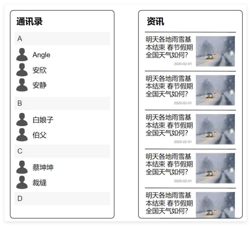
List是⼀个功能强⼤的容器组件,使⽤List可以轻松⾼效地显⽰结构化、可滚动的列表信息,例如通讯录、新闻列表等等。
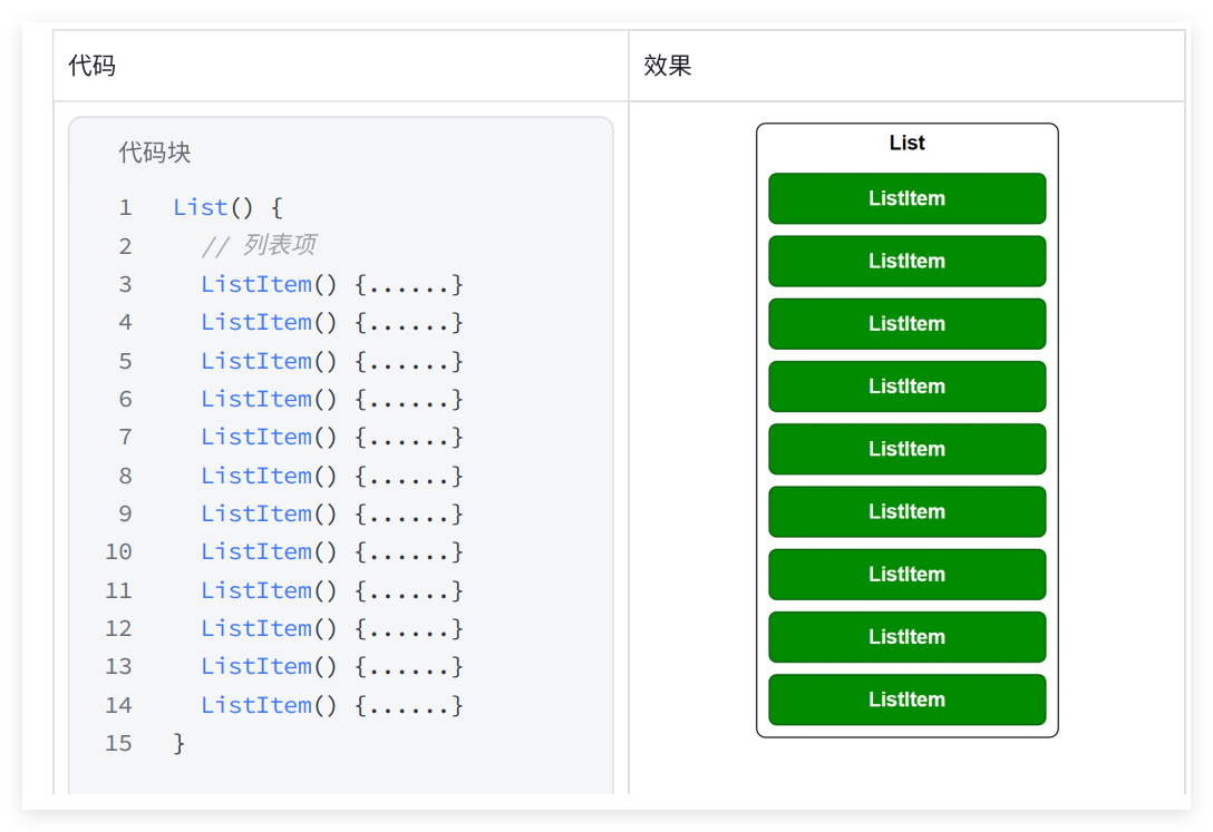
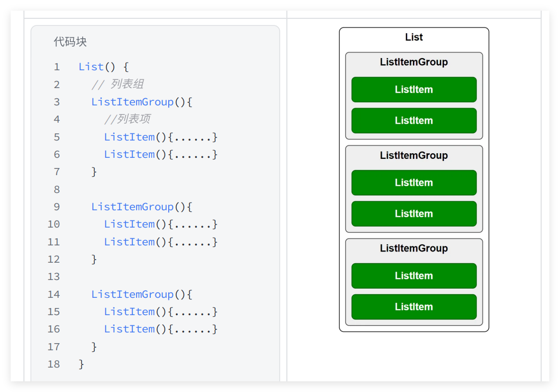
List容器的⼦组件为ListItem或者ListItemGroup,其中,
ListItem表⽰单个列表项,ListItemGroup⽤于列表数据的分组展⽰,其⼦组件也是ListItem,具体⽤法如下
6.2 参数
List组件的参数定义如下,下⾯逐⼀介绍每个参数
//代码块
List(value?:{space?: number | string, scroller?: Scroller})
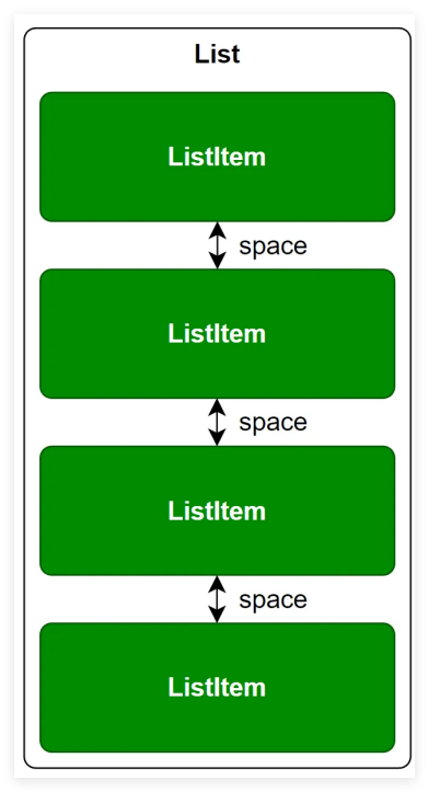
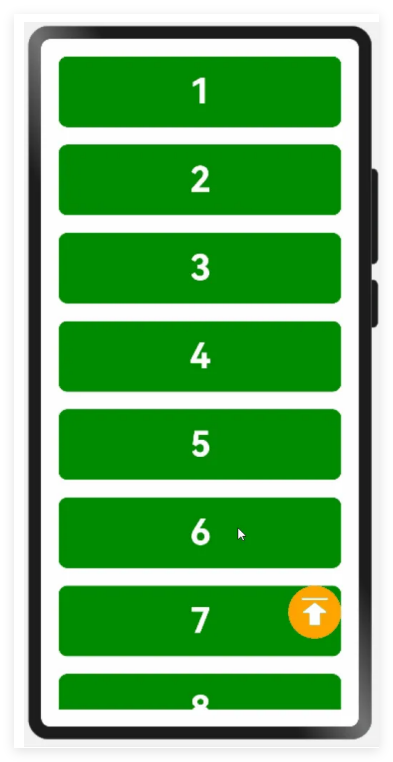
6.2.1 space 列表项间距
space 参数⽤于设置列表项的间距,如下图所⽰
6.2.2 scroller 列表滚动控制器
scroller 参数⽤于绑定列表滚动控制器(Scroller),Scroller可以控制列表的滚动,例如令列表返回顶部
相关案例⻅:
Demos/entry/src/main/ets/pages/layout/list/parameter/scroller/s
olution/ScrollerPage.ets
//代码块
@Entry
@Component
struct ScrollerPage {
 data: number[] = [1, 2, 3, 4, 5, 6, 7, 8, 9, 10, 11, 12, 13, 14, 15]
 scroller: Scroller = new Scroller();
 build() {
 Stack({ alignContent: Alignment.BottomEnd }) {
 List({ space: 20, scroller: this.scroller }) {
 ForEach(this.data, (item:number) => {
 ListItem() {
 Text(item.toString())
 .itemTextStyle()
 }
 })
 }.listStyle()
 .height('100%')
 .width('100%')
 Button({ type: ButtonType.Circle }) {
 Image($r('app.media.icon_top'))
 .width(40)
 .height(40)
 }
 .width(60)
 .height(60)
 .backgroundColor(Color.Orange)
 .offset({ x: -20, y: -100 })
 .onClick(() => {
 this.scroller.scrollToIndex(0) // 实例化scroller内的⽅法
scrollToIndex
 })
 }
 }
}
@Extend(Text) function itemTextStyle() {
 .height(80)
 .width('100%')
 .textAlign(TextAlign.Center)
 .fontColor(Color.White)
 .fontSize(40)
 .fontWeight(FontWeight.Bold)
 .backgroundColor('#008a00')
 .borderRadius(10)
}
@Extend(List) function listStyle() {
 .backgroundColor(Color.White)
 .padding(20)
}
6.3 常⽤属性
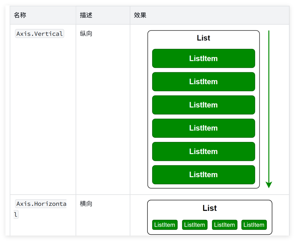
6.3.1 主轴⽅向listDirection()
使⽤ listDirection() ⽅法可以设置列表的主轴⽅向(即列表的排列和滚动⽅向),其参数类型为枚举类型 Axis ,可选的枚举值如下
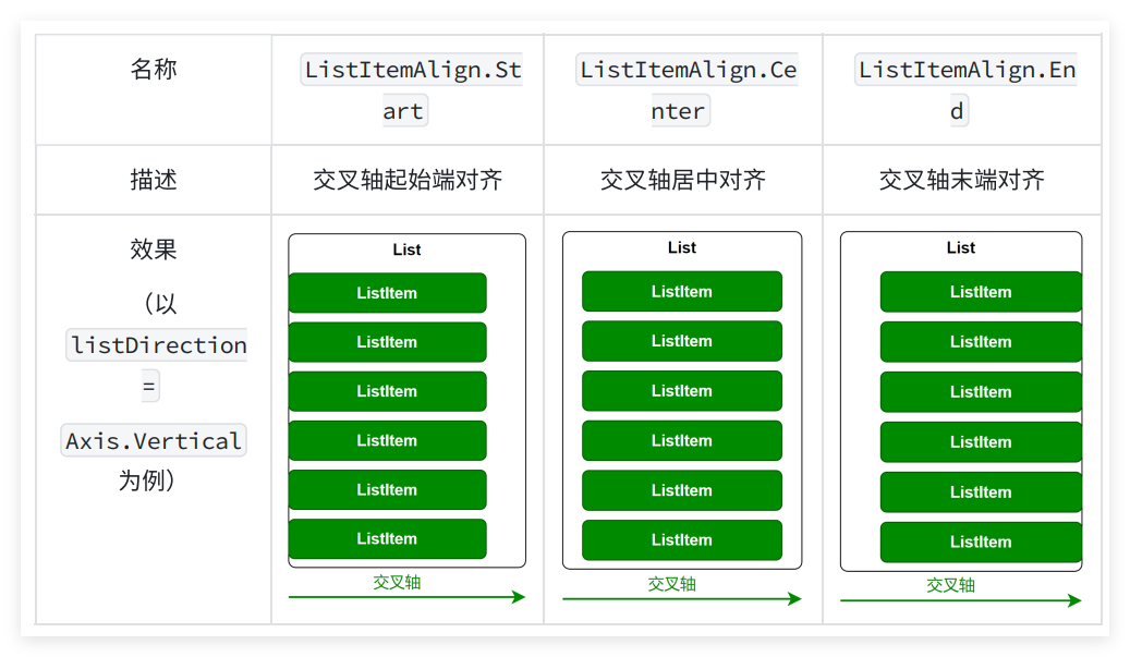
6.3.2 交叉轴对⻬⽅式alignListItem()
使⽤ alignListItem() ⽅法可以设置⼦组件在交叉轴⽅向的对⻬⽅式,其参数类型为枚举类型 ListItemAlign ,可选的枚举值有
相关案例⻅:
Demos/entry/src/main/ets/pages/layout/list/attribute/align/Alig
nPage.ets
//代码块
@Entry
@Component
struct AlignPage {
 data: number[] = [1, 2, 3, 4, 5, 6, 7, 8, 9, 10, 11, 12, 13, 14, 15]
 build() {
 List({ space: 20 }) {
 ForEach(this.data, (item) => {
 ListItem() {
 Text(item.toString())
 .height(80)
 .width(320)
 .itemTextStyle()
 }
 })
 }.listStyle()
 .height('100%')
 .width('100%')
 .alignListItem(ListItemAlign.Center)
 }
}
@Extend(Text) function itemTextStyle() {
 .textAlign(TextAlign.Center)
 .fontColor(Color.White)
 .fontSize(40)
 .fontWeight(FontWeight.Bold)
 .backgroundColor('#008a00')
 .borderRadius(10)
}
@Extend(List) function listStyle() {
 .backgroundColor(Color.White)
 .padding({ top: 20, bottom: 20 })
}
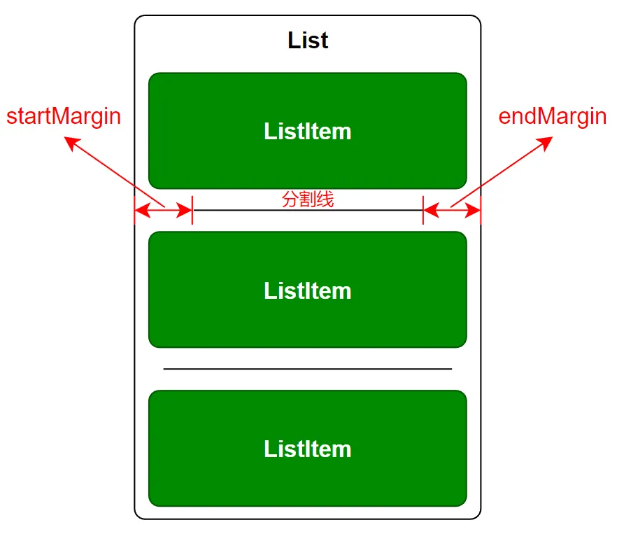
6.3.3 元素分割线divider()
使⽤ divider() 属性可设置列表元素分割线样式,该⽅法的参数定义如下
//代码块
divider(value: {strokeWidth: Length, color?: ResourceColor,
startMargin?: Length, endMargin?: Length})
相关案例⻅:
Demos/entry/src/main/ets/pages/layout/list/attribute/divider/Di
viderPage.ets
//代码块
@Entry
@Component
struct DividerPage {
 data: number[] = [1, 2, 3, 4, 5, 6, 7, 8, 9, 10, 11, 12, 13, 14, 15]
 build() {
 List({ space: 20 }) {
 ForEach(this.data, (item:number) => {
 ListItem() {
 Text(item.toString())
 .height(80)
 .width(320)
 .itemTextStyle()
 }
 })
 }
 .listStyle()
 .height('100%')
 .width('100%')
 .alignListItem(ListItemAlign.Center)
 .divider({
 strokeWidth: 1,
 color: Color.Orange,
 startMargin: 30,
 endMargin: 30
 })
 }
}
@Extend(Text) function itemTextStyle() {
 .textAlign(TextAlign.Center)
 .fontColor(Color.White)
 .fontSize(40)
 .fontWeight(FontWeight.Bold)
 .backgroundColor('#008a00')
 .borderRadius(10)
}
@Extend(List) function listStyle() {
 .backgroundColor(Color.White)
 .padding({ top: 20, bottom: 20 })
}
6.3.4 滚动条样式scrollBar()
使⽤ scrollBar() ⽅法可以设置滚动条状态,该⽅法的参数类型为枚举类型
BarState ,可选的枚举值如下
相关案例⻅:
Demos/entry/src/main/ets/pages/layout/list/attribute/scrollBar/
ScrollBarPage.ets
//代码块
@Entry
@Component
struct ScrollBarPage {
 data: number[] = [1, 2, 3, 4, 5, 6, 7, 8, 9, 10, 11, 12, 13, 14, 15]
 build() {
 List({ space: 20 }) {
 ForEach(this.data, (item) => {
 ListItem() {
 Text(item.toString())
 .height(80)
 .width(320)
 .itemTextStyle()
 }
 })
 }.listStyle()
 .height('100%')
 .width('100%')
 .alignListItem(ListItemAlign.Center)
 .scrollBar(BarState.Auto)
 }
}
@Extend(Text) function itemTextStyle() {
 .textAlign(TextAlign.Center)
 .fontColor(Color.White)
 .fontSize(40)
 .fontWeight(FontWeight.Bold)
 .backgroundColor('#008a00')
 .borderRadius(10)
}
@Extend(List) function listStyle() {
 .backgroundColor(Color.White)
 .padding({ top: 20, bottom: 20 })
}
6.3.5 其余功能
上述只是List列表布局最为常⽤的⼀些功能,其余功能可参考官⽅⽂档。
6.4 课后练习
6.4.1 需求效果
使⽤列表布局List组件实现通讯录
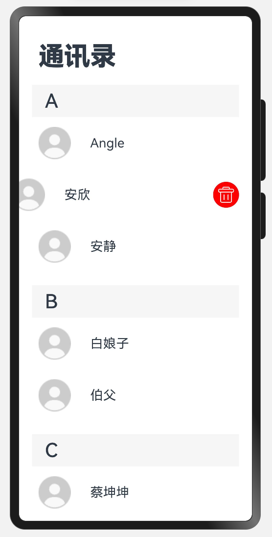
6.4.2 代码实现
//代码块
// 定义接⼝,表⽰数据结构
interface DataItem {
 key: string;
 items: string[];
}
@Entry
@Component
struct ScrollBarPage {
 // 使⽤数组来存储数据
 @State data: DataItem[] = [
 { key: 'A', items: ['Angle', '安欣', '安静'] },
 { key: 'B', items: ['⽩娘⼦', '伯⽗'] },
 { key: 'C', items: ['蔡坤坤', '陈晓','陈妍希'] },
 ];
 @Builder
 itemHead(text: string) {
 // 列表分组的头部组件,对应联系⼈分组A、B等位置的组件
 Text(text)
 .fontSize(30)
 .fontWeight(500)
 .textAlign(TextAlign.Start)
.padding({ left: 20 })
 .backgroundColor('#f6f6f6')
 .width(320)
 .height(50)
 }
 @Builder
 ItemDel(index: number, groupKey: string) {
 Button({ type: ButtonType.Circle }) {
 Image($r('app.media.icon_del_white'))
 .padding(5)
 .borderRadius('50%')
 .width('100%')
 .height('100%')
 .backgroundColor(Color.Red)
 }
 .width(40).height(40)
 .onClick(() => {
 console.log('点击删除当前项')
 // 深层级删除,需要使⽤后续为实现的知识点 组件级别状态管理 @ObjectLink
和 @Observed
 })
 }
 build() {
 Column() {
 Text('通讯录')
 .fontSize(40)
 .fontWeight(FontWeight.Bolder)
 .textAlign(TextAlign.Start)
 .width('100%')
 .padding({ left: 30 })
 List({ space: 20 }) {
 ForEach(this.data, (group: DataItem) => {
 ListItemGroup({ header: this.itemHead(group.key) }) {
 ForEach(group.items, (item: string, index: number) => {
 ListItem() {
 Row() {

Image($r('app.media.img_user_avatar')).width(50).height(50)
 Text(item.toString())
 .height(80)
 .width(320)
 .margin({ left: 30 })
 .fontSize(20)
 }
 }.width(320).padding({ left: 10 })
 .swipeAction({ end: this.ItemDel(index, group.key) })
 })
 }
 })
 }
 .listStyle()
 .height('100%')
 .width('100%')
 .alignListItem(ListItemAlign.Center)
 .scrollBar(BarState.Auto)
 }
 }
}
@Extend(List)
function listStyle() {
 .backgroundColor(Color.White)
 .padding({ top: 20, bottom: 20 })
}
7. router路由
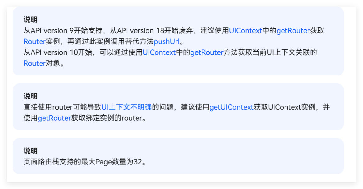
router模块可⽀持路由跳转⻚⾯,但是在新版本api中router已经不推荐使⽤,官⽹原话:
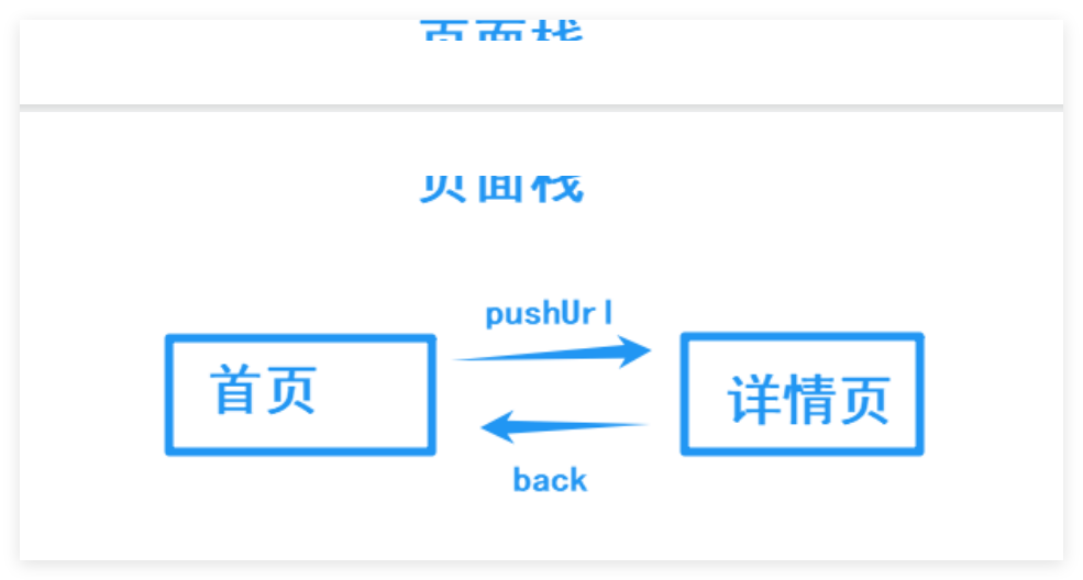
7.1路由跳转模式
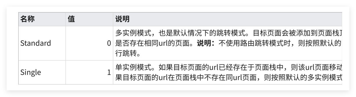
//代码块
this.getUIContext().getRouter().pushUrl({ url: 'pages/Index' },
router.RouterMode.Single)
7.2pushUrl路由跳转
跳转⽬标⻚⾯,⻚⾯在⻚⾯栈中从上往下加
//代码块
this.getUIContext().getRouter().pushUrl({ url: '⻚⾯地址' })
⽤法
//代码块
// 2.调⽤⽅法-普通跳转(可以返回)
this.getUIContext().getRouter().pushUrl({
 url:'⻚⾯地址'
})
// 2.调⽤⽅法-替换跳转(⽆法返回)
this.getUIContext().getRouter().replaceUrl({
 url:'⻚⾯地址'
})
// 2.调⽤⽅法-返回()
this.getUIContext().getRouter().back()
//Index.ets
import { router } from '@kit.ArkUI'
@Entry
@Component
struct Index {
 onPageShow(): void {
 AlertDialog.show({
 message: this.getUIContext().getRouter().getLength(),
 alignment: DialogAlignment.Bottom
 })
 }

 // 路由模式 :
 // 单⻚⾯模式 Single router.RouterMode.Single
 // 标准模式:Standard router.RouterMode.Standard
 build() {
 Column({ space: 20 }) {
 Text('我是Index')
 .fontSize(30)
 .fontWeight(900)
 Button('跳转SubPage')
 .onClick(() => {
 this.getUIContext().getRouter().pushUrl({
 url: 'pages/SubPage',
 })
 })
 Button('替换 Index')
 .onClick(() => {
 this.getUIContext().getRouter().replaceUrl({
 url: 'pages/SubPage',
 },)
 })
 }
 .width('100%')
 .height('100%')
 .justifyContent(FlexAlign.Center)
 }
}
//SubPage.ets
@Entry
@Component
struct SubPage {
 @State message: string = 'SubPage';
 onPageShow(): void {
 AlertDialog.show({ message: this.getUIContext().getRouter().getLength(),
alignment: DialogAlignment.Bottom })
 }
 build() {
 Column({ space: 20 }) {
 Text(this.message)
 .fontSize($r('app.float.page_text_font_size'))
 .fontWeight(FontWeight.Bold)
 Button('返回')
 .onClick(() => {
 this.getUIContext().getRouter().back()
 })
 Button('跳转Index')
 .onClick(() => {
 this.getUIContext().getRouter().pushUrl({ url: 'pages/Index' })
 })
 }
 .justifyContent(FlexAlign.Center)
 .height('100%')
 .width('100%')
 }
}
7.5路由传参
//代码块
// -----------传递参数------------
// 普通跳转 并 传递参数
this.getUIContext().getRouter().pushUrl({
 url:'地址',
 params:{
 // 以对象的形式传递参数
 }
})
// 覆盖跳转并传递参数
 this.getUIContext().getRouter().replaceUrl(
 url:'地址',
 params:{
 // 以对象的形式传递参数
 }
)
// 返回并传递参数
 this.getUIContext().getRouter().back(
 url:'地址',
 params:{
 // 以对象的形式传递参数
 }
)
// -------------⻚⾯ B接收并解析参数------------
// aboutToAppear⼀会展开 (⽣命周期函数)
aboutToAppear(): void {
 // 1.确认内容
 console.log(JSON.stringify(router.getParams()))
 // 2.通过 as 类型断⾔ 转为具体的类型
 const params = router.getParams() as 类型
 // 3. 通过点语法即可取值
 params.xxx
}
带参数跳转
//代码块
import { router } from '@kit.ArkUI'
@Entry
@Component
struct Index {
 onPageShow(): void {
 AlertDialog.show({
 message: this.getUIContext().getRouter().getLength(),
 alignment: DialogAlignment.Bottom
 })
 }
 // 路由模式 :
 // 单⻚⾯模式 Single router.RouterMode.Single
 // 标准模式:Standard router.RouterMode.Standard
 build() {
 Column({ space: 20 }) {
 Text('我是Index')
 .fontSize(30)
 .fontWeight(900)
 Button('跳转SubPage')
 .onClick(() => {
 this.getUIContext().getRouter().pushUrl({
 url: 'pages/SubPage',
 })
 })
 Button('替换 Index')
 .onClick(() => {
 this.getUIContext().getRouter().replaceUrl({
 url: 'pages/SubPage',
 },)
 })
 Button('带参跳转SubPage')
 .onClick(() => {
 this.getUIContext().getRouter().pushUrl({
 url: 'pages/SubPage',
 params: {
 name: 'ArkUI',
 age: 18
 }
 })
 })
 }
 .width('100%')
 .height('100%')
 .justifyContent(FlexAlign.Center)
 }
}
//代码块
@Entry
@Component
struct SubPage {
@State message: string = 'SubPage';
 @State routerParams: string = '还没有路由参数'
 onPageShow(): void {
 AlertDialog.show({ message: this.getUIContext().getRouter().getLength(),
alignment: DialogAlignment.Bottom })
 }
 aboutToAppear(): void {
 const params = this.getUIContext().getRouter().getParams() as object
 this.routerParams = JSON.stringify(params)
 }
 build() {
 Column({ space: 20 }) {
 Text(this.routerParams)
 .fontSize($r('app.float.page_text_font_size'))
 .fontWeight(FontWeight.Bold)
 Text(this.message)
 .fontSize($r('app.float.page_text_font_size'))
 .fontWeight(FontWeight.Bold)
 Button('返回')
 .onClick(() => {
 this.getUIContext().getRouter().back()
 })
 Button('跳转Index')
 .onClick(() => {
 this.getUIContext().getRouter().pushUrl({ url: 'pages/Index' })
 })
 }
 .justifyContent(FlexAlign.Center)
 .height('100%')
 .width('100%')
 }
}


 扫一扫
扫一扫


 327
327

 被折叠的 条评论
为什么被折叠?
被折叠的 条评论
为什么被折叠?
 到【灌水乐园】发言


