


 文章讲述了如何使用Plotly库对箱线图进行颜色定制。首先介绍了boxmode参数用于重叠箱子,然后指出px.box()不支持box_color参数。为改变箱线颜色,文章提供了使用plotly.graph_objects创建单独箱线并设置fillcolor的方法,通过循环遍历数据并添加到Figure对象中实现颜色区分。
一、问题描述
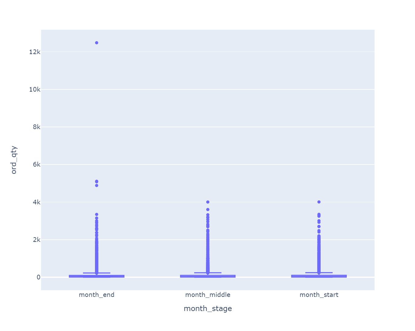
我用Plotly库进行可视化:
import plotly.express as px
category_orders = {"month_stage": ['month_end', 'month_middle', 'month_start']}
fig = px.box(data2, x = "month_stage", y = "ord_qty", notched = True,
             category_orders = category_orders)
fig.update_layout(
    width = 800,  # 设置宽度为600像素
    height = 640  # 设置高度为400像素
)
fig.show()
我们生成的结果如下:
我想区别一下颜色,可以使用 boxmode 参数来设置不同箱子的颜色,如下所示:
import plotly.express as px
category_orders = {"month_stage": ['month_end', 'month_middle', 'month_start']}
fig = px.box(data2, x="month_stage", y="ord_qty", notched=True,
             category_orders=category_orders, boxmode='overlay')
fig.update_layout(
    width=800,  # 设置宽度为600像素
    height=640  # 设置高度为400像素
)
fig.show()
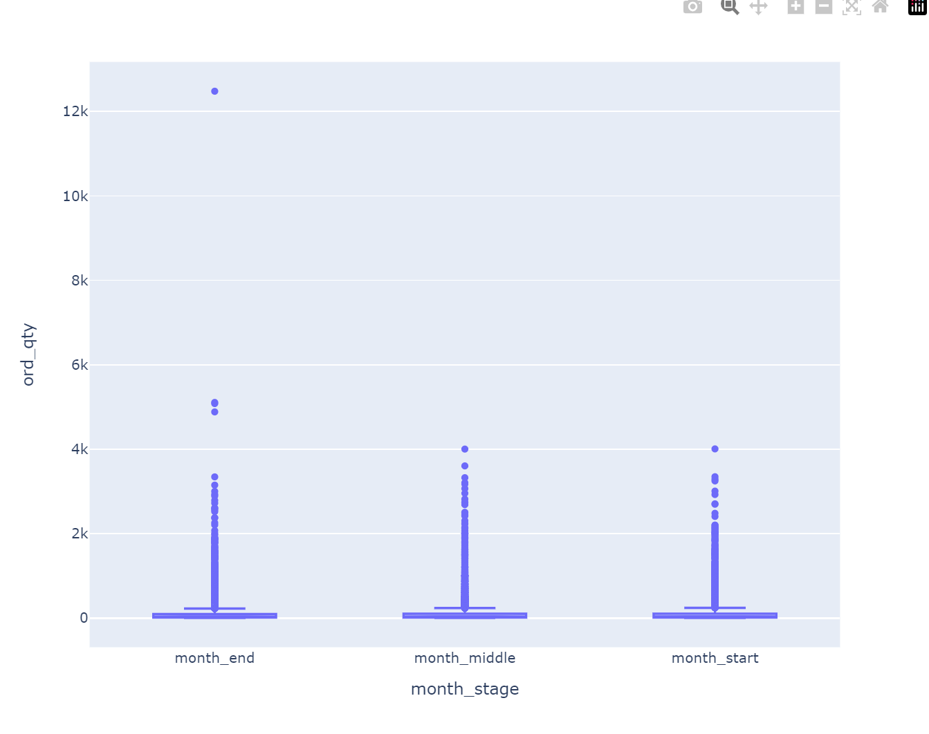
在上面的代码中,我们将 boxmode 设置为 'overlay',这样每个箱子都会用不同的颜色重叠在一起。要自定义颜色,可以使用 box_color 参数传递一个颜色列表,例如:
import plotly.express as px
category_orders = {"month_stage": ['month_end', 'month_middle', 'month_start']}
fig = px.box(data2, x="month_stage", y="ord_qty", notched=True,
             category_orders=category_orders, boxmode='overlay',
             box_color=['red', 'green', 'blue'])
fig.update_layout(
    width=800,  # 设置宽度为600像素
    height=640  # 设置高度为400像素
)
fig.show()
在上面的代码中,我们将 box_color 参数设置为一个颜色列表,其中每个元素对应于一个箱子。在本例中,我们将第一个箱子设置为红色,第二个箱子设置为绿色,第三个箱子设置为蓝色。
然后引发报错:
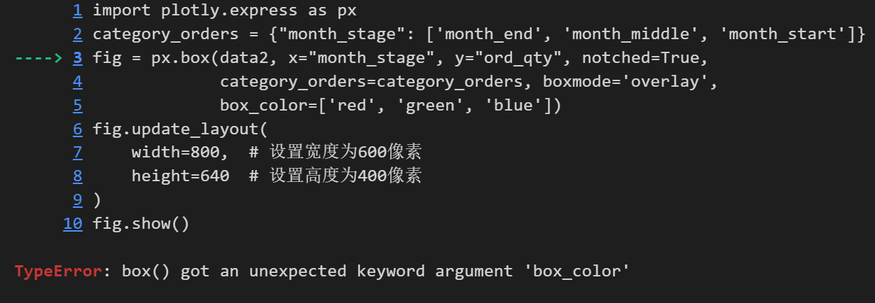
二、错误解决
px.box() 并不支持 box_color 参数。要改变箱线的颜色,可以尝试以下方法:
import plotly.graph_objects as go
import plotly.express as px

fig = go.Figure()

category_orders = {"month_stage": ['month_end', 'month_middle', 'month_start']}
colors = ['red', 'green', 'blue']

for stage, color in zip(category_orders["month_stage"], colors):
    data = data2[data2["month_stage"] == stage]
    box = go.Box(
        y=data["ord_qty"],
        name=stage,
        boxpoints="all",
        jitter=0.3,
        whiskerwidth=0.2,
        fillcolor=color,
        marker=dict(size=2, color=color),
        line=dict(width=1),
    )
    fig.add_trace(box)

fig.update_layout(
    xaxis=dict(title="Month Stage"),
    yaxis=dict(title="Order Quantity"),
    width=800,
    height=640,
    showlegend=False,
)

fig.show()
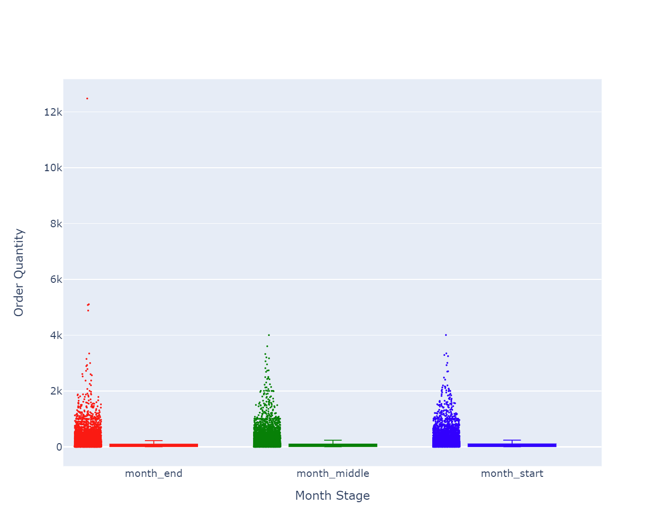
这里使用了 plotly.graph_objects 模块,手动创建箱线图的每个部分,并设置了 fillcolor 参数来改变箱线的颜色。通过循环遍历每个月份的数据来创建多个箱线图,并将它们添加到一个 go.Figure() 对象中。


 被折叠的 条评论
为什么被折叠?
被折叠的 条评论
为什么被折叠?
 到【灌水乐园】发言


