


注解会在图像中添加元数据,元数据依然是数据,所以可以使用以下函数:
geom_text():可添加文本说明或者为点添加标签;
geom_rect():标注图形中你感兴趣的区域;
geom_line()、geom_path()、geom_segment():添加直线,可以在直线上绘制箭头;
geom_vline()、geom_hline()、geom_abline():在图形中添加参照线(基准线),其跨度为整张图像。
一般来说,注解既可添加在前景(必要时使用alpha函数以保证能看清数据)也可添加在背景中。添加于背景时,默认使用白色字体。
下面依然使用economics数据集举例说明:
添加注解标明各个总统的当政时间
library(ggplot2)
ggplot(economics,aes(date,unemploy))+geom_line()
presidential <- subset(presidential,start > economics$date[1])
ggplot(economics)+
  geom_rect(aes(xmin=start,xmax=end,fill=party),
  ymin=-Inf,ymax=Inf,alpha=0.2,data=presidential)+
  geom_vline(aes(xintercept=as.numeric(start)),
  data=presidential,colour="grey50",alpha=0.5)+
  geom_text(aes(x=start,y=2500,label=name),
  data=presidential,size=3,vjust=0,hjust=0,nudge_x=50)
  geom_line(aes(date,unemploy))+
  scale_fill_manual(values = c("blue","red"))
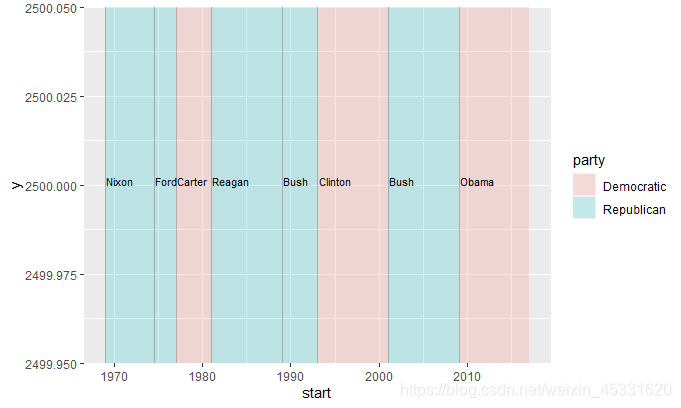
图看起来还不错,但好像有些繁琐。
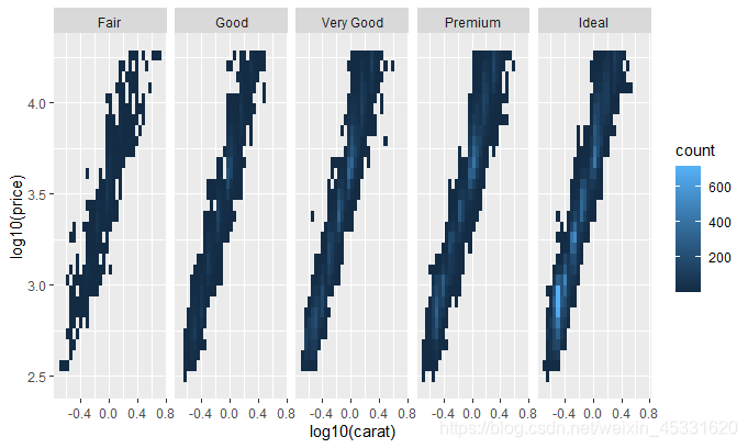
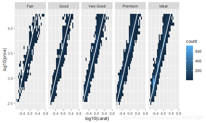
各类注解,尤其是参照线,在通过分面比较组间关系时格外有用,不过其实用的也不多。。
ggplot(diamonds,aes(log10(carat),log10(price)))+
  geom_bin2d()+facet_wrap(~cut,nrow = 1)
mod_coef <- coef(lm(log10(price)~log10(carat),
                    data=diamonds))
ggplot(diamonds,aes(log10(carat),log10(price)))+
  geom_bin2d()+geom_abline(intercept = mod_coef[1],
  slope=mod_coef[2],colour="white",size=1)+
  facet_wrap(~cut,nrow = 1)


 621
621

 被折叠的 条评论
为什么被折叠?
被折叠的 条评论
为什么被折叠?
 到【灌水乐园】发言


