


在这个项目中,我将把我的数据分析和探索性数据分析技巧应用到棒球数据中。特别是,我想知道Moneyball在奥克兰运动家队的表现如何。我连接到sql数据库并用sqlite索取里面的信息来建成我自己的数据分析表格。我用colab写的该项目,我先把sql文件传到了 google drive上面。
import pandas
import numpy as np
import sqlite3
from google.colab import drive
import matplotlib.pyplot as plt
from numpy.polynomial.polynomial import polyfit
# Accessing the Data from sql file
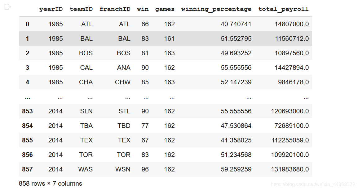
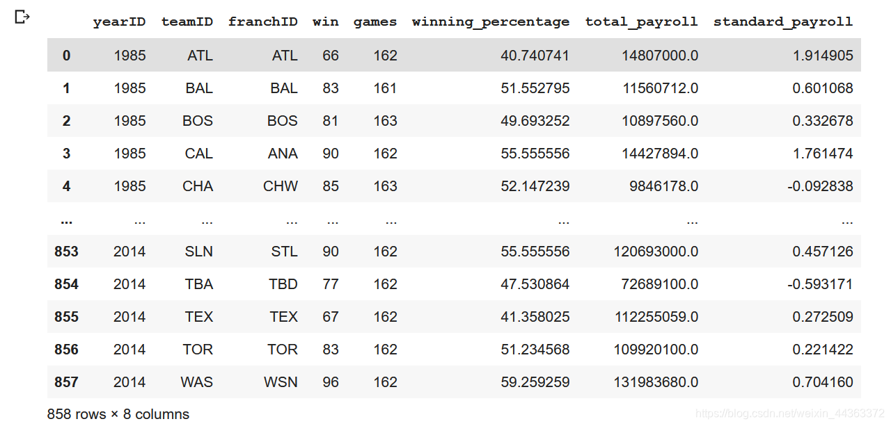
conn = sqlite3.connect('/content/gdrive/MyDrive/lahman2014.sqlite')query = "SELECT t.yearID, t.teamID, t.franchID, t.W as win, t.G as games, (t.W*1.0/t.G*1.0)*100 as winning_percentage, sum(s.salary) as total_payroll FROM Salaries as s INNER JOIN Teams as t ON s.yearID = t.yearID AND s.teamID = t.teamID GROUP BY s.yearID, s.teamID"
wtable = pandas.read_sql(query, conn)
wtable运行效果
说明1990年至2014年各球队的薪资分配情况,我会在下面做出一个关系图。
query2 = "SELECT t.yearID, t.teamID, t.franchID, t.W, t.G, sum(s.salary) as totalPayroll FROM Salaries as s INNER JOIN Teams as t ON s.yearID = t.yearID AND s.teamID = t.teamID WHERE s.yearID >= 1990 AND s.yearID <= 2014 GROUP BY s.yearID, s.teamID"
p2 = pandas.read_sql(query2, conn)
temp = p2.pivot(index = 'yearID', columns = 'teamID', values = 'totalPayroll')
plt.rcParams["figure.figsize"] = [24,12]
for col in (temp.columns):
  plt.plot(temp[col], label=col)
  plt.legend(col)

yMax = plt.ylim()[1]
plt.title("Total_payroll_of_each_team")
plt.legend(bbox_to_anchor=(0.03,0.95), loc = 2, ncol = 4)
plt.show()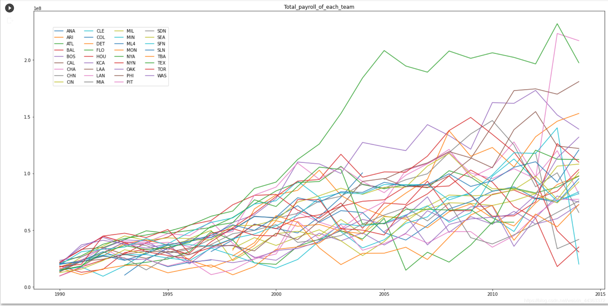
接下来我画了一张1990年到2014年每个团队平均工资的图表。
mean = temp.mean(axis = 1)
plt.rcParams["figure.figsize"] = [12,8]
plt.plot(mean)
plt.title("ave_pay")

plt.show()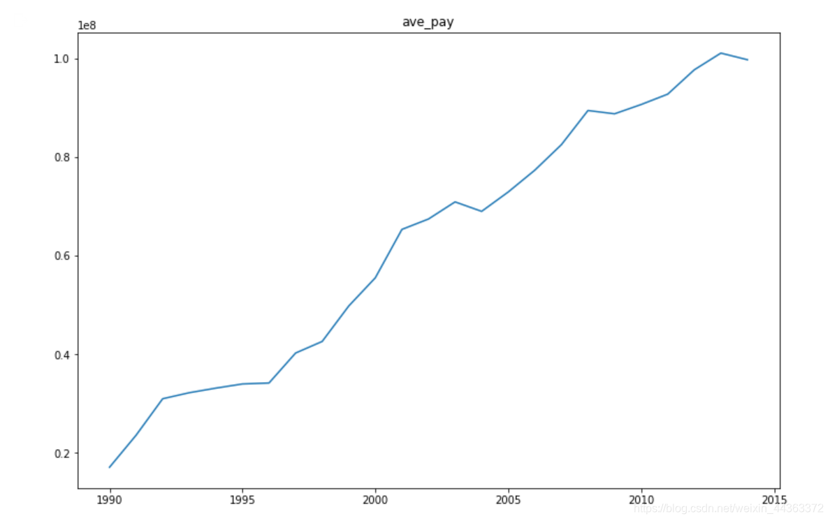
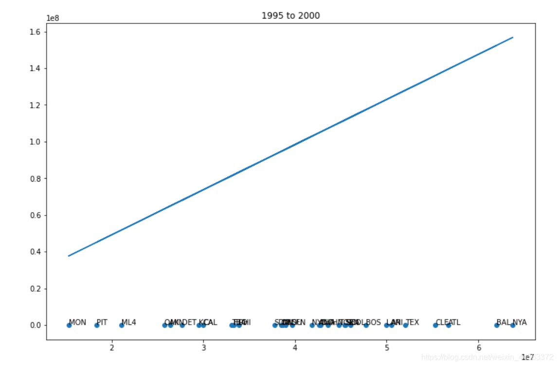
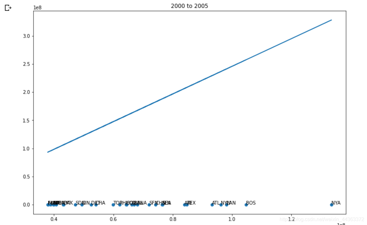
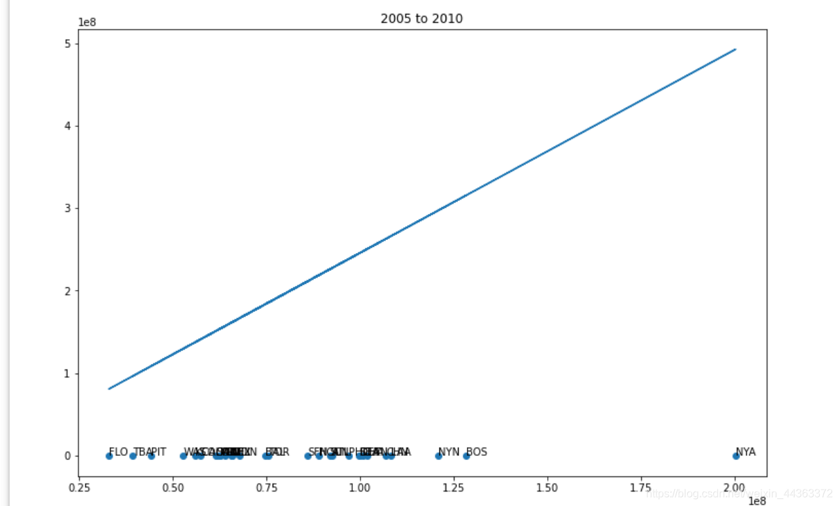
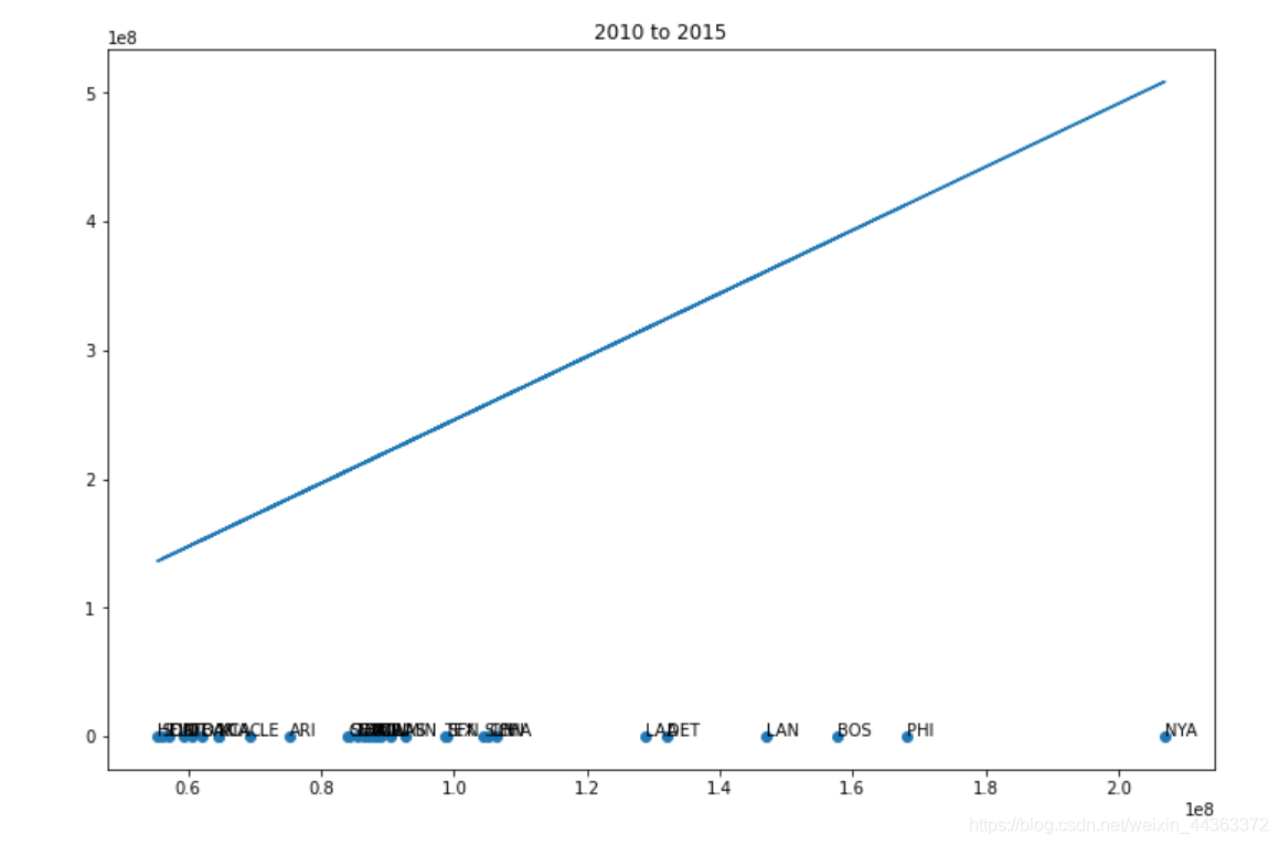
下一步,编写代码将年份离散为5个时间段。
wtable['cut'] = pandas.cut(wtable['yearID'], [1990, 1995, 2000, 2005, 2010, 2015], right = False)
first = 1990

for i, section in wtable.groupby('cut'):
  payment = []
  win_game = []
  teams = []
  for t, team in section.groupby('teamID'):
    payment.append(team['total_payroll'].mean())
    win_game.append(team['winning_percentage'].mean())
    teams.append(t)

  figure, axis = plt.subplots()
  axis.scatter(payment, win_game)
  plt.title(str(first) + " to " + str(first + 5))

  for a, name in enumerate(teams):
    axis.annotate(name, (payment[a], win_game[a]))

  x, y = polyfit(pays, wins, 1)
  plt.plot(payment, np.multiply(y, payment) + x)
  first = first + 5
  plt.show()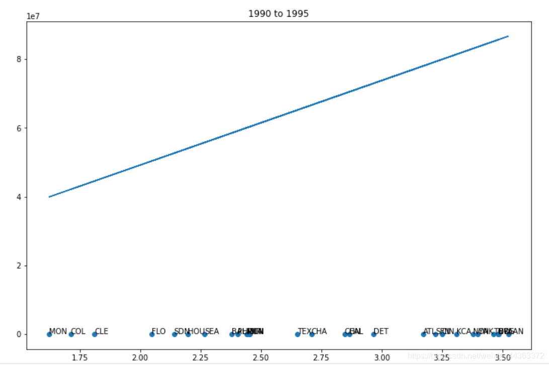
在数据集中创建一个新的变量,使按年计算的工资单标准化。
for y, year in wtable.groupby('yearID'):

  deviation = year['total_payroll'].std()
  avg = year['total_payroll'].mean()
  for x, team in year.groupby('teamID'):
    wtable.loc[(wtable['yearID'] == y) & (wtable['teamID'] == x),'standard_payroll'] = (team['total_payroll'] - avg) / deviation

wtable.drop("cut", axis=1, inplace=True)
wtable
运行结果
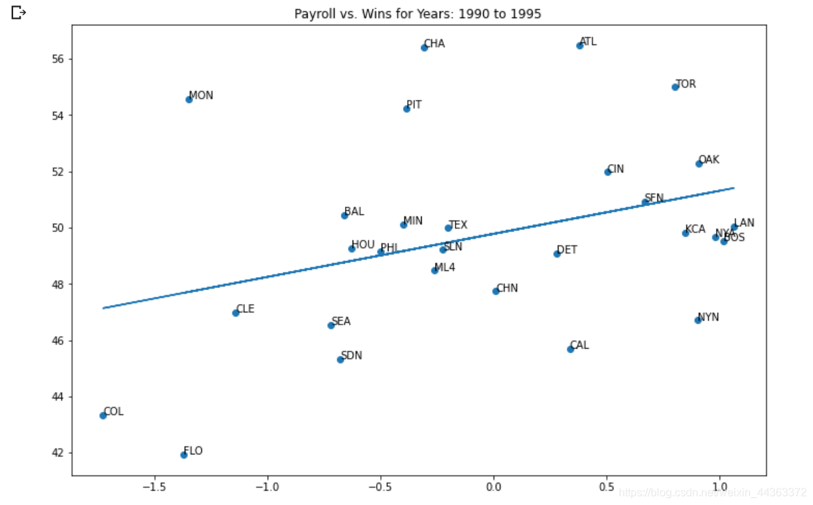
我用这个新的工资标准再画一遍上面5个时间段的图,运行效果有5张图,为了方便我这里只展现出来其中一张。
wtable['cut'] = pandas.cut(wtable['yearID'], [1990, 1995, 2000, 2005, 2010, 2015], right = False)
start = 1990

for i, section in wtable.groupby('cut'):

  pays = []
  wins = []
  teams = []
  for t, team in section.groupby('teamID'):
    pays.append(team['standard_payroll'].mean())
    wins.append(team['winning_percentage'].mean())
    teams.append(t)

  fig, ax = plt.subplots()
  ax.scatter(pays, wins)
  plt.title("Payroll vs. Wins for Years: " + str(start) + " to " + str(start + 5))


  for j, name in enumerate(teams):
    ax.annotate(name, (pays[j], wins[j]))

  x, y = polyfit(pays, wins, 1)
  plt.plot(pays, np.multiply(y, pays) + x)
  start = start + 5
  plt.show()
效果图
接下来制作一个获胜百分比(y轴)与标准化工资(x轴)的散点图。
fig, ax = plt.subplots()
for i, team in win_pay_table.groupby('teamID'):
  ax.scatter(team['standard_payroll'], team['winning_percentage'], label = i)
plt.title("The expected winrate of a team with standard payroll is 49.98%,and teams increase 2.5% wins for every 1 standard units of payroll")

x, y = polyfit(win_pay_table['standard_payroll'], win_pay_table['winning_percentage'], 1)
plt.plot(win_pay_table['standard_payroll'], np.multiply(y, win_pay_table['standard_payroll']) + x)
print("y = "+str(round(y, 2))+"x + "+str(round(x, 2)))

plt.show()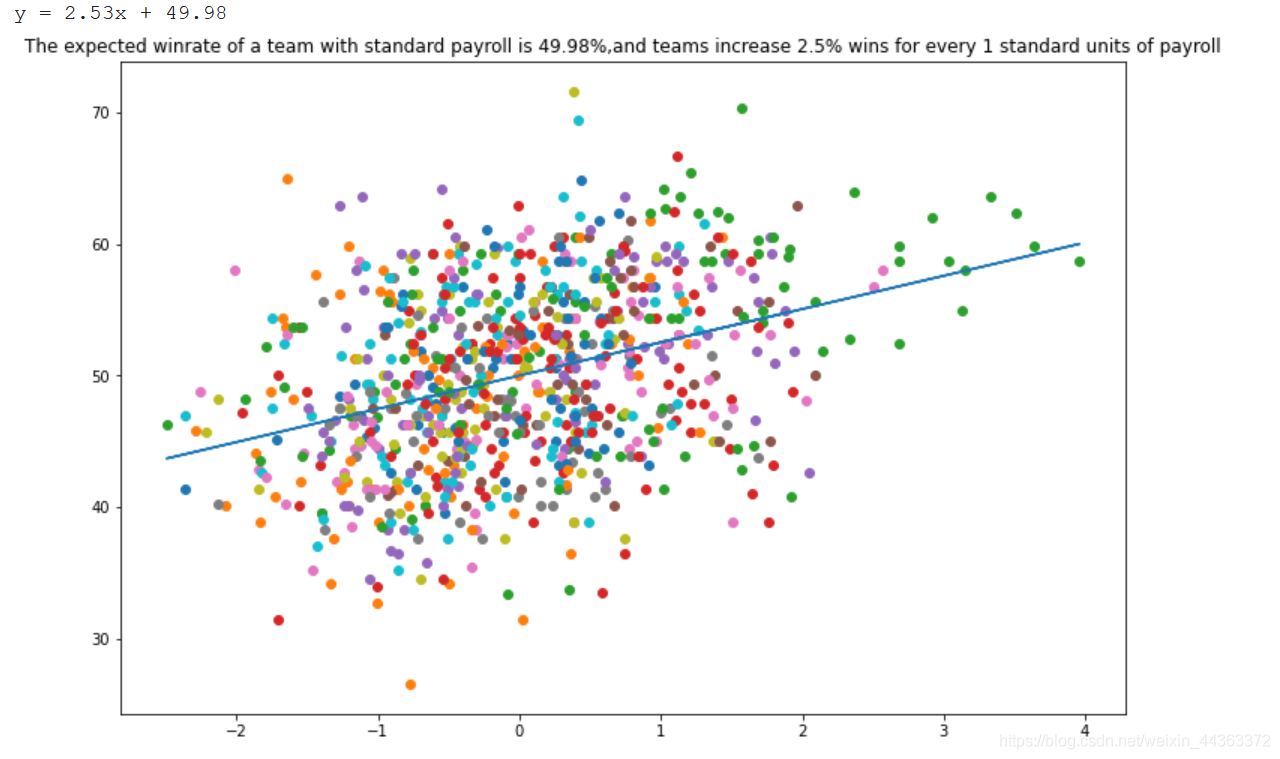
创建一个新的字段来计算每个团队的支出效率
for i, year in win_pay_table.groupby('yearID'):
  for j, team in year.groupby('teamID'):
    result = 2.53 * team['standard_payroll'] + 49.98
    payment = team['winning_percentage'] / result
    win_pay_table.loc[(win_pay_table['yearID'] == i) & (win_pay_table['teamID'] == j),'efficiency'] = payment

efficiency = win_pay_table.pivot(index = 'yearID', columns = 'teamID', values = 'efficiency')

teams = ['OAK', 'BOS', 'NYA', 'ATL', 'TBA']
for x in teams:
  plt.plot(efficiency[x])

plt.show()
效果图
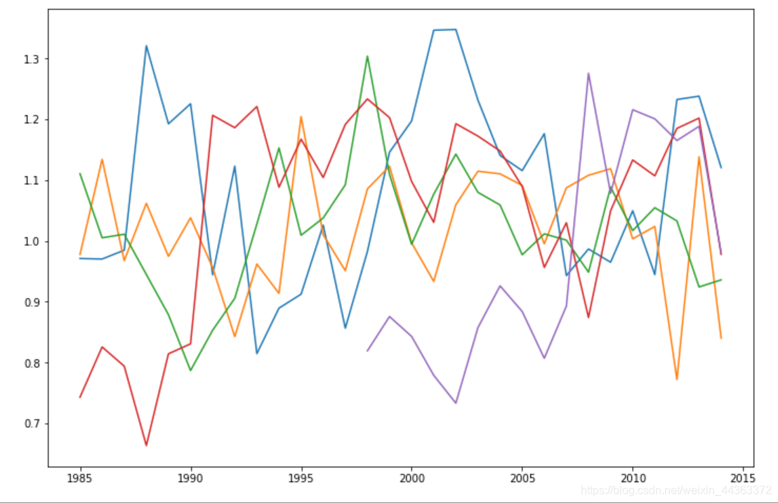
通过以上数据分析和关系图,我们可以得出在2000-2005年间,OAK团队的效率最高。随着工资的增加,通常大多数球队的胜率会增加很多。球员薪资是一个非常重要的因素去发展一个团队。


 被折叠的 条评论
为什么被折叠?
被折叠的 条评论
为什么被折叠?
 到【灌水乐园】发言


