


 这篇博客详细介绍了matplotlib的使用,包括面向对象和pyplot两种绘图方式,以及如何创建figure、axes、axis,控制线型、颜色,处理多子图,设置文本和数学公式,使用非线性坐标轴等。还展示了不同类型的图例,如普通线图、散点图、多子图和伪色彩图。
Usage Guide
Usage Guide
A simple example
Matplotlib在Figure(即Windows,类似容器、画布)上绘图;每个Figure包含若干个Axes(一个区域,可以根据坐标确定点的位置的区域。如直角坐标系、极坐标系)。可以用如下两句创建:
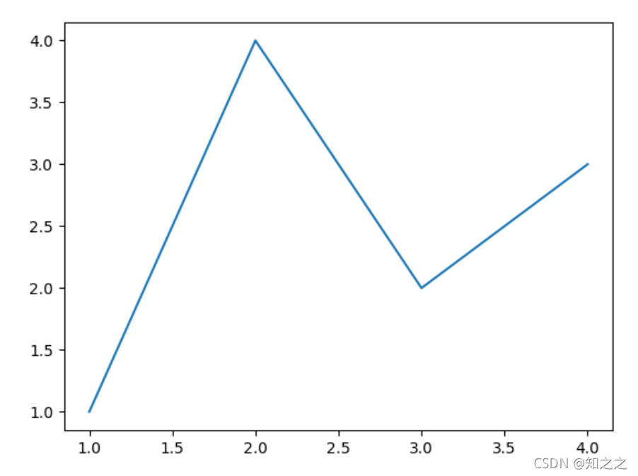
fig, ax = plt.subplots()  # Create a figure containing a single axes.
ax.plot([1, 2, 3, 4], [1, 4, 2, 3])  # Plot some data on the axes.
但是上述方法是面向对象的绘图方式。matplotlib中提供了更方便的画图方式(类MATLAB方式):
plt.plot([1, 2, 3, 4], [1, 4, 2, 3]) # Matplotlib plot.
这种方式中,没有明确指定Axes和Figure,都是默认的。事实上,每个Axes的画图方法,都有一个在matplotlib.pyplot 中对应的方法执行画图操作。因此这两者是等价的。
Parts of a Figure
Figure
全部的figure,其包含了图像中所有内容(图像、图例、文字等)。但是通常我们不必关注它。
下面是创建figure并指定其包含若干个Axes的示例:
fig = plt.figure()  # an empty figure with no Axes
fig, ax = plt.subplots()  # a figure with a single Axes
fig, axs = plt.subplots(2, 2)  # a figure with a 2x2 grid of Axes
Axes
这是实际上plot显示的区域。每个Axes包含若干个Axis对象(负责数据的limit)。每个Axes包含一个title,x-label和y-label。
Axis
是一种number-line-like objects,管理两个内容:graph limits and generating the ticks(the marks on the axis) and ticklabels (strings labeling the ticks).
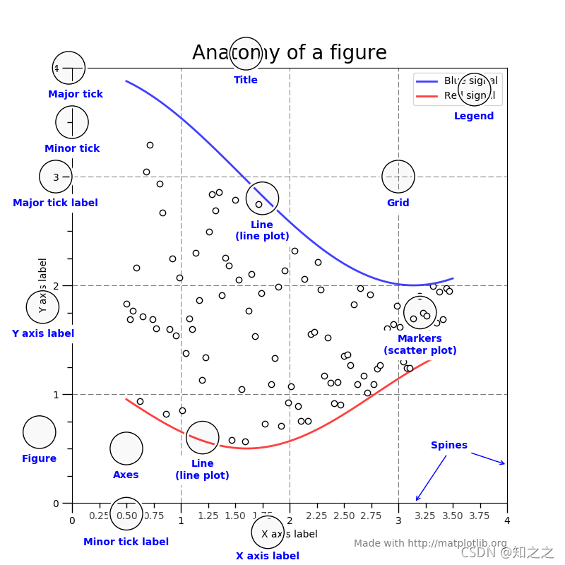
Artist
所有能看到的内容都是Artist。当figure被渲染后,所有Artist被画到画布上(When the figure is rendered, all of the artists are drawn to the canvas.)
Types of inputs to plotting functions
最好输入这两种数据:numpy.arrayor numpy.ma.masked_array。pandas的也可以,但是有出错的风险。
The object-oriented interface and the pyplot interface
即,面向对象的绘图方式(显式定义axes,然后在axes上画图)和类MATLAB的画图方式(用pyplot直接画)。
这里推荐的是,非交互式代码中用面向对象的方式;交互式过程中直接用plt。
这有个使用字典解压参数的例子:
def my_plotter(ax, data1, data2, param_dict):
    """
    A helper function to make a graph

    Parameters
    ----------
    ax : Axes
        The axes to draw to

    data1 : array
       The x data

    data2 : array
       The y data

    param_dict : dict
       Dictionary of kwargs to pass to ax.plot

    Returns
    -------
    out : list
        list of artists added
    """
    out = ax.plot(data1, data2, **param_dict)
    return out
data1, data2, data3, data4 = np.random.randn(4, 100)
fig, ax = plt.subplots(1, 1)
my_plotter(ax, data1, data2, {'marker': 'x'})
Backends
因为matplotlib面向多种用途(如交互式、非交互式、脚本),所以有多种Backends做支持。当使用交互式Backends,则产生交互式输出。
Pyplot tutorial
Intro to pyplot
matplotlib.pyplot包含了类MATLAB函数的集合。每个函数都会对改变figure中现有某部分(画图、加标签等)。matplotlib.pyplot在函数调用过程中,自动跟踪当前的状态(即现在在哪个figure、哪个axes上画图),因此每次调用其中函数,都是在当前状态所指的Axes上画图的。matplotlib.pyplot中每个函数,Axes对象都有,且后者更灵活。
示例:
import matplotlib.pyplot as plt
plt.plot([1, 2, 3, 4])
plt.ylabel('some numbers')
plt.show()
画出的图为:
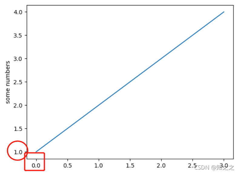
注意这里X轴是从0开始,而Y轴从1开始。这是因为,若只传入一个参数,plot函数认为这是Y值。那么X值是从0开始自动生成的。
可以传入多个序列:
plt.plot([1, 2, 3, 4], [1, 4, 9, 16])
Formatting the style of your plot
对于每个(x,y)数据点,都有一个format string 控制了color and line type。这沿袭了MATLAB中的方式。默认参数为’b-’,蓝色实线。
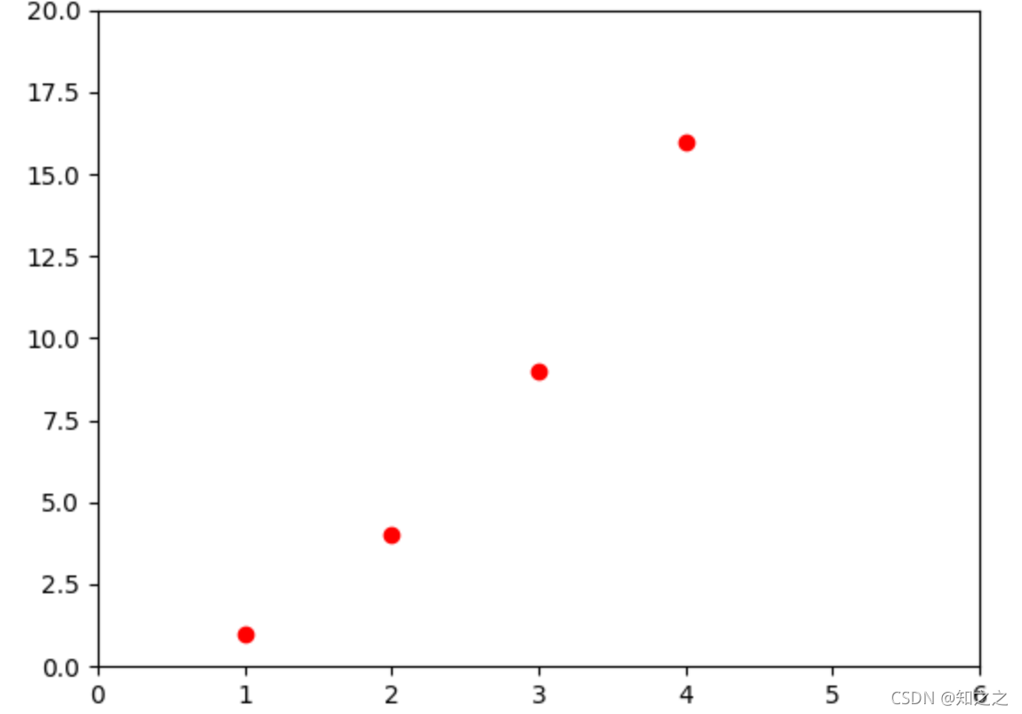
如果想画红色圆点:
plt.plot([1, 2, 3, 4], [1, 4, 9, 16], 'ro')
plt.axis([0, 6, 0, 20])
plt.show()
其中axis函数接受的参数是[xmin, xmax, ymin, ymax],这四个值决定了axes的视窗(viewport)。其实就是控制了显示那部分坐标系。
Different format styles in one function
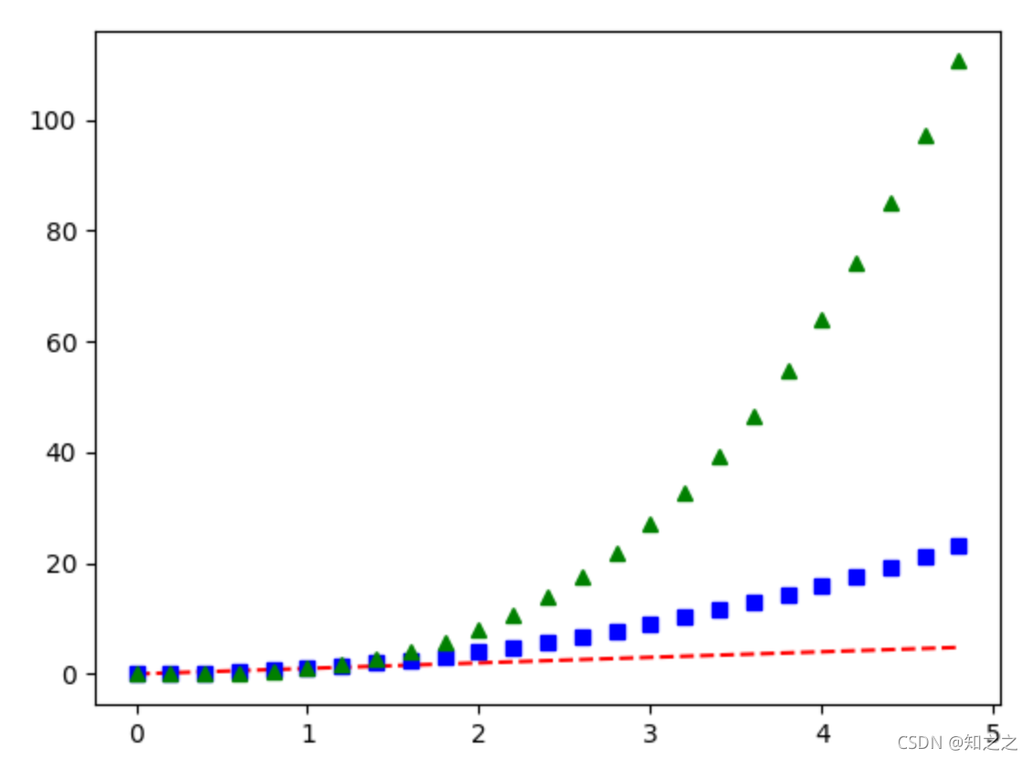
如果matplotlib只能跟列表玩,那么也就太low了。事实上,可以通过一个函数调用实现多种样式绘制:
import numpy as np

# evenly sampled time at 200ms intervals
t = np.arange(0., 5., 0.2)

# red dashes, blue squares and green triangles
plt.plot(t, t, 'r--', t, t**2, 'bs', t, t**3, 'g^')
plt.show()
这段代码传入了三组数组对象,绘制出三张图(三个不同的style)。
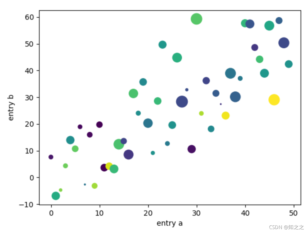
Plotting with keyword strings
可以用字典的索引作为x和y:
data = {'a': np.arange(50),
        'c': np.random.randint(0, 50, 50),
        'd': np.random.randn(50)}
data['b'] = data['a'] + 10 * np.random.randn(50)
data['d'] = np.abs(data['d']) * 100

plt.scatter('a', 'b', c='c', s='d', data=data)
plt.xlabel('entry a')
plt.ylabel('entry b')
plt.show()
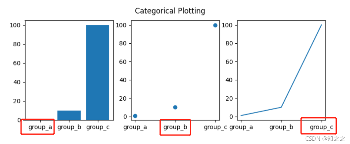
Plotting with categorical variables
这种方式将X轴设置为categorical variables而非数据:
这么说绘图方式就是将x和y对应,然后绘制。只要y是数值就行。
names = ['group_a', 'group_b', 'group_c']
values = [1, 10, 100]

plt.figure(figsize=(9, 3))

plt.subplot(131)
plt.bar(names, values)
plt.subplot(132)
plt.scatter(names, values)
plt.subplot(133)
plt.plot(names, values)
plt.suptitle('Categorical Plotting')
plt.show()
Controlling line properties
有三种设置线条属性的方式。这没看
Working with multiple figures and axes
获取当前Axes:gca方法(Get the current Axes)
获取当前Figure:gcf方法。
下面这段代码创建多个子图:
def f(t):
    return np.exp(-t) * np.cos(2*np.pi*t)

t1 = np.arange(0.0, 5.0, 0.1)
t2 = np.arange(0.0, 5.0, 0.02)

plt.figure()
plt.subplot(211)
plt.plot(t1, f(t1), 'bo', t2, f(t2), 'k')

plt.subplot(212)
plt.plot(t2, np.cos(2*np.pi*t2), 'r--')
plt.show()
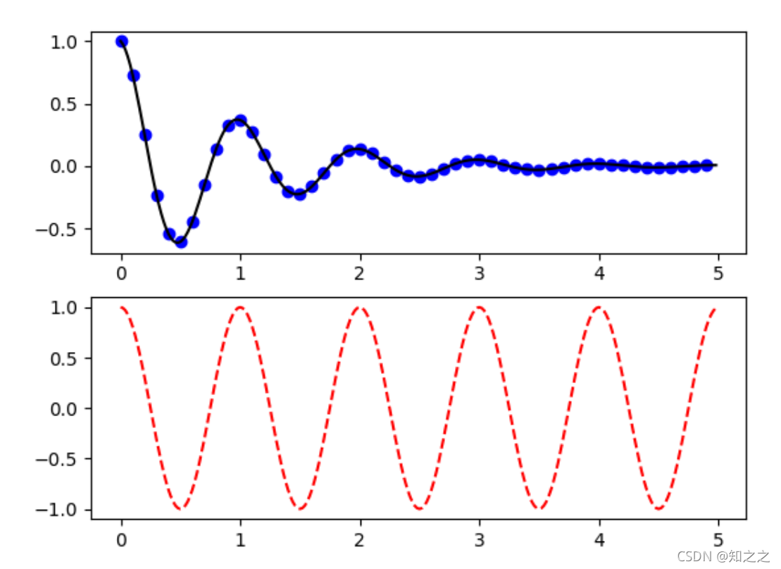
其中,subplot方法三个参数分别是 numrows, numcols, plot_number。当numrows*numcols<10,可以省略逗号,写成上面的 形式。
可以通过不同的数字创建不同的figure:
import matplotlib.pyplot as plt
plt.figure(1)                # the first figure
plt.subplot(211)             # the first subplot in the first figure
plt.plot([1, 2, 3])
plt.subplot(212)             # the second subplot in the first figure
plt.plot([4, 5, 6])


plt.figure(2)                # a second figure
可以清除内容: You can clear the current figure with clf and the current axes with cla.
要关闭一个图,要显示调用close,否则会驻留内存。
Working with text
文本可以被放置在任何位置。xlabel、title只是一些特殊的位置。
所有的text都是matplotlib.text.Text 类型,就像line一样,其style可以调整。
plt.text(60, .025, r'$\mu=100,\ \sigma=15$')
Using mathematical expressions in text
支持TeX语法,注意要加r符号就行(和正则表达式很像)
plt.title(r'$\sigma_i=15$')
Annotating text
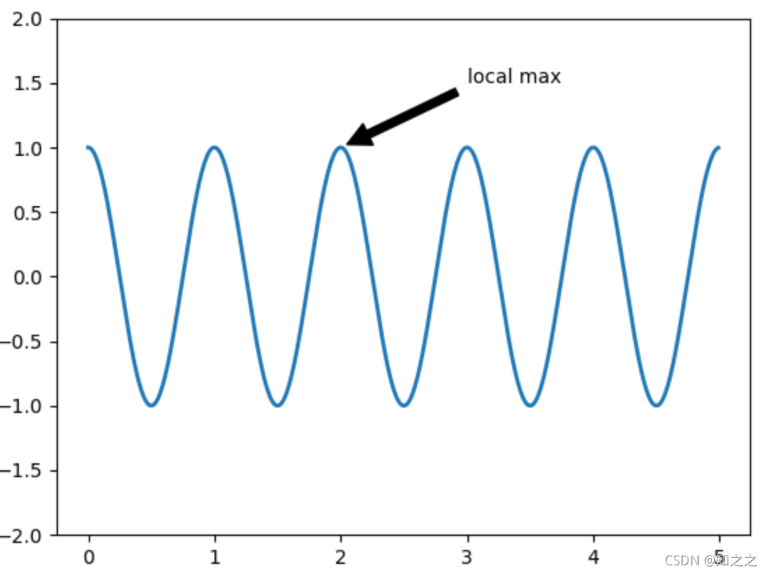
给图片加注解,可以由这个函数实现:
plt.annotate('local max', xy=(2, 1), xytext=(3, 1.5),
             arrowprops=dict(facecolor='black', shrink=0.05),
             )
其中xy=(2, 1), xytext=(3, 1.5),分别对应注解箭头所指的位置和注解的文本的位置:
Logarithmic and other nonlinear axes
matplotlib.pyplot 支持非线性axis scales,还有logarithmic and logit scales。当数据大小很大时,用这个很有用。
改变scale的方式是:
plt.xscale('log')
自己也可以添加自己需要的变换尺度。是transform什么的。
Sample plots in Matplotlib
Simple Plot
这就是画一个普通的线图。有个网格开关到时可以注意一下:
x=np.arange(0,2,0.01)
y=np.sin(x) + np.cos(x)
plt.plot(x,y,'r-o')
#网格开关
plt.grid()
Multiple subplots in one figure
图片
imgshow
pcolormesh伪色彩图
可以用来绘制决策边界:

GUI绘图
搞了半天知道需要修改设置,从这看到的


 被折叠的 条评论
为什么被折叠?
被折叠的 条评论
为什么被折叠?
 到【灌水乐园】发言


