圣杯布局
- 通过父容器设置左右两栏宽度,第一个子元素作为中间栏
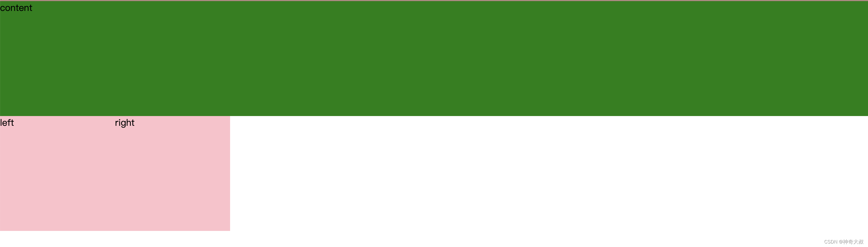
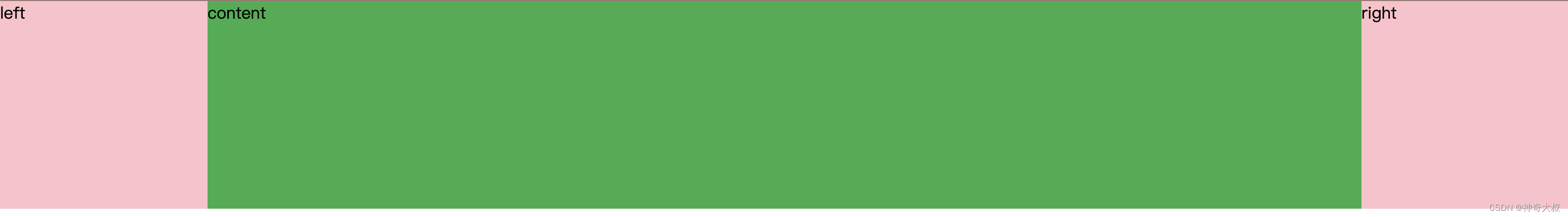
基本布局
  <div class="wrap">
    <div class="content">content</div>
    <div class="left">left</div>
    <div class="right">right</div>
  </div>
设置所有子元素浮动和元素大小
  *{
    margin: 0px;
    padding: 0px;
  }
  .content{
    width: 100%;
    background: green;
    height: 200px;
  }
  .left, .right{
    height: 200px;
    width: 200px;
    background: pink;
  }
  .wrap div{
    float: left;
  }
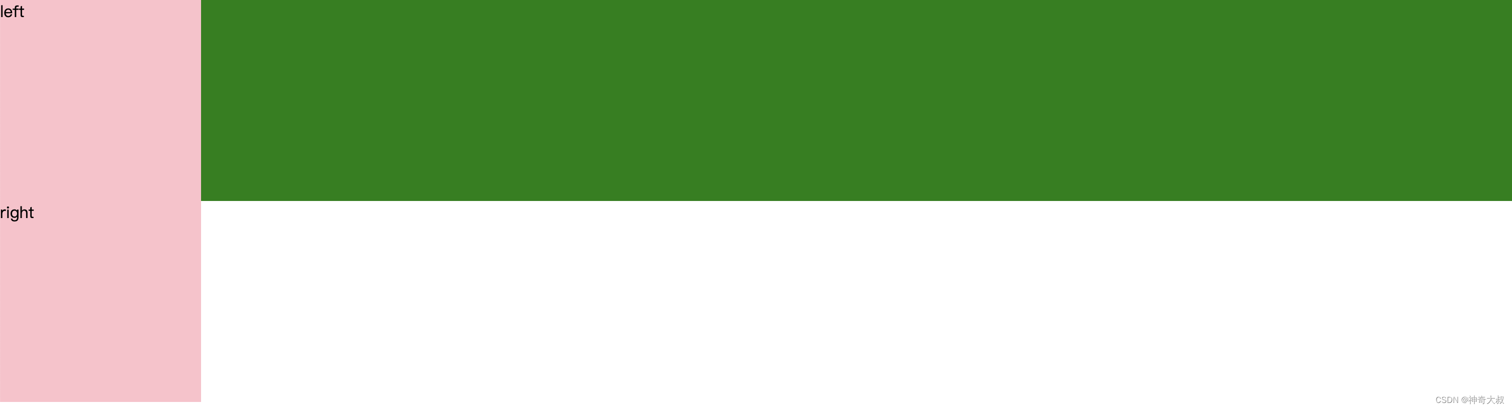
左栏 margin-left 移动到上一行
- margin-left:-100%; 移动父元素的宽度
  *{
    margin: 0px;
    padding: 0px;
  }
  .content{
    width: 100%;
    background: green;
    height: 200px;
  }
  .left, .right{
    height: 200px;
    width: 200px;
    background: pink;
  }
  .wrap div{
    float: left;
  }
  .left{
    margin-left: -100%;
    position: relative;
  }
- 可以看到左栏移动了上去,且来到中间栏的左边遮住了中间栏的内容
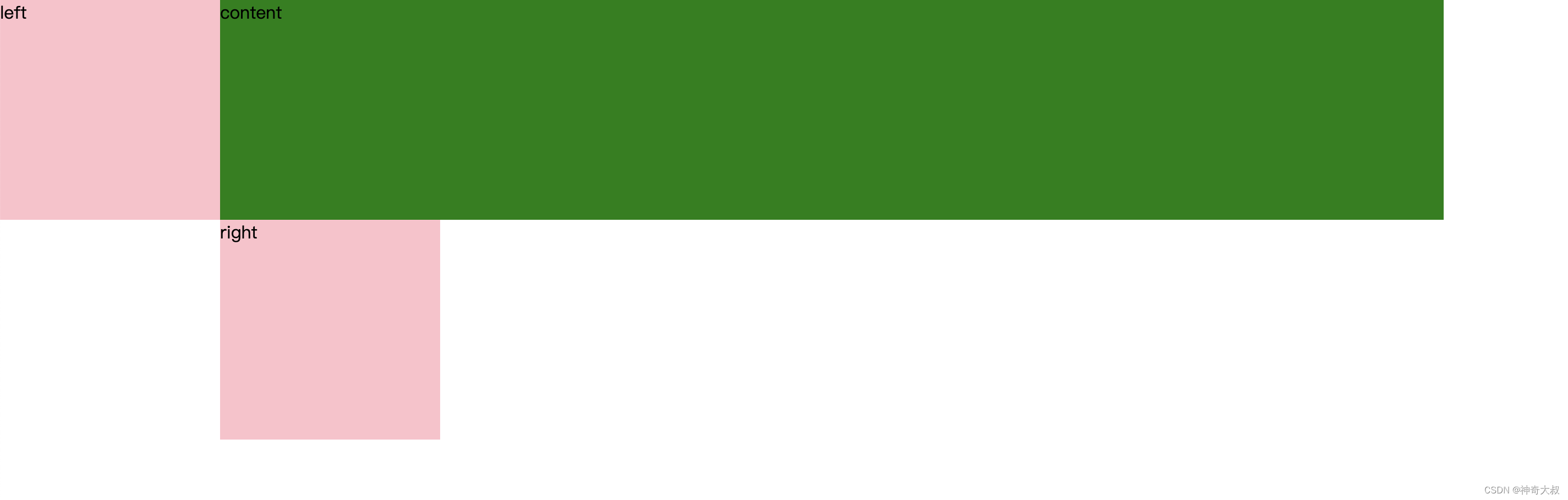
父元素设置 padding,左栏设置 left 向左移动
  *{
    margin: 0px;
    padding: 0px;
  }
  .content{
    width: 100%;
    background: green;
    height: 200px;
  }
  .left, .right{
    height: 200px;
    width: 200px;
    background: pink;
  }
  .wrap div{
    float: left;
  }
  .wrap{
    padding: 0 200px;
    height: 2000px;
  }
  .left{
    margin-left: -100%;
    position: relative;
    left: -200px;

  }
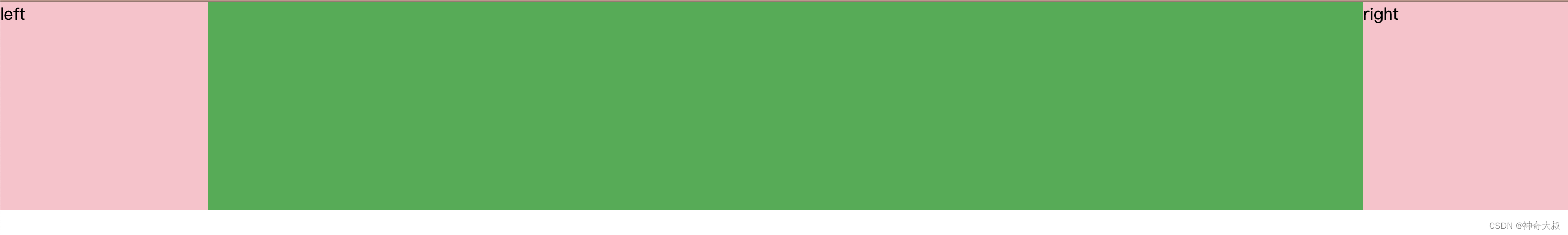
右栏设置设置 margin-left 和 left
  *{
    margin: 0px;
    padding: 0px;
  }
  .content{
    width: 100%;
    background: green;
    height: 200px;
  }
  .left, .right{
    height: 200px;
    width: 200px;
    background: pink;
  }
  .wrap div{
    float: left;
  }
  .wrap{
    padding: 0 200px;
    height: 2000px;
  }
  .left{
    margin-left: -100%;
    position: relative;
    left: -200px;

  }
  .right{
    margin-left: -200px;
    position: relative;
    left: 200px;
  }

双飞翼布局
- 通过中间栏的左右 margin 设置左右两栏宽度,第一个子元素作为中间栏
基本布局
 <div class="wrap">
     <div class="content">
         <div class="ineer">content</div>
     </div>
     <div class="left">left</div>
     <div class="right">right</div>
 </div>
子元素浮动,中间栏宽度 100%
 *{
   margin: 0;padding: 0;
 }
 .left, .right{
   width: 200px;
   height: 200px;
   background: pink;
   float: left;
 }
 .content{
   height: 200px;
   background: rgb(45, 173, 75);
   float: left;
   width: 100%;
 }
 .left{
   margin-left: -100%;
 }
 .right{
   margin-left: -200px;
 }
中间栏设置 margin 让出位置
*{
margin: 0;padding: 0;
}
.left, .right{
width: 200px;
height: 200px;
background: pink;
float: left;
}
.content{
height: 200px;
background: rgb(45, 173, 75);
float: left;
width: 100%;
}
.ineer{
margin: 0 200px;
height: 200px;
}
.left{
margin-left: -100%;
}
.right{
margin-left: -200px;
}
异同
- 相同点
- 都是通过 浮动 + margin-left,让第一个元素成为中间栏,然后后面元素浮动到中间栏的左右位置上,所以都会占据中间栏的内容
- 不同点
- 圣杯:通过父容器设置 padding 来让中间栏留出左右两栏位置,然后再让左右两栏通过 postion:relative 定位下的 left 偏移到留白位置
- 双飞翼:通过中间栏设置 margin 留出空白位置,因为左右两栏本身就在中间栏的左右两边,所以左右两栏无需再偏移


 本文对比分析了圣杯布局和双飞翼布局,前者通过父元素padding和子元素相对定位实现,后者利用中间栏的margin调整两侧栏位置。重点讲解了布局原理、关键代码示例和两者异同。


 扫一扫
扫一扫


 566
566

 被折叠的 条评论
为什么被折叠?
被折叠的 条评论
为什么被折叠?
 到【灌水乐园】发言


