


 本文介绍了双飞翼布局的DOM结构与圣杯布局的区别,详细阐述了如何通过CSS设置各列宽度与浮动,以及如何为左右两列预留空间。通过逐步添加元素并调整布局,展示了双飞翼布局的形成过程,最终给出了实现该布局的完整CSS代码。
1. DOM结构
    <div class="head"></div>
    <div class="container column">
      <div class="center"></div>
    </div>
    <div class="left column"></div>
    <div class="right column"></div>
    <div class="footer"></div>
双飞翼布局的DOM结构与圣杯布局的区别是用container仅包裹住center,另外将.column类从center移至container上。
2. CSS代码
按照与圣杯布局相同的思路,首先设置各列的宽度与浮动,并且为左右两列预留出空间,以及为footer设置浮动清除:
.container {
  width: 100%;
}

.column {
  float: left;
}

.center {
  margin-left: 200px;
  margin-right: 150px;
}

.left {
  width: 200px;
}

.right {
  width: 150px;
}

.footer {
  clear: both;
}
得到如下效果示意图:
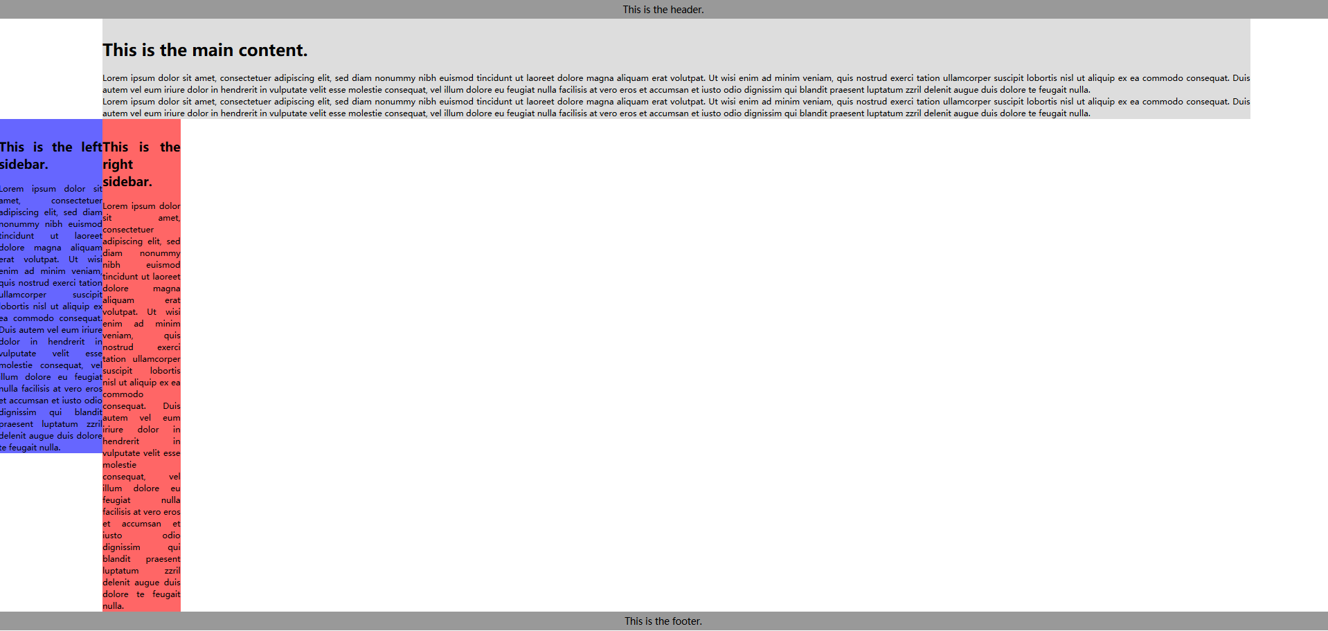
以上代码将container,left,right设置为float: left,而在container内部,center由于没有设置浮动,所以其宽度默认为container的100%宽度,通过对其设置margin-left和margin-right为左右两列预留出了空间。
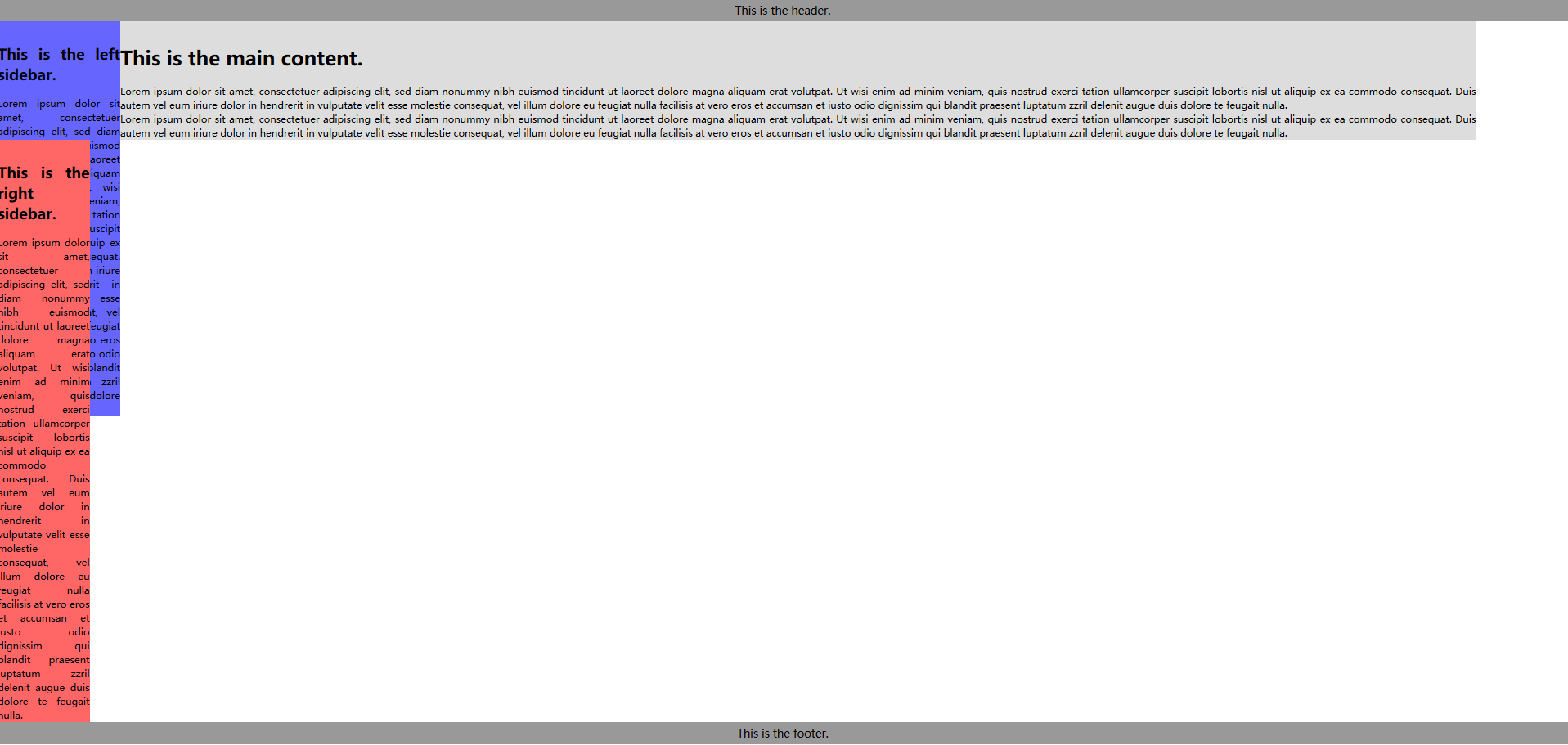
将left放置到预留位置:
.left {
  width: 200px;
  margin-left: -100%;
}
得到:
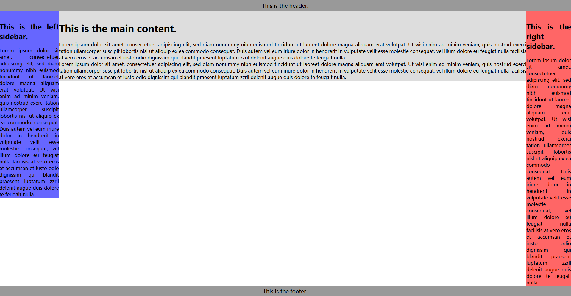
将right放置到预留位置:
.right {
  width: 150px;
  margin-left: -150px;
}
最后计算最小页面宽度:由于双飞翼布局没有用到position:relative进行定位,所以最小页面宽度应该为200+150=350px。但是当页面宽度缩小到350px附近时,会挤占中间栏的宽度,使得其内容被右侧栏覆盖,如下所示:
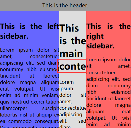
因此在设置最小页面宽度时,应该适当增加一些宽度以供中间栏使用(假设为150px),则有:
body {
  min-width: 500px;
}
至此双飞翼布局大功告成!其布局整体代码为:
       body{
            min-width: 550px;
        }
      .head{
        height: 200px;
        background: tomato;
      }
      .container{
          width: 100%;

          height: 200px;
      }
      .column{
          float: left;
      }
      .center{
          height: 200px;
          margin-left: 200px;
          margin-right: 150px;
          background: deeppink;
      }
      .left{
          height: 200px;
          width: 200px;
          background: blue;
          margin-left: -100%;
      }
      .right{
          height: 200px;
          width: 150px;
          background: yellow;
          margin-left: -150px;
      }
      .footer{
        clear: both;
        height: 200px;
        background: wheat;
      }


 扫一扫
扫一扫


 566
566

 被折叠的 条评论
为什么被折叠?
被折叠的 条评论
为什么被折叠?
 到【灌水乐园】发言


