


 本文介绍了解决中间部分被挡住问题的两种网页布局方案:双飞翼布局与圣杯布局。这两种布局都实现了侧边栏宽度固定,中间栏宽度自适应的特点。通过具体的实现代码对比了两种布局的不同之处。
双飞翼、圣杯布局
概念:都是侧边两栏宽度固定,中间栏宽度自适应。
用处:解决中间部分被挡住的问题。
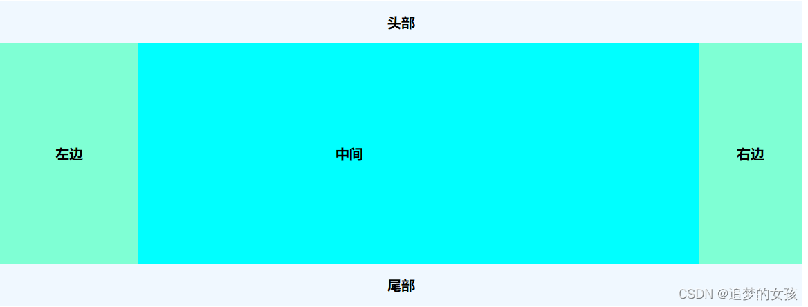
圣杯布局:
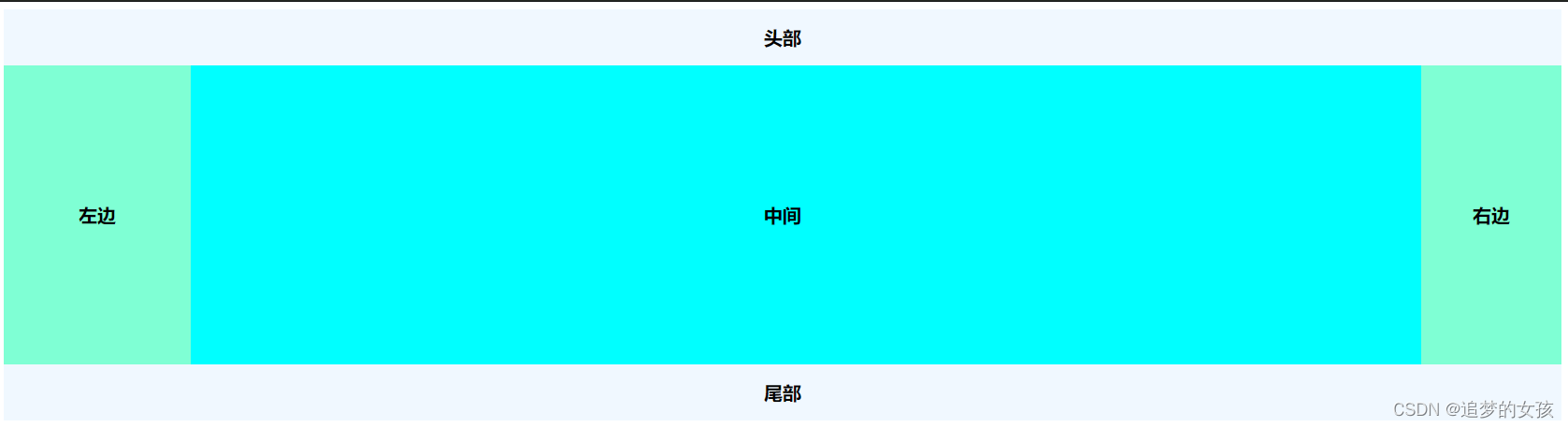
双飞翼布局:双飞翼则是在center这个div中再加了一个div来放置内容,在给这个新的div设置margin-left和margin-right 。
圣杯布局:在父元素上设置了padding-left和padding-right,在给左右两边的内容设置position为relative。
双飞翼实现代码
<!DOCTYPE html>
<html>

<head>
  <meta charset="utf-8">
  <script src="http://lib.sinaapp.com/js/jquery/2.0.2/jquery-2.0.2.min.js"></script>
</head>
<style>
body{
	min-width: 600px;
	font-weight: bold;
	font-size: 20px;
}
#header,#footer{
	background-color: aliceblue;
	text-align: center;
	height:60px;
	line-height: 60px;
	}
#left,#center,#right{
	float: left;
}
#container{
	overflow: hidden;//清除浮动
}
.column{
	text-align: center;
	height: 320px;
	line-height: 320px;
}
#center{
	width:100%;
	background-color: aqua;
}
#left{
	width:200px;
	background-color: aquamarine;
	margin-left: -100%;

}
#right{
	margin-left: -150px;
	width: 150px;
	background-color: aquamarine;
}
.content{
	margin-left:0 160px 200px;
}
</style>

<body>
  <div id="header">头部</div>

  <div id="container">
    <div id="center" class="column">
      <div class="content">中间</div>
    </div>
    <div id="left" class="column">左边</div>
    <div id="right" class="column">右边</div>
  </div>

  <div id="footer">尾部</div>
</body>

</html>
圣杯实现代码
<!DOCTYPE html>
<html>

<head>
  <meta charset="utf-8">
  <script src="http://lib.sinaapp.com/js/jquery/2.0.2/jquery-2.0.2.min.js"></script>
</head>
<style>
body{
	min-width: 600px;
	font-weight: bold;
	font-size: 20px;
}
#header,#footer{
	background-color: aliceblue;
	text-align: center;
	height:60px;
	line-height: 60px;
	}
#left,#center,#right{
	float: left;
}
#container{
	overflow: hidden;//清除浮动
	padding-left: 200px;
	padding-right: 150px;
}
.column{
	text-align: center;
	height: 320px;
	line-height: 320px;
}
#center{
	width:100%;
	position: relative;
	background-color: aqua;
}
#left{
	margin-left: -100%;
	width:200px;
	background-color: aquamarine;
	position: relative;

}
#right{
	position: relative;
	width: 150px;
	background-color: aquamarine;
	margin-left: -150px;
	right: -150px;
}
.content{
	margin-left:0 160px 200px;
}
#footer{
	clear: both;
}
</style>

<body>
  <div id="header">头部</div>

  <div id="container">
    <div id="center" class="column">
      中间
    </div>
    <div id="left" class="column">左边</div>
    <div id="right" class="column">右边</div>
  </div>

  <div id="footer">尾部</div>
</body>

</html>
以上内容是参考本篇文章
添加链接描述


 扫一扫
扫一扫


 344
344


 到【灌水乐园】发言


