


曲面图代码
import numpy as np
import matplotlib.pyplot as plt
from mpl_toolkits.mplot3d import Axes3D

# 定义二维正态分布函数
def bivariate_normal(x, y, mean_x=0, mean_y=0, sigma_x=1, sigma_y=1, rho=0):
    return (1 / (2 * np.pi * sigma_x * sigma_y * np.sqrt(1 - rho**2))) * \
           np.exp(-1 / (2 * (1 - rho**2)) *
                  (
                      ((x - mean_x)**2 / sigma_x**2) +
                      ((y - mean_y)**2 / sigma_y**2) -
                      2 * rho * (x - mean_x) * (y - mean_y) / (sigma_x * sigma_y)
                  )
           )

# 生成网格数据
x = np.linspace(-5, 5, 100)
y = np.linspace(-5, 5, 100)
X, Y = np.meshgrid(x, y)

# 计算正态分布的值
Z = bivariate_normal(X, Y, mean_x=0, mean_y=0, sigma_x=2, sigma_y=2, rho=0)#用于改进平坦度

# 创建3D图形
fig = plt.figure(figsize=(10, 7))
ax = fig.add_subplot(111, projection='3d')

# 绘制曲面图
surf = ax.plot_surface(X, Y, Z, cmap='plasma', linewidth=0, antialiased=False, alpha=0.7)# cmap='plasma'  用于改变颜色 # 添加透明度

# 隐藏坐标轴、刻度、标签和网格
ax.set_xticks([]), ax.set_yticks([]), ax.set_zticks([])  # 隐藏刻度
ax.set_xlabel(''), ax.set_ylabel(''), ax.set_zlabel('')  # 隐藏坐标轴标签
ax.grid(False)  # 隐藏网格线

# 移除坐标轴背景和线条
ax.w_xaxis.set_pane_color((1.0, 1.0, 1.0, 0.0))
ax.w_yaxis.set_pane_color((1.0, 1.0, 1.0, 0.0))
ax.w_zaxis.set_pane_color((1.0, 1.0, 1.0, 0.0))
ax.w_xaxis.line.set_linewidth(0)
ax.w_yaxis.line.set_linewidth(0)
ax.w_zaxis.line.set_linewidth(0)

# 保存图形为高清图片
plt.savefig('flat.png', dpi=300, bbox_inches='tight', pad_inches=0)
# 显示图形
plt.show()
图如下:


- 使用 ‘plasma’ 颜色映射 #‘viridis’、‘plasma’、‘inferno’、‘cividis’
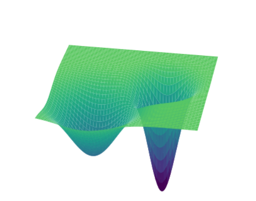
一个尖锐一个平坦
from matplotlib.colors import PowerNorm
import numpy as np
import matplotlib.pyplot as plt
from mpl_toolkits.mplot3d import Axes3D

# 生成数据
x = np.linspace(-5, 5, 100)
y = np.linspace(-5, 5, 100)
X, Y = np.meshgrid(x, y)

# 定义具有一个平坦和一个尖锐极值点的函数
Z_flat = 0.5 * np.exp(-0.2 * ((X - 2)**2 + (Y - 2)**2))  # 平坦的极值点
Z_sharp = np.exp(-0.6* ((X + 2)**2 + (Y + 1)**2))         # 尖锐的极值点
Z = -(Z_flat + Z_sharp) # 方向取反

# 创建图形和3D坐标轴
fig = plt.figure()
ax = fig.add_subplot(111, projection='3d')

# 绘制曲面
surf = ax.plot_surface(X, Y, Z, cmap="viridis", vmin=-0.9, vmax=0.3,shade=True, lightsource=0.5)#viridis
#surf = ax.plot_surface(X, Y, Z, cmap="inferno", norm=PowerNorm(gamma=0.7))
# 隐藏坐标轴和数值标签
ax.set_xticks([])  # 隐藏 x 轴刻度
ax.set_yticks([])  # 隐藏 y 轴刻度
ax.set_zticks([])  # 隐藏 z 轴刻度
ax.set_xlabel('')  # 隐藏 x 轴标签
ax.set_ylabel('')  # 隐藏 y 轴标签
ax.set_zlabel('')  # 隐藏 z 轴标签
ax.set_axis_off()  # 隐藏整个坐标轴

ax.view_init(elev=30, azim=100)  # 调整视角

# 去掉空白区域
fig.tight_layout()
plt.savefig('ad.png', dpi=300, bbox_inches='tight', pad_inches=0.1)
# 显示图形
plt.show()
输出:
PPT画曲线图
- https://www.bilibili.com/video/BV1wN411Q7fg/?spm_id_from=333.337.search-card.all.click&vd_source=ec464e30d7d9062c46ebfd3907771703
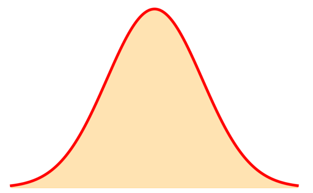
画一个简单的正态分布图
import numpy as np
import matplotlib.pyplot as plt
from scipy.stats import norm

# 定义正态分布的参数
mu = 0  # 均值
sigma = 1  # 标准差

# 生成 x 值(从 -4 到 4,间隔为 0.01)
x = np.arange(-3, 3, 0.01)

# 计算正态分布的概率密度函数 (PDF)
y = norm.pdf(x, mu, sigma)

# 绘制曲线图
plt.figure(figsize=(8, 5))
plt.plot(x, y, label=f"μ={mu}, σ={sigma}", color='red', linewidth=5)

# 填充曲线下的区域
plt.fill_between(x, y, color='orange', alpha=0.3)  # alpha 控制透明度

# 隐藏坐标轴
plt.axis('off')

# 调整图形边距,使图形居中
plt.subplots_adjust(left=0, right=1, top=1, bottom=0)
#plt.savefig('aaad.png', dpi=300, bbox_inches='tight', pad_inches=0.1)
plt.savefig('aaad.png', dpi=300, bbox_inches='tight', pad_inches=0.1, transparent=True)#transparent=True 保存图像背景透明
# 显示图形
plt.show()
输出:
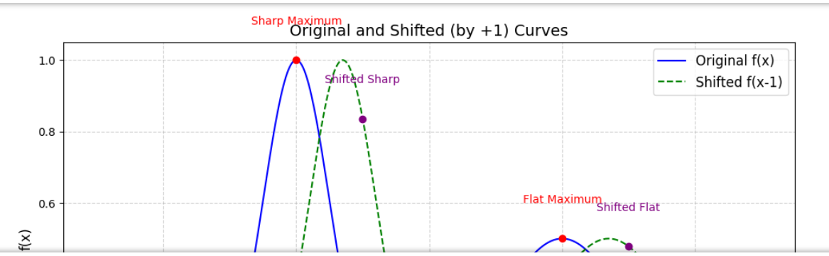
画2维尖锐 平坦
import numpy as np
import matplotlib.pyplot as plt

# 定义原始函数
def f(x):
    return np.exp(-(x + 2)**2 / 0.5) + 0.5 * np.exp(-(x - 2)**2 / 2)

# 定义平移后的函数(向右平移1个单位)
def f_shifted(x):
    return f(x - 0.7)  # 向右平移1个单位

# 生成数据点
x_values = np.linspace(-5, 5, 500)
y_values = f(x_values)
y_shifted = f_shifted(x_values)

# 创建图形
plt.figure(figsize=(10, 6))

# 绘制原始曲线
plt.plot(x_values, y_values, label='Original f(x)', color='blue')

# 绘制平移后的曲线
plt.plot(x_values, y_shifted, label='Shifted f(x-1)', color='green', linestyle='--')

# 标记原始极大值
max1_x = -2
max1_y = f(max1_x)
max2_x = 2
max2_y = f(max2_x)
plt.scatter([max1_x, max2_x], [max1_y, max2_y], color='red', zorder=5)
plt.text(max1_x, max1_y + 0.1, 'Sharp Maximum', color='red', ha='center')
plt.text(max2_x, max2_y + 0.1, 'Flat Maximum', color='red', ha='center')

# 标记平移后的极大值
shifted_max1_x = max1_x + 1
shifted_max1_y = f_shifted(shifted_max1_x)
shifted_max2_x = max2_x + 1
shifted_max2_y = f_shifted(shifted_max2_x)
plt.scatter([shifted_max1_x, shifted_max2_x], [shifted_max1_y, shifted_max2_y], color='purple', zorder=5)
plt.text(shifted_max1_x, shifted_max1_y + 0.1, 'Shifted Sharp', color='purple', ha='center')
plt.text(shifted_max2_x, shifted_max2_y + 0.1, 'Shifted Flat', color='purple', ha='center')

# 设置标题和标签
plt.title('Original and Shifted (by +1) Curves', fontsize=14)
plt.xlabel('x', fontsize=12)
plt.ylabel('f(x)', fontsize=12)

# 添加图例
plt.legend(fontsize=12)

# 显示网格
plt.grid(True, linestyle='--', alpha=0.6)

# 显示图形
plt.tight_layout()
plt.show()
输出:
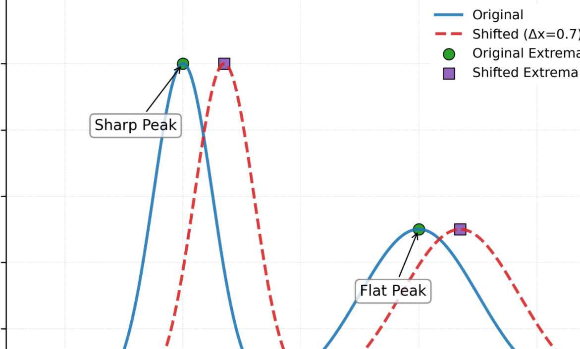
美化
import numpy as np
import matplotlib.pyplot as plt
from matplotlib import rcParams

# 设置学术风格绘图参数
rcParams['font.family'] = 'Times New Roman'  # 使用学术论文常用字体
rcParams['mathtext.fontset'] = 'stix'  # 数学符号风格
plt.style.use('default')  # 使用默认样式作为基础
rcParams.update({
    'figure.autolayout': True,  # 自动调整布局
    'axes.titlesize': 12,       # 标题大小
    'axes.labelsize': 10,       # 坐标轴标签大小
    'xtick.labelsize': 9,       # x轴刻度标签大小
    'ytick.labelsize': 9,       # y轴刻度标签大小
    'legend.fontsize': 9,       # 图例字体大小
    'axes.linewidth': 0.8,      # 坐标轴线宽
    'grid.linewidth': 0.4,      # 网格线宽
})

# 定义原始函数
def f(x):
    return np.exp(-(x + 2)**2 / 0.5) + 0.5 * np.exp(-(x - 2)**2 / 2)

# 定义平移后的函数(向右平移0.7个单位)
def f_shifted(x):
    return f(x - 0.7)

# 生成数据点
x_values = np.linspace(-5, 5, 500)
y_values = f(x_values)
y_shifted = f_shifted(x_values)

# 创建图形和坐标轴
fig, ax = plt.subplots(figsize=(6.4, 4.8), dpi=300)  # 标准学术图表尺寸
fig.patch.set_facecolor('white')

# 绘制曲线(使用ColorBrewer配色)
line_orig, = ax.plot(x_values, y_values, label='Original',
                    color='#1f77b4', linewidth=2.0, alpha=0.9)
line_shifted, = ax.plot(x_values, y_shifted, label='Shifted (Δx=0.7)',
                       color='#d62728', linewidth=2.0, linestyle='--', alpha=0.9)

# 标记极值点
max1_x, max2_x = -2, 2
shifted_max1_x, shifted_max2_x = max1_x + 0.7, max2_x + 0.7

ax.scatter([max1_x, max2_x], [f(max1_x), f(max2_x)],
          color='#2ca02c', s=60, marker='o', edgecolor='black', linewidth=0.6,
          label='Original Extrema')
ax.scatter([shifted_max1_x, shifted_max2_x],
          [f_shifted(shifted_max1_x), f_shifted(shifted_max2_x)],
          color='#9467bd', s=60, marker='s', edgecolor='black', linewidth=0.6,
          label='Shifted Extrema')

# 添加极值点标注
ax.annotate('Sharp Peak', xy=(max1_x, f(max1_x)), xytext=(-3.5, 0.8),
           arrowprops=dict(arrowstyle="->", linewidth=0.8, color='black'),
           bbox=dict(boxstyle="round", fc="white", ec="gray", alpha=0.8))
ax.annotate('Flat Peak', xy=(max2_x, f(max2_x)), xytext=(1, 0.3),
           arrowprops=dict(arrowstyle="->", linewidth=0.8, color='black'),
           bbox=dict(boxstyle="round", fc="white", ec="gray", alpha=0.8))

# 坐标轴和标题设置
ax.set_xlabel('Position (x)', fontsize=10, labelpad=6)
ax.set_ylabel('Signal Intensity', fontsize=10, labelpad=6)
ax.set_title('Comparison of Original and Shifted Spectral Peaks',
            fontsize=12, pad=12)

# 图例设置
ax.legend(loc='upper right', frameon=True, framealpha=0.9,
         facecolor='white', edgecolor='none')

# 网格和刻度设置
ax.grid(True, linestyle=':', color='gray', alpha=0.4)
ax.tick_params(axis='both', which='major', labelsize=9)
ax.set_xlim(-5, 5)
ax.set_ylim(0, 1.2)

# 保存高分辨率图片
plt.savefig('spectral_peaks_comparison.png', dpi=600, bbox_inches='tight')
plt.show()
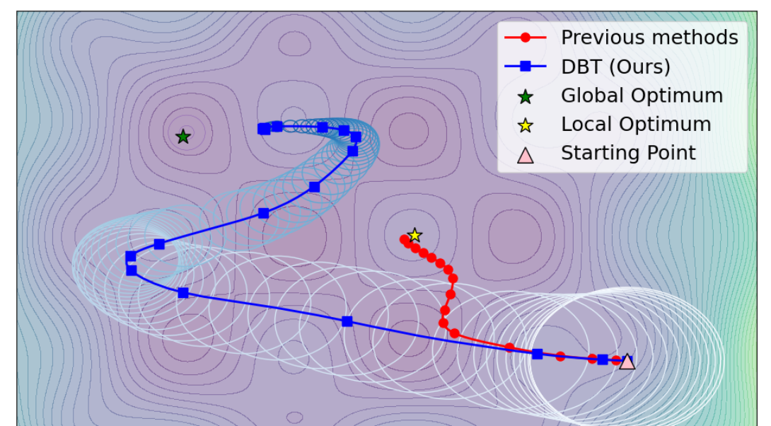
动态边界
import numpy as np
import matplotlib.pyplot as plt
from matplotlib import cm
from matplotlib.patches import Ellipse

# ======================
# 生成对抗攻击目标函数
# ======================
def adversarial_loss(x, y):
    """模拟对抗攻击的非凸损失函数"""
    return (2*(x-0.3)**4 + 1.5*(y-0.5)**4 - 5*np.cos(5*x)*np.sin(4*y) + 0.5*(x**2 + y**2))

x = np.linspace(-1.5, 2.5, 200)
y = np.linspace(-1.5, 2, 200)
X, Y = np.meshgrid(x, y)
Z = adversarial_loss(X, Y)

# ======================

def fixed_step_attack(start, base_lr=0.1, steps=80):
    """具有动态边界的自适应步长攻击(能够跳出局部最优)"""
    path = [start.copy()]
    momentum = np.zeros(2)
    grad_history = []

    for t in range(steps):
        dx = 8*(path[-1][0]-0.3)**3 - 15*np.sin(5*path[-1][0])*np.sin(4*path[-1][1]) + path[-1][0]
        dy = 6*(path[-1][1]-0.5)**3 + 12*np.cos(5*path[-1][0])*np.cos(4*path[-1][1]) + path[-1][1]
        grad = np.array([dx, dy])

        # 自适应逻辑:动量加速 + 梯度幅值归一化 + 动态边界缩放
        momentum = 0.9*momentum + 0.05*grad                      #这一步很重要
        gradient_magnitude = np.linalg.norm(grad)
        adaptive_lr = base_lr / (gradient_magnitude + 1e-8)

        # 动态边界缩放
        dynamic_boundary = max(0.05, 1.0 - t / steps)  # 动态边界逐渐缩小
        scaled_lr = adaptive_lr * dynamic_boundary

        grad_history.append(gradient_magnitude)
        path.append(path[-1] - scaled_lr * momentum)
    return np.array(path)

def adaptive_step_attack(start, base_lr=0.1, steps=86):
    """具有动态边界的自适应步长攻击"""
    path = [start.copy()]
    momentum = np.zeros(2)
    grad_history = []

    for t in range(steps):
        dx = 8*(path[-1][0]-0.3)**3 - 15*np.sin(5*path[-1][0])*np.sin(4*path[-1][1]) + path[-1][0]
        dy = 6*(path[-1][1]-0.5)**3 + 12*np.cos(5*path[-1][0])*np.cos(4*path[-1][1]) + path[-1][1]
        grad = np.array([dx, dy])

        # 自适应逻辑:动量加速 + 梯度幅值归一化 + 动态边界缩放
        momentum = 0.954*momentum + 0.1*grad
        gradient_magnitude = np.linalg.norm(grad)
        adaptive_lr = base_lr / (gradient_magnitude + 1e-8)

        # 动态边界缩放
        dynamic_boundary = max(0.05, 1.0 - t / steps)  # 动态边界逐渐缩小
        scaled_lr = adaptive_lr * dynamic_boundary

        grad_history.append(gradient_magnitude)
        path.append(path[-1] - scaled_lr * momentum)
    return np.array(path)

# ======================
# 生成优化路径
# ======================
np.random.seed(42)
start_point = np.array([1.8, -0.5])
fixed_path = fixed_step_attack(start_point)
adaptive_path = adaptive_step_attack(start_point)

# ======================
# 可视化设计
# ======================
plt.figure(figsize=(12, 8))
ax = plt.subplot(111)

# 绘制损失函数地形
levels = np.linspace(Z.min(), Z.max(), 45)
contour = ax.contourf(X, Y, Z, levels=levels, cmap=cm.viridis, alpha=0.4)  # 使用 viridis


# 绘制优化路径
ax.plot(fixed_path[:,0], fixed_path[:,1], 'r-o', lw=2, markersize=8,
        markevery=5, label='Previous methods', zorder=4)

ax.plot(adaptive_path[:,0], adaptive_path[:,1], 'b-s', lw=2, markersize=8,
        markevery=5, label='DBT (Ours)', zorder=5)

# 动态边界可视化
for i in range(len(adaptive_path)):
    t = i
    dynamic_boundary = max(0.05, 1.0 - t / 80)
    color = plt.cm.Blues(t / len(adaptive_path))
    # 初始阶段稍微大,后期趋于常数
    boundary_size = dynamic_boundary * (1 + 1.1 * (1 - t / len(adaptive_path)))  # 初始稍微大,后期缩小
    ax.add_patch(plt.Circle(adaptive_path[i], boundary_size * 0.25, edgecolor=color, fill=False, lw=1))

# 标注全局最优点
global_optimum = np.array([-0.6, 1.1])  # 全局最优点
ax.scatter(global_optimum[0], global_optimum[1], c='green', s=200, marker='*',
           edgecolor='black', label='Global Optimum', zorder=6)

# 标注局部最优点
local_optimum = np.array([0.65, 0.4])  # 局部最优点
ax.scatter(local_optimum[0], local_optimum[1], c='yellow', s=200, marker='*',
           edgecolor='black', label='Local Optimum', zorder=6)

# 标注起始点
start = np.array([1.8, -0.5])  # 起始点
ax.scatter(start[0], start[1], c='pink', s=200, marker='^',
           edgecolor='black', label='Starting Point', zorder=6)


ax.add_patch(Ellipse((-0.58, 1.13), width=0.2, height=0.25,
                     edgecolor=(0.5, 0.3, 0.7),  # 灰紫色 (RGB 值)
                     facecolor='none',
                     linestyle='-',
                     linewidth=0.3,
                     ))

ax.add_patch(Ellipse((-0.58, 1.13), width=0.08, height=0.1,
                     edgecolor=(0.5, 0.3, 0.7),  # 灰紫色 (RGB 值)
                     facecolor='none',
                     linestyle='-',
                     linewidth=0.3,
                     ))


# 全局设置
ax.set_xticks([])  # 移除x轴刻度
ax.set_yticks([])  # 移除y轴刻度
ax.legend(loc='upper right', fontsize=18)  #upper  center
plt.savefig('adversarial_optimization_with_dynamic_boundary.png', dpi=300, bbox_inches='tight', pad_inches=0.1)
plt.show()


 3356
3356

 被折叠的 条评论
为什么被折叠?
被折叠的 条评论
为什么被折叠?
 到【灌水乐园】发言


