


 本文介绍了可靠性图的概念及其在评估气候预报系统时如何使用。通过将观测频率与预报概率进行比较,可靠性图直观地展示了预报系统的性能。文章还讨论了与气候预报相关的概率集群现象,并强调了频率分布的重要性,以理解预报结果的分布情况。
Reliability diagrams (Hartmann et al. 2002) are simply graphs of the Observed frequency of an event plotted against the Forecast probability of an event. This effectively tells the user how often (as a percentage) a forecast probability actually occurred.
In theory, a perfect forecast system will result in forecasts with a probability of X% being consistent with the eventual outcome X% of the time. Hence when plotting a reliability diagram comparisons are made against the diagonal (see below figure).
With climate forecasting, it is also often the case that probabilities will be clustered together, generally near the 0.5 probability, as chaos dictates that situations are rarely perfectly predictable/historically identical, for similar initial conditions. Hence it is important to also plot some form of frequency distribution to indicate how the forecasts are spread over time. Are they all clustered together, or are they well spread? The below figure shows a probability function plotted for each curve, in order to demonstrate that the majority of forecasts were indeed clustered in the central probability bins.
The technique for constructing the reliability diagram is similar to that for calculating the ROC score, only instead of plotting the hit rate against the false alarm rate, the hit rate is calculated only from the sets of forecasts for each probability separately. It is then plotted against the corresponding forecast probabilities.
The hit rate for each probability bin is defined as:
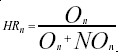
where O = number of Observed instances,
NO = number of non-observed instances
Frequency histograms are constructed from the same contingency tables as those used to produce the reliability diagrams. Frequency histograms show the frequency of forecasts as a function of the probability bin. The frequency of forecasts (Fn) for probability bin n is defined as:
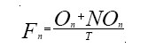
where T is the total number of forecasts.
An example of a reliability diagram for Level 1 of the SVSLRF is given below:

Reliability diagrams and frequency histograms are mandatory for level 1.
References:
Hartmann, H.C., Pagano, T.C., Sorooshiam, S. and Bales, R. 2002. Confidence builder: evaluating seasonal climate forecasts from user perspectives. Bull Amer. Met. Soc., 84, 683-698


 1078
1078

 被折叠的 条评论
为什么被折叠?
被折叠的 条评论
为什么被折叠?
 到【灌水乐园】发言


