


 博客通过实例介绍如何用Matplotlib进行绘图实践。包含画散点图,数据前两列是成绩,第三列是01分类;还涉及画出特定函数曲线,帮助读者掌握Matplotlib绘图。
决定通过一个个例子来实践并掌握Matplotlib。。
例子1.
画一个散点图,数据分布如下:
import numpy as np
import pandas as pd
import matplotlib.pyplot as plt
%matplotlib inline #注意,这个代码意思是在ipython的编译器里,内嵌绘图,这样就不用plt.show()了

import os
path = 'data' + os.sep + 'LogiReg_data.txt'
pdData = pd.read_csv(path, header=None, names=['Exam 1', 'Exam 2', 'Admitted'])
pdData.head()
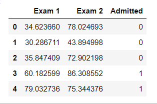
前两列是成绩,第三列是分类,只有01两类
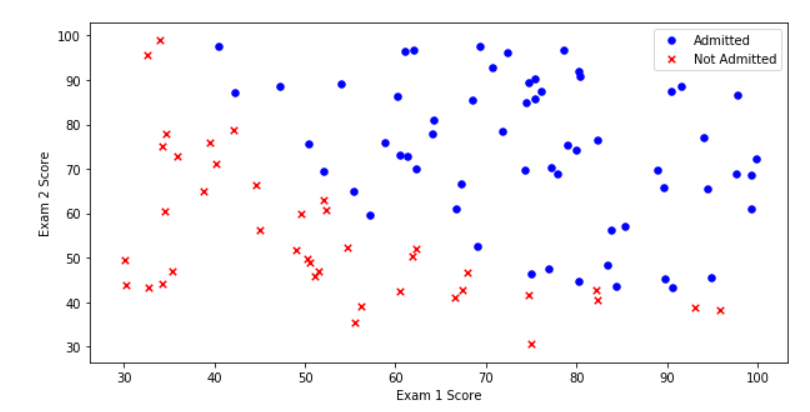
然后开始画图:
positive = pdData[pdData['Admitted'] == 1] # returns the subset of rows such Admitted = 1, i.e. the set of *positive* examples
negative = pdData[pdData['Admitted'] == 0] # returns the subset of rows such Admitted = 0, i.e. the set of *negative* examples

fig, ax = plt.subplots(figsize=(10,5))
ax.scatter(positive['Exam 1'], positive['Exam 2'], s=30, c='b', marker='o', label='Admitted')
ax.scatter(negative['Exam 1'], negative['Exam 2'], s=30, c='r', marker='x', label='Not Admitted')
ax.legend()
ax.set_xlabel('Exam 1 Score')
ax.set_ylabel('Exam 2 Score')
例子2.
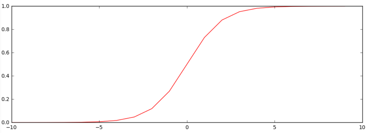
画出函数曲线
函数是下面这个:
def sigmoid(z):
    return 1 / (1 + np.exp(-z)) #注意e的指数次形式的写法
画图:
nums = np.arange(-10, 10, step=1) #creates a vector containing 20 equally spaced values from -10 to 10
fig, ax = plt.subplots(figsize=(12,4))
ax.plot(nums, sigmoid(nums), 'r')


 1895
1895

 被折叠的 条评论
为什么被折叠?
被折叠的 条评论
为什么被折叠?
 到【灌水乐园】发言


