


 文章详细介绍了移动端网页设计中的Flex布局,包括主轴对齐方式(justify-content),侧轴对齐方式(align-items和align-self),伸缩比(flex),改变元素排列方向(flex-direction)以及弹性盒子换行(flex-wrap)。通过示例代码展示了这些属性如何工作,帮助开发者更好地理解和应用Flex布局实现灵活的响应式设计。
目录
一、移动端特点
- PC屏幕大,网页固定版心
- 手机屏幕小, 网页宽度多数为100%

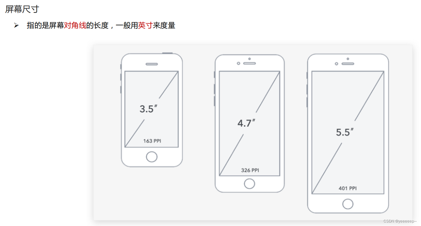
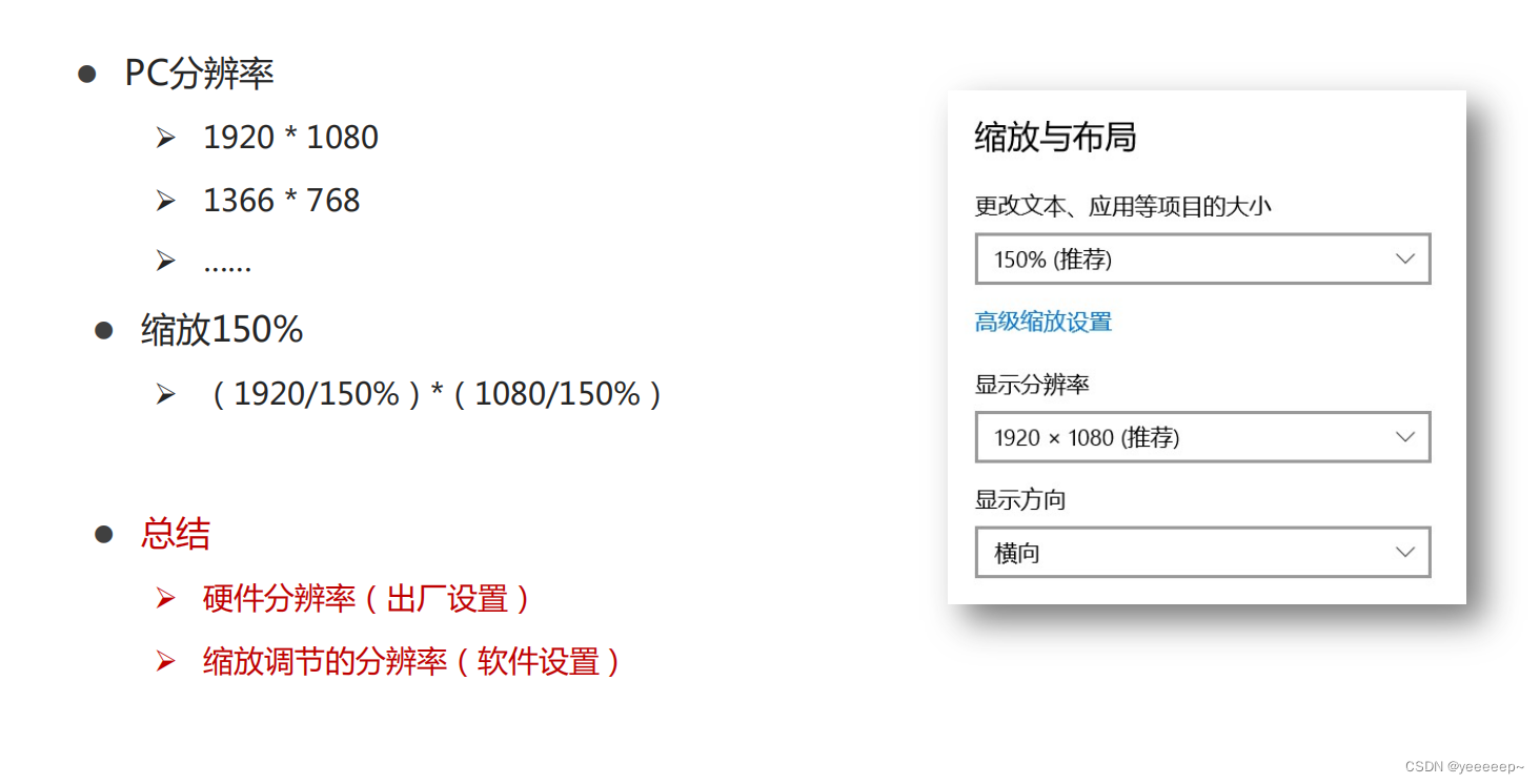
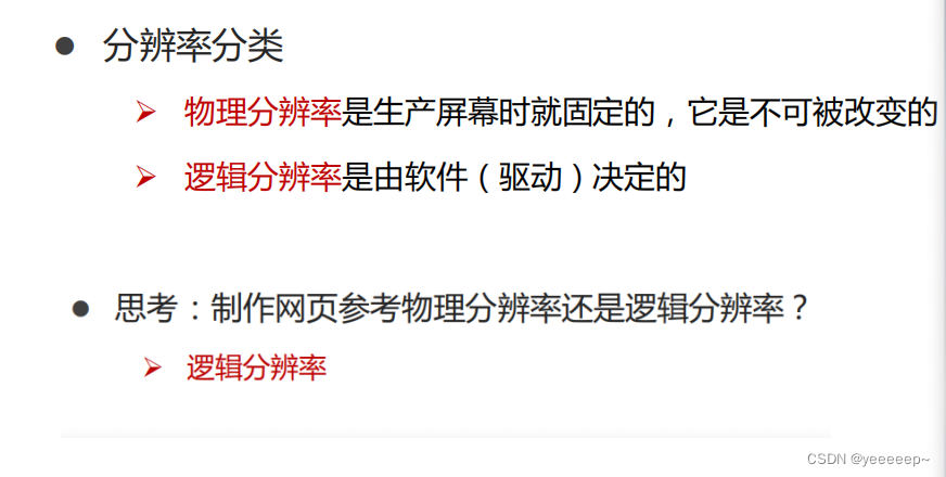
分辨率
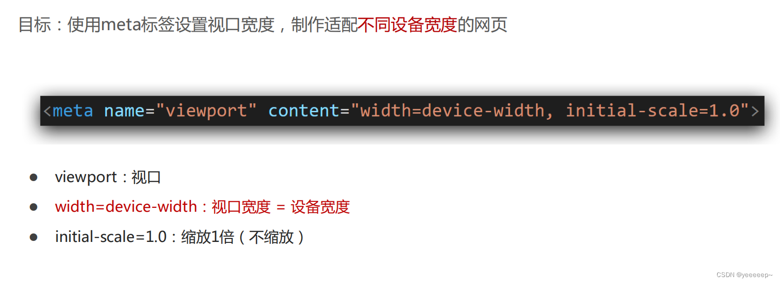
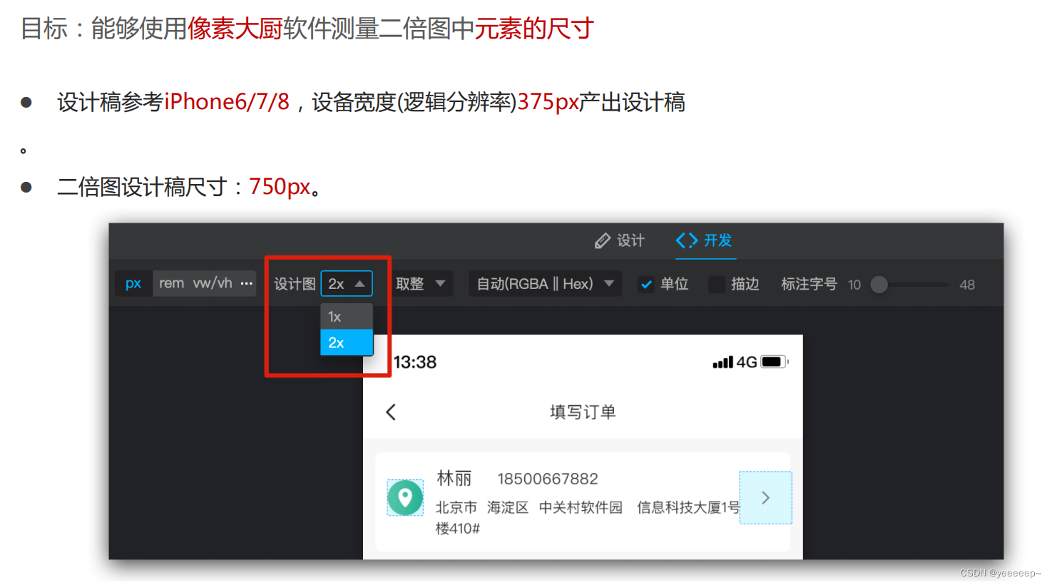
视口
二倍图
二、flex布局(display-flex)
- 是一种浏览器提倡的布局模型
- 布局网页更简单、灵活
- 避免浮动脱标的问题

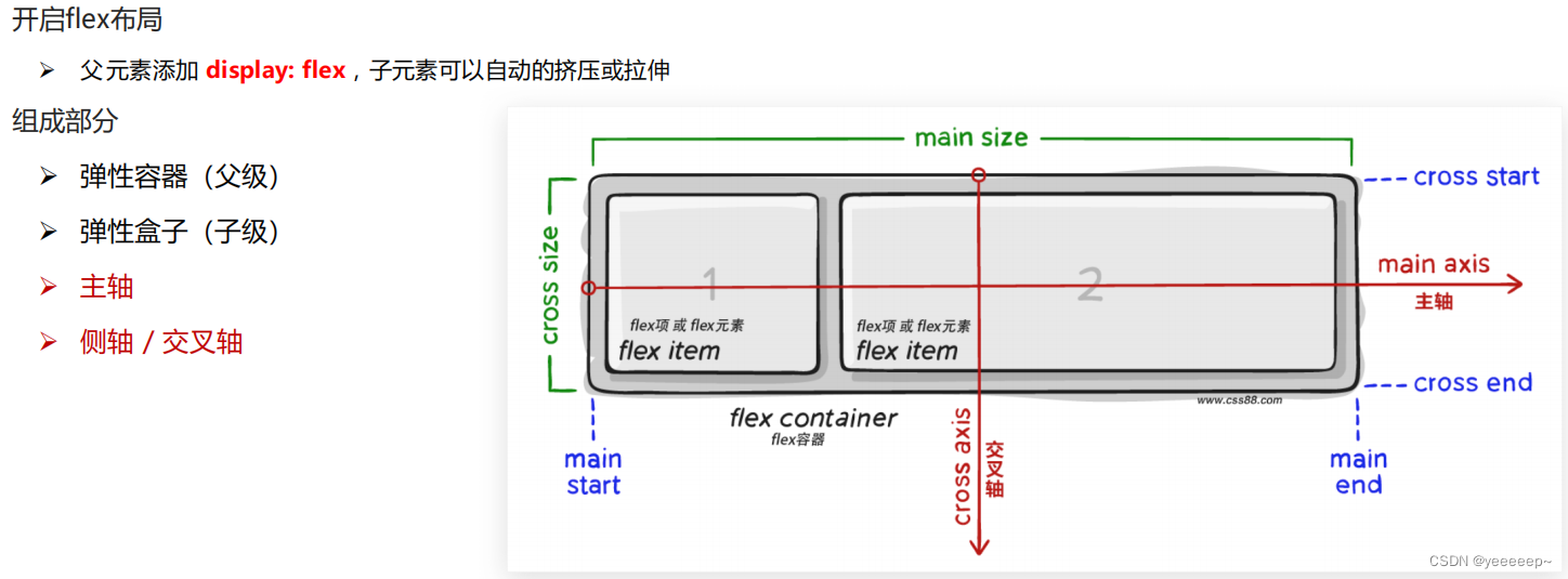
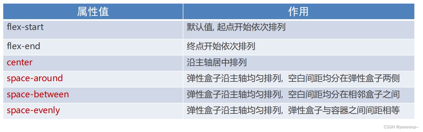
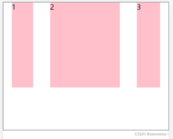
1、主轴对齐方式(justify-content)
<!DOCTYPE html>
<html lang="en">
<head>
<meta charset="UTF-8">
<meta http-equiv="X-UA-Compatible" content="IE=edge">
<meta name="viewport" content="width=device-width, initial-scale=1.0">
<title>主轴对齐方式</title>
<style>
* {
margin: 0;
padding: 0;
}
.box {
display: flex;
/* 居中 */
justify-content: center;
/* 间距在弹性盒子(子级)之间 */
justify-content: space-between;
/* 所有地方的间距都相等 */
justify-content: space-evenly;
/* 间距加在子级的两侧 */
/* 视觉效果: 子级之间的距离是父级两头距离的2倍 */
height: 200px;
margin: auto;
border: 1px solid #000;
}
.box div {
width: 100px;
height: 100px;
background-color: pink;
}
</style>
</head>
<body>
<div class="box">
<div>1</div>
<div>2</div>
<div>3</div>
</div>
</body>
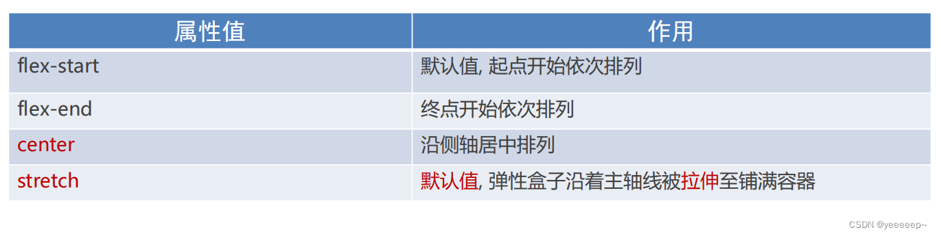
</html>2、侧轴对齐方式(align-items/self)
- align-items(添加到弹性容器)
- align-self:控制某个弹性盒子在侧轴的对齐方式(添加到弹性盒子)
<!DOCTYPE html>
<html lang="en">

<head>
    <meta charset="UTF-8">
    <meta http-equiv="X-UA-Compatible" content="IE=edge">
    <meta name="viewport" content="width=device-width, initial-scale=1.0">
    <title>侧轴对齐方式</title>
    <style>
        * {
            margin: 0;
            padding: 0;
        }

        .box {
            display: flex;

            /* 居中 */
            /* align-items: center; */

            /* 拉伸,默认值(现有状态,测试的时候去掉子级的高度,子级有高度不会拉伸) */
            align-items: stretch;

            height: 300px;
            margin: auto;
            border: 1px solid #000;
        }

        .box div {
            width: 100px;
            height: 100px;
            background-color: pink;
        }

        /* 单独设置某个弹性盒子的侧轴对齐方式 */
        .box div:nth-child(2){
            align-self: center;
        }


    </style>
</head>

<body>
    <div class="box">
        <div>1111</div>
        <div>2</div>
        <div>3</div>
    </div>
</body>

</html>
3、伸缩比(flex: )
<!DOCTYPE html>
<html lang="en">
<head>
    <meta charset="UTF-8">
    <meta http-equiv="X-UA-Compatible" content="IE=edge">
    <meta name="viewport" content="width=device-width, initial-scale=1.0">
    <title>Document</title>
    <style>
        * {
            margin: 0;
            padding: 0;
        }

        .box {
            display: flex;

            height: 300px;
            border: 1px solid #000;
        }

        .box div {
            height: 200px;
            margin: 0 20px;
            background-color: pink;
        }

        .box div:nth-child(1) {
            width: 50px;
        }

        .box div:nth-child(2) {
            /* 占用父级剩余尺寸的份数 */
            flex: 3;
        }

        .box div:nth-child(3) {
            flex: 1;
        }

    </style>
</head>
<body>
    <div class="box">
        <div>1</div>
        <div>2</div>
        <div>3</div>
    </div>
</body>
</html>
4. 改变元素排列方向(flex-direction: )
<!DOCTYPE html>
<html lang="en">

<head>
    <meta charset="UTF-8">
    <meta http-equiv="X-UA-Compatible" content="IE=edge">
    <meta name="viewport" content="width=device-width, initial-scale=1.0">
    <title>主轴方向</title>
    <style>
        * {
            margin: 0;
            padding: 0;
        }

        li {
            list-style: none;
        }

        .box li {
            display: flex;
            /* 1. 先确定主轴方向!!!!; 2. 再选择对应的属性实现主轴或侧轴的对齐方式 */
            /* 修改主轴方向: 列 */
            flex-direction: column;

            /* 视觉效果: 实现盒子水平居中 */
            align-items: center;

            /* 视觉效果: 垂直居中 */
            justify-content: center;


            width: 80px;
            height: 80px;
            border: 1px solid #ccc;
        }

        .box img {
            width: 32px;
            height: 32px;
        }
    </style>
</head>

<body>
    <div class="box">
        <ul>
            <li>
                <img src="./images/media.png" alt="">
                <span>媒体</span>
            </li>
        </ul>
    </div>
</body>

</html>
5.弹性盒子换行(flex-wrap)
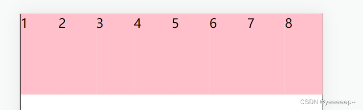
调整行对齐方式 :align-content (取值与justify-content基本相同)
<!DOCTYPE html>
<html lang="en">

<head>
    <meta charset="UTF-8">
    <meta http-equiv="X-UA-Compatible" content="IE=edge">
    <meta name="viewport" content="width=device-width, initial-scale=1.0">
    <title>弹性盒子换行</title>
    <style>
        * {
            margin: 0;
            padding: 0;
        }

        .box {
            display: flex;

            /* 默认值, 不换行 */
            /* flex-wrap: nowrap; */

            /* 弹性盒子换行 */
            flex-wrap: wrap;

            /* 调节行对齐方式 */
            align-content: center;
            align-content: space-around;


            height: 500px;
            border: 1px solid #000;
        }

        .box div {
            width: 100px;
            height: 100px;
            background-color: pink;
        }
    </style>
</head>

<body>
    <div class="box">
        <div>1</div>
        <div>2</div>
        <div>3</div>
        <div>4</div>
        <div>5</div>
        <div>6</div>
        <div>7</div>
        <div>8</div>
    </div>
</body>

</html>


 扫一扫
扫一扫


 1153
1153

 被折叠的 条评论
为什么被折叠?
被折叠的 条评论
为什么被折叠?
 到【灌水乐园】发言


