


 本文详细介绍了CSS中的Flex布局,包括容器属性如flex-direction、flex-wrap、justify-content、align-items等,以及元素属性如order、flex-grow、flex-shrink、flex-basis。Flex布局为前端开发提供了强大的页面布局能力,使得复杂布局的实现变得更加简单和灵活。
背景
布局的传统解决方案,基于盒模型,依赖 display 属性 + position属性 + float属性。它对于那些特殊布局非常不方便,比如,垂直居中就不容易实现。
2009年,W3C 提出了一种新的方案----Flex 布局,可以简便、完整、响应式地实现各种页面布局。目前,它已经得到了所有浏览器的支持,这意味着,现在就能很安全地使用这项功能。
Flex 是 Flexible Box 的缩写,意为"弹性布局",也称为伸缩盒子。用来为盒状模型提供最大的灵活性。
flex布局是前端html,css中一个很重要的一个知识点,学好了flex布局,对你页面的布置有着很大的帮助,可以让你在页面布局方面如鱼得水。
flex:容器属性和元素属性
容器属性
- flex-direction
- flex-wrap
- flex-flow
- justify-content
- align-items
- align-content
元素属性
- order
- flex-grow
- flex-shrink
- flex-basis
- flex
- align-self
flex弹性盒模型
- 只要元素使用过了flex布局,那么我们就称为flex容器。而他所有的子元素也会自动成为容器成员,也就是flex项目。
- 任何一个容器都可以指定为 Flex 布局。
- 对于某个元素只要声明了
display: flex;,那么这个元素就成为了弹性容器,具有flex弹性布局的特性。 - 每个弹性容器都有两根轴:主轴和交叉轴,两轴之间成90度关系。注意:水平的不一定就是主轴。
- 每根轴都有起点和终点,这对于元素的对齐非常重要。
- 弹性容器中的所有子元素称为<弹性元素>,弹性元素永远沿主轴排列。
- 弹性元素也可以通过
display:flex设置为另一个弹性容器,形成嵌套关系。因此一个元素既可以是弹性容器也可以是弹性元素。 - 弹性容器的两根轴非常重要,所有属性都是作用于轴的。
主轴
flex布局是一种一维布局模型,一次只能处理一个维度(一行或者一列)上的元素布局。
也就是说,flex布局大部分的属性都是作用于主轴的,在交叉轴上很多时候只能被动地变化。
我们可以在弹性容器上通过flex-direction修改主轴的方向。如果主轴方向修改了,那么:
- 交叉轴就会相应地旋转90度。
- 弹性元素的排列方式也会发生改变,因为弹性元素永远沿主轴排列。
容器属性
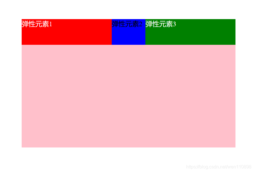
1. ## flex-direction属性
取值:row(默认) | row-reverse | column | column-reverse
用于控制项目排列方向与顺序,默认row,即横向排列,项目排列顺序为正序1-2-3;row-reverse同为横向排列,但项目顺序为倒序3-2-1。
column 与row相反,为纵向排列,项目顺序为正序1-2-3,column-reverse同为纵向排列,项目顺序为倒序3-2-1。
<!DOCTYPE html>
<html lang="en">

<head>
  <meta charset="UTF-8">
  <meta http-equiv="X-UA-Compatible" content="IE=edge">
  <meta name="viewport" content="width=device-width, initial-scale=1.0">
  <title>Document</title>
  <style>
    * {
      margin: 0;
      padding: 0;
    }

    /* 父容器设置样式 */
    .container {
      width: 400px;
      height: 400px;
      background-color: pink;
      margin: 100px auto;
      /* 伸缩盒布局 display我们是在父容器中进行声明的 */
      display: flex;
      /* 主轴方向设置 */
      /* 水平方向 从左至右 */
      /* flex-direction: row; */
      /* 垂直方向 */
      /* flex-direction: column; */
      /* 反方向 */
      /* 从右至左 */
      /* flex-direction: row-reverse; */
      /* 从下至上 */
      flex-direction: column-reverse;
    }

    div {
      width: 60px;
      height: 60px;
      color: white;
    }
  </style>
</head>

<body>
  <!-- 父容器 -->
  <div class="container">
    <div class="div1" style="background-color: red;">弹性元素1</div>
    <div class="div2" style="background-color: blue;">弹性元素2</div>
    <div class="div3" style="background-color: cyan;">弹性元素3</div>
  </div>
</body>

</html>

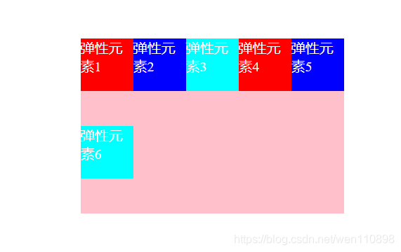
flex-wrap属性
-
弹性元素 永远沿主轴排列,但是当主轴排列不下去了怎么办?这时候我们就该使用flex-wrap属性
-
通过设置flex-wrap属性可使得主轴上的元素不换行、换行、反向换行。
取值:nowrap(默认) | wrap | wrap-reverse
用于控制项目是否换行,nowrap表示不换行;
举个例子:比如容器宽度为300px,容器中有6个宽度为60px的元素,nowrap情况下,项目会强行等分容器宽度从而不换行,那么项目实际宽度也就只有50px了,而非我们自己设置的60px。
<!DOCTYPE html>
<html lang="en">

<head>
    <meta charset="UTF-8">
    <meta http-equiv="X-UA-Compatible" content="IE=edge">
    <meta name="viewport" content="width=device-width, initial-scale=1.0">
    <title>Document</title>
    <style>
        * {
            margin: 0;
            padding: 0;
        }

        /* 父容器设置样式 */
        .container {
            width: 300px;
            height: 200px;
            background-color: pink;
            /* 上下100,左右自适应 */
            margin: 100px auto;
            /* 伸缩盒布局  display: flex;是在父元素设置的*/
            display: flex;
            /* 默认flex-direction:row */
            /* 控制主轴方向上是否换行 默认 nowrap*/
            /* flex-wrap: nowrap; */

            flex-wrap: wrap;
            /* 设置为换行之后,宽度改变,300/6=50px */
        }

        div {
            width: 60px;
            height: 60px;
            color: white;
        }
    </style>
</head>

<body>
    <!-- 父容器 -->
    <div class="container">
        <div class="div1" style="background-color: red;">弹性元素1</div>
        <div class="div2" style="background-color: blue;">弹性元素2</div>
        <div class="div3" style="background-color: cyan;">弹性元素3</div>
        <div class="div4" style="background-color: red;">弹性元素4</div>
        <div class="div5" style="background-color: blue;">弹性元素5</div>
        <div class="div6" style="background-color: cyan;">弹性元素6</div>

    </div>
</body>

</html>
flex-flow属性
flex-flow属性是flex-deriction与flex-wrap属性的简写集合,默认属性为row nowrap,即横向排列,且不换行,如果需要控制项目排列与换行,推荐使用此属性,而非单独写两个。
           /* flex-direction和flex-wrap的简写 */
            flex-flow: nowrap row;
             /* 表示不换行,横向排列*/
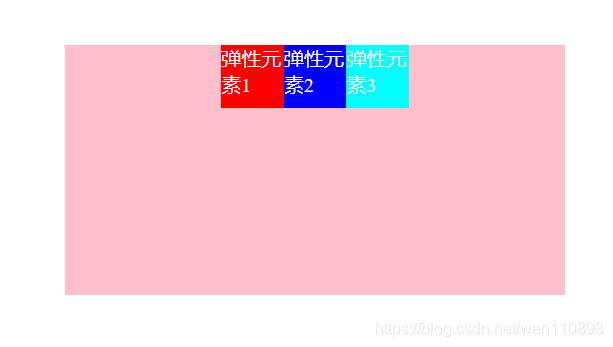
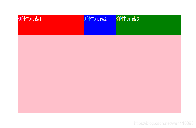
justify-content属性
取值:flex-start(默认) | flex-end | center | space-between | space-around | space-evenly;
用于控制项目在主轴的对齐方式,默认flex-start即左对齐,center 为居中,对应的flex-end为右对齐。
<!DOCTYPE html>
<html lang="en">

<head>
  <meta charset="UTF-8">
  <meta http-equiv="X-UA-Compatible" content="IE=edge">
  <meta name="viewport" content="width=device-width, initial-scale=1.0">
  <title>Document</title>
  <style>
    * {
      margin: 0;
      padding: 0;
    }

    /* 父容器设置样式 */
    .container {
      width: 400px;
      height: 200px;
      background-color: pink;
      margin: 100px auto;
      /* 伸缩盒布局 display我们是在父容器中进行声明的 */
      display: flex;
      /* 水平居中 */
      justify-content: center;
      /* space-around为项目之间间距为左右两侧项目到容器间距的2倍,比较特别的布局,日常使用不太多。 */
      /* justify-content: space-around; */
      /* space-between为左右两端对齐,即左右两侧项目都紧贴容器,且项目之间间距相等。 */
      /* justify-content: space-between; */
      /* space-evenly为项目之间间距与项目与容器间距相等,相当于除去项目宽度,平均分配了剩余宽度作为项目左右margin。 */
      /* justify-content: space-evenly; */
    }
    div {
      width: 50px;
      height: 50px;
      color: white;
    }
  </style>
</head>

<body>
  <!-- 父容器 -->
  <div class="container">
    <div class="div1" style="background-color: red;">弹性元素1</div>
    <div class="div2" style="background-color: blue;">弹性元素2</div>
    <div class="div3" style="background-color: cyan;">弹性元素3</div>
  </div>
</body>

</html>
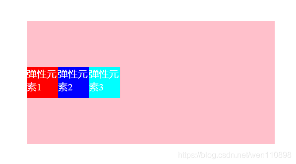
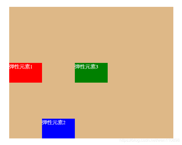
align-items属性
取值:flex-start | flex-end | center | baseline | stretch(默认)
用于控制项目在交叉轴排列方式,默认stretch即如果项目没设置高度,或高度为auto,则占满整个容器。
<!DOCTYPE html>
<html lang="en">

<head>
  <meta charset="UTF-8">
  <meta http-equiv="X-UA-Compatible" content="IE=edge">
  <meta name="viewport" content="width=device-width, initial-scale=1.0">
  <title>Document</title>
  <style>
    * {
      margin: 0;
      padding: 0;
    }

    /* 父容器设置样式 */
    .container {
      width: 400px;
      height: 200px;
      background-color: pink;
      margin: 100px auto;
      /* 伸缩盒布局 display我们是在父容器中进行声明的 */
      display: flex;
      /* 垂直居中 */
      align-items: center;
    }

    div {
      width: 50px;
      height: 50px;
      color: white;
    }
  </style>
</head>

<body>
  <!-- 父容器 -->
  <div class="container">
    <div class="div1" style="background-color: red;">弹性元素1</div>
    <div class="div2" style="background-color: blue;">弹性元素2</div>
    <div class="div3" style="background-color: cyan;">弹性元素3</div>
  </div>
</body>

</html>
align-content
取值:flex-start | flex-end | center | space-between | space-around | space-evenly | stretch(默认);
用于控制多行项目的对齐方式,如果项目只有一行则不会起作用,需设置flex-wrap: wrap;默认stretch,即在项目没设置高度,或高度为auto情况下让项目填满整个容器,与align-items类似。
项目属性
容器属性是放在容器中的,项目属性是放在项目中的。就如容器是父元素,项目是子元素的关系。
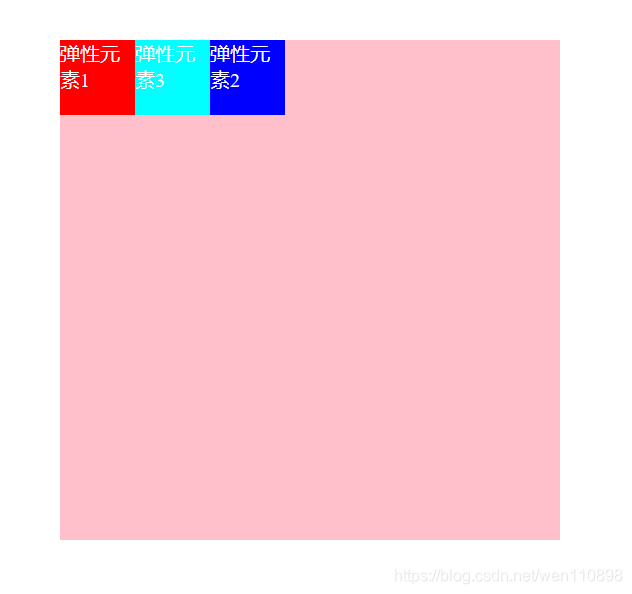
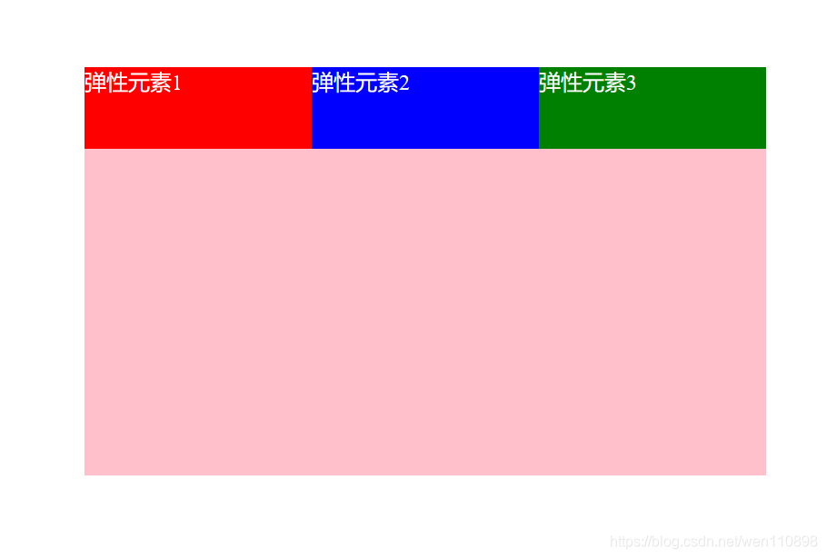
order
取值:默认0,用于决定项目排列顺序,数值越小,项目排列越靠前。
<!DOCTYPE html>
<html lang="en">

<head>
  <meta charset="UTF-8">
  <meta http-equiv="X-UA-Compatible" content="IE=edge">
  <meta name="viewport" content="width=device-width, initial-scale=1.0">
  <title>Document</title>
  <style>
    * {
      margin: 0;
      padding: 0;
    }

    /* 父容器设置样式 */
    .container {
      width: 400px;
      height: 400px;
      background-color: pink;
      margin: 100px auto;
      /* 伸缩盒布局 display我们是在父容器中进行声明的 */
      display: flex;
    }
    /* order 对项目或弹性元素 做一个排序 */
    /* 取值:默认0,用于决定项目排列顺序,**数值越小,项目排列越靠前 */
    div {
      width: 60px;
      height: 60px;
      color: white;
    }
    .div1{
      order: 2;
    }
    .div2{
      order: 10;
    }
    .div3{
      order: 3;
    }
  </style>
</head>

<body>
  <!-- 父容器 -->
  <div class="container">
    <div class="div1" style="background-color: red;">弹性元素1</div>
    <div class="div2" style="background-color: blue;">弹性元素2</div>
    <div class="div3" style="background-color: cyan;">弹性元素3</div>
  </div>
</body>

</html>
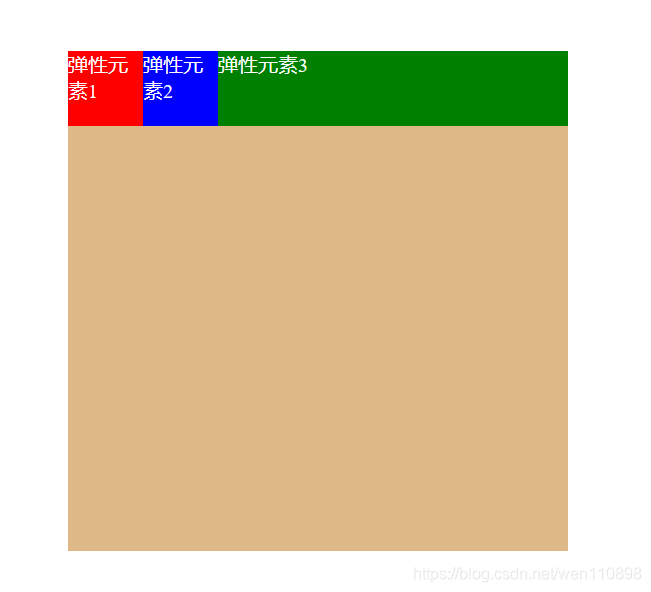
flex-grow
取值:默认0,用于决定项目在有剩余空间的情况下是否放大,默认不放大;
注意,即便设置了固定宽度,也会放大。
假设默认三个项目中前两个个项目都是0,最后一个是1,最后的项目会占满剩余所有空间。
<!DOCTYPE html>
<html lang="en">

<head>
  <meta charset="UTF-8">
  <meta http-equiv="X-UA-Compatible" content="IE=edge">
  <meta name="viewport" content="width=device-width, initial-scale=1.0">
  <title>Document</title>
  <style>
    * {
      margin: 0;
      padding: 0;
    }

    /* 父容器设置样式 */
    .container {
      width: 400px;
      height: 400px;
      background-color: burlywood;
      margin: 100px auto;
      /* 伸缩盒布局 display我们是在父容器中进行声明的 */
      display: flex;
    }

    div {
      width: 60px;
      height: 60px;
      color: white;
    }

    .div3{
     flex-grow: 1;
    }
  </style>
</head>

<body>
  <!-- 父容器 -->
  <div class="container">
    <div class="div1" style="background-color: red;">弹性元素1</div>
    <div class="div2" style="background-color: blue;">弹性元素2</div>
    <div class="div3" style="background-color: green;">弹性元素3</div>
  </div>
</body>

</html>
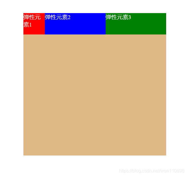
假设只有第一个项目默认为0,后面两个项目flex-grow均为1,那么后两个项目平分剩余空间。
<!DOCTYPE html>
<html lang="en">

<head>
  <meta charset="UTF-8">
  <meta http-equiv="X-UA-Compatible" content="IE=edge">
  <meta name="viewport" content="width=device-width, initial-scale=1.0">
  <title>Document</title>
  <style>
    * {
      margin: 0;
      padding: 0;
    }

    /* 父容器设置样式 */
    .container {
      width: 400px;
      height: 400px;
      background-color: burlywood;
      margin: 100px auto;
      /* 伸缩盒布局 display我们是在父容器中进行声明的 */
      display: flex;
    }

    /* order 对项目或弹性元素 做一个排序 */
    div {
      width: 60px;
      height: 60px;
      color: white;
    }

    .div1 {
      flex-grow: 0;
    }

    .div2 {
      flex-grow: 1;
    }

    .div3 {
      flex-grow: 1;
    }
  </style>
</head>

<body>
  <!-- 父容器 -->
  <div class="container">
    <div class="div1" style="background-color: red;">弹性元素1</div>
    <div class="div2" style="background-color: blue;">弹性元素2</div>
    <div class="div3" style="background-color: green;">弹性元素3</div>
  </div>
</body>

</html>
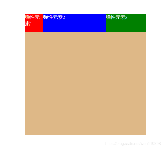
 假设第一个项目默认为0,第二个项目为flex-grow:2,最后一个项目为1,则第二个项目在放大时所占空间是最后项目的两倍((0+1)*2)。
<!DOCTYPE html>
<html lang="en">

<head>
  <meta charset="UTF-8">
  <meta http-equiv="X-UA-Compatible" content="IE=edge">
  <meta name="viewport" content="width=device-width, initial-scale=1.0">
  <title>Document</title>
  <style>
    * {
      margin: 0;
      padding: 0;
    }

    /* 父容器设置样式 */
    .container {
      width: 400px;
      height: 400px;
      background-color: burlywood;
      margin: 100px auto;
      /* 伸缩盒布局 display我们是在父容器中进行声明的 */
      display: flex;
    }

    div {
      width: 60px;
      height: 60px;
      color: white;
    }

    .div1 {
      flex-grow: 0;
    }

    .div2 {
      flex-grow: 2;
    }

    .div3 {
      flex-grow: 1;
    }
  </style>
</head>

<body>
  <!-- 父容器 -->
  <div class="container">
    <div class="div1" style="background-color: red;">弹性元素1</div>
    <div class="div2" style="background-color: blue;">弹性元素2</div>
    <div class="div3" style="background-color: green;">弹性元素3</div>
  </div>
</body>

</html>
flex-shrink**
取值:默认1,用于决定项目在空间不足时是否缩小,默认项目都是1,即空间不足时大家一起等比缩小;注意,即便设置了固定宽度,也会缩小。
但如果某个项目flex-shrink设置为0,则即便空间不够,自身也不缩小。比如下面代码中,我给子元素都设置了800width,因为flex-shrink默认1,所以空间不足时大家一起等比缩小。
<!DOCTYPE html>
<html lang="en">

<head>
  <meta charset="UTF-8">
  <meta http-equiv="X-UA-Compatible" content="IE=edge">
  <meta name="viewport" content="width=device-width, initial-scale=1.0">
  <title>Document</title>
  <style>
    * {
      margin: 0;
      padding: 0;
    }

    /* 父容器设置样式 */
    .container {
      width: 500px;
      height: 300px;
      background-color: pink;
      margin: 100px auto;
      /* 伸缩盒布局 display我们是在父容器中进行声明的 */
      display: flex;
    }

    div {
      width: 800px;
      height: 60px;
      color: white;
      /* flex: shrink 1; */
    }

  </style>
</head>

<body>
  <!-- 父容器 -->
  <div class="container">
    <div class="div1" style="background-color: red;">弹性元素1</div>
    <div class="div2" style="background-color: blue;">弹性元素2</div>
    <div class="div3" style="background-color: green;">弹性元素3</div>
  </div>
</body>

</html>
下面我给div2设为0,其他为默认1
<!DOCTYPE html>
<html lang="en">

<head>
  <meta charset="UTF-8">
  <meta http-equiv="X-UA-Compatible" content="IE=edge">
  <meta name="viewport" content="width=device-width, initial-scale=1.0">
  <title>Document</title>
  <style>
    * {
      margin: 0;
      padding: 0;
    }

    /* 父容器设置样式 */
    .container {
      width: 500px;
      height: 300px;
      background-color: pink;
      margin: 100px auto;
      /* 伸缩盒布局 display我们是在父容器中进行声明的 */
      display: flex;
    }

    .div1 {
      width: 800px;
      height: 60px;
      color: white;
      flex: shrink 1;
    }

    .div2 {
      height: 60px;
      width: 300px;
      flex: shrink 0;
    }

    .div3 {
      width: 800px;
      height: 60px;
      color: white;
      flex: shrink 1;
    }
  </style>
</head>

<body>
  <!-- 父容器 -->
  <div class="container">
    <div class="div1" style="background-color: red;">弹性元素1</div>
    <div class="div2" style="background-color: blue;">弹性元素2</div>
    <div class="div3" style="background-color: green;">弹性元素3</div>
  </div>
</body>

</html>
flex-basis
取值:默认auto,用于设置项目宽度,默认auto时,项目会保持默认宽度,或者以width为自身的宽度,但如果设置了flex-basis,权重会比width属性高,因此会覆盖widtn属性
<!DOCTYPE html>
<html lang="en">

<head>
  <meta charset="UTF-8">
  <meta http-equiv="X-UA-Compatible" content="IE=edge">
  <meta name="viewport" content="width=device-width, initial-scale=1.0">
  <title>Document</title>
  <style>
    * {
      margin: 0;
      padding: 0;
    }

    /* 父容器设置样式 */
    .container {
      width: 500px;
      height: 300px;
      background-color: pink;
      margin: 100px auto;
      /* 伸缩盒布局 display我们是在父容器中进行声明的 */
      display: flex;
    }

    div {
      width: 200px;
      height: 60px;
      color: white;
    }
    .div2{
        flex-basis: 100px;
    }

  </style>
</head>

<body>
  <!-- 父容器 -->
  <div class="container">
    <div class="div1" style="background-color: red;">弹性元素1</div>
    <div class="div2" style="background-color: blue;">弹性元素2</div>
    <div class="div3" style="background-color: green;">弹性元素3</div>
  </div>
</body>

</html>
flex
取值:默认0 1 auto,flex属性是flex-grow,flex-shrink与flex-basis三个属性的简写,用于定义项目放大,缩小与宽度。
该属性有两个快捷键值,分别是auto(1 1 auto)等分放大缩小,与none(0 0 auto)不放大不缩小。
还有最常用的flex:1 === flex: 1 1 0px( 等分、等比缩小、无权重)
3.13.align-self
取值:auto(默认) | flex-start | flex-end | center | baseline | stretch,表示继承父容器的align-items属性。如果没父元素,则默认stretch。
用于让个别项目拥有与其它项目不同的对齐方式,各值的表现与父容器的align-items属性完全一致。
<!DOCTYPE html>
<html lang="en">

<head>
  <meta charset="UTF-8">
  <meta http-equiv="X-UA-Compatible" content="IE=edge">
  <meta name="viewport" content="width=device-width, initial-scale=1.0">
  <title>Document</title>
  <style>
    * {
      margin: 0;
      padding: 0;
    }

    /* 父容器设置样式 */
    .container {
      width: 500px;
      height: 400px;
      background-color: pink;
      margin: 100px auto;
      /* 伸缩盒布局 display我们是在父容器中进行声明的 */
      display: flex;
      align-items: center;
    }

    div {
      width: 100px;
      height: 60px;
      color: white;
    }

    .div2 {
      /* 个别项目拥有与其它项目不同的对齐方式 */
      align-self: flex-end;
    }

  </style>
</head>

<body>
  <!-- 父容器 -->
  <div class="container">
    <div class="div1" style="background-color: red;">弹性元素1</div>
    <div class="div2" style="background-color: blue;">弹性元素2</div>
    <div class="div3" style="background-color: green;">弹性元素3</div>
  </div>
</body>

</html>


 扫一扫
扫一扫


 1180
1180

 被折叠的 条评论
为什么被折叠?
被折叠的 条评论
为什么被折叠?
 到【灌水乐园】发言


